Post Modernism: Jeff Koons

Jeffrey Koons

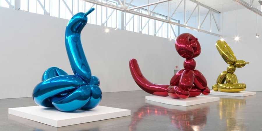
is an American artist known for working with popular culture subjects and his reproductions of banal objects, such as balloonImage result for jeff koons animals produced in stainless steel with mirror-finish surfaces.

He is the epitome of Neo-Pop, a 1980s movement that looked to earlier Pop artists, particularly Warhol, for inspiration. His steel Balloon Dog sculptures, probably his best-known works, transpose an ephemeral childhood memory into an enduring form. His work looks cheap, but is expensive, an ingenious reversal of economic logic that forms the basis for his stunning commercial success.

Image result for jeff koons


Steel Baloon Dog sculpture

Balloon Flower (Red)

Koons’ most famous works to date are the towering sculptures inspired by balloon animals. This one stands over ten feet tall and weighs in excess of a ton. Its sumptuous skin, according to the artist, is intended to “manipulate and seduce,” like the Baroque decor of Christian cathedrals. Like the cheap, shiny rubber it is meant to imitate, the surface of Balloon Flower evokes the eternal appeal of precious metal.

Balloon Flower (Red)

Rendering of Play-Doh

For generations of adults, from the baby boomers to millennials, the mere sight of Play-Doh is nostalgic, conjuring the scent and tactile appeal of this strange, yet calming synthetic substance.

Rendering of Play- Doh


Sources

https://www.tate.org.uk/art/art-terms/p/postmodernism

https://www.theartstory.org/artist-koons-jeff-artworks.htm#pnt_6

https://en.wikipedia.org/wiki/Jeff_Koons#Early_Works_and_Inflatables

Post Modernism: Jeff Koons

Roy Lichtenstein

Roy Lichtenstein was one of the most influential and innovative artists of the second half of the twentieth century. He is preeminently identified with Pop Art, a movement he helped originate, and his first fully achieved paintings were based on imagery from comic strips and advertisements and rendered in a style mimicking the crude printing processes of newspaper reproduction.

Lichtenstein’s success was matched by his focus and energy, and after his initial triumph in the early 1960s, he went on to create an oeuvre of more than 5,000 paintings, prints, drawings, sculptures, murals and other objects celebrated for their wit and invention.

Roy Lichtenstein, Self Portrait

What makes his art so special is the fact that nothing like this had been done before Lichtenstein came along. A lot of art critics did not take his art seriously because to them it wasn’t “real art“.

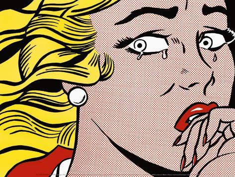
Roy Lichtenstein, Crying Girl

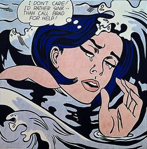
His work, along with that of Andy Warhol, heralded the beginning of the Pop art movement, and, essentially, the end of Abstract Expressionism as the dominant style. Lichtenstein did not simply copy comic pages directly, he employed a complex technique that involved cropping images to create entirely new, dramatic compositions, as in Drowning Girl, whose source image included the woman’s boyfriend standing on a boat above her.

Drowning Girl
Drowning Girl (Original Comic)

Later in his career, Lichtenstein was particularly fascinated by the abstract way in which cartoonists drew mirrors, using diagonal lines to denote a reflective surface. He once remarked, “Now, you see those lines and you know it means ‘mirror,’ even though there are obviously no such lines in reality.

Mirror #1 (1976)

Sources

https://lichtensteinfoundation.org/biography/

https://www.theartstory.org/artist-lichtenstein-roy.htm

http://www.dreamwallsglass.com/2012/06/roy-lichtenstein-mirrors/

https://www.tate.org.uk/art/artists/roy-lichtenstein-1508

Roy Lichtenstein

Yves Tanguy: Cubism, Dadaism & Surrealism


Yves Tanguy was a French surrealist painter famous for eating spiders as a party trick and painting misshapen rocks and molten surfaces. He painted the hyper-real world with exacting precision which helped him communicate his ideas easily.

Photograph of Yves Tanguy

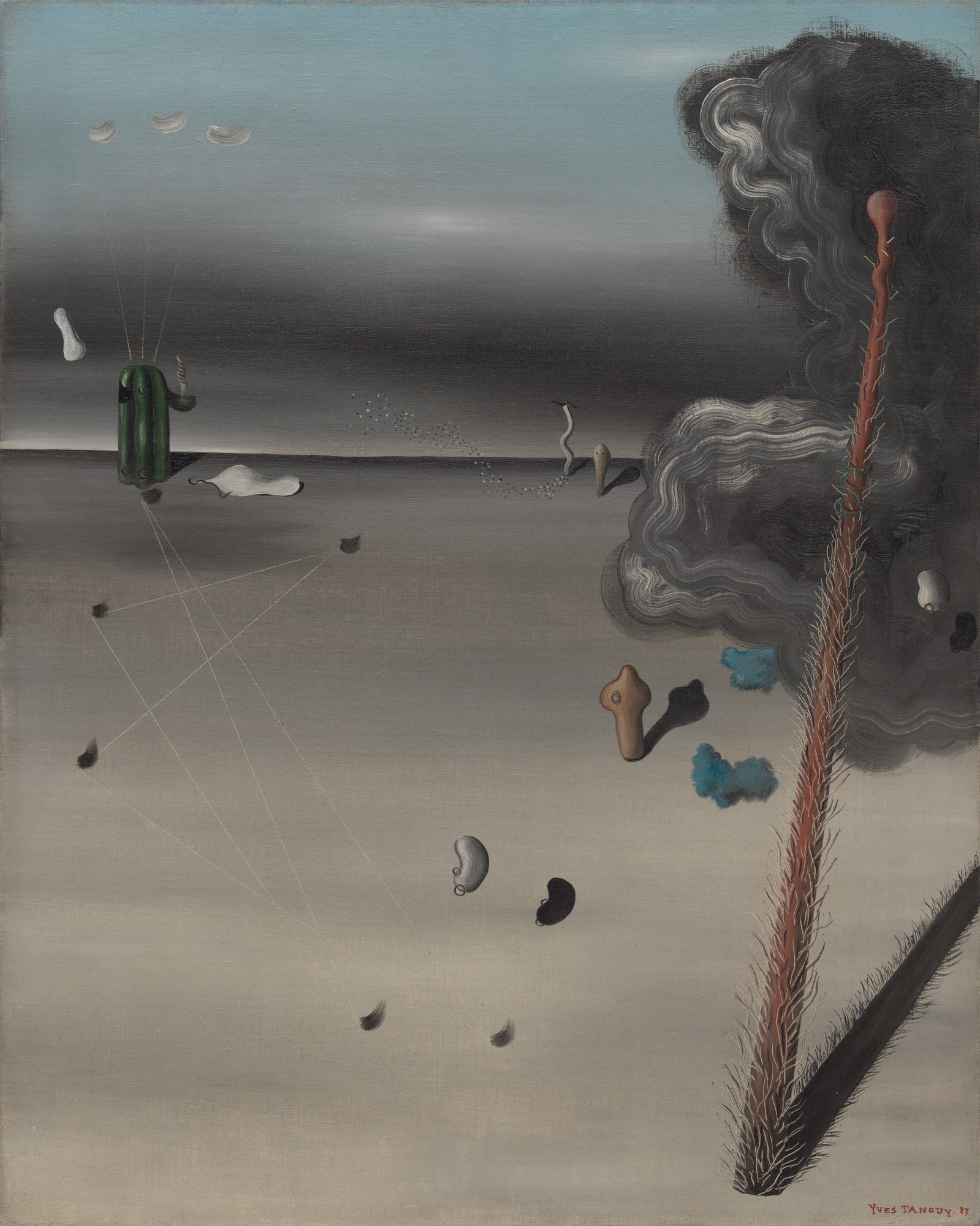
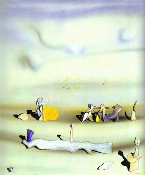
Like most of the surrealist painters, Tanguy relied largely on personal symbolism. For example, in this painting called Mama, Papa is Wounded! the title complicates rather than clarifies the meaning of the work. I personally think that this painting and its name represent World War I. The post-apocalyptic look of this artwork gives the viewer a deep feeling of anxiety and loss.


Mama, Papa is Wounded!

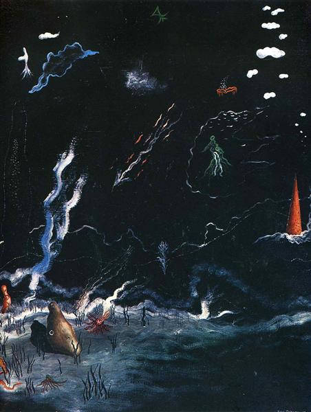
Storm is somewhat different from most of Tanguy’s works. It looks more like an underwater scene rather than desert-like landscape. The life forms that swim across look a lot like real animals like jellyfish, while most of his other work is a lot more surreal.


Storm(Black Landscape)
Tomorrow

Sources

https://www.theartstory.org/artist-tanguy-yves.htm

https://www.wikiart.org/en/yves-tanguy

http://davidsartoftheday.blogspot.com/2015/03/yves-tanguy-storm-black-landscape.html

Yves Tanguy: Cubism, Dadaism & Surrealism

Chaim Soutine: Expressionism, Fauvism & Early 20th Century

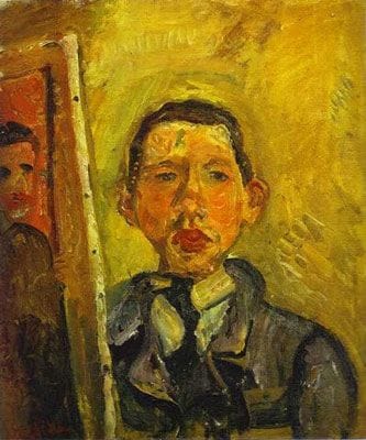
Self Portrait

Chaim Soutine is an expressionist artist that lived and worked in Paris at the height of the modern era.

Despite dominant trends toward abstraction, Soutine maintained a firm connection to the recognizable subject matter. His innovation was in the way he chose to represent his subjects: with a thick impasto of paint covering the surface of the canvas, the palette, visible brushwork, and forms translated the artist’s inner torment.

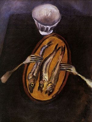
Still Life with Herrings (1916)

There is a lot of symbolism in most of Soutine’s work. For example, here, in Still Life with Herrings, he made the forks look like arms reaching for the skinny fish to represent hunger. Soutine suffered great poverty while growing up and constant stomach ulcers that often made eating impossible.


Woman Entering Water

In this painting, he confronts his figure head-on, with little distinction between the woman and the water itself. Her dress, skin, and posture are all static while not entirely motionless – much like the water she is entering. Soutine’s brushwork drastically flattens the figure and her surroundings, removing the feeling of natural depth.

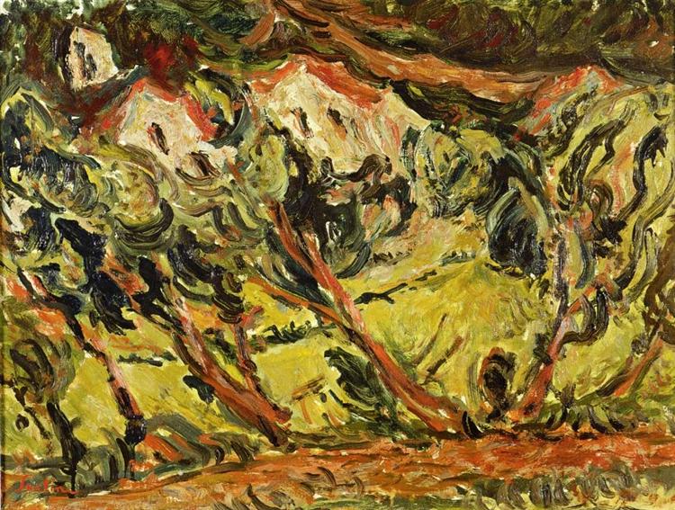
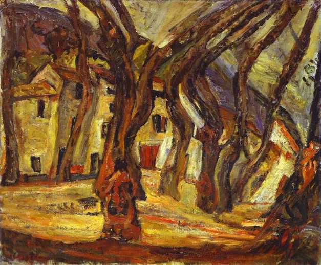
Céret Landscape

Chaim Soutine was not a fan of the outdoors, so he rendered his landscapes with his own brand of anxiety and gloominess, indicated by scenery that seems to shift across the canvas.

Landscape

Sources

https://www.theartstory.org/artist-soutine-chaim.htm

(1) Soutine’s Portraits: Cooks, Waiters & Bellboys – a tour with Fred Sirieix – YouTube

https://www.wikiart.org/en/chaim-soutine


Chaim Soutine: Expressionism, Fauvism & Early 20th Century

Gustave Moreau: Impressionism & Post Impressionism

Salome, Gustave Moreau

Gustave Moreau was a major figure in French Symbolist painting whose main emphasis was the illustration of biblical and mythological figures. His mother was a musician and his father an architect, so Moreau was exposed to art from a very young age. His parents ensured that he got a good education. At the age of 15, he visited Rome, Italy where he developed a keen interest in art. Later, at around the age of 18, he studied with François-Edouard Pico, the Neoclassical painter, and prepared for the entrance exam to the Ecole des Beaux-Arts in Paris.

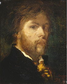
Self Portrait, Gustave Moreau

Gustave Moreau’s visionary paintings speak to an obsession with the otherworldly which makes him one of the most fascinating artists of 19th century. His unusual faith, called Neo-Platonism, inspired him to pay close attention to the imperfection of our physical world. He believed that by doing so he was “allowing divine vision to speak through his brush”.

Pieta, Gustave Moreau

Most of his art is focused on biblical scenes. However, he would interpret them according to his own ideas, imagination, and faith. There is also quite a lot of symbolism in his work. He took those symbols to represent humans’ desires and emotions in the abstract form. These are all reasons for why he is considered a forerunner of symbolism and realism.

The Apparition, Gustave Moreau
Le Poète et La Sirène, Gustave Moreau

Sources:

https://hyperallergic.com/285470/paint-is-the-language-of-god-the-gospel-according-to-gustave-moreau/

https://www.theartstory.org/artist-moreau-gustave.htm

https://en.musee-moreau.fr/gustave-moreau/biography

www.artcyclopedia.com/artists/moreau_gustave.html


Gustave Moreau: Impressionism & Post Impressionism

William Blake: Realism, Pre-Impressionism & Pre-Raphaelites

William Blake was an English poet, painter, and printmaker. Largely unrecognized during his lifetime, Blake is now considered a seminal figure in the history of the poetry and visual arts of the Romantic Age.

Self Portrait by William Blake

Most of Blake’s works have very unusual stories behind them which is one of the reasons he got rejected by the society during his lifetime. For example, in this piece called “The House of Death”, he illustrates lines from Book XI of John Milton’s poem Paradise Lost. The Archangel Michael shows Adam the misery that will be inflicted on Man now he has eaten the Forbidden Fruit. In a vision of ‘Death’s ‘grim Cave’ Adam sees a ‘monstrous crew’ of men afflicted by ‘Diseases dire’.

The House of Death

I, personally, really like this kind of paintings because they make me see a different perspective on famous stories and the world around me. Here are a few more examples of William Blake’s eye-opening work.

Newton
The Ghost of a Flea
The Good and Evil Angels

Sources:

https://www.tate.org.uk/art/artists/william-blake-39

https://www.poetryfoundation.org/poets/william-blake

https://www.britannica.com/biography/William-Blake

William Blake: Realism, Pre-Impressionism & Pre-Raphaelites

How to Get The Best Fonts Without Purchasing Adobe Typekit (Survey 3)

Lecture Summary: Today’s lecture was about the discoveries people made back in 15th – 18th centuries. There was a great number of changes- cultural, scientific, communicational – all happened within a relatively short period of time. One of the reasons for such drastic rate of development was the birth of humanism. Humanists were people that did not believe everything that the Bible and the Church were telling them. They looked for scientific and logical explanations for everything that surrounded them. Such passion for science led to scientists writing more books to pass on their knowledge to the generations to come. That, of course, inspired those of creative mind to develop new fonts and ways to illustrate and brighten up what was written on the pages of dry textbooks.

DESIGN & ILLUSTRATIONS

During the 15th century printing evolved from hand-printed fabrics to the production of books. The term incunable is used to refer to all books printed with metal type from the beginning of Gutenberg’s movable type printing press, around 1455, to the end of 1500. Most of the incunabula had very detailed illustrations that supported the message of the books. However, only the wealthiest people could afford to buy or print their own books. People of average income had block books instead, that had handmade watercolour illustrations.

A printed illustration from an incunable.

TYPOGRAPHY

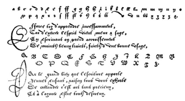
In the 1400’s books were made using handwritten Gothic style, until Gutenberg’s first carved typeface was developed. His font was based on the hand-lettered Gothic style, the technique, however, was completely different. After the movable type printing became popular across Europe, more fonts were created, most of which are still used to this day.

GEOFFROY TORY

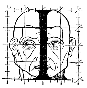
He was a French humanist and an engraver, best known for adding accents on letters in French. In Champ-fleury, auquel est contenu l’art et science de la vraie proportion des lettres antiques selon le corps et visage humain (Gilles de Gourmond, Paris, 1529), Geoffroy Tory compared the proportions in letters to proportions in the human body. In his book, Tory talks about Roman capitals and criticizes Durer’s work.

Troy’s sketch


ROBERT GRANJON

Robert Granjon was a French type designer and printer. He is best known for introducing the typeface Civilité and for his italic type form, the design of which in modern days is used in Garamond Italic. He started his career as a punch cutter which was a craft used in traditional typography to cut letter punches in steel as the first stage of making metal type. During his lifetime Granjon created 9 typefaces and a set of musical symbols. Whilst working as a punch cutter, Granjon designed c. 50 different alphabets, for which he cut c. 6,000 punches.

The Gothic Italic Typeface Civilité


sources:

https://stjohnscollegelibrary.wordpress.com/2016/06/01/do-we-need-pictures-illustration-of-the-earliest-printed-books/

https://blog.spoongraphics.co.uk/articles/a-history-of-typeface-styles-type-classification

http://luc.devroye.org/fonts-32678.html


How to Get The Best Fonts Without Purchasing Adobe Typekit (Survey 3)

0-1400 Fashion (Europe)

Lecture Summary(Sept.26, 2018): During today’s lecture, we talked about the significance of God and Gutenberg on the way people communicated in ca. 0-1400. There were countless inventions in that period of time, including typography and codex. I find those two inventions the most crucial as they made a huge difference in the way people communicated – they now had the ability to print books which made the process much faster compared to before when people would write books by hand. Book of Hours was a popular book in the medieval times as almost all people were religious back then. In my opinion, this was a significant event because it introduced the concept of a book to regular working people, most of whom were illiterate.

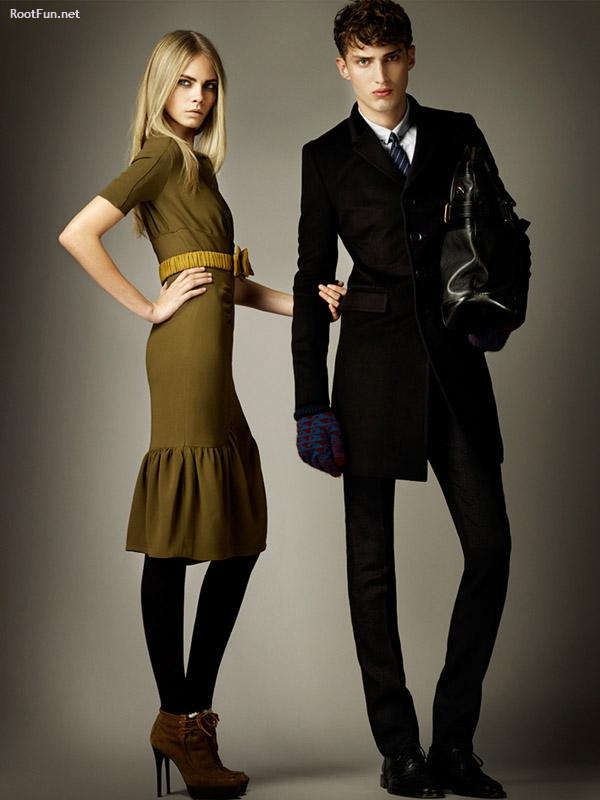
By the end of the 1400’s both men’s and women’s fashion had evolved a great deal. Even some of today’s fashion trends had first started in that period and gradually transformed into what we wear nowadays. For example, in 1300’s female hem-lines progressively reduced in the course of the century. And by the end of the century it was fashionable for men to omit the long loose over-garment of previous centuries (whether called tunic, kirtle, or other names) altogether, putting the emphasis on a tailored top that fell a little below the waist—a silhouette that is still reflected in men’s costume today.

Image result for 1400 europe fashionImage result for mens and womens fashion

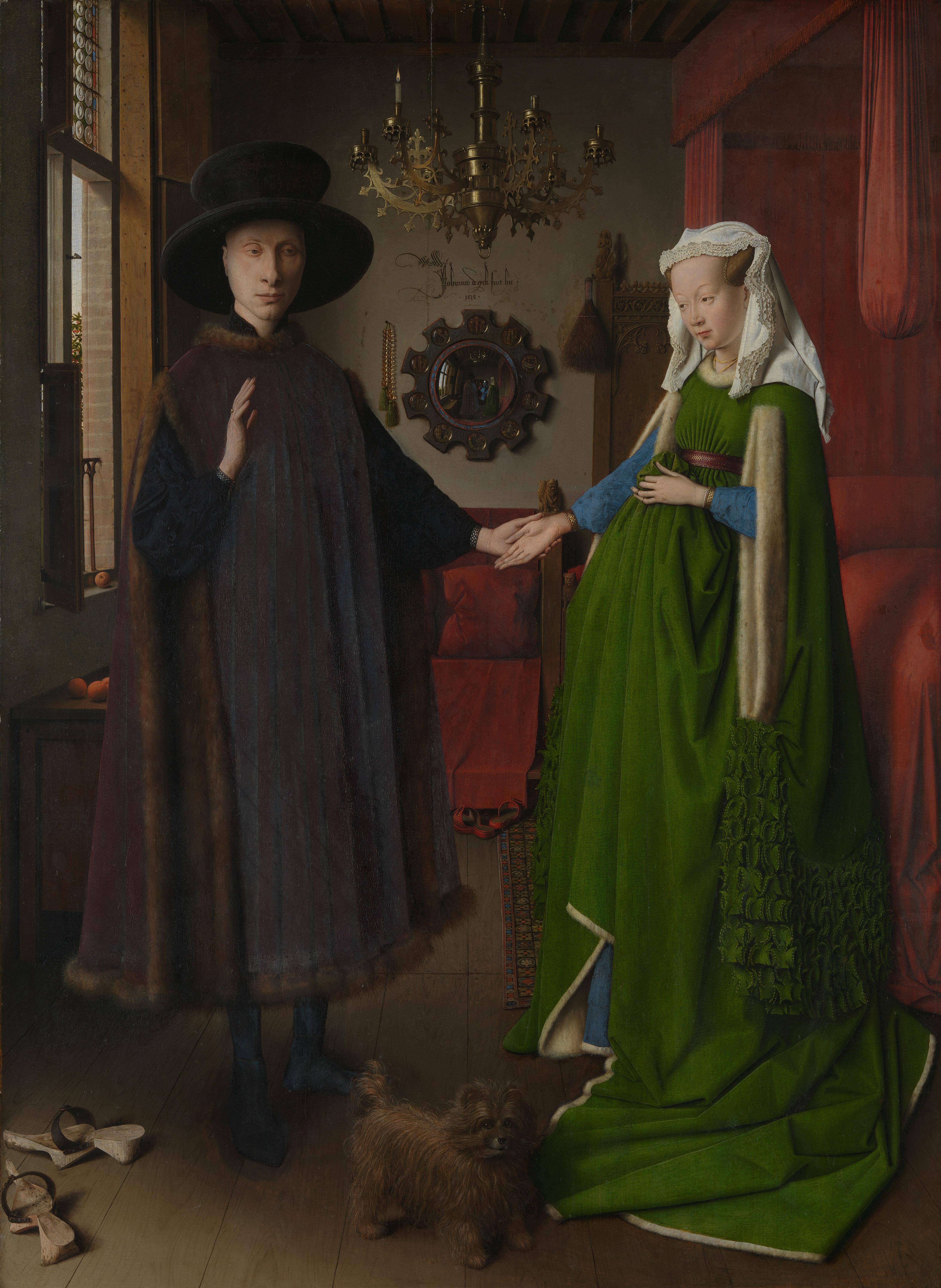
However, since there was still centuries until photography would be invented, there aren’t a lot of artifacts that show us what regular people wore. So, most paintings only show people that would dress up specifically for the artist to paint them. For instance, a famous painting by Jan van Eyck, called “The Arnolfini Portrait” from 1434, shows a couple getting married. The man wears a fur-lined tappert over a black cotehardie and a wide-brimmed hat.  The woman wears a wimple over her hair as well as a green, fur-lined, high-waisted gown with slashed sleeves over a blue cotehardie.

Image result for The Arnolfini Portrait

Many textiles, fabrics, and materials were invented in that period which also affected people’s fashion choices. Wool was the most important material for clothing, due to its numerous favorable qualities, such as the ability to take dye and it being a good insulator. Embroidery in wool, and silk or gold thread for the rich was used for decoration. Checkered and plaid fabrics were occasionally seen. Fur was mostly worn as an inner lining for warmth; a fur-lined coat (rabbit, or the more expensive cat) was one of the most common garments. Vair, the fur of the squirrel, white on the belly and grey on the back, was particularly popular through most of the 15th century and can be seen in many illuminated manuscript illustrations.

Image result for illuminated manuscript illustrations 1400 Sources:

https://en.wikipedia.org/wiki/1300%E2%80%931400_in_European_fashion

rootfun.net

http://www.fashionencyclopedia.com/fashion_costume_culture/European-Culture-15th-Century/Fifteenth-Century-Clothing.html

Laver, James. Costume and Fashion: A Concise History. 4th ed. London, England: Thames and Hudson, 2002


0-1400 Fashion (Europe)

Pre – Columbian Art

Pre-Columbian art refers to the visual arts of indigenous peoples of the Caribbean, North, Central, and South Americas until the late 15th and early 16th centuries, and the time period marked by Christopher Columbus’ arrival in the Americas. Hunters and gatherers developed tools, traditions, and art that helped them survive and develop as a unique culture. For centuries, before the European invasion in the sixteenth century, they were creating amazing architectural monuments and everyday subjects (mainly by hand). Their work reflects their life and different belief systems that existed during that period of time. Most of their work includes metal, textiles, and, most importantly, sculptures.

Image result for pre-columbian arthttps://www.invaluable.com/buy-now/a-large-pre-columbian-nayarit-seated-male-figure-4904179880
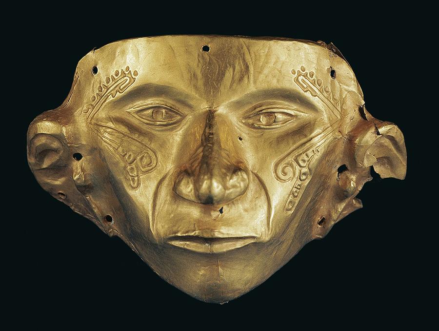
Image result for pre-columbian arthttps://fineartamerica.com/featured/gold-mask-pre-columbian-art-jewelry-everett.html

The Pre-classic period was dominated by the highly developed Olmec civilization, which flourished around 1200–400 BCE. The Olmecs were the earliest known major civilization in Mexico following a progressive development in Soconusco. The Olmecs produced jade figurines, and created heavy-featured, colossal heads, up to 2 meters (8 ft) high. The Mesoamerican tradition of building large ceremonial centres appears to have begun under the Olmecs.
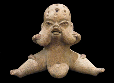
Image result for olmec figurineshttp://www.abovetopsecret.com/forum/thread992421/pg1

Most of the sculptures were found buried with the people they belonged to. Pre- Columbian Americans believed in the afterlife – a transition into a different world after one’s death. They also believed that during that transition people needed their belongings. Therefore, burying sculptures, images, and symbols that the person could use in the following life was a common practice in the Pre- Columbian time.

During the Classic period the dominant Civilization was the Maya. Maya royalty commissioned artwork that honoured their achievements and secured their place in time. Maya script, also known as Maya glyphs, was the writing system of the Maya civilization of Mesoamerica and is the only Mesoamerican writing system that has been found. The earliest inscriptions found which are identifiably Maya date to the 3rd century BCE in San Bartolo, Guatemala. Maya script is extremely different from most other cultures. It is far more visually interesting than English writing, for example (see image below). It included images and symbols that only the Maya royalty was able to write and read.

Image result for maya writing

Scenes depicting various rituals and historical events are embedded with hieroglyphic text to enable the viewer to identify the important figures, times and places instead of relying upon physical features that could be forgotten over time. The interpretation of the actions represented in the artwork goes hand in hand with understanding the decorative text that is woven into the picture. Unlocking this hieroglyphic text is vital as it removes anonymity and mystery from the scenes and reveals detailed records of those who held power throughout the timeline of the civilization.

https://www.youtube.com/watch?v=qi8nqmqIoqM

https://en.m.wikipedia.org/wiki/Pre-Columbian_art

http://www.ancientscripts.com/maya.html

https://design.tutsplus.com/articles/art-history-indigenous-south-america–cms-28629


Pre – Columbian Art