Survey 7: Russian government was just as bad in 1905…

BLOODY SUNDAY

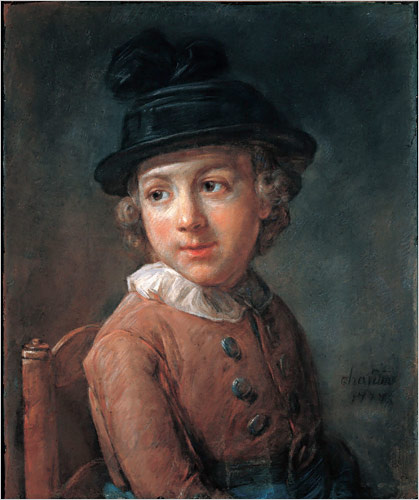
On the 22nd of January, 1905 Bloody Sunday Massacre took place in the Russian capital at the time, St Petersburg. Soldiers of the Imperial guard fired on protestors who were led by the Orthodox Priest Father Georgy Gapon as they marched towards the Winter Palace where they planned to present a petition to Tzar Nicholas II.

By 1905 there was growing dissatisfaction amongst the urban working class. Father Gapon had established the “Assembly of the Russian Factory and Mill Workers of the City of St. Petersburg” to promote workers’ rights in 1904. The workers wanted to have 8-hour long workdays but the owners of the factories rejected their request reason being that the factory would go bankrupt as all the other factories would still make their employees work 14 hours a day. But after four Assembly members from the Putilov ironworks were fired from their jobs in December 1904, workers across the city went on strike. Capitalizing on the situation Father Gapon drafted a petition to the Tsar calling for improved working conditions and other reforms that received 150,000 signatures.

Portrait of Father Gapon

Gapon had already notified the authorities of the petition and the march, and in response, approximately 10,000 troops from the Imperial Guard were placed around the palace. However, why they began firing on the peaceful march is unclear. Even the number killed or injured is uncertain with estimates ranging from the government’s official figure of 96 dead to revolutionary claims of more than 4,000.

Illustration of the Bloody Sunday massacre

The Tsar was not in the palace at the time, and did not give an order for the troops to fire, but was widely blamed for the massacre. In response strikes and protests spread around the country, and eventually developed into the 1905 Revolution.

After hundreds of strikes, October Manifesto was created. Officially “The Manifesto on the Improvement of the State Order”, is a document that served as a precursor to the Russian Empire’s first Russian Constitution of 1906. Duma was formed and was supposed to approve and disapprove any new laws. That was supposed to help develop a more democratic society, however, not much had changed, because all the members of the Duma were Tzar Nicholas’s puppets so he still got to make all decisions by himself.

Russian Imperial Duma and a life-size portrait of Nicholas II

Sources

Russian Revolution of 1905 | Britannica.com

https://www.spb.kp.ru/daily/26328.2/3210114/

https://spartacus-educational.com/RUSgapon.htm

http://www.bbc.co.uk/history/bloody_sunday

Lecture Summary

This lecture covered the period from 1905 until 1915 and discussed the philosophy and effects of modernism on our society, as well as some political events that would eventually be reasons for the First World War. I found it extremely interesting that the style that was born over a hundred years ago is still considered modern. Current designers still rely on the saying “form follows function” as the basis of their creative process.


Survey 7: Russian government was just as bad in 1905…

Gustave Moreau: Impressionism & Post Impressionism

Salome, Gustave Moreau

Gustave Moreau was a major figure in French Symbolist painting whose main emphasis was the illustration of biblical and mythological figures. His mother was a musician and his father an architect, so Moreau was exposed to art from a very young age. His parents ensured that he got a good education. At the age of 15, he visited Rome, Italy where he developed a keen interest in art. Later, at around the age of 18, he studied with François-Edouard Pico, the Neoclassical painter, and prepared for the entrance exam to the Ecole des Beaux-Arts in Paris.

Self Portrait, Gustave Moreau

Gustave Moreau’s visionary paintings speak to an obsession with the otherworldly which makes him one of the most fascinating artists of 19th century. His unusual faith, called Neo-Platonism, inspired him to pay close attention to the imperfection of our physical world. He believed that by doing so he was “allowing divine vision to speak through his brush”.

Pieta, Gustave Moreau

Most of his art is focused on biblical scenes. However, he would interpret them according to his own ideas, imagination, and faith. There is also quite a lot of symbolism in his work. He took those symbols to represent humans’ desires and emotions in the abstract form. These are all reasons for why he is considered a forerunner of symbolism and realism.

The Apparition, Gustave Moreau
Le Poète et La Sirène, Gustave Moreau

Sources:

Paint Is the Language of God: The Gospel According to Gustave Moreau

https://www.theartstory.org/artist-moreau-gustave.htm

https://en.musee-moreau.fr/gustave-moreau/biography

www.artcyclopedia.com/artists/moreau_gustave.html


Gustave Moreau: Impressionism & Post Impressionism

Survey 6: Fly Me to the Moon, Lumiere Brothers!

Lecture Summary

Throughout 1895 – 1905 a lot of events happened that were the foundation for the society we live in nowadays. Women started fighting for their rights for the very first time in history, the first Nobel Prizes were awarded, and new technologies like, cinematographe, were developed.

Annie Kenney and Christabel Pankhurst fighting for women’s right to vote

The Lumière Brothers: Pioneers of cinema

A lot of people are under the impression that the development of modern film technology is all thanks to the famous inventor, Thomas Edison, and his employee, William Dickson. Together, they developed two very first film technologies: kinethograph (basically a camera), and kinetoscope (a single viewer exhibition device that you use to watch kinethograph films). However, while they were busy inventing the two in the United States, people all over the world were going after a similar goal. In Lyon, France, the Lumiere brothers invented a lightweight all-in-one motion picture device that made movies and exhibited them. They called it Cinematographe. It played back the developed roll of film shining a bright light through it to show images.

Lumière Cinematographe, 1895

Voyage dans la Lune

Georges Melies, a French magician, director, and theatrical special effects specialist, got invited to one of the Lumier brothes’ movie screenings. And it of course blew his mind. He tried to purchase the cinematographe on the spot but the Lumier brothers weren’t ready to sell. But Melies did not give up. After searching all over the world, he ended up buying an animatograph.  He now had the opportunity to direct the very first science fiction movie in 1902 called Le Voyage dans la Lune or A Trip to the Moon. Inspired by a wide variety of sources, including Jules Verne’s novels “From Earth to the Moon” and “Around the Moon”, the film follows a group of astronomers who travel to the Moon in a capsule, explore the Moon’s surface, escape from an underground group of aliens, and return in a splashdown to Earth. It features a cast of French theatrical performers, led by Méliès himself in the main role of Professor Barbenfouillis, and is filmed in the overtly theatrical style for which Méliès became famous.

Poster for Le Voyage Dans La Lune

Sources:

https://en.wikipedia.org/wiki/A_Trip_to_the_Moon

https://www.britannica.com/biography/Lumiere-brothers

https://blog.scienceandmediamuseum.org.uk/the-lumiere-brothers-pioneers-of-cinema…


Survey 6: Fly Me to the Moon, Lumiere Brothers!

William Blake: Realism, Pre-Impressionism & Pre-Raphaelites

William Blake was an English poet, painter, and printmaker. Largely unrecognized during his lifetime, Blake is now considered a seminal figure in the history of the poetry and visual arts of the Romantic Age.

Self Portrait by William Blake

Most of Blake’s works have very unusual stories behind them which is one of the reasons he got rejected by the society during his lifetime. For example, in this piece called “The House of Death”, he illustrates lines from Book XI of John Milton’s poem Paradise Lost. The Archangel Michael shows Adam the misery that will be inflicted on Man now he has eaten the Forbidden Fruit. In a vision of ‘Death’s ‘grim Cave’ Adam sees a ‘monstrous crew’ of men afflicted by ‘Diseases dire’.

The House of Death

I, personally, really like this kind of paintings because they make me see a different perspective on famous stories and the world around me. Here are a few more examples of William Blake’s eye-opening work.

Newton
The Ghost of a Flea
The Good and Evil Angels

Sources:

https://www.tate.org.uk/art/artists/william-blake-39

https://www.poetryfoundation.org/poets/william-blake

https://www.britannica.com/biography/William-Blake

William Blake: Realism, Pre-Impressionism & Pre-Raphaelites

Survey 5: Posters & Advertisements

Lecture Summary: Wealthy people had starter traveling so a lot of new cultures were discovered by the western society which influenced the people’s perception of the world. Exhibitions were arranged for the average people to be able to experience things from all over the world. Europeans were fascinated with the Japanese culture which led to Japonism. The “Bible of Ornaments” was created which included a lot of new patterns adopted from different cultures. However, alongside the obsession with the unexplored, a lot of artists started looking back on the old patterns from the Renaissance and Rococo. Mass production was becoming a problem for artists – now things could be made a lot faster and cheaper. But newer things were also of poor quality. So, the arts and crafts movement was started.

Poster Design in France

For today’s designer, the Victorian era might seem like a complete nightmare. In both, interior and poster design, it was typical to add as many patterns and information as possible, leaving almost no empty places.

A lot of people say that the 1890’s was the golden age for posters. Most of the look very visually appealing. However, it took a while for the designers to get to that successful point. A French poster designer, Jules Chéret, was trying out newly explored patterns and ways of drawing in his early works. Some of it looks extremely busy and overcrowded – there is no specific point for the eye to focus on. 

Early Poster by Jules Cheret

The Improvement

It didn’t take Cheret a long tome to figure out what works and what doesn’t. His later work is what was the beginning of the posters we create nowdays. He made a lot of changes, and in opinion, they look like they were almost done by a completely different person. They were clean, lively, and easy to understand. Here’s an example of one of my favourite works by Jules Cheret.

Quinquina Dubonnet, 1895

Jules Cheret’s Influence

Before Jules Cheret’s work, posters weren’t influencing the audience nearly as well as they were after. The world of advertising was completely changed after Cheret. Now advertisements were more simple and straight-forward than ever.

Saxoleine by Jules Cheret

References:

https://www.antiqueposters.com/Saxoleine-Patrole-de-Surete-Maitres-13-p/1658.htm

http://www.pictorem.com/43218/Quinquina%20Dubonnet,%201895,%20Jules%20Cheret.html

https://www.britannica.com/biography/Jules-Cheret

http://www.windsorfineart.com/jules-cheret/

Survey 5: Posters & Advertisements

Neoclassicism 1750 – 1850 – Survey 4

Lecture Summary: During the lecture, we talked about romanticism and the industrial revolution. The 1750’s was the time of mass production in large cities, and, therefore mass consumption. There were more jobs, more money for people to spend on secondary needs, and more things were made for them to buy. Now, there was a huge need for advertising, so people were creating posters, and more newspapers were printed.

Architecture Overview

The style of architecture was changing a lot as well. Since people started producing new materials like iron and steel, architecture and engineering began to separate. Architects started to focus more on the aesthetic aspect of the buildings they’d been hired to work on.

Industrial Revolution

Features of Neoclassical Architecture

Neoclassicism was yet another return to the Classical Orders of Greek and Roman Antiquity on a monumental level, except with the addition of development of all the engineering advances and new materials of the modern era. It was marked by large-scale structures, supported and/or decorated with columns, and enlarged Renaissance-style domes. Sometimes columns were multiplied and stacked, to create an impression of height, while facades were decorated with a combination of colonnades, rotundas and porticoes.

Leeds Town Hall

France

Neoclassicism was born in Italy, although it became especially active in France largely because of the presence of French designers trained at the French Academy in Rome. Classical features had begun appearing in architectural design at the end of Louis XVI’s reign, who began the building of the Palace of Versailles, one of the amazing masterpieces of architecture. This style was then adopted during the first Napoleonic empire: High Society employed it on their private homes, along with extras like faux ruins, follies, grottos, and fountains to decorate the landscape, while more experimental architects used it to design a range of civic structures.

Jacques Germain Soufflot

Jacques-Germain Soufflot was a French architect, a leader in the development of Neoclassical architecture and the designer of the Church of Sainte-Geneviève (the Panthéon) in Paris. He claimed to be self- taught but he lived in Rome for about 20 years and studied the classical monuments there as well as the Greek temples at Paestum. One of his most influential accomplishments was designing of Sainte-Geneviève, which was intended to be a church. However, because of the classical origins of the design, when the Revolution abolished religion, the church was secularized and renamed the Panthéon. Unfortunately, much of the decoration was removed. The effect of a light interior space was destroyed, resulting in the somewhat gloomy monument that the Panthéon is today.

Pantheon

Sources:

http://www.visual-arts-cork.com/history-of-art/neoclassical-architecture.htm#neoclassicism

https://www.britannica.com/biography/Jacques-Germain-Soufflot

https://www.architecture.com/knowledge-and-resources/knowledge-landing-page/classical-classical-revival-neo-classical


Neoclassicism 1750 – 1850 – Survey 4

Jean-Baptiste-Siméon Chardin – Neoclassicism, Romanticism & Rococo

Jean-Baptiste-Siméon Chardin (November 2, 1699 – December 6, 1779) was a French painter. He is considered a master of still life. He lived on the Left Bank near Saint-Sulpice until 1757, when Louis XV granted him a studio and living quarters in the Louvre.

Chardin’s Self Portrait

Some of his earlier work has pretty minimal, almost boring composition. For example, in his painting Glass of Water and A Coffee Pot, the title pretty much sums up the whole composition. However, I find this painting beautiful because of the luminosity of the glass of water. It’s fascinating how such a small detail can bring so much life into the painting.

Glass Of Water And A Coffee Pot

Chardin has also done some work that has a more original and creative composition. A lot of his work involves animals(dead or alive) which is another one of the reasons I chose to write a blog post about him. For example, in Still Life With Cat And Fish the way he painted the cat tells you the whole story of the painting. Its pose shows its desire for the fish, as well as the fear that it might get caught stealing someone else’s food.

Still Life With Cat And Fish
The Silver Tureen

In his older years, Chardin did a lot of pastel portraits which are just as amazing as his early oil paintings.

Portrait Of A Boy

Sources:

http://www.jean-baptiste-simeon-chardin.org/


Jean-Baptiste-Siméon Chardin – Neoclassicism, Romanticism & Rococo

How to Get The Best Fonts Without Purchasing Adobe Typekit (Survey 3)

Lecture Summary: Today’s lecture was about the discoveries people made back in 15th – 18th centuries. There was a great number of changes- cultural, scientific, communicational – all happened within a relatively short period of time. One of the reasons for such drastic rate of development was the birth of humanism. Humanists were people that did not believe everything that the Bible and the Church were telling them. They looked for scientific and logical explanations for everything that surrounded them. Such passion for science led to scientists writing more books to pass on their knowledge to the generations to come. That, of course, inspired those of creative mind to develop new fonts and ways to illustrate and brighten up what was written on the pages of dry textbooks.

DESIGN & ILLUSTRATIONS

During the 15th century printing evolved from hand-printed fabrics to the production of books. The term incunable is used to refer to all books printed with metal type from the beginning of Gutenberg’s movable type printing press, around 1455, to the end of 1500. Most of the incunabula had very detailed illustrations that supported the message of the books. However, only the wealthiest people could afford to buy or print their own books. People of average income had block books instead, that had handmade watercolour illustrations.

A printed illustration from an incunable.

TYPOGRAPHY

In the 1400’s books were made using handwritten Gothic style, until Gutenberg’s first carved typeface was developed. His font was based on the hand-lettered Gothic style, the technique, however, was completely different. After the movable type printing became popular across Europe, more fonts were created, most of which are still used to this day.

GEOFFROY TORY

He was a French humanist and an engraver, best known for adding accents on letters in French. In Champ-fleury, auquel est contenu l’art et science de la vraie proportion des lettres antiques selon le corps et visage humain (Gilles de Gourmond, Paris, 1529), Geoffroy Tory compared the proportions in letters to proportions in the human body. In his book, Tory talks about Roman capitals and criticizes Durer’s work.

Troy’s sketch


ROBERT GRANJON

Robert Granjon was a French type designer and printer. He is best known for introducing the typeface Civilité and for his italic type form, the design of which in modern days is used in Garamond Italic. He started his career as a punch cutter which was a craft used in traditional typography to cut letter punches in steel as the first stage of making metal type. During his lifetime Granjon created 9 typefaces and a set of musical symbols. Whilst working as a punch cutter, Granjon designed c. 50 different alphabets, for which he cut c. 6,000 punches.

The Gothic Italic Typeface Civilité


sources:

Do we need pictures? Illustration of the earliest printed books.

A History of Typeface Styles & Type Classification

http://luc.devroye.org/fonts-32678.html


How to Get The Best Fonts Without Purchasing Adobe Typekit (Survey 3)