My final brand choice was pretty different from what I was planning on originally: instead of using multiple typefaces I used one, instead of a vibrant colour palette I went with black and white. Nonetheless, I believe I made all the right decisions. The b/w colours and minimal type really make the work stand out which is the whole point of this project, anyway. I think in the beginning of this project I wanted to compensate with bright visual element for lack of “good” projects in my portfolio. But, after a little bit of going backwards and refining, I realized that my work was more than good enough and unique on its own. Overall, I would give myself a 9/10 for the project because through this process I gained more confidence as a professional and feel brave enough to get out there and get all the jobs! Thanks Judy 🙂
Uncategorized
Logo Concepts
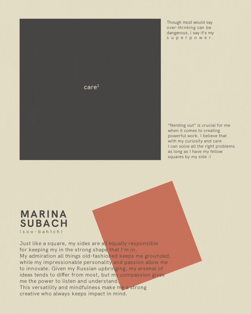
Coming up with my personal logo was a difficult task seeing as how I had to think of myself as a professional designer which I’m not used to doing normally. I realized quite a few new things about myself while sketching, like how much I love to tinker with letterforms and simple shapes, which in turn gave me more definition as to what kind of logo would represent who I am the best. All of my logo concepts are based around one letter (M) and look like a simple and focused mark that people can recognize my work by.
The biggest differences between these logos is the feelings they communicate. The first one is very unstructured and more detailed than the other two, showing that I’m open-minded and caring. Second one is more bold to show that good values and positive outcome of a project are very important to me. Last one was inspired by one of the USSR music record’s logos which hints at my background, thanks to which I feel obliged to always do my very best, and stay focused.
 Loading…
Personal Branding (process)
While putting together my brand, I realized I didn’t know as much about myself as I thought I did. When trying to think about what makes me different from other people, I realized how “basic” my values are — meaning that I don’t have any crazy aspirations for my career, as long as I’m happy doing what I love and can financially support my family and our adventures together.
I’ve also realized that what I love has changed quite a bit in the last three years. As much as I love creative work, now I see it more as a tool to help me accomplish something bigger, rather than pretty design being the goal of what I do. I would feel the most fulfilled if I could bring balance and innovation to our planet, and, perhaps, more importantly, the people on it.
I believe my mood boards reflect well who I am as an individual and a professional. I’m giving myself a 9/10 because I didn’t include a “green” clients picture in my workplace board.
Comic Glossary
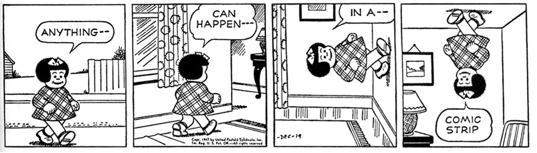
Comic
A juxtaposed pictorial and other images in deliberate sequence intended to convey information and/or to produce an aesthetic response in the viewer.
A sequence of text and images that tells a story.

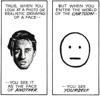
Cartoon
“A vacuum into which our identity and awareness are pulled an empty shell that we inhabit which enables us to travel in another realm.”
A cartoon is a simplified version of the real thing.
Icon
A pictorial representation of a person, place or thing.
Gutter
Space between two panels that lets the reader make a connection between them.

Closure
“Mentally completing that which is incomplete based on past experience.”
Not everything can be told through visual and verbal representation so sometimes there are blanks in a sequence that the reader has to fill.

Panel-to-Panel Transitions
The transition from one panel to the next. They can be different depending on how much time passes between them or how space changes.
Bleed
When a panel bleeds off the page it’s on.

Motion Lines
“Motion lines represent objects moving through space.”
Lines that show the direction an object moves in.

Synaesthetic
“Synesthesia is a perceptual phenomenon in which stimulation of one sensory or cognitive pathway leads to involuntary experiences in a second sensory or cognitive pathway.”
When one sense that is being stimulated, it stimulates another one.
Word Balloon
Also called a speech bubble; is usually used to hold dialogue, but can also hold symbols. It’s used to convey sound from a source. It can also take different shapes to express different emotions.

Digital Reflection
“How does working by hand differ from drawing utilizing the computer or from typing on the computer? Do you think you are using different parts of your brain? Why? Are these different ways of thinking/doing? Which media do you prefer and why? “
I believe that balance is crucial when it comes to anything whether it’s your diet or your drawing/writing habits, especially nowadays because we have so many different options to choose from.
I’ve loved to create for as long as I can remember. When I was growing up we didn’t have the technology that’s available to the kids nowadays. And, honestly, I’m glad we didn’t. Instead of playing Fortnite we played outside in some bushes learning things firsthand – we were simply being kids. I oftentimes think about those times and how lucky I was to have had a wholesome childhood. And I look at how some parents raise their children now. They will go as far as handing a tablet to a 3-year-old with some mind-numbing game or cartoon just to shut them up. Witnessing such things upsets me greatly because this generation of babies is going to miss out on so many exciting REAL LIFE experiences. I’ve also heard that using a lot of technology at a young age affects one’s brain development but I’m no scientist. That’s just something I think about.
There is also, of course, a positive side to having this much technology available to us. For instance, graphic and web design started thriving after computers became accessible to the general public which gave the creatives like me so many more opportunities to express ourselves and our ideas in a cool and unique way. I have the best time executing my illustrations on my computer BUT before I even think about opening my laptop I have to get my sketches done by hand. I do this because it gives me much more freedom to experiment and come up with unique ideas and my mind feels more flexible I guess. It just feels so much natural and easy to let loose and fill up an empty page of my sketchbook rather than click some buttons.
Overall, I think balance is key to reaching your full potential when it comes to technology.
Supergraphics: Barbara Stauffacher Solomon
Barbara Stauffacher Solomon is best known for her interior Supergraphics of the 1960s Sea Ranch and her 1991 Ribbon of Light installation at the Embarcadero Promenade in San Francisco, her iconic style of mixing Swiss Modernism and West Coast Pop, pioneered the look of the California Cool – an important moment in graphic design history.
:format(webp):no_upscale()/cdn.vox-cdn.com/uploads/chorus_asset/file/9965699/Screen_Shot_2018_01_02_at_1.55.35_PM.png)
At first, she was hired only to create the Sea Ranch’s logo and brochure. In fact, as she reveals in the interview, the now-iconic supergraphics were one of the last elements she designed for the development. The architects had gone way over budget designing the Sea Ranch’s swim and tennis club and they needed a cost-effective signage system. Enter Solomon’s bold, Helvetica-heavy solution, achieved in just a handful of days with just a few coats of paint. The project was later published in Life magazine and gained its popularity.
:format(webp)/cdn.vox-cdn.com/uploads/chorus_image/image/58189369/cc2a2790646381af98e00478536e605d.0.jpg)
A joint effort by Barbara Solomon, Vito Acconci, and Stanley Saitowitz, the Promenade Ribbon a 2.5-mile long linear sculpture that wraps along the Embarcadero sidewalk, was completed in 1996.

Punctuated by lighted glass blocks set in paving, it once provided gentle illumination for nighttime passersby. Today, twenty years later, it lights up no more.
A few factors contributed to the darkening. Sea level rise and king tides have resulted in water corroding of Ribbon’s power source. And the fiber optic lights, beautiful when they worked, suffered from water damage caused by the porous nature of concrete.
Sources
https://www.curbed.com/2018/1/3/16842200/barbara-stauffacher-solomon-sea-ranch-supergraphics
https://create.adobe.com/2018/3/28/visions_not_previous.html
Survey 9: Viewfinding the Leica
Lecture Summary
This week’s lecture covered the time period of 1925 – 1930. It was a great time for science and technology. Communication was greatly improved after the TV and portable cameras were invented.
Leica Cameras 1913 – 1930
Leica I – was first introduced to the market at the 1925 spring fair in Leipzig, based on the Ur-Leica prototype developed by Barnack in 1913 and the Prototype 1 developed in 1923. Interchangeable lenses for these were introduced in 1930.

The Leica was by no means the first 35mm camera, but it was the first to make 35mm truly viable, leading to the most popular film format ever. The camera was the brainchild of Oskar Barnack, who joined Leitz in 1911 as Director of Research. He soon began work on a movie camera, for use with 35mm film, the standard movie gauge of the time.
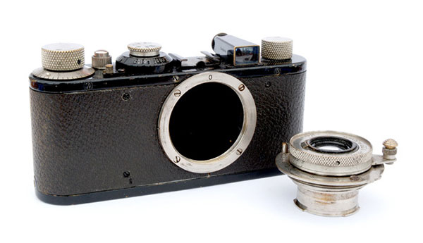
Because emulsion speeds of then current films were unreliable and accurate metering was all but impossible, Barnack built a small device intended to test small batches of movie film. It became apparent, however, that what he had actually created was a miniature still camera, known today as the Ur-Leica. Specification was sparse. Shutter speeds, from the cloth focal plane shutter, covered 1/25 – 1/500 second. The lens was pulled out on a short metal tube and was pushed back almost flat with the body when not in use. It could not be detached. The viewfinder was mounted separately on the top plate, rather than built in, and there was no rangefinder, other than a separate accessory. The camera was covered with vulcanite, often mistaken for leather.
Sources
https://www.shutterbug.com/content/leica-i-camera-change-photography
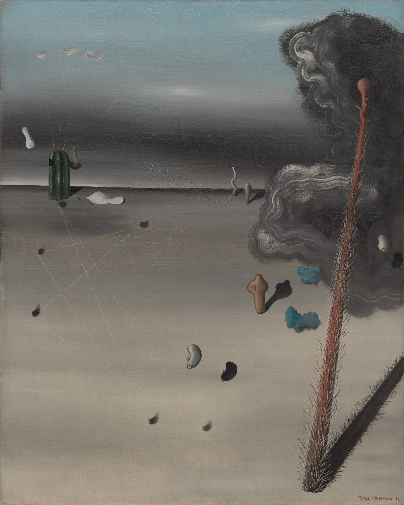
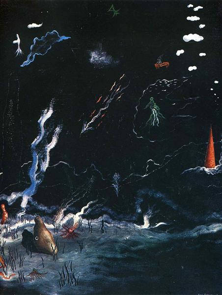
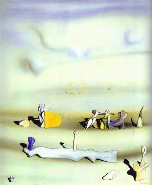
Yves Tanguy: Cubism, Dadaism & Surrealism
Yves Tanguy was a French surrealist painter famous for eating spiders as a party trick and painting misshapen rocks and molten surfaces. He painted the hyper-real world with exacting precision which helped him communicate his ideas easily.

Like most of the surrealist painters, Tanguy relied largely on personal symbolism. For example, in this painting called Mama, Papa is Wounded! the title complicates rather than clarifies the meaning of the work. I personally think that this painting and its name represent World War I. The post-apocalyptic look of this artwork gives the viewer a deep feeling of anxiety and loss.
Storm is somewhat different from most of Tanguy’s works. It looks more like an underwater scene rather than desert-like landscape. The life forms that swim across look a lot like real animals like jellyfish, while most of his other work is a lot more surreal.
Sources
https://www.theartstory.org/artist-tanguy-yves.htm
https://www.wikiart.org/en/yves-tanguy
http://davidsartoftheday.blogspot.com/2015/03/yves-tanguy-storm-black-landscape.html
Survey 8: Suprematism 1915- 1925
Lecture Summary
This week’s lecture covered the time period of 1915 – 1925 which immediately tells us that World War I happened during that time. It influenced everything and everybody in the world, including design. A lot of propaganda posters were created to get people to participate in the war and support one’s country. Although it had one of the deadliest outcomes, the world of art and design was changed forever.
Suprematism is an art movement, focused on basic geometric forms, such as circles, squares, lines, and rectangles, painted in a limited range of colors. This was a completely new concept at the time – completely fascinated artists all over the world. It is also considered to be the beginning of conceptual art. The founder of this movement was a Russian artist Kazimir Malevich.
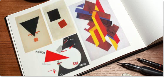
Kazimir Malevich
He is most famous for his painting Black Square. The name pretty much sums up what the painting looks like, however, there is a lot more meaning behind it. Suprematism focused on the absence of any physical objects, and the Black Square communicated that perfectly.
Like Malevich explained once,
“Under Suprematism, I understand the primacy of pure feeling in creative art. To the Suprematist, the visual phenomena of the objective world are, in themselves, meaningless; the significant thing is feeling, as such, quite apart from the environment in which it is called forth.”

El Lissitzky
Lissitzky was one of the very successful Malevich’s students. His work greatly influenced the Bauhaus and constructivist movements, and he experimented with production techniques and stylistic devices that would go on to dominate the 20th-century graphic design.


Sources
https://www.tate.org.uk/whats-on/tate-modern/exhibition/malevich
https://www.theartstory.org/artist-malevich-kasimir.htm
https://en.wikipedia.org/wiki/El_Lissitzky