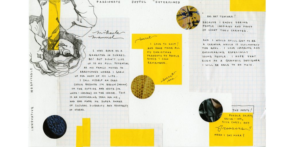
The colours I chose were meant to be warm, bright and impactful to showcase that I am passionate, joyful, innovative, determined and hospitable. I enjoy the colour yellow as it is usually a happy colour and dark blue/green are cool equalizers so it portrays my quiet personality as well.
I also love using texture and collage in my art, especially with school supplies because they are just simple materials that are usually accessible to me. In this case I used the graph paper and post-it notes to emphasize text and images. I thought it worked well for this project too because it is a school yearbook.
For my portrait I decided to go for a simplistic realism effect so that I wouldn’t take away from the text too much. The reason the graph paper and post-it note overlap the drawing is because I often use texture and colours to represent my diversity. I have always thought my skin colour doesn’t visually represent who I am as a person. In my mind, this helps me to express the term “oreo cookie” that I find empowering.
The circle images are, again, more textured than image based because I thought it was a more interesting way to capture the feeling. It allows someone to immerse themselves in the activity rather than watching someone else do it.
The layout on a whole has a theme of organized chaos. There are things going off the page, words that are in different directions and the portrait is upside down. But it also has structure to it because of the geometric shapes.
I give myself a 9/10 because I could have done a better job with planning out the size and amount of writing, as well as dealing with the white space.