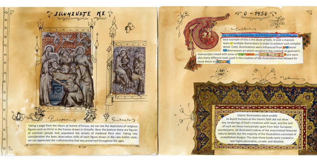
The colours I chose were more earthy tones, apart from the text about the Book of Kells as that is a more brightly coloured codex to begin with. This was for historical accuracy and I believe it also helps to draw the audience into the spread as well.
There are a few reasons I chose to do a collage-based spread rather than illustrating the entire thing. First of all, I felt it complimented the text better and created a cleaner finish to the page. Second, I thought it was more unique as, so far, I haven’t seen many spreads with pasted images. Finally, It balances out the whimsical pen and ink illustrations that I did to border the various text on the page. The pen and ink illustrations are inspired by their corresponding illuminations and are a little bit “rough” on purpose. They are meant to bring playfulness to the piece and compliment the structured, richly-coloured images.
The layout of the spread is positioned to draw the reader across the page. It doesn’t really matter which part you start reading, but the reader’s eye is drawn in a circle to the right (starting with the title and ending with the European Illumination), which I think is unique.
I give myself an 8/10 for this piece because there are places, like the Celtic Illumination text, that I rushed a little bit. I think it would also be nice if I illustrated more things in the spread and will have to take that into account for next time. All in all, I think the design works and communicates the information well.