I chose a black and white colour scheme for this spread because photography was becoming a popular way to capture moments in time and wanted the spread to embody the 19th century. It also gives it the spread a classy feel.
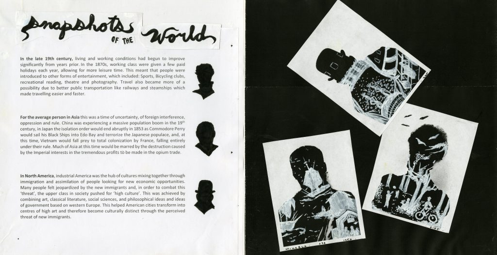
The images themselves are meant to look like double-exposure photographs and contain drawings on the inside of the larger silhouettes. The drawings are meant to be little “snapshots” into what life was like for the working middle class around the world at the time. It shows the contrast in a dramatic way. The smaller silhouettes of each figure draws the reader to the text that matches with the image as well.
The layout of the spread is quite right-sided heavy, which wasn’t intentional and would be something I would watch out for next time. But I did intend for readers to be drawn to the images first and then to the text to find out what they were about.
I give myself an 9/10 for this one because I think it communicates the idea across well. It also integrates information and imagery together in a pleasing way. There are still areas to work on though in my designing.