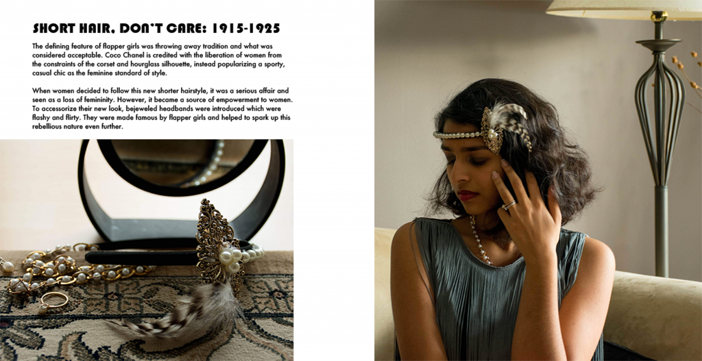
This week I had an object-based spread, so I chose to make the flapper girl headband and compliment it by fully dressing up as if I were from the 1920s.
The overall colour scheme for my spread has sort of a sepia tint to it because I wanted it to come across classy without taking away from the colours of the outfit or the object. I also wanted it to look a bit like it was from a fashion magazine.
For the object (and the outfit/images) I chose to emphasize pearls as part of the accessories as those were very popular in the 1920s.
I felt that a more “broken” layout to the spread would draw people’s attention more and helps to mimic the magazine feel. The images have a bit of mystery to them which invites the reader to read the text. The font for the title I chose also embodies the 1920s (Bauhaus haha).
I give myself a 9/10 for this because I could have maybe condensed the text a little bit more. But I think it’s an overall successful design