
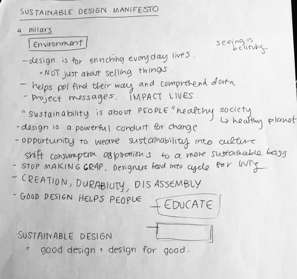
For my Design Manifesto, I chose to outwardly address the issues of consumerism and declare our responsibilities as designers in regards to these issues. My goal was to realign the priorities of designers from “making things pretty” to creating smart, sustainable work. In my writing, I chose to use a strong tone of voice with an interesting hook in the first paragraph to keep readers engaged. In the beginning stages of this project, I struggled with writing an actual “manifesto,” and wasn’t sure how to write one. I spent time researching and reading manifestos of various topics to see the different types of writing structures I could use. The second half of my research was focused on the sustainability aspect. I browsed countless sites which spoke on sustainable design as well as Judy’s presentation slides and took notes from both sources. I have attached some of my notes below.
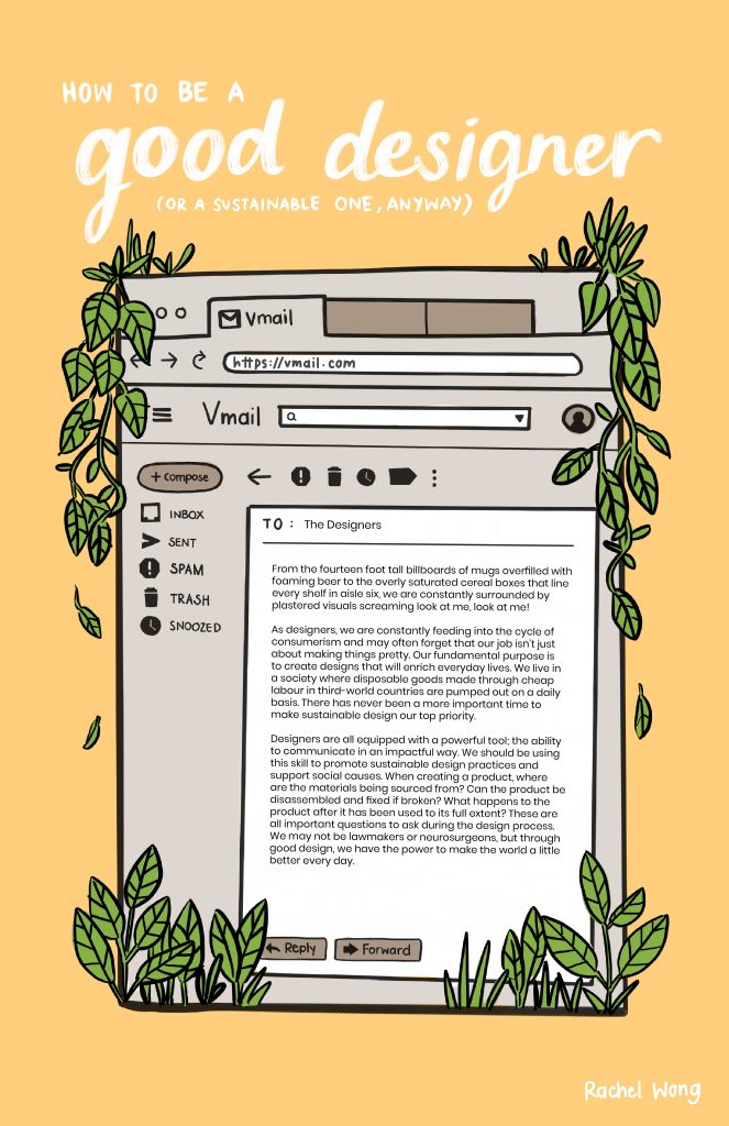
During Judy’s lectures, we learned that seemingly minimal tasks, like sending a text or opening an email can create a carbon footprint. That’s right – sending a short email can add about 4g of Carbon Dioxide to the atmosphere. I chose to create my poster around this idea and decided to address my manifesto as an email to all designers. I illustrated greenery growing out from the corners of the email browser window to symbolize a sustainable aspect bursting out from the grey, mundane component. I decided to hand-write all the text in the poster (except for the email body text) to add a hand-made aspect that would contradict with the uniform text of the actual manifesto. I am very happy with how this turned out! I would give myself a 9/10 on my poster. My main concern that frustrated me during the illustration part of my process was the placement of the title text. I fiddled with many variations of placement and it was mainly the descenders of the letters “g” and ascenders of the letters “d” in my title that were causing the problem. I tried to write my title in all capital letters instead, but I felt that it created a much more serious tone to the poster that I did not want. All in all, I am overall satisfied the layout that I eventually concluded with, as well as the bright yet subdued yolk-yellow background colour I chose. I believe my poster resonates with my written piece effectively and represents my style accurately as well.
Resources Used:
Judy’s presentation slides
“How to Write a Personal Manifesto.” The Art of Manliness, 7 Nov. 2018, www.artofmanliness.com/articles/how-and-why-to-write-your-own-personal-manifesto/.
“How to Write a Manifesto, with Manifesto Writing Examples.” Benedictine University CVDL, 28 June 2018, cvdl.ben.edu/blog/how-to-write-a-manifesto/.
“How to Write a Manifesto.” Alexandra Franzen, 9 Nov. 2017, www.alexandrafranzen.com/2015/12/31/manifesto/.
“How to Write a Manifesto: Guides.” A Research Guide for Students, 11 July 2018, www.aresearchguide.com/write-a-manifesto.html.
“1000 Words: A Manifesto for Sustainability in Design.” Core77, www.core77.com/posts/40586/1000-Words-A-Manifesto-for-Sustainability-in-Design.
“Sustainable Design – What Does It Really Mean?” Architecture . Construction . Engineering . Property, 31 Jan. 2017, sourceable.net/sustainable-design-what-does-it-really-mean/.