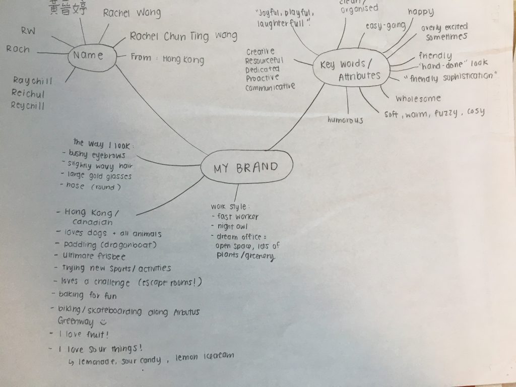
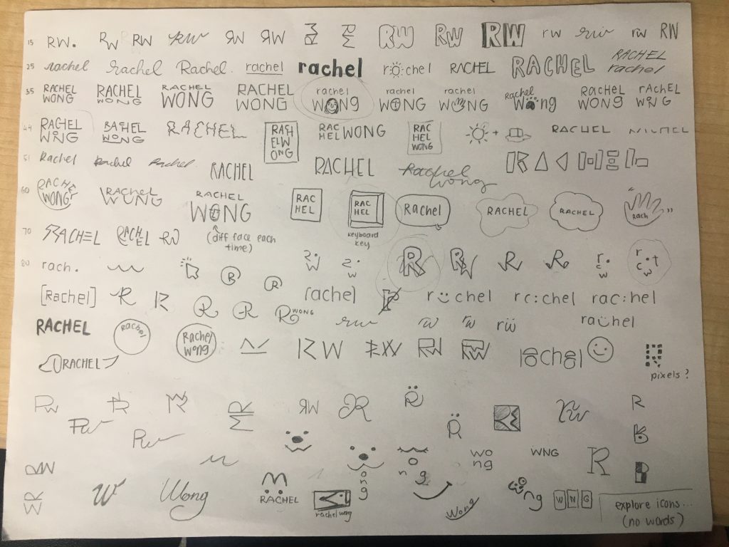
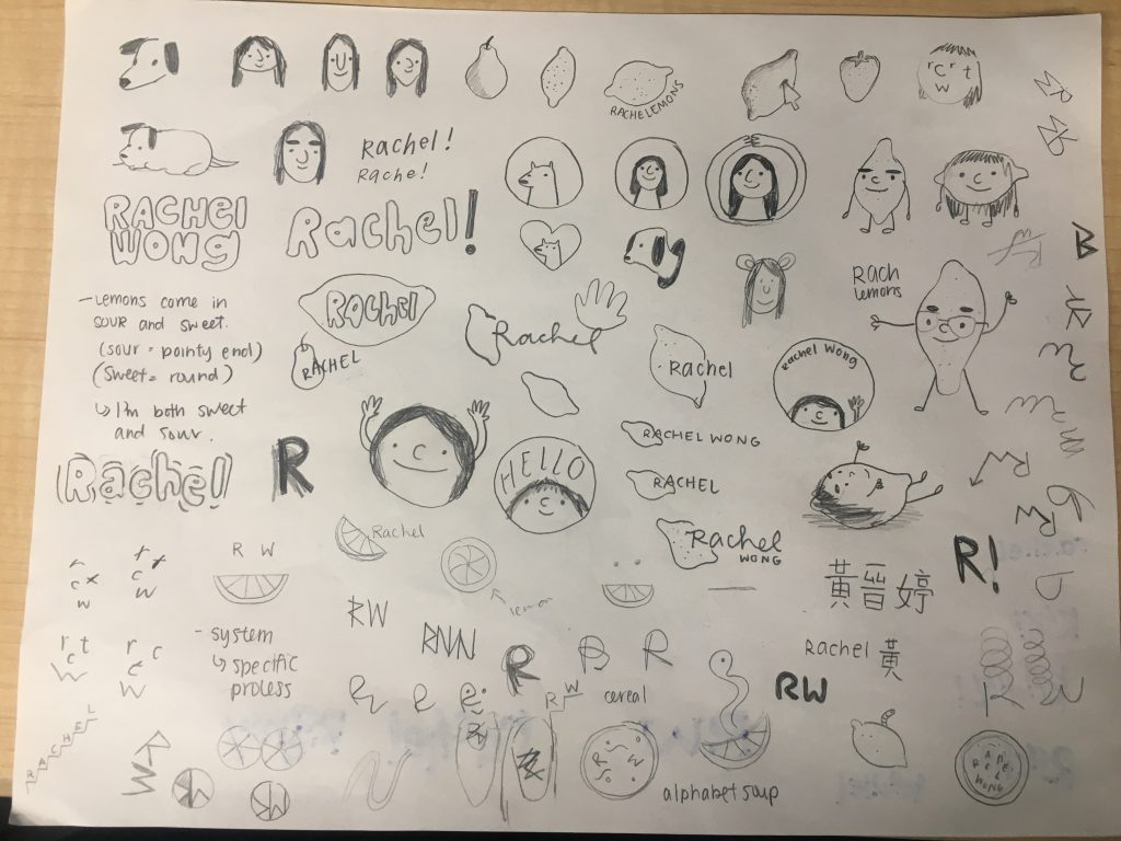
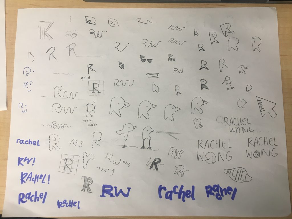
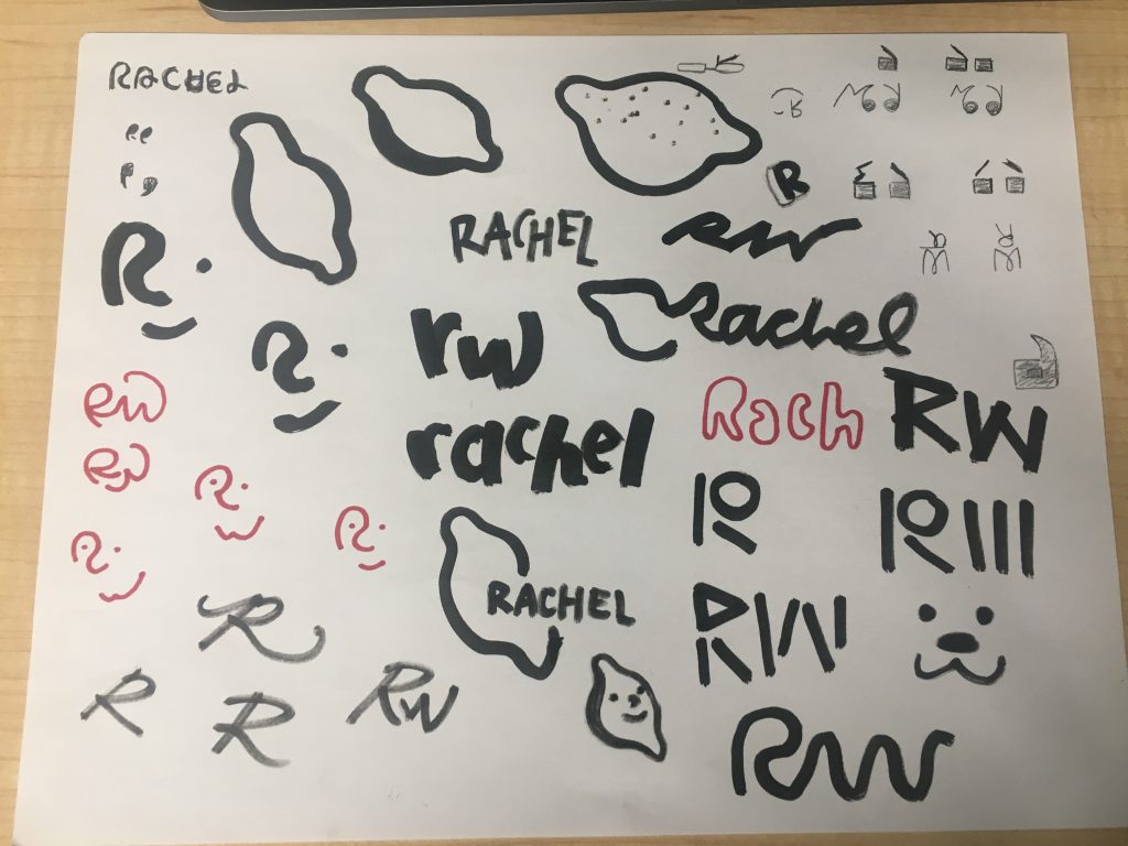
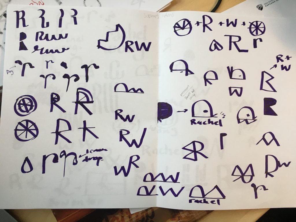
Sketching logos for my personal branding has been one of the most challenging tasks! As designers, we are often quite picky when it comes to design choices. In this project, that pickiness is intensified because I am my own client. It has been very difficult creating logos that I love and also identify with because I almost feel like I don’t know myself entirely too well – even with my moodboards made. I don’t know what “icon” I identify with, and my personal style may not align with my personality. When I started creating icons as opposed to typography based logos, I started sketching lemons because when I was younger, I’d always use “rachelemons” as a username for all the accounts I made. I also love lemons (and all fruits for that matter) and love the colour yellow as it is a sunny, bright, happy colour. I actually had a lot of fun with the lemons and would love to make business cards that look like lemons! In the end, I decided to use a thicker marker and try out some logos for a new perspective! I’d give myself a 9/10 for this portion of the process. I ideated a lot and explored many different options, but I do feel like I hit a bit of a wall and could have potentially went more out of the box with my thinking.