IDES 320: Mentorship – Phase 5

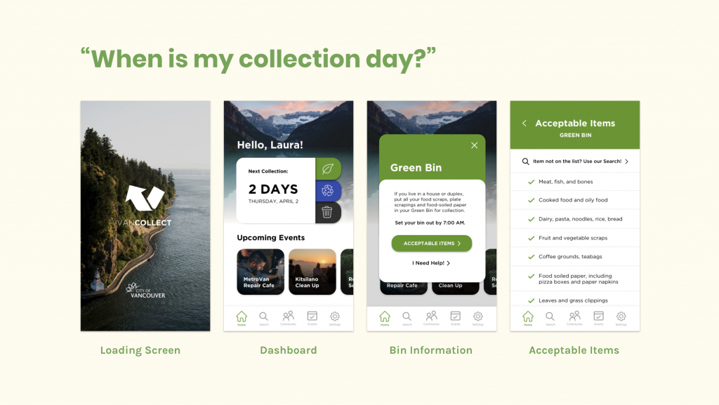
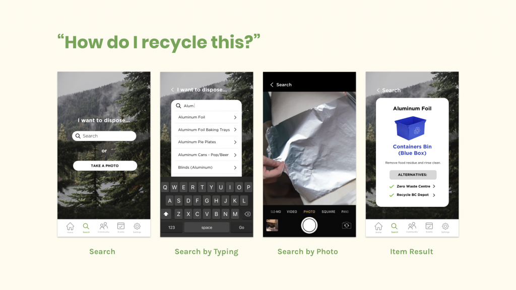
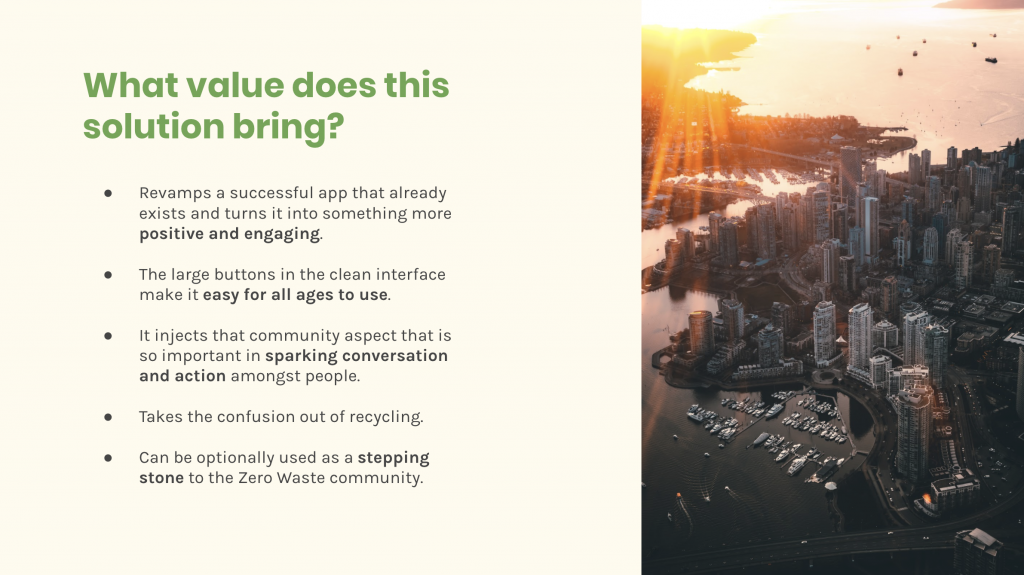
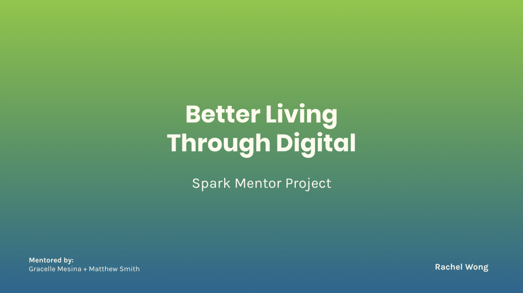
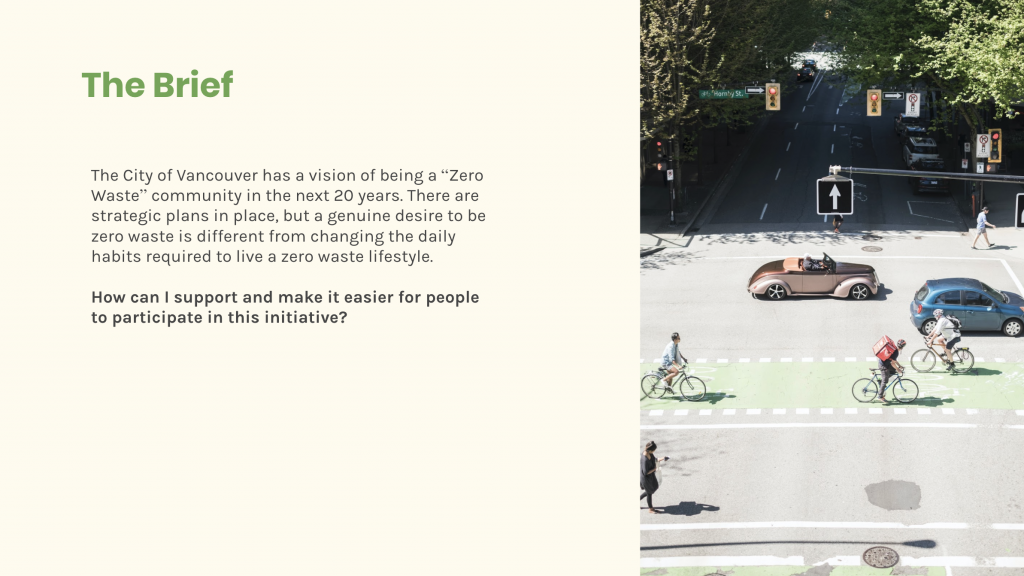
This marks my last blog post about my entire mentorship process with Engine Digital! I can’t believe 6 weeks flew by so fast… it only feels like a week ago that I was still searching for a mentor. With COVID-19, the days are surprisingly going by a lot quicker than I expected. I love that this whole mentorship is included in Judy’s IDES 320 course and I think it is truly invaluable. It was nice being able to work with and get feedback from industry professionals and I’m so happy that I did my mentorship at Engine. It gave me a small insight to what working at a digital agency is like. I got to meet Grace and Matthew who were amazingly supportive and massively talented and I wouldn’t have wanted to be mentored by anyone else. Initially going into the mentorship, I was very nervous and didn’t know what to expect. However, this whole process has confirmed how friendly and open the design community is and how willing people are to help students such as my classmates and I. I am very excited to see how everyone else’s mentorship has gone and what they have created because I don’t think any of us have really mentioned how our projects have been going. For me, the most difficult part was definitely ideating and settling on a real problem that I could devise a solution for. My mentors really emphasized on creating something feasible – financially and conceptually. It was difficult but also nice working with this constraint because in university, they often say “don’t worry about the budget!” because they want you to create something unique and out of the box. In the real world though, budget is very much a concern because that is primarily what the client cares about and they want to keep it as low as possible. I think I will definitely be able to take what I learned and apply it to my upcoming capstone project in fourth year which I need to ideate for this summer. One of the biggest things I learned was how to create a really well thought out presentation that is both succinct but provides enough information for someone who is unfamiliar with the topic to understand. I also learned that practicing truly makes perfect. I became more and more confident in my presentation after I rehearsed it multiple times with my friend over video call. I’ve also learned to never stop exploring when it comes to creating ideas and executing solutions. I definitely went through the situation of thinking that I had a solid idea, but then having the put it to the side and try to explore other avenues that I haven’t touched yet. Coming out of this mentorship, I have definitely gained more connections (and friends!) in the industry, gained more insight into UX/UI jobs, learned to ideate and prototype better, and have created a project that I feel like, with a few tweaks, is definitely portfolio worthy! As for photos, I don’t have much to share because it was such an online-based mentorship due to COVID-19, so I’ll share a few screens from my project:
IDES 320: Mentorship – Phase 4

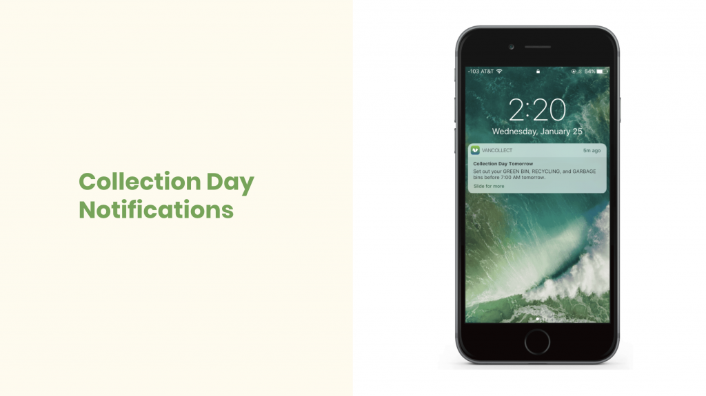
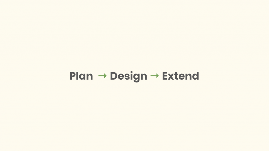
I presented my final project to a small group of designers at Engine Digital over a Google Hangouts call last week! I was a little nervous building up to it, but on the days before the presentation, I made sure my deck was super polished. I wrote any necessary presenter notes, made sure my prototype was fully functioning, rehearsed it a multitude of times, and even video called my friend on Google Hangouts and practiced my presentation several times with them to make sure it would all go smoothly. At first, when I started building my presentation deck, a major thing I initially struggled with was thinking about what to include. I had to choose which parts of my process to show and how to tell everything in a succinct and engaging manner without glossing over important details. I used the format “Plan, Design, and Extend”, which is a presentation style that Engine Digital likes to often use. This really helped organize my presentation in an order that made sense. Another part that I struggled with was deciding what copy to leave in the presentation, and what to put in my presenter notes that I would add onto as I spoke so that it didn’t seem like I was just reading off the slides. I think after a lot of practice and adjustments along the way, I achieved a good balance. On presentation day, Grace (my mentor) introduced me and the project to the other 4 people sitting in for my presentation. Matthew was there was well, which was awesome! My presentation took about 20 minutes and the feedback I received after surprisingly very positive! The audience members said it was a very good presentation, and that I was a good, calming presenter who was able to keep the audience very engaged. They thought that the presentation had good flow and storytelling to it. As for the actual app, they were all impressed by the solution and said that the app looked really good and functioned well – an overall solid solution. They also thought I had great rationale at the end to justify why the solution would work. Matthew was very happy with the work and thought it was nice seeing where I ended up taking the project since the last time I saw him. Some of the things I could work on was including different age ranges in my user testing, potentially adding a screen to the app that includes showing what content was not recyclable, and also including recycling reminders that would pop up on your phone screen – which I added to the presentation deck afterwards. Overall, I would give myself 9.5/10 on this portion because the whole presentation went so well and everyone who gave me feedback was very impressed and happy! Below are a few slides from my final presentation. I couldn’t take a photo of the video call presentation because of privacy concerns.

IDES 320: Mentorship – Phase 3

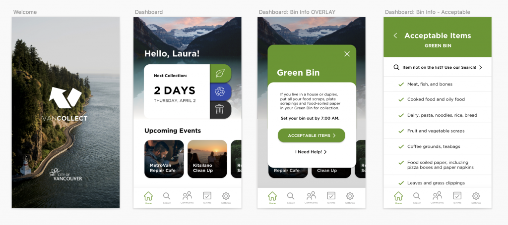
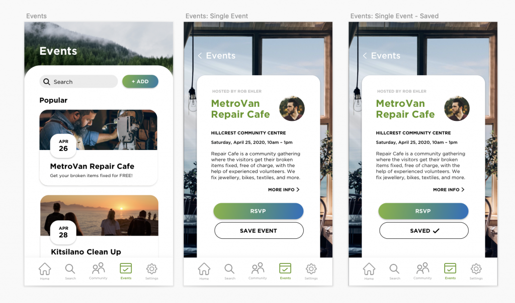
Phase 3 has been a very hectic but also exciting part of this project because I get to apply visuals to all my designs. From last week’s work, I took all my sketches and made digital mid-fidelity wireframes. Then, I started my tiresome hunt for good, royalty-free photography for my app. This phase was over the course of 2 weeks. My mentor, Grace, was quite happy with the outcome of the app and encouraged me to experiment with more layouts to see how they would work. My app took a few different directions, and I’ve constantly changed the photography as this was the hardest part to source. I wanted the app to be very easy to use and understand so that people who have questions regarding recycling properly aren’t struggling with the app as well. I also performed user testing during this phase with 4 people over Zoom. Each session started with an initial interview about the person’s background and opinions on Vancouver recycling, followed by four tasks that I assigned for them to perform over screen sharing of my prototype in Invision. I concluded the session with questions about their experience with their app. The feedback that I received from user testing was surprisingly very positive. The users all really liked the app and there weren’t substantial issues that they encountered. I then spent the last few days learning how to add motion to my prototype to elevate it. I would give myself 9/10 on this phase because it was again, another extremely stressful week filled with lots of work that had to be done and I feel like I delivered a lot successfully.

IDES 320: Mentorship – Phase 2

This second phase of my mentorship was primarily further discussing concepts with my mentor, Grace. I was struggling with this ideating part the most. The feedback that she gave me was that I needed to generate more questions around the problem and she gave me a lot of tips around good design thinking. It was a new way of ideating for me. One of the problems I was also struggling with was choosing a specific problem to tackle because Zero Waste encompasses a lot of different aspects. We communicated through email during this phase because I was running slightly behind schedule and sent her some notes from my document of questions I formulated and potential ideas that could come out of those. She explained the difference between problem-solving questions and research questions and how through asking these more problem-solving questions and doing the research, I’ll eventually hit the “right” problem-solving question – which may appear ambiguous but feel actionable. I don’t have any images to show for this part because it was mainly communication through email. Eventually, I settled on a good problem-solving question, which Grace helped me with refining: How might we make recycling convenient and engaging in Vancouver to promote waste reduction?

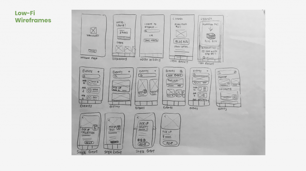
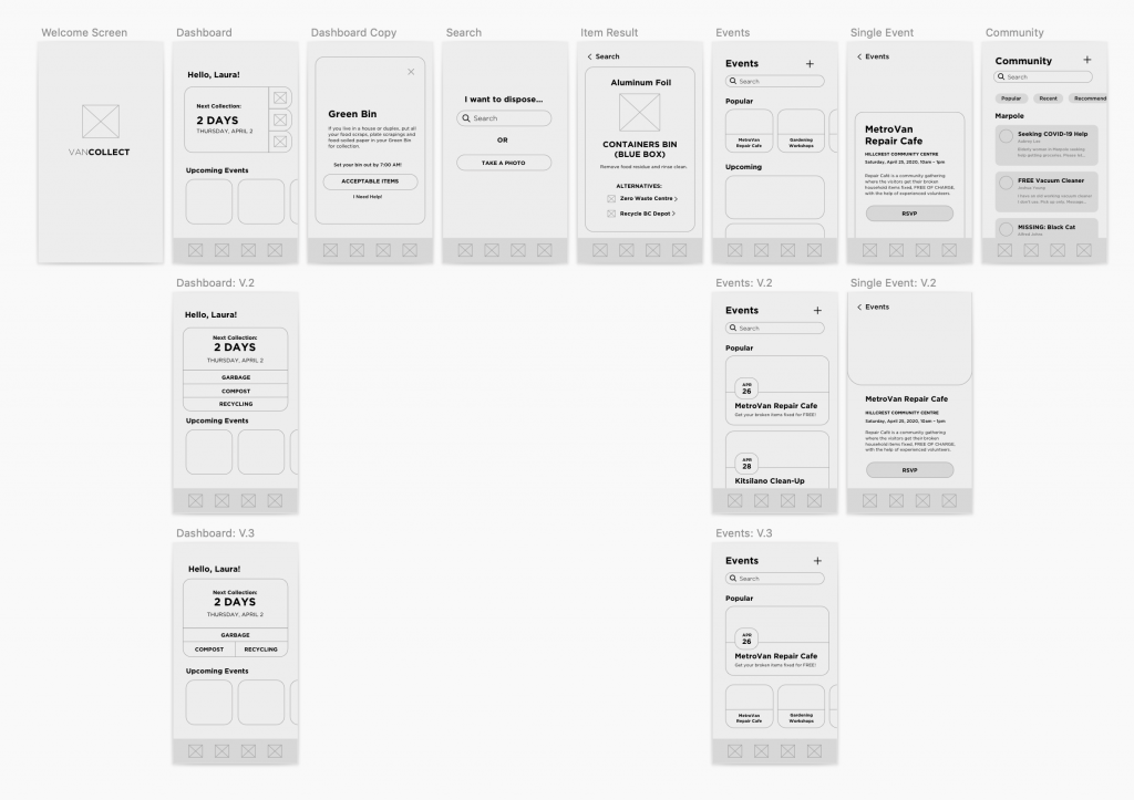
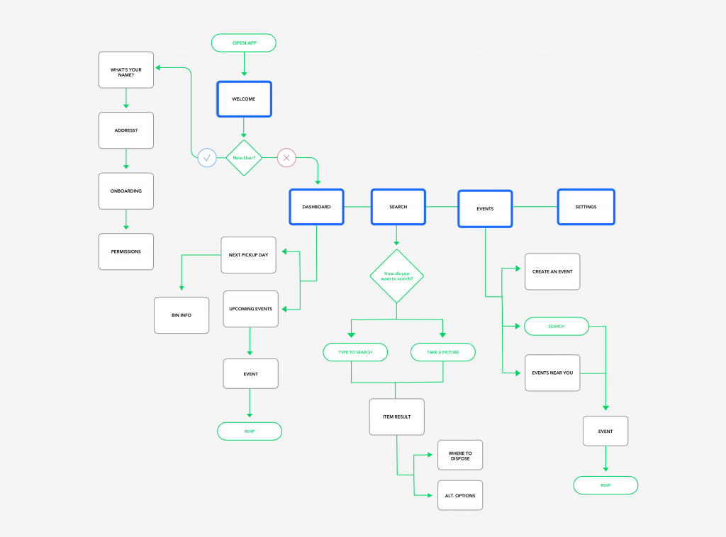
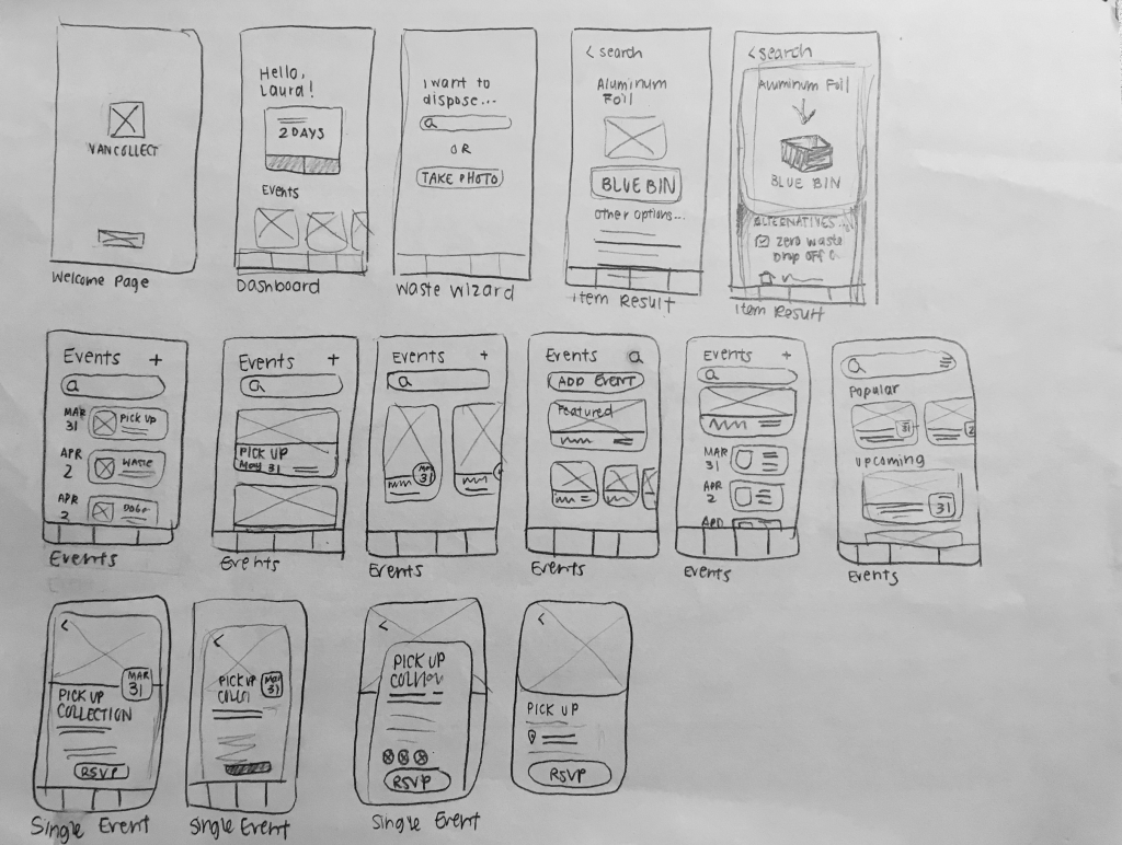
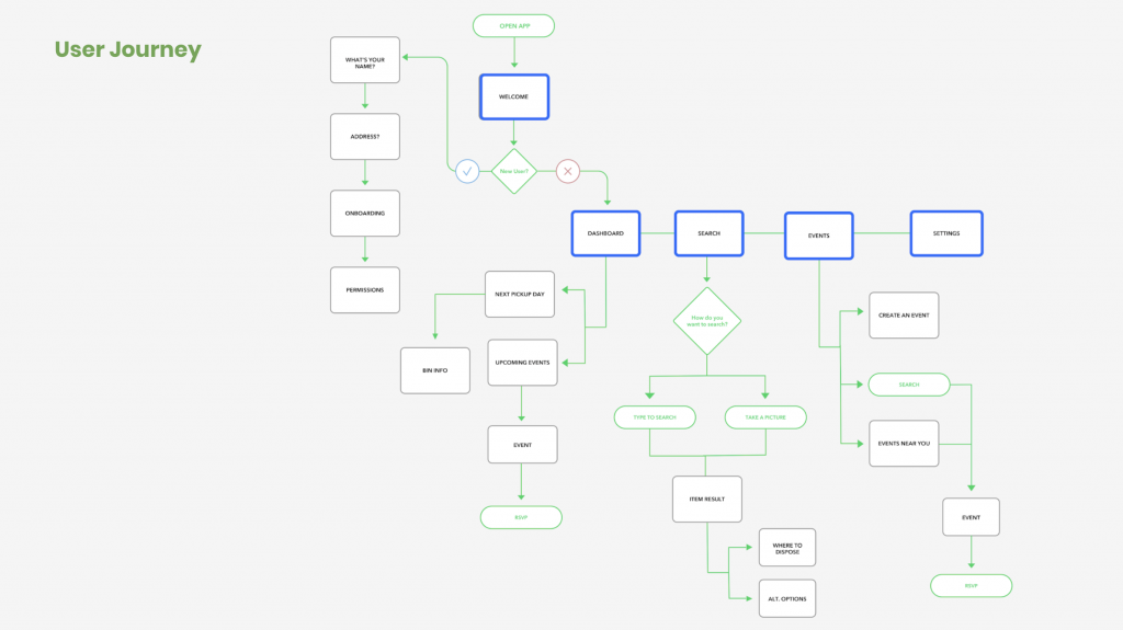
After landing on this, I quickly began to create a site map and started sketching my wireframes. Creating these helps me easily map out what the major pages I need to make, and quickly put down interface ideas. Here they are:

I would give myself 9/10 for this phase because I worked extremely hard to deliver as much as possible and keep on schedule. I learned a lot about ideating with my mentor and being able to create problem-solving questions to surround my design around.

IDES 320: Mentorship – Phase 1

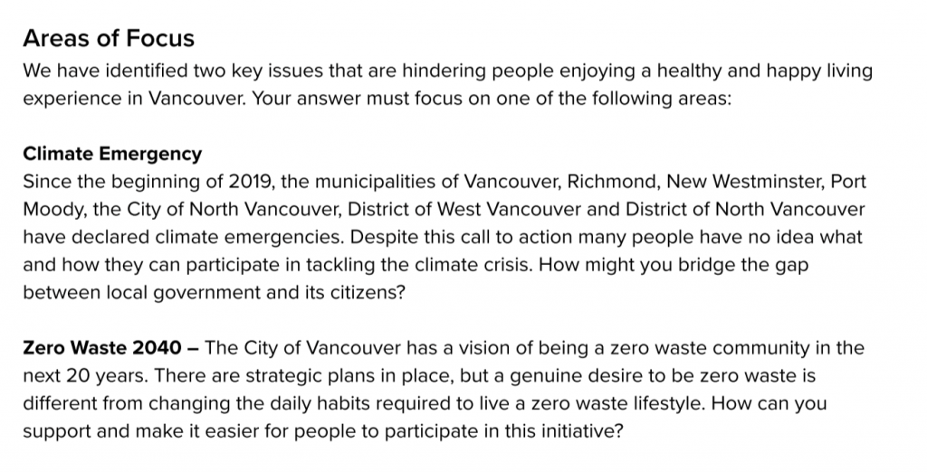
This year, I have the fortunate opportunity of doing a mentorship at Engine Digital, a digital design studio that focuses on UX/UI! I chose Engine Digital because I have been unsure whether I would like to focus on Branding or UX/UI as I move further into the program, and I thought this would be a great opportunity to see explore the world of Interactive. I am being mentored by Matthew Johnson and Gracelle Mesina – two super nice and chill people who are mega talented! My mentorship with Engine Digital is slightly different than my classmates because Engine creates a brief for me! For this project, the theme is “Better Living Through Digital”. I had the option of choosing between two different areas of focus:

I decided to choose Zero Waste 2040 because it felt like an issue more closer to home. Don’t get me wrong – I know “Climate Emergency” is a global crisis but I felt like it was a huge problem with countless ways to tackle it from. In our first meeting, Grace gave me a tour of the space. It was a 3-level office located near the Olympic Village area. Everyone worked on the second floor (and I saw Courtney from 4th year there!), while the top floor was for lounging and eating, and the first floor was the lobby with a couple offices and meeting spaces. There were two dogs there. One of them was a Nova Scotia Duck Tolling Retriever (one of my favourite dogs!!) and it came into our meeting room and got all the belly rubs on the sofa I sat on. Matthew, Grace, and I spent the first meeting getting to know each other and I gave them a small presentation of my portfolio. They were happy with my portfolio and gave a ton of great feedback on things I could work on! We quickly briefed on the project itself, before parting ways as two hours had already past.

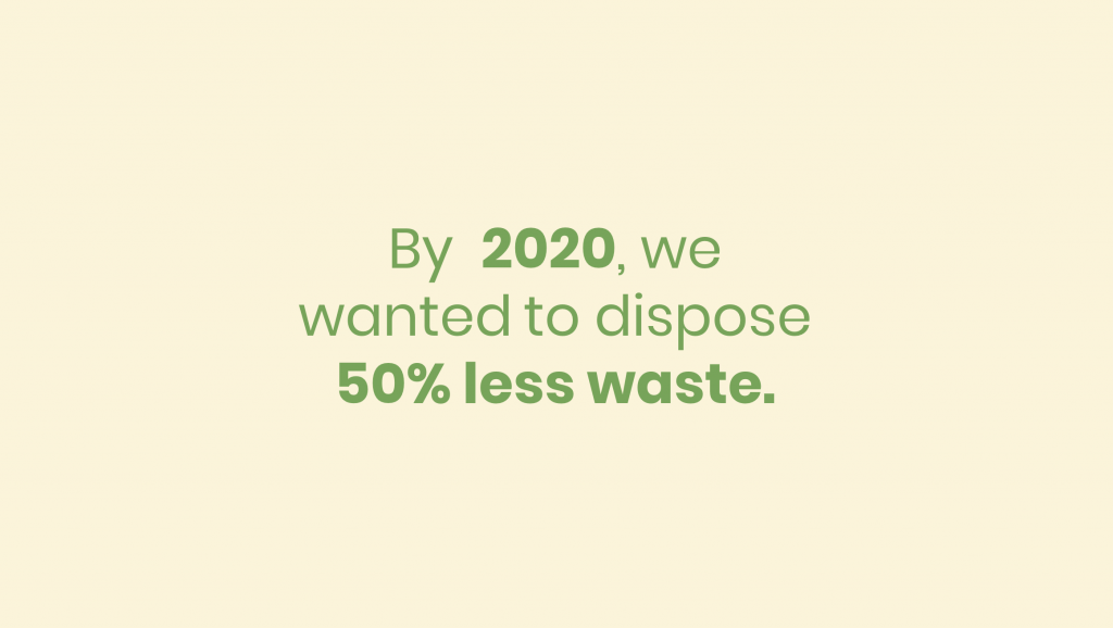
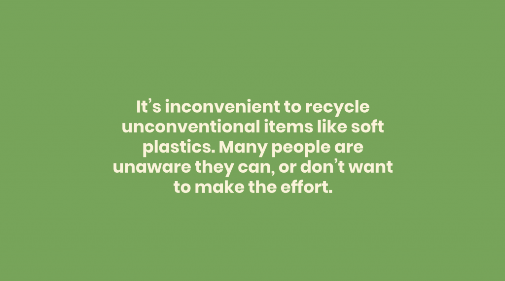
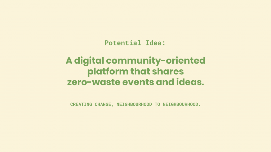
The next week, I came back with more research done and gave a presentation (that was given a max of 5 minutes in length) on the research I had done, problems I found, and potential solutions to these issues. There was about 30 slides in my presentation, but here are a few of them:

After giving my presentation, they gave me more feedback on some of my ideas. To expand on my current ideas, they encouraged that I focus on larger themes (potential “blockers”) and create many questions surrounding those themes, rather than think of potential solutions. We sat there and discussed a lot because I was feeling slightly confused. In IDEA, we hadn’t explored this way of ideating – I was used to always finding a problem and thinking of several solutions in a span of 2 weeks or less, and then spending the 1-2 additional weeks creating the product. This new way of thinking really opened up my mind and it is currently the stage I am at right now. In the past few days, the effects of COVID-19 have really start to hit Vancouver (and the rest of Canada). All my classes are now online and my mentorship meeting this week will be online as well. By this week, I am expected to have a final idea and solution figured out. I am not quite there yet but have emailed Grace to further discuss my ideas. Hopefully I’ll be able to think of something in the next few days! I’d give myself 9/10 so far during this phase because I am really trying my best to create high-quality presentations for my mentors. This has felt pretty challenging already, especially with the new “UX”(?) way of ideating/thinking and I’ve been feeling a bit lost. I am glad though, because I think I’m going to learn a lot (and I already have!) through this mentorship.

IDES 320: Personal Branding – 3 Concepts

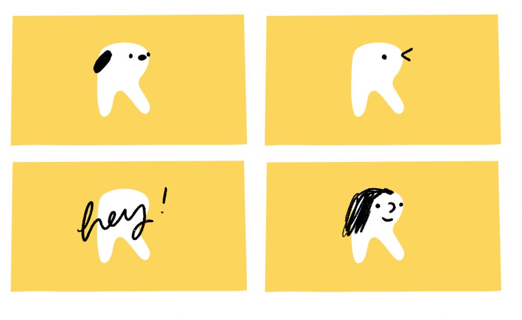
Initially, I felt worried about having to choose 3 final concepts because I didn’t feel extremely passionate about any particular logos (except for the lemon… more later). After having an in-class peer review though, I felt a lot more confident because I was able to get feedback and new perspectives. Rendering my 3 concepts more tightly was very fun and gave me joy because I was working in my own style. In the end, I like my “lemon” and “DIY R” concepts the most as I feel like they are the most fun and unique. I’m really excited to see what other people say about these logos once I present. We are almost at the finish line!! I’d give myself a 9/10 for this portion because I feel like I was able to render the final three concepts quite well and they are good contenders.

IDES 320: Personal Branding – Sketches

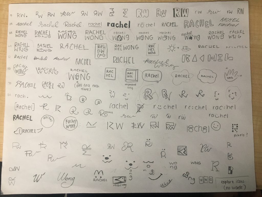
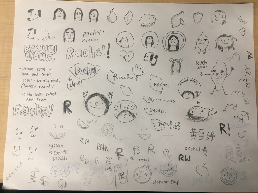
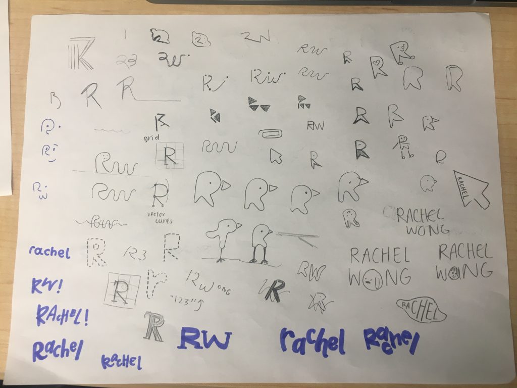
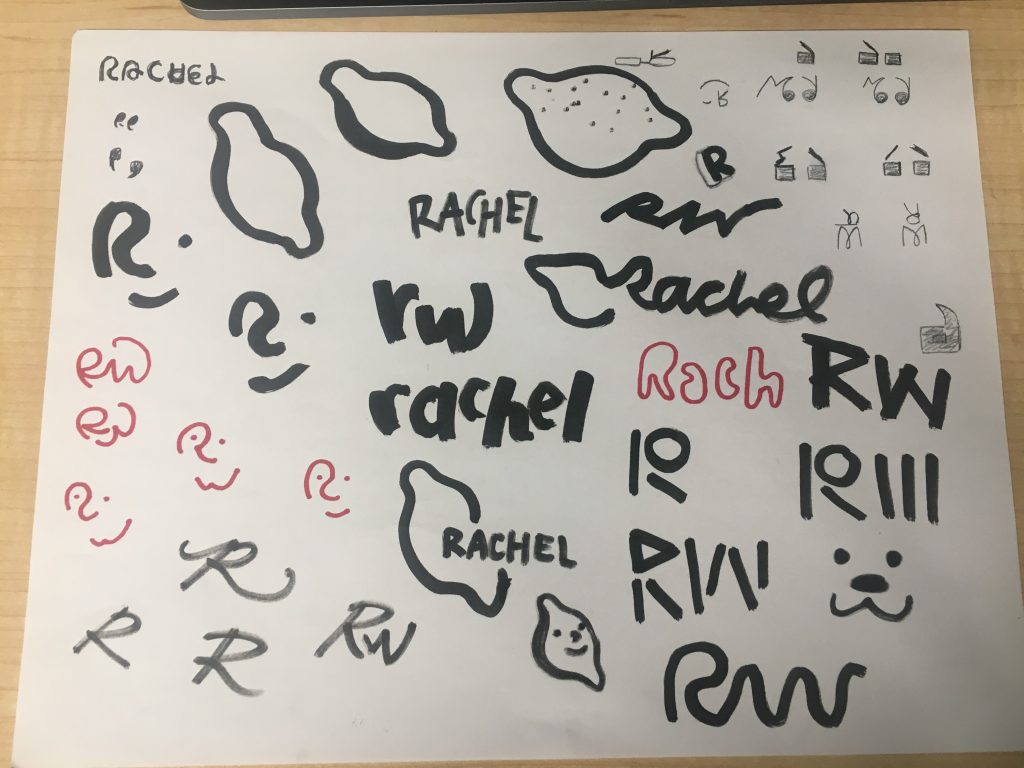
Sketching logos for my personal branding has been one of the most challenging tasks! As designers, we are often quite picky when it comes to design choices. In this project, that pickiness is intensified because I am my own client. It has been very difficult creating logos that I love and also identify with because I almost feel like I don’t know myself entirely too well – even with my moodboards made. I don’t know what “icon” I identify with, and my personal style may not align with my personality. When I started creating icons as opposed to typography based logos, I started sketching lemons because when I was younger, I’d always use “rachelemons” as a username for all the accounts I made. I also love lemons (and all fruits for that matter) and love the colour yellow as it is a sunny, bright, happy colour. I actually had a lot of fun with the lemons and would love to make business cards that look like lemons! In the end, I decided to use a thicker marker and try out some logos for a new perspective! I’d give myself a 9/10 for this portion of the process. I ideated a lot and explored many different options, but I do feel like I hit a bit of a wall and could have potentially went more out of the box with my thinking.

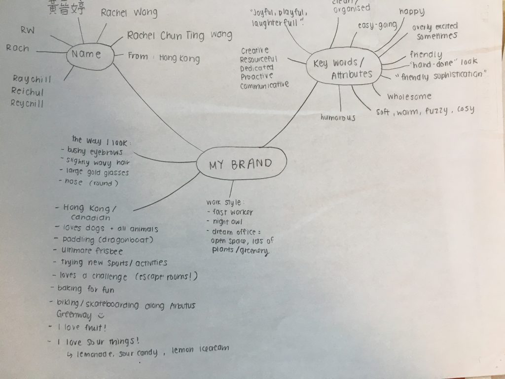
I started with a mind map with just words and phrases that I could later ideate from visually.

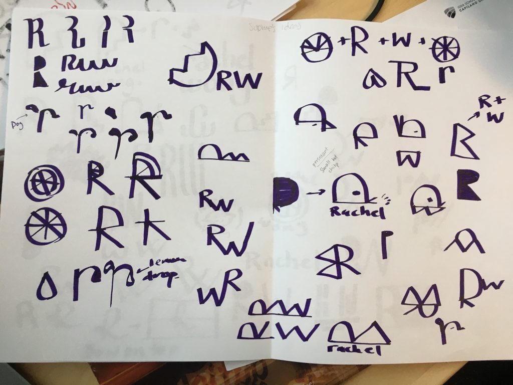
I swapped sketchbooks with Sophie and we began sketching out ideas for each other. Here are Sophie’s ideas for me!

IDES 320: Personal Brand – Moodboards

For project 2, I was tasked with creating a creative brief and a series of mood boards for my personal brand identity. The brief was relatively easy for me to create, but I struggled when creating mood boards. I created 11 mood boards in total:  Typography, Design, Illustration, Branding I Admire, Places to Work, Places to Play, and separate boards each for Sounds, Textures, Tastes, Smells, and Sights. I enjoyed creating the senses boards because it was fun finding images of things I liked. When I got to “Tastes”, I started to get so hungry!  With design and typography, I found it difficult to differentiate for myself what I loved aesthetically and what spoke to me personally. For example, I highly admire the branding work of Glasford and Walker, but it does not necessarily represent my personality. After completing my mood boards, I felt a sense of comfort knowing that I was able to layout who I really was into several boards. Especially because all of my school projects were for fictional clients and not myself, I never really had the time to sit down and think about what my style actually looks like and how I could translate this into a brand. I think I am still slightly unsure as to what I want my entire aesthetic to look like but these mood boards are a great stepping stone to a final product.

Examples of some of my mood boards.

Screen Shot 2020-01-23 at 12.25.17 AM.png
I can truly smell every image in this board. There’s nothing like the smell of freshly baked banana bread right out of the oven!
Screen Shot 2020-01-23 at 12.26.42 AM.png
I love touching soft items. When I’m at home, I wear a fleece bathrobe all around the house. I have about 6 fleece blankets placed throughout the house because I’m always cold and love to feel cozy!