Design Principles

Too Strong for Blasters by Jeremy Saliba features a scene from Star Wars: The Empire Strikes Back when Luke faces down an AT-AT on the planet Hoth. The most predominant element in this piece is contrast in both scale and colour. By using the complementary colours orange and blue, the viewers’ eyes are automatically drawn to Luke as his orange suit stands out from the cold blue of his environment. Additionally, Luke is scaled-down, which helps magnify the massive size and grandeur of the AT-AT in front of him.
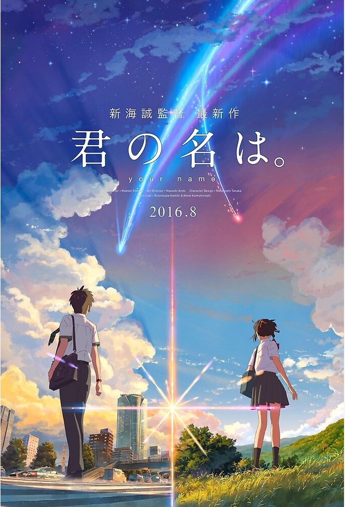
Although this poster for the movie Your Name is not exactly symmetrical, visual weight is distributed evenly enough for the whole composition to give a sense of balance. Cut in half by the flared light of the sun, the poster depicts two figures mirroring each other. One is shown in the city while the other is in a rural town but despite the difference in environmental settings, the even placement of each creates a stable and orderly look.
Gestalt Principles
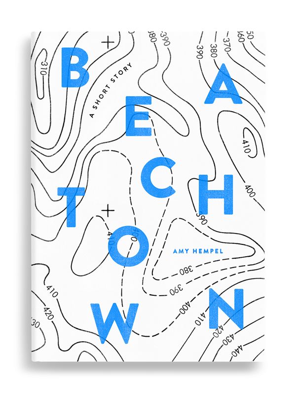
In this book cover for Beach Town by Amy Hempel, words are scattered across the surface. Even though the same blue colour is used, the similarity of the font size helps differentiate between the title and the name of the author, allowing the viewer to make two groups of text.
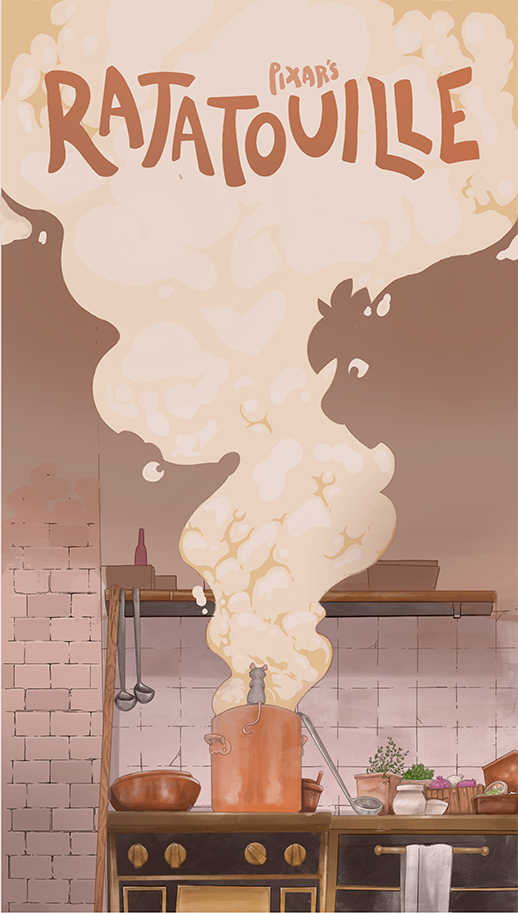
In this alternative poster for the film, Ratatouille, Adam Fisher plays with figure/ground to add an interesting twist to the center of his illustration. On one hand, you get the image of steam rising from a pot. If you shift your focus to the kitchen wall, you’d be able to make out the silhouette of a rat (Remy) and a man (Linguini).