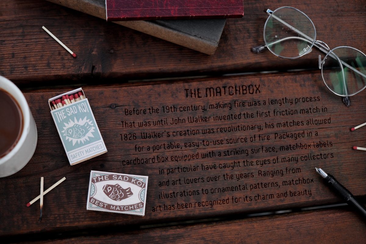
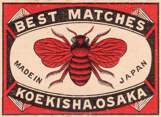
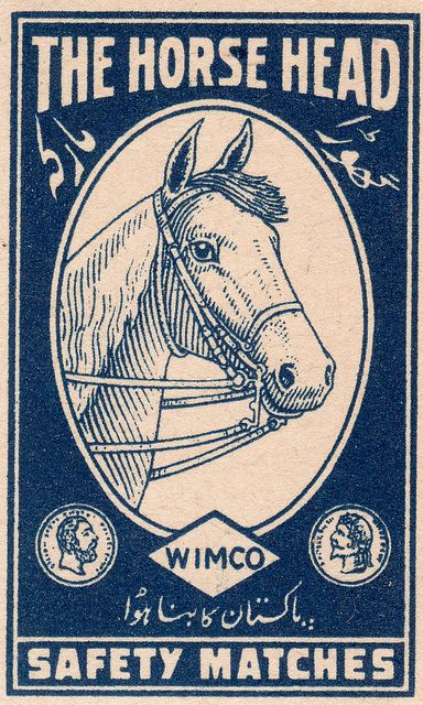
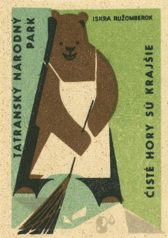
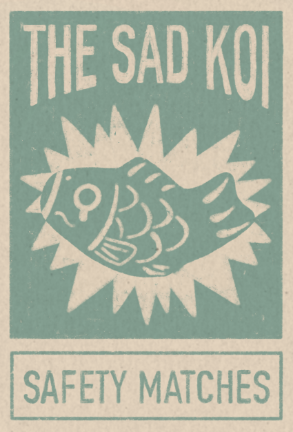
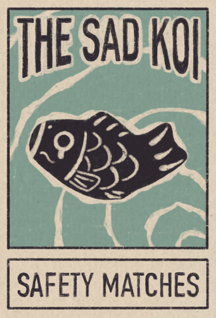
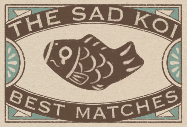
For my historical artifact, I explored the origins of matchboxes and designed one myself. It’s interesting how much variety there is in matchbox label designs and how unique and detailed each one of them is. There’s a huge range of illustrations and typography that decorate matchboxes and I enjoyed studying the different styles. Back in the 19th and 20th centuries, matchbox labels were often printed with things that were popular and “cool” at the time, rather than a manufacturer’s name. Therefore, matchboxes from this era provide an intriguing glimpse into what people perceived to be trendy or exciting.
After I finished my research, I created a dieline and sketched out a bunch of potential matchbox covers. Settling on making a koi fish as the main subject for my label, I played with typography and borders until I was satisfied with a couple of designs. Using cardstock, I experimented with a few mediums like markers, pens, gouache and pencil crayons to make the label and then folded it into a sliding box.
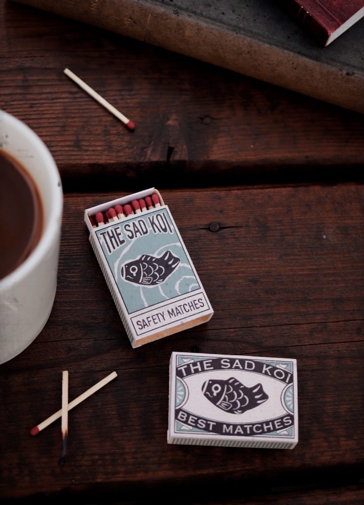
For my composition, I wanted to create a vintage cafe scene. I would believe that a lot of people who carried matchboxes in their pockets in the 1800s and 1900s often sat down in places like cafes to have a smoke. Unfortunately, I didn’t have any dark wood tables in my house so I had to set up my display outside on my balcony. As a result, it was difficult to find a time to photograph my artifact because of how gloomy the weather has been. On the odd day it wasn’t raining too much, I pulled out some props and got to work shooting my artifact. Regarding my museum label, I decided to add it in post and use a font that made the text look like it was wood burned onto the table. I thought this would be fitting considering how closely related wood burning is to matches.
In the end, I spent around 10 hours on this project and I would give myself an 8.5/10. I liked how my composition was laid out but because I didn’t have that many vintage props on hand, the photo didn’t look as authentic as I hoped it would be. The outcome of the matchbox labels I designed turned out better than I thought so I’m pretty happy with that. There was a lot of trial and error with folding the box and deciding which mediums to use to execute the design. If I were to change anything, I would probably make my museum label look like pages of newspapers instead of wood burned text.
Sources:
Research
https://medium.com/study-of-history/a-short-history-c52a80c69d5e
https://www.thoughtco.com/history-of-chemical-matches-606805
https://www.protimient.com/MatchBoxLabels.pdf
Images
https://www.flickr.com/photos/maraid/2321972602/in/set-72157594234429063/
https://www.flickr.com/photos/maraid/2966913705/in/set-72157604922299315/
https://www.flickr.com/photos/taffeta/3905539196/in/set-72157621919837283
https://www.flickr.com/photos/taffeta/10411533796/in/set-72157636832428413
