Categories
141

Survey 4

Behind the Wave That Became an Overseas Sensation.

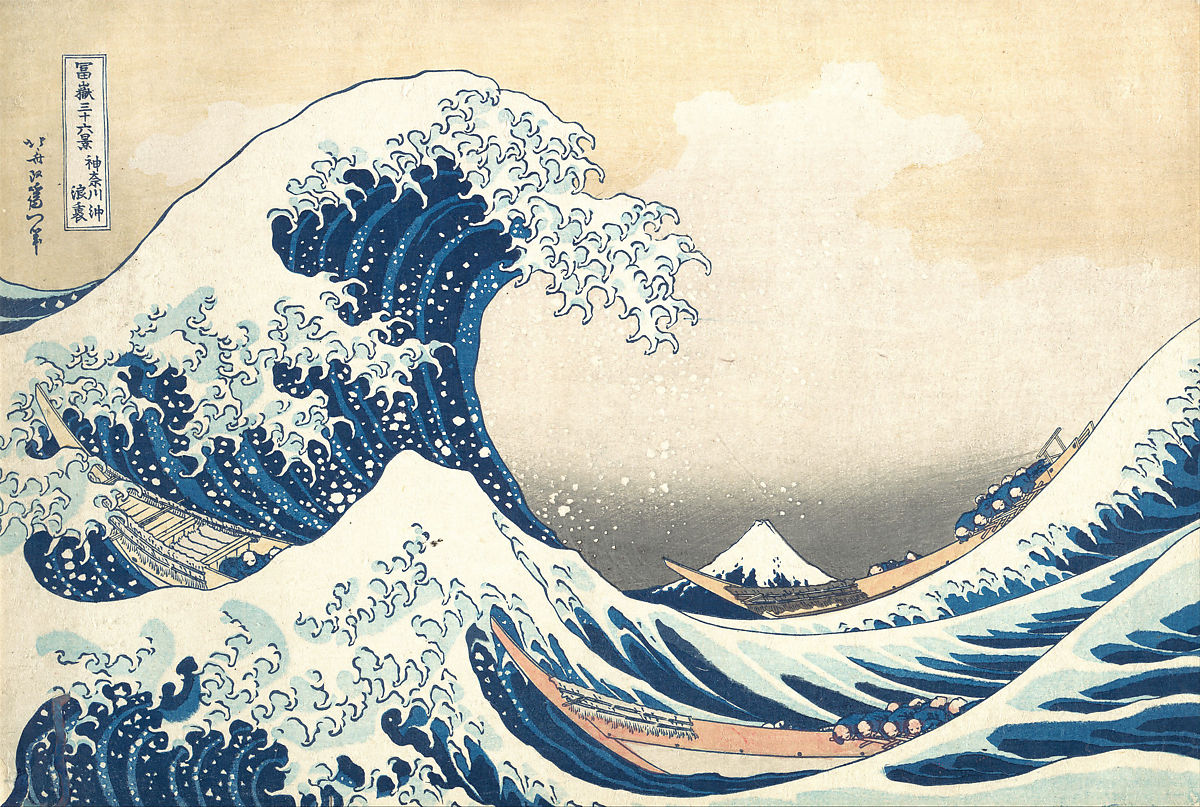
Even though you might not have heard the name Katsushika Hokusai, it’s almost guaranteed that you’ve seen his most famous work Under the Wave off Kanagawa, better known as The Great Wave. This renowned woodblock print is a part of a series of prints titled Thirty-six views of Mount Fuji, which was made between 1830-1833. Fuji appears in all of the images in the series, sometimes as the focal point and other times as background detail. One of the most striking aspects of The Great Wave is the use of Persian Blue, a recently invented pigment at the time that was imported to Japan. Visual play is also apparent in the piece as the mountain, reduced in size by perspective, looks to be moments away from being engulfed by a gigantic wave.
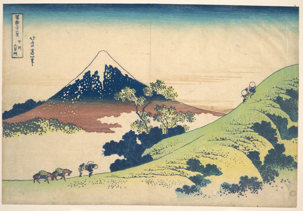
The Inume Pass in Kai Province (甲州犬目峠), from the series Thirty-six Views of Mount Fuji.

Born in 1760 in Edo (now Tokyo), Japan, Katsushika Hokusai’s name had become synonymous with ukiyo-e art. Most of the ukiyo-e prints back then depicted images of courtesans and actors but Hokusai decided to move away from the tradition to focus on landscapes and the everyday routines of Japanese individuals from various economic classes. This change of subject eventually led to the creation of Thity-Six Views of Mount Fuji, which marked the summit in the history of Japanese landscape print. The series, particularly The Great Wave and Fuji in Clear Weather, cemented Hokusai’s reputation both in Japan and overseas.
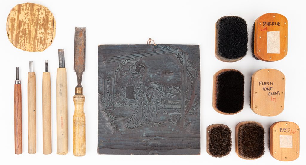
Woodblocking tools for the ukiyo-e printing process.

During the Edo period, ukiyo-e prints were inexpensive and thousand of copies of a print were produced until the carvings on the woodblocks became worn out. Initially, prints were monochromatic but new technology in 1765 enabled a wide spectrum of colours to be added. A separate block was used for each colour and the paper had to be sturdy enough to resist multiple rubbings on the various woodblocks.

Gustave de Jonghe’s composition The Japanese Fan depicts a young woman walking in front of a Japanese screen, surrounded by other Japanese objects.

Regardless of the fact that The Great Wave was created at a time when Japanese trade was heavily restricted, Hokusai’s print left a lasting impact on the art world and the formation of the West’s perception of Japanese art. From the 1870s onwards, Japonisme became a prominent trend and had a strong influence on artists such as Edgar Degas, Henri de Toulouse-Lautrec, Claude Monet, and Vincent van Gogh.


Sources

Research

https://www.metmuseum.org/toah/hd/ukiy/hd_ukiy.htm

https://www.britannica.com/biography/Hokusai

https://www.khanacademy.org/humanities/ap-art-history/south-east-se-asia/japan-art/a/hokusai-under-the-wave-off-kanagawa-the-great-wave

https://www.bbc.com/culture/article/20150409-the-wave-that-swept-the-world

Images

https://www.metmuseum.org/art/collection/search/45030

https://japanesegallery.com/references-ukiyo-e

https://en.wikipedia.org/wiki/Gustave_L%C3%A9onard_de_Jonghe
Categories
141

Typography Zine

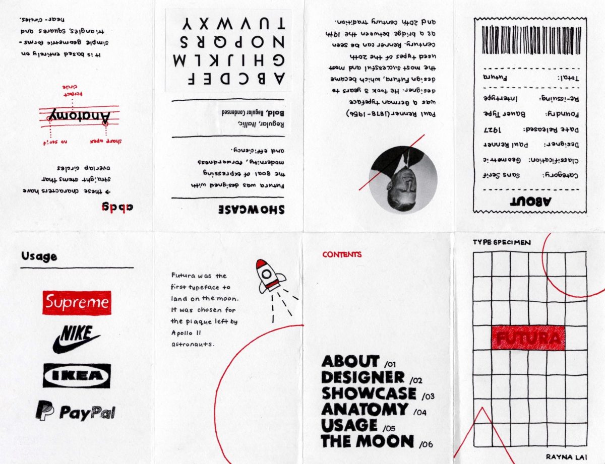
Zines were something I’ve been wanting to make for some time so I was pleasantly surprised when this project got assigned. For my design, I decided to go with a more modern and minimalistic approach because I thought that represented the typeface the best. With the use of whitespace, I brainstormed a lot about what I could do to present my content in interesting ways while getting critical information across.

Front page: Since Futura is a geometric-based typeface, I included a lot of those shapes and forms on the cover. To offset how geometric most of the design is throughout the rest of the zine, I decided to draw most of the elements and purposefully didn’t use a ruler to give it a more handmade feel.
About page: Although Futura is most often used as a display font, it’s one of the most versatile typefaces around. The stroke weight is almost even throughout and remains legible even when the font is resized. For that reason, I presented a rundown of the key facts about Futura on a receipt to indicate that it can also work well in fine print. 
Usage page: Popular in advertisements and logos, I showed off a collection of brands that use Futura or a customized version of it.
The Moon page: During my early stages of research, what stood out to me the most about Futura was the fact that it was the first typeface to land on the moon. I chose to dedicate a page in the last spread for this fact so I could make my zine more personal to what I found interesting.

Like always, I spent too much time in the planning process that I didn’t leave much time to make the actual product. As a result, I made my zine in a rush and made some dumb mistakes along the way. I couldn’t make my handwriting as neat as I wanted to and one of my biggest regrets was that I accidentally coloured in the letters in my title. Initially, I had planned on making the letters white and the background red to reflect Supreme’s logo. Moreover, I misunderstood the requirements for the last page. The brief said that the back cover should include a brief bullet summary so I thought a table of contents would suffice. If I could go back, I would make sure I cleared up any confusion with the brief before I created my zine. Nevertheless, I would give myself a 8/10. I’m satisfied with the outcome of my design and did my best to showcase Futura in a way that’s engaging and easy to follow.

https://www.slideshare.net/RaynaL3/futura-type-specimen-zine
Categories
131

Rococo

François Boucher 1703-1770

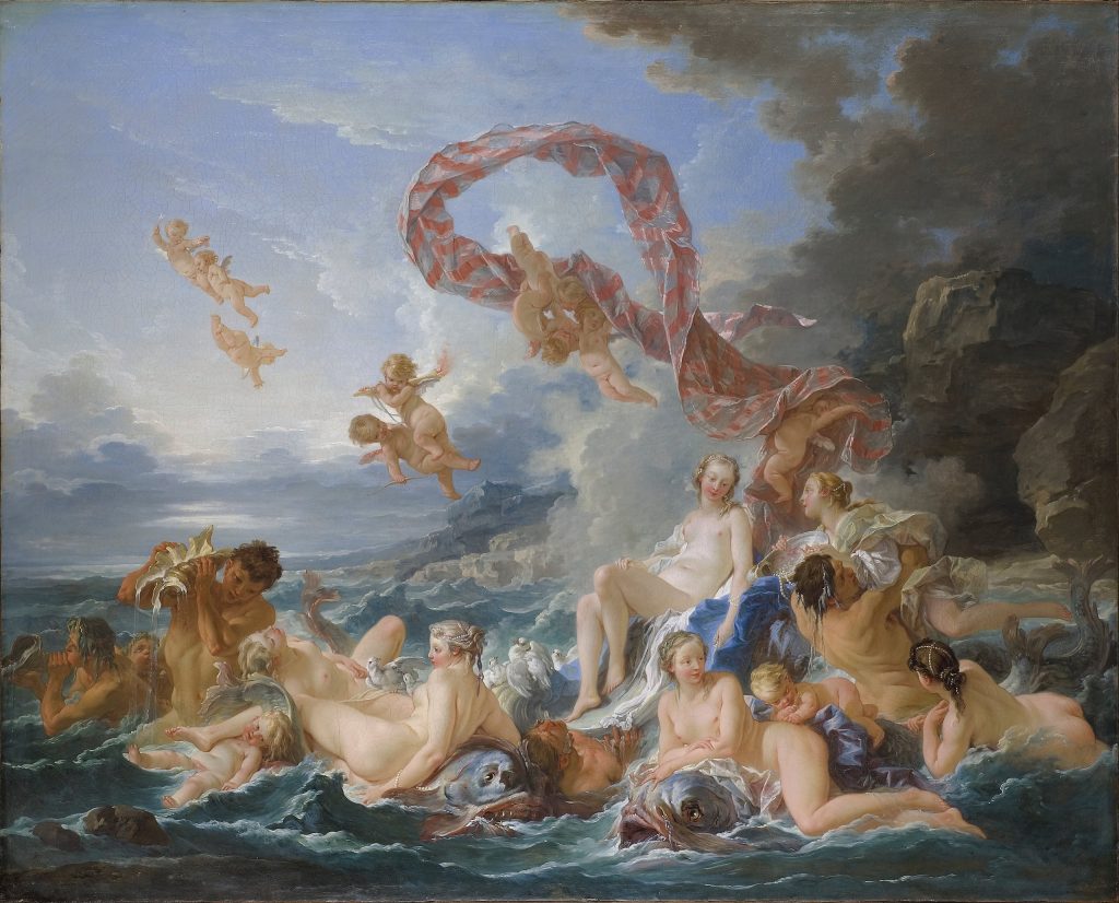
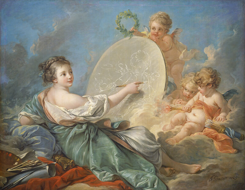
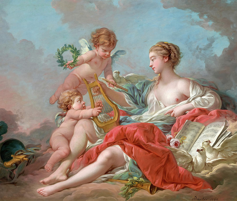
Born in Paris, François Boucher is one of the most celebrated artists of the 18th century and is credited with the development of the Rococo style and its spread across Europe. He worked in a wide variety of mediums like porcelain, tapestry and print and was a talented painter, draughtsman, etcher and stage designer. From royals to bourgeois collectors, Boucher had a diverse range of patrons, one of which was Madame de Pompadour. The mistress of King Louis XV was known as being the “godmother of Rococo” and Boucher’s portraits played an important role in her self-presentation and image development.

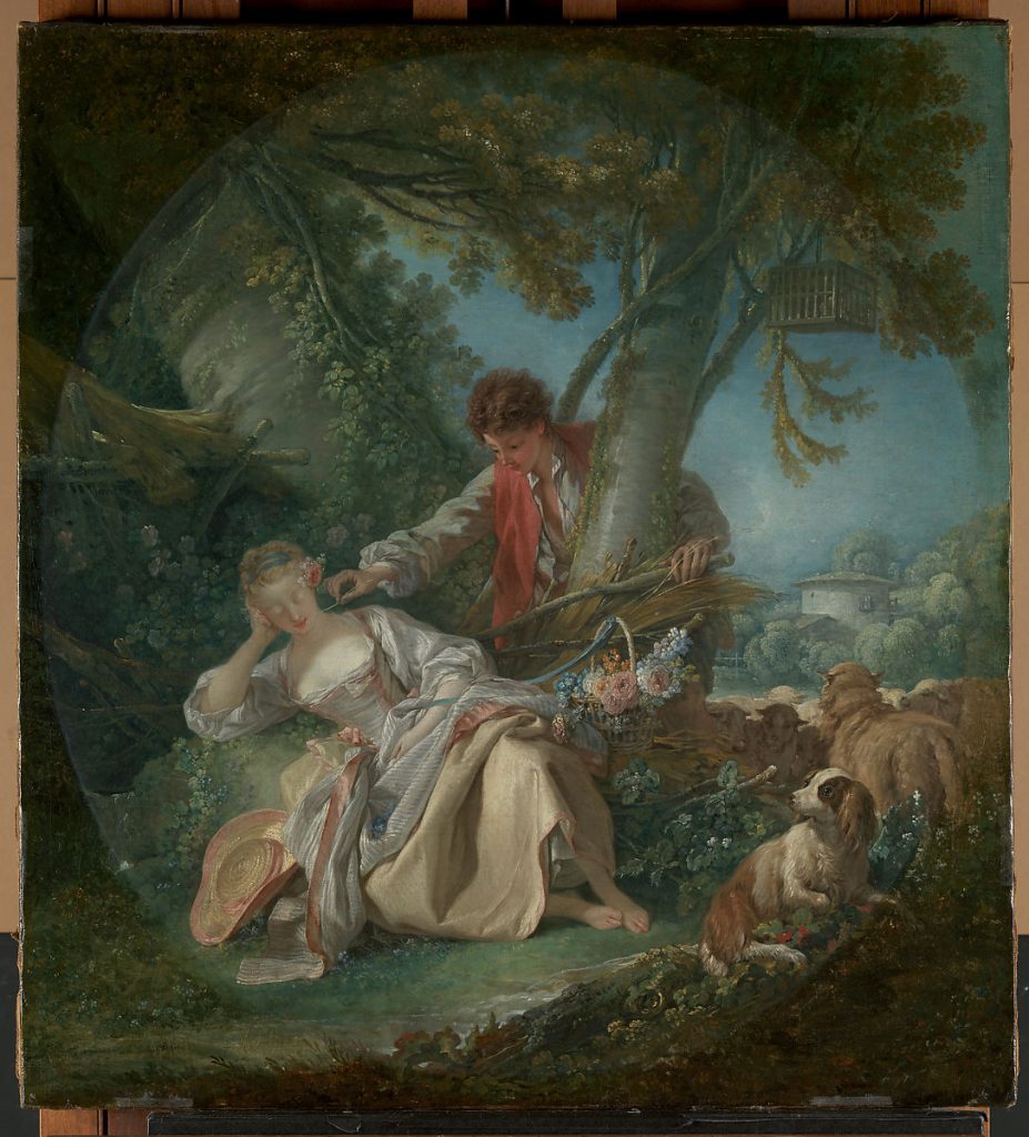
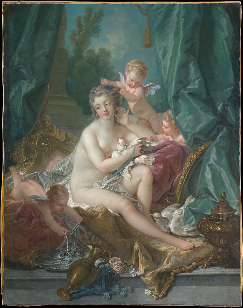
Although Boucher’s paintings encompassed a great number of themes, his most original contribution to the aesthetic of Rococo was his reimagining of idealized landscapes. Shepherds and shepherdesses in silk dresses often populated pastoral scenes in a high-toned palette favouring blues and pinks. The Interrupted Sleep and The Toilette of Venus are fine examples of this type of subject matter. What became the hallmark of Boucher’s work and what stood out to me the most was his refined but whimsical style, gently modelled forms and delicate use of colours.


References:

https://en.wikipedia.org/wiki/Fran%C3%A7ois_Boucher

https://www.metmuseum.org/toah/hd/bouc/hd_bouc.htm

https://www.metmuseum.org/art/metpublications/Francois_Boucher_1703_1770

https://www.britannica.com/biography/Francois-Boucher

https://www.francoisboucher.org/

https://www.gallery.ca/collection/artist/francois-boucher

Categories
141

Survey 2

The Birth of the World’s Easiest Writing System.

Hangul (한글), the Korean writing system, is an alphabet of 24 letters made up of 10 consonants and 14 vowels. Unlike most other written languages, Hangul is unique in the way it was created deliberately rather than having evolved over time.

Before the 15th century, Chinese was used as the normal medium of written communication. This system was known in Korea as Hanja (한자, 漢字) but the transferring of Chinese script to the Korean language caused issues. The two languages were fundamentally different in structure and didn’t represent the sounds of spoken Korean at all. This made it extremely difficult to learn and as a result, Hanja was out of reach for the lower classes.

Seeing the divide between the elites and lower classes, King Sejong of the Choson dynasty wanted to unite the people of Korea by inventing an alphabet for the language. By 1446, Hangul was unveiled and was made the official writing system.

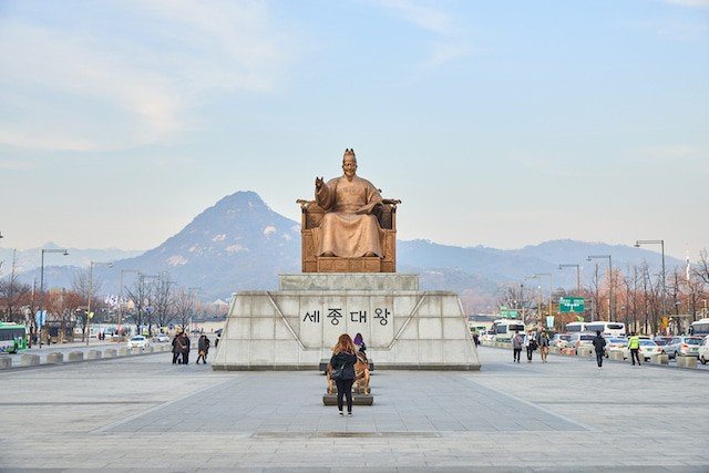
This statue of King Sejong is located in the heart of Seoul and is considered one of Seoul’s major landmarks. King Sejong is also featured on the ten thousand won bill.

Despite how much it improved literacy, Hangul nearly died out due to the elite wanting to preserve their status. For them, Hanja was the only true way to write Korean and Hangul was eventually banned by King Yeonsnagum in the 16th century. Fast forward 500 years, Hangul saw a resurgence during the Japanese occupation and the use of Hanja started to decline in the 1970s. These days, almost all Korean is written in Hangul and Korea boasts near 100% literacy nationwide!

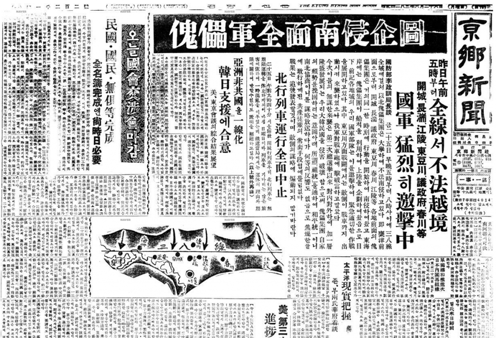
This is a Korean newspaper printed in the 1950s. As you can see, there is a mixture of Hanja and Hangul being used.

Fun fact! There is even a national holiday set aside in honour of the invention of Hangul. Hangul Day (한글날) is celebrated on October 9 and is the world’s only official holiday dedicated to a writing system.

The Mechanics of Hangul

Just like how English assigns a sound to each letter, Hangul is also phonetic. However, it includes a number of changes that make it particularly well adapted to Korean. Instead of each letter being written in a straight line, each syllable is formed in a block-like shape that matches the Chinese characters they replaced. This simplifies the process of determining the definition of any Chinese-based words. With each block containing at least one consonant and one vowel, consonants are designed to look like the speaker’s mouth shape when pronouncing the corresponding sounds, whereas vowels include elements meaning ‘sky( · )’, ‘land(ㅡ)’, and ‘human(ㅣ)’. As the spoken words mostly sound exactly as they are written, Hangul is recognized to be one of the world’s easiest writing systems to learn.

This periodic table outlines the basics of Hangul. You can learn the entire alphabet in a single afternoon!

Sources:

Research

https://www.90daykorean.com/hangul-day/

https://whattodoinkorea.com/a-brief-history-of-hangeul/

https://www.britannica.com/topic/Hangul-Korean-alphabet

https://www.britannica.com/topic/writing/Chinese-writing-and-its-derivatives

Images

https://www.90daykorean.com/hangul-day/

https://ellun.tistory.com/m/277

https://m.blog.naver.com/PostView.naver?isHttpsRedirect=true&blogId=hanuinuri&logNo=60123307274

Categories
100

“The Importance of Urban Forests” Summary

The following is a written assignment for my English 100 class on Amy Fleming’s article, “The Importance of Urban Forests: Why Money really does Grow on Trees” (2016).

In “The Importance of Urban Forests: Why Money Really Does Grow on Trees,” journalist Amy Fleming addresses the environmental, economic and health benefits of trees in urban settings. For years, city officials have balked at the price of planting and maintaining trees. However, the profitable services that trees provide outweigh any of the costs leaders may be reluctant to invest. To put a dollar amount on the economic impact trees have, Fleming reports that benefits such as energy savings, air quality improvements and costs avoided in flooding “added up to $120m a year” in contrast to the “$22m annual parks department expenditure” (3). Not only do urban forests have substantial monetary value and allow for financial gain, but they also improve psychological well-being. In neighbourhoods with more trees, research suggests that stress, anxiety and mental fatigue levels aren’t as high and that violent tendencies are reduced (qtd. in Fleming 4). These points drive home the fact that health and nature go hand in hand and that trees can improve the overall quality of life. As more and more green spaces are being wiped out in cities, Fleming calls attention to the launching of the New Urban Agenda – a roadmap for sustainable urban development. This UN-adopted document aims to protect the environment and represents a vision for a greener future.