Categories
141

Historical Type Identification Poster

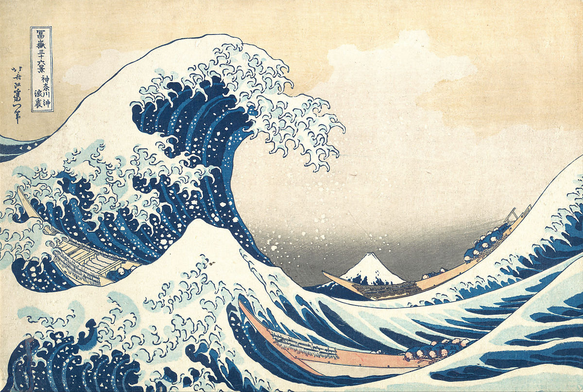
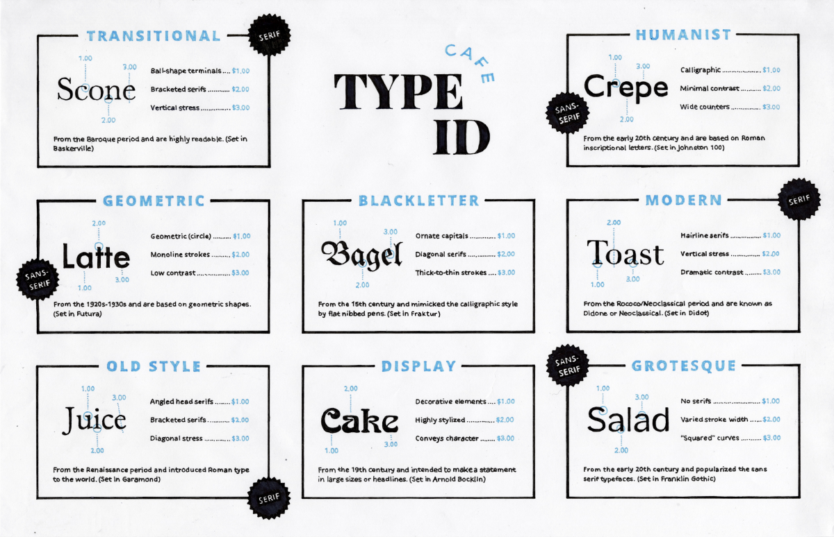
For our final project, we were tasked to create a handmade identification poster that shares the history of type. My main two ideas for the poster was to either make it look like a newspaper or a restaurant menu. After experimenting with different layouts in my sketchbook, I eventually settled on the menu idea. 

Firstly, I used the name of the restaurant as the title of the poster – Cafe Type ID (ID meaning identification). Rolling with the menu concept, I decided to include words of various cafe food items and set them in the typefaces I wanted to showcase. By breaking down each typeface’s anatomy, I pointed out their different characteristics and labelled them with numbers. To make the poster look more like a menu, I referred to each number by writing them on the side like they were the prices of items. Underneath each type category, I wrote out a very brief description of the typeface using my research. Drawing inspiration from the “badge” you sometimes see on menus that indicates whether an item is new or recommended, I labelled each typeface category with “serif” or “sans-serif”. The layout was finalized using the computer and then with a ruler, I grided up my 11″ x 17″ paper so that all the written information and boxes were straight and aligned. If you thought it was odd that all the food items were written so neatly, it was because I printed out all the words and traced them. 

If I were to give myself a mark out of 10, I would give myself a 9. With the amount of information we were supposed to put on the poster, it was challenging to figure out a way to organize everything without making it look cluttered. However, I think I did a good job with the clean layout. A downside to the cleanliness though, was it made the poster lack a bit of character and not as interesting to look at in my opinion. If I were to go back and spend more time in the planning process, I would’ve maybe added a few illustrations of the food items to make it more visually appealing and engaging. Also, with the amount of tracing and small text I was writing, my hand cramped a lot so I had to take frequent breaks which extended the amount of time I spent making this poster. From research to final execution, I spent roughly 10 hours on this project. Overall, I’m satisfied with the outcome of my menu design and I found that it was a good way to review the things we learned in class.

Categories
141

Historial Artifact

For my historical artifact, I explored the origins of matchboxes and designed one myself. It’s interesting how much variety there is in matchbox label designs and how unique and detailed each one of them is. There’s a huge range of illustrations and typography that decorate matchboxes and I enjoyed studying the different styles. Back in the 19th and 20th centuries, matchbox labels were often printed with things that were popular and “cool” at the time, rather than a manufacturer’s name. Therefore, matchboxes from this era provide an intriguing glimpse into what people perceived to be trendy or exciting.

After I finished my research, I created a dieline and sketched out a bunch of potential matchbox covers. Settling on making a koi fish as the main subject for my label, I played with typography and borders until I was satisfied with a couple of designs. Using cardstock, I experimented with a few mediums like markers, pens, gouache and pencil crayons to make the label and then folded it into a sliding box.

For my composition, I wanted to create a vintage cafe scene. I would believe that a lot of people who carried matchboxes in their pockets in the 1800s and 1900s often sat down in places like cafes to have a smoke. Unfortunately, I didn’t have any dark wood tables in my house so I had to set up my display outside on my balcony. As a result, it was difficult to find a time to photograph my artifact because of how gloomy the weather has been. On the odd day it wasn’t raining too much, I pulled out some props and got to work shooting my artifact. Regarding my museum label, I decided to add it in post and use a font that made the text look like it was wood burned onto the table. I thought this would be fitting considering how closely related wood burning is to matches. 

In the end, I spent around 10 hours on this project and I would give myself an 8.5/10. I liked how my composition was laid out but because I didn’t have that many vintage props on hand, the photo didn’t look as authentic as I hoped it would be. The outcome of the matchbox labels I designed turned out better than I thought so I’m pretty happy with that. There was a lot of trial and error with folding the box and deciding which mediums to use to execute the design. If I were to change anything, I would probably make my museum label look like pages of newspapers instead of wood burned text.


Sources:

Research

https://medium.com/study-of-history/a-short-history-c52a80c69d5e

https://www.thoughtco.com/history-of-chemical-matches-606805

https://www.protimient.com/MatchBoxLabels.pdf

Images

https://www.flickr.com/photos/maraid/2321972602/in/set-72157594234429063/

https://www.flickr.com/photos/maraid/2966913705/in/set-72157604922299315/

https://www.flickr.com/photos/taffeta/3905539196/in/set-72157621919837283

https://www.flickr.com/photos/taffeta/10411533796/in/set-72157636832428413

Categories
141

Survey 4

Behind the Wave That Became an Overseas Sensation.

Even though you might not have heard the name Katsushika Hokusai, it’s almost guaranteed that you’ve seen his most famous work Under the Wave off Kanagawa, better known as The Great Wave. This renowned woodblock print is a part of a series of prints titled Thirty-six views of Mount Fuji, which was made between 1830-1833. Fuji appears in all of the images in the series, sometimes as the focal point and other times as background detail. One of the most striking aspects of The Great Wave is the use of Persian Blue, a recently invented pigment at the time that was imported to Japan. Visual play is also apparent in the piece as the mountain, reduced in size by perspective, looks to be moments away from being engulfed by a gigantic wave.

The Inume Pass in Kai Province (甲州犬目峠), from the series Thirty-six Views of Mount Fuji.

Born in 1760 in Edo (now Tokyo), Japan, Katsushika Hokusai’s name had become synonymous with ukiyo-e art. Most of the ukiyo-e prints back then depicted images of courtesans and actors but Hokusai decided to move away from the tradition to focus on landscapes and the everyday routines of Japanese individuals from various economic classes. This change of subject eventually led to the creation of Thity-Six Views of Mount Fuji, which marked the summit in the history of Japanese landscape print. The series, particularly The Great Wave and Fuji in Clear Weather, cemented Hokusai’s reputation both in Japan and overseas.

Woodblocking tools for the ukiyo-e printing process.

During the Edo period, ukiyo-e prints were inexpensive and thousand of copies of a print were produced until the carvings on the woodblocks became worn out. Initially, prints were monochromatic but new technology in 1765 enabled a wide spectrum of colours to be added. A separate block was used for each colour and the paper had to be sturdy enough to resist multiple rubbings on the various woodblocks.

Gustave de Jonghe’s composition The Japanese Fan depicts a young woman walking in front of a Japanese screen, surrounded by other Japanese objects.

Regardless of the fact that The Great Wave was created at a time when Japanese trade was heavily restricted, Hokusai’s print left a lasting impact on the art world and the formation of the West’s perception of Japanese art. From the 1870s onwards, Japonisme became a prominent trend and had a strong influence on artists such as Edgar Degas, Henri de Toulouse-Lautrec, Claude Monet, and Vincent van Gogh.


Sources

Research

https://www.metmuseum.org/toah/hd/ukiy/hd_ukiy.htm

https://www.britannica.com/biography/Hokusai

https://www.khanacademy.org/humanities/ap-art-history/south-east-se-asia/japan-art/a/hokusai-under-the-wave-off-kanagawa-the-great-wave

https://www.bbc.com/culture/article/20150409-the-wave-that-swept-the-world

Images

https://www.metmuseum.org/art/collection/search/45030

https://japanesegallery.com/references-ukiyo-e

https://en.wikipedia.org/wiki/Gustave_L%C3%A9onard_de_Jonghe

Categories
141

Typography Zine

Zines were something I’ve been wanting to make for some time so I was pleasantly surprised when this project got assigned. For my design, I decided to go with a more modern and minimalistic approach because I thought that represented the typeface the best. With the use of whitespace, I brainstormed a lot about what I could do to present my content in interesting ways while getting critical information across.

Front page: Since Futura is a geometric-based typeface, I included a lot of those shapes and forms on the cover. To offset how geometric most of the design is throughout the rest of the zine, I decided to draw most of the elements and purposefully didn’t use a ruler to give it a more handmade feel.
About page: Although Futura is most often used as a display font, it’s one of the most versatile typefaces around. The stroke weight is almost even throughout and remains legible even when the font is resized. For that reason, I presented a rundown of the key facts about Futura on a receipt to indicate that it can also work well in fine print. 
Usage page: Popular in advertisements and logos, I showed off a collection of brands that use Futura or a customized version of it.
The Moon page: During my early stages of research, what stood out to me the most about Futura was the fact that it was the first typeface to land on the moon. I chose to dedicate a page in the last spread for this fact so I could make my zine more personal to what I found interesting.

Like always, I spent too much time in the planning process that I didn’t leave much time to make the actual product. As a result, I made my zine in a rush and made some dumb mistakes along the way. I couldn’t make my handwriting as neat as I wanted to and one of my biggest regrets was that I accidentally coloured in the letters in my title. Initially, I had planned on making the letters white and the background red to reflect Supreme’s logo. Moreover, I misunderstood the requirements for the last page. The brief said that the back cover should include a brief bullet summary so I thought a table of contents would suffice. If I could go back, I would make sure I cleared up any confusion with the brief before I created my zine. Nevertheless, I would give myself a 8/10. I’m satisfied with the outcome of my design and did my best to showcase Futura in a way that’s engaging and easy to follow.

https://www.slideshare.net/RaynaL3/futura-type-specimen-zine
Categories
141

Survey 2

The Birth of the World’s Easiest Writing System.

Hangul (한글), the Korean writing system, is an alphabet of 24 letters made up of 10 consonants and 14 vowels. Unlike most other written languages, Hangul is unique in the way it was created deliberately rather than having evolved over time.

Before the 15th century, Chinese was used as the normal medium of written communication. This system was known in Korea as Hanja (한자, 漢字) but the transferring of Chinese script to the Korean language caused issues. The two languages were fundamentally different in structure and didn’t represent the sounds of spoken Korean at all. This made it extremely difficult to learn and as a result, Hanja was out of reach for the lower classes.

Seeing the divide between the elites and lower classes, King Sejong of the Choson dynasty wanted to unite the people of Korea by inventing an alphabet for the language. By 1446, Hangul was unveiled and was made the official writing system.

This statue of King Sejong is located in the heart of Seoul and is considered one of Seoul’s major landmarks. King Sejong is also featured on the ten thousand won bill.

Despite how much it improved literacy, Hangul nearly died out due to the elite wanting to preserve their status. For them, Hanja was the only true way to write Korean and Hangul was eventually banned by King Yeonsnagum in the 16th century. Fast forward 500 years, Hangul saw a resurgence during the Japanese occupation and the use of Hanja started to decline in the 1970s. These days, almost all Korean is written in Hangul and Korea boasts near 100% literacy nationwide!

This is a Korean newspaper printed in the 1950s. As you can see, there is a mixture of Hanja and Hangul being used.

Fun fact! There is even a national holiday set aside in honour of the invention of Hangul. Hangul Day (한글날) is celebrated on October 9 and is the world’s only official holiday dedicated to a writing system.

The Mechanics of Hangul

Just like how English assigns a sound to each letter, Hangul is also phonetic. However, it includes a number of changes that make it particularly well adapted to Korean. Instead of each letter being written in a straight line, each syllable is formed in a block-like shape that matches the Chinese characters they replaced. This simplifies the process of determining the definition of any Chinese-based words. With each block containing at least one consonant and one vowel, consonants are designed to look like the speaker’s mouth shape when pronouncing the corresponding sounds, whereas vowels include elements meaning ‘sky( · )’, ‘land(ㅡ)’, and ‘human(ㅣ)’. As the spoken words mostly sound exactly as they are written, Hangul is recognized to be one of the world’s easiest writing systems to learn.

This periodic table outlines the basics of Hangul. You can learn the entire alphabet in a single afternoon!

Sources:

Research

https://www.90daykorean.com/hangul-day/

https://whattodoinkorea.com/a-brief-history-of-hangeul/

https://www.britannica.com/topic/Hangul-Korean-alphabet

https://www.britannica.com/topic/writing/Chinese-writing-and-its-derivatives

Images

https://www.90daykorean.com/hangul-day/

https://ellun.tistory.com/m/277

https://m.blog.naver.com/PostView.naver?isHttpsRedirect=true&blogId=hanuinuri&logNo=60123307274