Zines were something I’ve been wanting to make for some time so I was pleasantly surprised when this project got assigned. For my design, I decided to go with a more modern and minimalistic approach because I thought that represented the typeface the best. With the use of whitespace, I brainstormed a lot about what I could do to present my content in interesting ways while getting critical information across.
Front page: Since Futura is a geometric-based typeface, I included a lot of those shapes and forms on the cover. To offset how geometric most of the design is throughout the rest of the zine, I decided to draw most of the elements and purposefully didn’t use a ruler to give it a more handmade feel.
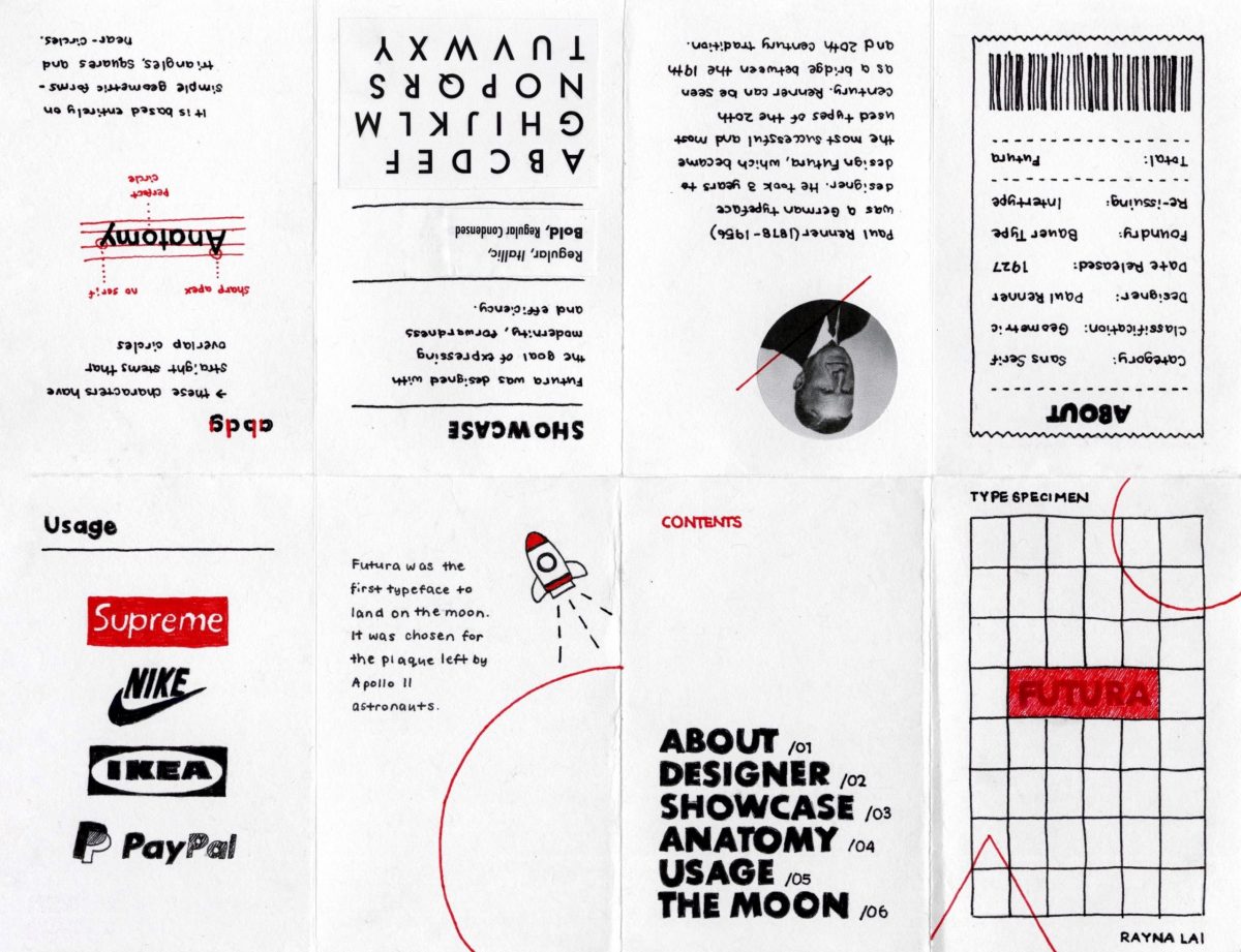
About page: Although Futura is most often used as a display font, it’s one of the most versatile typefaces around. The stroke weight is almost even throughout and remains legible even when the font is resized. For that reason, I presented a rundown of the key facts about Futura on a receipt to indicate that it can also work well in fine print.
Usage page: Popular in advertisements and logos, I showed off a collection of brands that use Futura or a customized version of it.
The Moon page: During my early stages of research, what stood out to me the most about Futura was the fact that it was the first typeface to land on the moon. I chose to dedicate a page in the last spread for this fact so I could make my zine more personal to what I found interesting.
Like always, I spent too much time in the planning process that I didn’t leave much time to make the actual product. As a result, I made my zine in a rush and made some dumb mistakes along the way. I couldn’t make my handwriting as neat as I wanted to and one of my biggest regrets was that I accidentally coloured in the letters in my title. Initially, I had planned on making the letters white and the background red to reflect Supreme’s logo. Moreover, I misunderstood the requirements for the last page. The brief said that the back cover should include a brief bullet summary so I thought a table of contents would suffice. If I could go back, I would make sure I cleared up any confusion with the brief before I created my zine. Nevertheless, I would give myself a 8/10. I’m satisfied with the outcome of my design and did my best to showcase Futura in a way that’s engaging and easy to follow.