Hello! My name is Rayna Lai and I’m a first-year student currently enrolled in the Bachelor of Design program at IDEA. Growing up, visual art has always been a creative outlet for me and a subject I had a passion for. However, I never viewed it as anything more than a hobby because it didn’t seem like the most realistic career path to follow. When I heard about IDEA, I dropped my plans of going into a science program without a second thought. With a reputation for getting students industry-prepared, IDEA stood out to me as the best post-secondary option; it was a place I could see myself grow, be challenged and doing something I loved. Although interactive design is the path I would ultimately like to pursue, I also have interests in branding, photography and graphic design. In addition, outside of school, you can usually find me hanging out with friends, playing Genshin Impact or jamming out to K-pop.
Month: October 2021
Categories
Mood Board
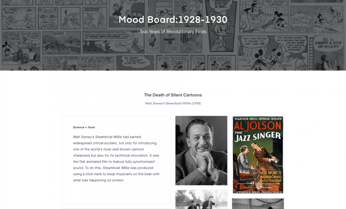
As a very indecisive person, I spent a couple of days thinking about what to choose for the three events to conduct my research on. In the end, I settled on events that were very close to each other on the timeline but each had a revolutionary impact on the world. The topic I was mostly interested in was Steamboat Willie since I’m a big fan of Walt Disney’s works. However, I found that after delving deeper into the other two events, the launching of Scotch tape and Otto Neurath’s Isotype and infographics, it made me appreciate the history of both.
Learning how to use Invision was quite a ride. I liked how clean the UI was and that you were able to change the size of the text boxes and images to your preference. However, there was a bug with mine where the header image wouldn’t load and the title of my mood board disappeared. I couldn’t figure out how to fix it after troubleshooting several times so I ended up restarting.
If I were to give myself a mark out of 10, I would give myself a 9/10. This project took me a long time to do as I put a lot of effort into my writeups and choosing images that could best represent each event. I didn’t manage my time as well as I hoped though so I’ll have to work on that. There was also a bit of confusion regarding the brief and rubric but I still believe I was able to make the most out of my understanding in order to make the mood board as best of my ability.
Link to my mood board: https://projects.invisionapp.com/boards/AS42Z1PFBUY/
Categories
High Renaissance & Mannerism
Corregio 1489-1534 (Parma)
Antonio Allegri, more commonly known as Correggio, was one of the great masters of the Italian Renaissance. Although he was often overshadowed by artists like Leonardo da Vinci and Titian, he was recognized by predecessors as the most ‘progressive’ of his period. Noted for his striking use of chiaroscuro, Correggio was the pioneer of illusionist painting. His use of dynamic composition and innovative foreshortening led him to achieve dramatic spatial depth in his works, which was one of the most distinguishable features of his style.
Chiaroscuro: an Italian artistic term used to describe the atmospheric effect of strong contrasts between light and dark in a piece, particularly paintings.
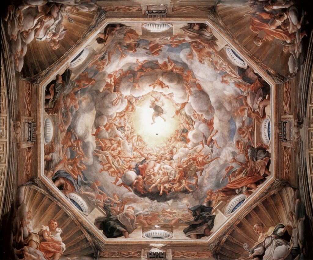
While reading The Story of Art, Correggio’s The Assumption of the Virgin was one of the artworks that stood out to me the most and it became the reason I wanted to conduct my research on him. What caught my eye were the beautiful vortex of sunlit clouds and the realistic figures that populated them. The power in The Assumption of the Virgin is in the way it gives the onlooker the illusion that the ceiling had opened a portal to Heaven. Figures seem to contort as the use of extreme foreshortening is apparent. Interestingly, the fresco is even more striking in person as it illuminates the dark and gloomy space of the Cathedral of Parma. Years later, this piece of work would serve as a catalyst and inspiration for ceiling paintings of the Baroque period. The remainder of Correggio’s works include altarpieces, smaller-scale religious paintings and mythological scenes.

Adoration of the Child, oil on canvas, c. 1526 
The Holy Night, oil on wood, c. 1530 
The Mystic Marriage of St. Catherine, c. 1527 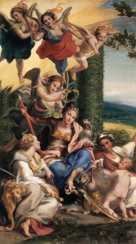
Allegory of Virtues, oil on canvas, c. 1525-1530
References:
https://www.britannica.com/biography/Correggio-Italian-artist
https://www.nationalgallery.org.uk/artists/correggio
Gombrich, E.H. The Story of Art. 16 ed., Phaidon Press, 1995.
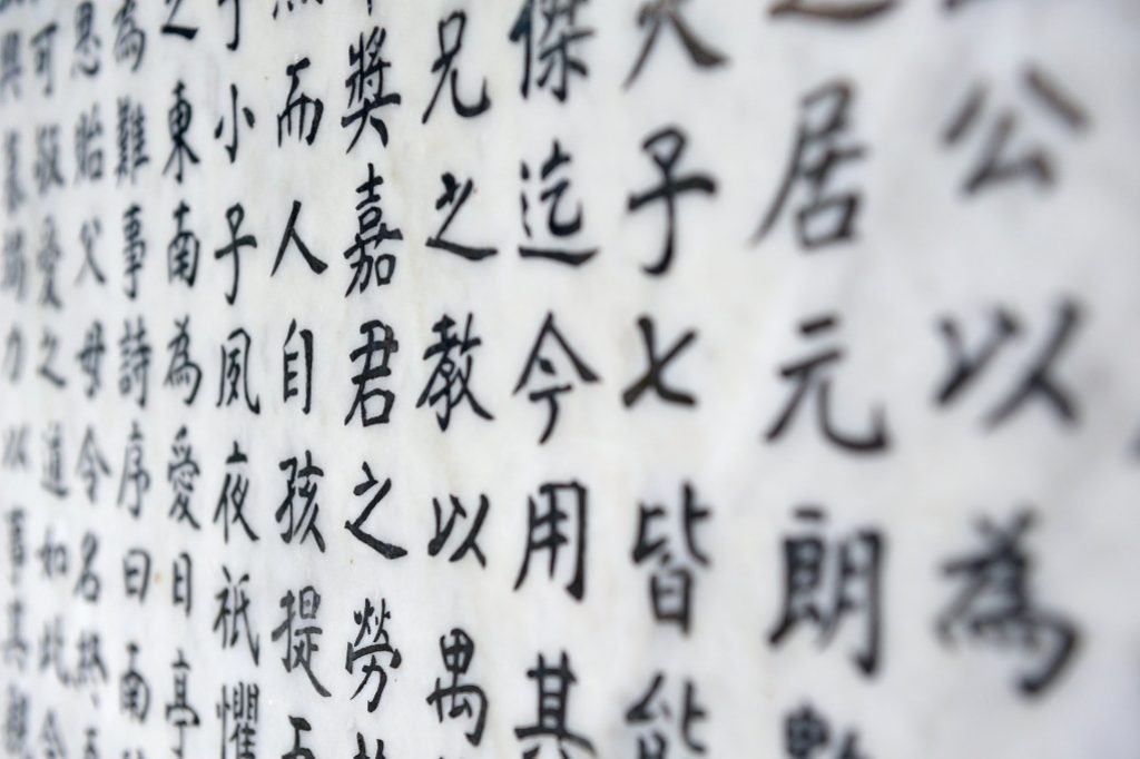
Evolution of the last standing ancient logographic script.
Although English is the largest spoken language in the world, Chinese beats it by a longshot if you only count native speakers. Unlike other ancient languages of Egypt and Sumeria, Chinese writing did not die out and is the only ancient logographic writing system still in use. As one of the oldest surviving languages, one would wonder how Chinese characters stood the test of time and evolved into the widely used script we see today.
From drawings to strokes and from complex to simple ones, Chinese characters went through thousands of years of development to include many different styles. Despite their numerous alterations, the characters incredibly have remained close to their original.
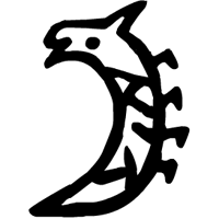
Oracle Bone Inscriptions (Jia Gu Wen 甲骨文)
It’s difficult to pinpoint the exact time when Chinese characters originated. The earliest known form of Chinese writing is dated back to the Shang Dynasty (1600 – 1046 B.C.) as inscriptions on animal bones and tortoiseshell. These oracle bones inscriptions were very complex, meaning they had already undergone years of development.
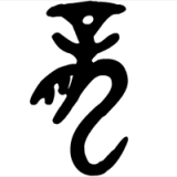
Bronze Inscriptions, (Jin Wen 金文)
By the Zhou Dynasty (1046 – 256 B.C.), Chinese characters evolved through the bronze script – writing cast or engraved on bronze objects. Over 2,000 collected single characters from these bronze objects can be read to this day due to their similarity to the modern Chinese writing system.
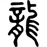
Small Seal Characters (Xiao Zhuan 小篆)
Today’s form of Chinese characters was fixed during the Qin Dynasty (221-207 B.C.). After conquesting the country, the first emperor, Qin Shi Huang, sought to unify his people by standardizing the written language. Previously, many different regional scripts were in use across China so the new simplified script allowed for faster writing and easier communication.
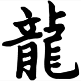
Official Script (Li Shu 隸書) and Regular Script (Kai Shu 楷書)
Even though the seal script allowed for faster writing during its time, it was still improved upon, eventually evolving into the official and regular script during the Han Dynasty (206 – 220 AD). Since the formation of the regular script, there haven’t been any more major changes of evolution for Chinese characters.
There was once a popular myth that Chinese writing is pictographic. The thought most likely stemmed from the fact that many of the oracle bone inscriptions were pictograms. However, these characters only comprise about 4% of the modern Chinese script. Think of the characters like they are built out of Lego blocks. One block usually represents the meaning and the other indicates its original pronunciation, which may have changed over time. Of course, there are characters that stand alone but it is now recognized that Chinese writing is logographic. Other logographic languages include Japanese, Korean and Vietnamese, all of which were adapted from Chinese.
Sources:
https://www.britannica.com/topic/Chinese-writing
https://www.britannica.com/topic/Chinese-languages/Han-and-Classical-Chinese