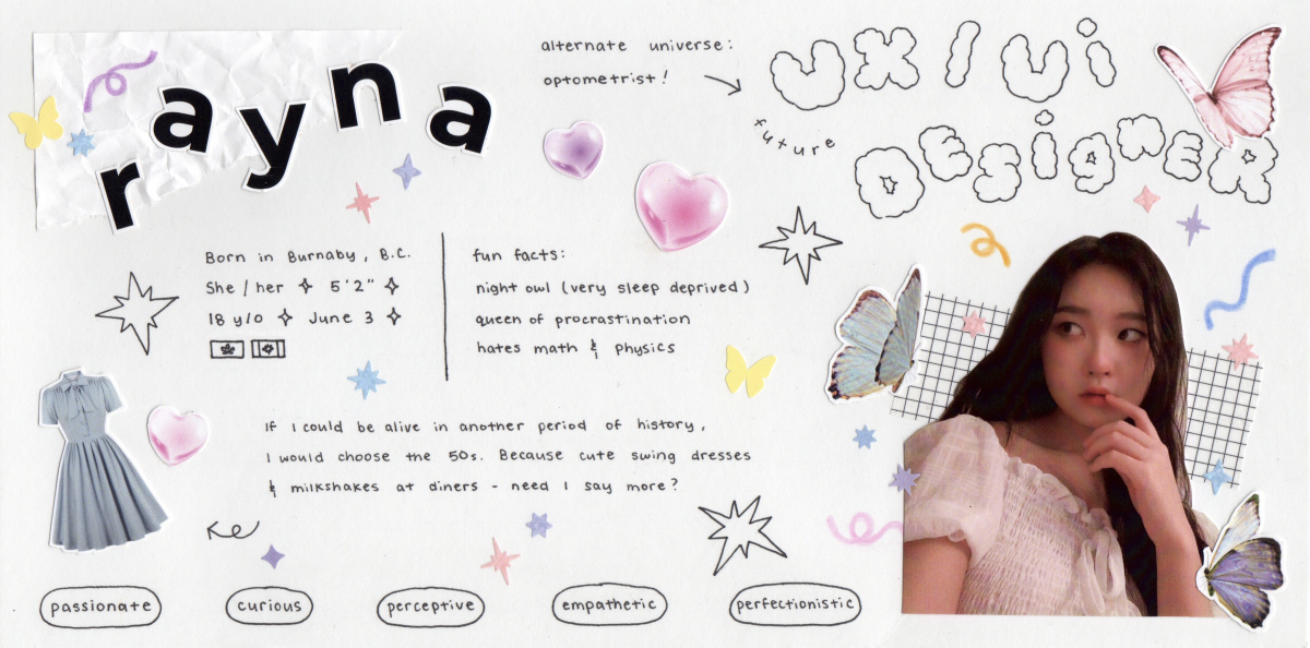
Welcome to my first assignment! For my yearbook spread, I tried my best to capture who I am through different imagery, colours and composition. One of the things I enjoy doing in my free time is bullet journaling / scrapbooking so that mainly inspired the theme of my spread. With a combination of textured paper, washi tape, coloured pencils, and a few hand-cut images I printed, I used a lot of layering when creating my layout. After I glued everything down and fine-lined my write-up, I also decorated the space with some small glittery stickers; this added a unique touch and reflected upon my fun-loving personality. Speaking of which, another way I expressed my personality was through the colour palette. I chose to liven up the black and white of the spread with bright pops of pastel colours. Although I tend to be a cheerful person, I’m quite soft-spoken most of the time so I thought that pastels would best express that.
In the end, I would give myself a 7/10 on this project. I spent around 6 hours making it – with planning and cutting out the images being the most time consuming. My major regret with the finished product was that I didn’t write enough. It was difficult to provide a portrait of myself in short answers and I ended up cutting too much out of my spread. If I had given this assignment more thought, it could have turned out more elaborate. Even though I’m happy with how my spread turned out aesthetically, I’m a little disappointed with the simplicity of it. In addition, I realized afterwards that I forgot to include my last name with my first name so there’s that too.