
To promote the Chinese theatrical release of the film, Spirited Away, artist Zao Dao created a series of posters – one of which puts the use of texture in the forefront. The first thing you notice in this poster is probably the clouds. The illustrated texture of them beautifully enhances the poster, with the swirling lines giving a sense of movement and rhythm.

Borderless Art Museum NO-MA’s poster effectively uses direction to add motion and to convey its message of “timelessness”. Typically, the eye gravitates from the top left to the bottom right corner of a page. However, this poster weaves its text and images along the curve of a spiral, directing the viewer to follow its direction. The title of the exhibition stands out first due to the size of the typography and then the eyes are left to flow counter-clockwise through the piece as the second vital piece of information, the date, lies at the center.
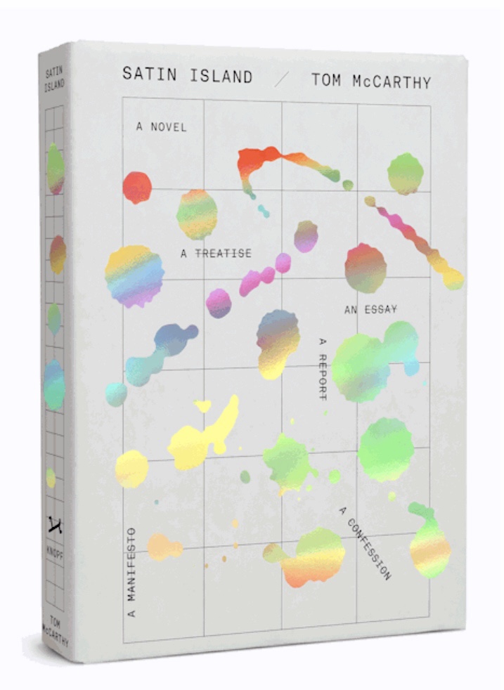
In Tom McCarthy’s novel, Satin Island, designer Peter Mendelsund uses splashes of colour to add interest to the cover art. Resembling oil drips, the iridescent colours stand out against the background of a black and white grid, creating a striking composition.