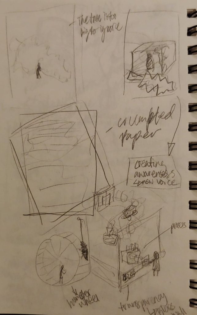
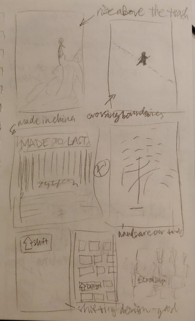
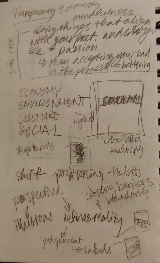
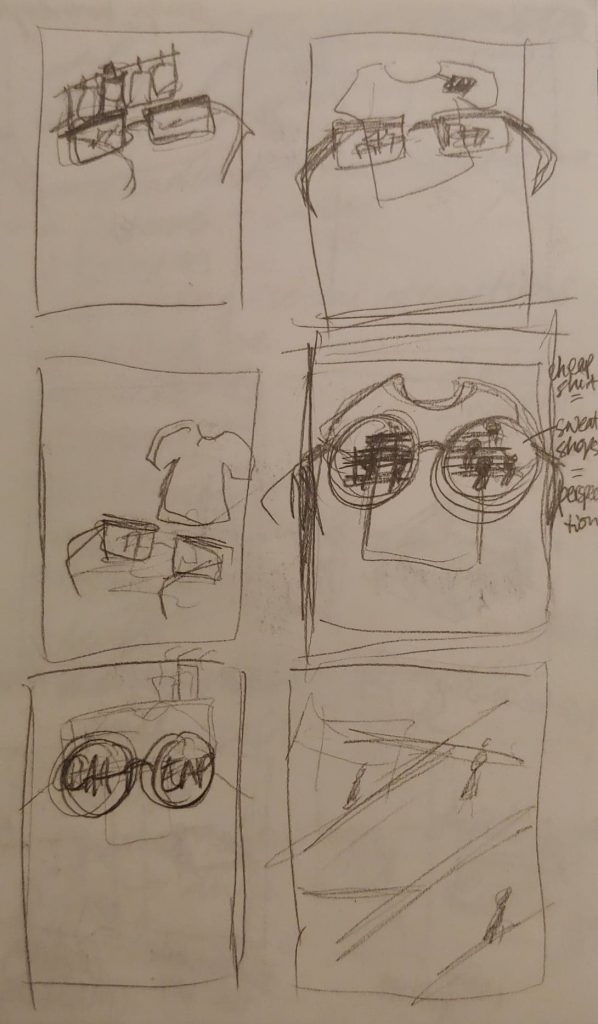
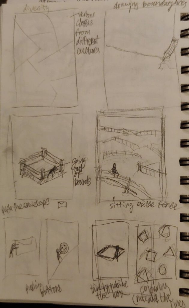
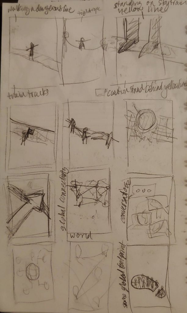
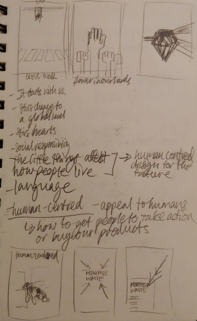
Sustainability is becoming a hot topic in the world and amongst the design community. As a young designer, the matter of sustainable design is very complex to me with all the various perspectives and aspects to consider, such as transparency, consumerism, global connectivity, etc.. After going through it all, the ideation process felt as convoluted as the topic, so, I decided to focus on what I believe is the core and purpose of sustainable design: reducing waste.

By taking the idea of reducing waste and combining it with the minimization symbol commonly seen on digital platforms, I emphasized the white space on the page to show that our resources can be reduced when we design smart. After this poster is taken down and finished its purpose, the blank page can be reused as scrap paper.
Another reason I chose to incorporate a digital theme into the poster is because, as a millenial, my life revolves around technology. Being a young designer as well, it’s important to realize that although I always had computers to rely on, going digital isn’t always greener. We need to know when it’s more effective to put our designs digital platforms and when to design for print. And if we print paper, be conscientious with the resources we have.
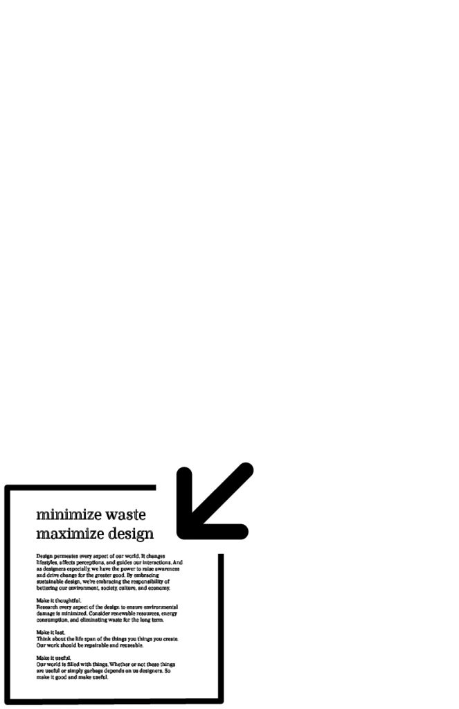
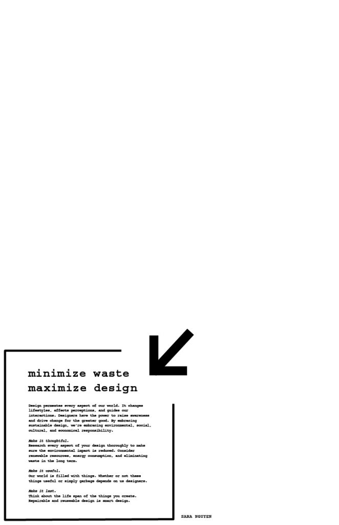
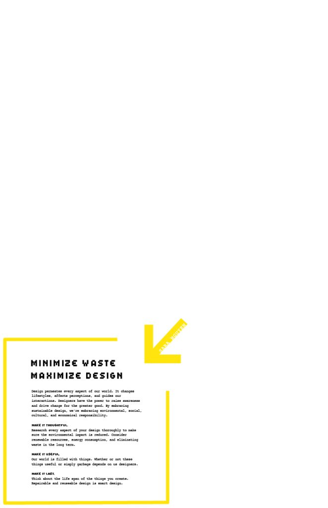
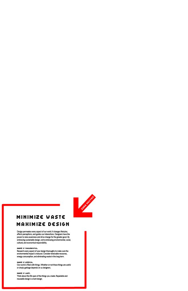
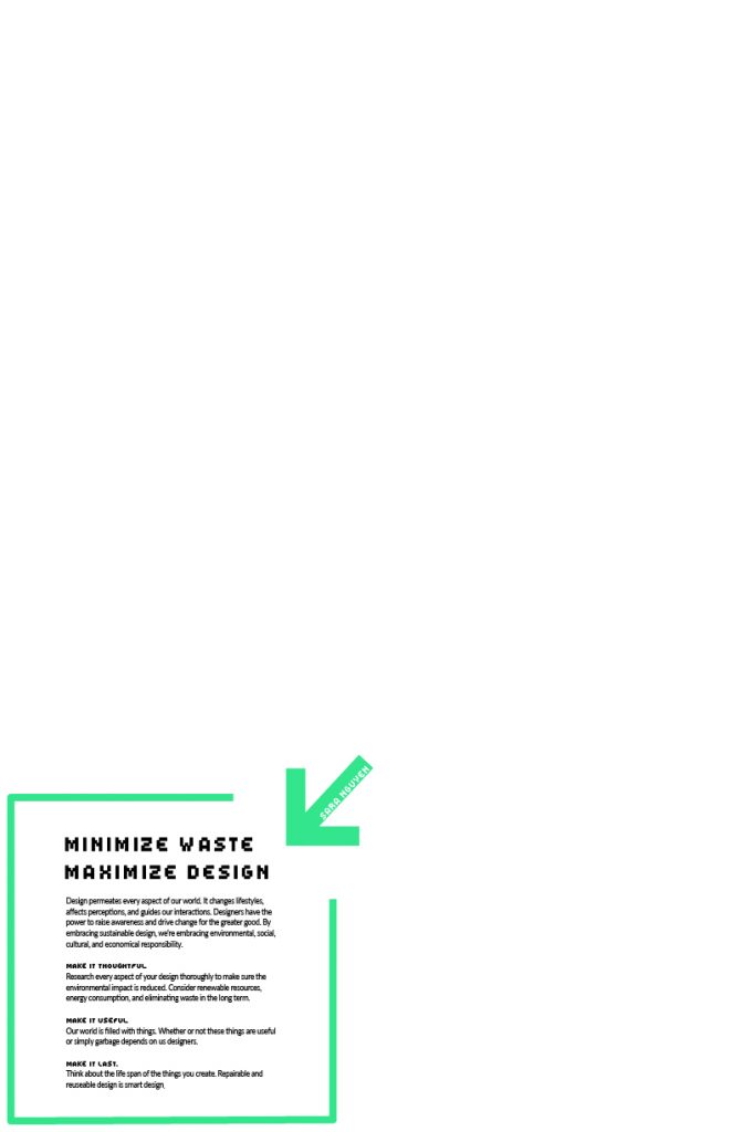
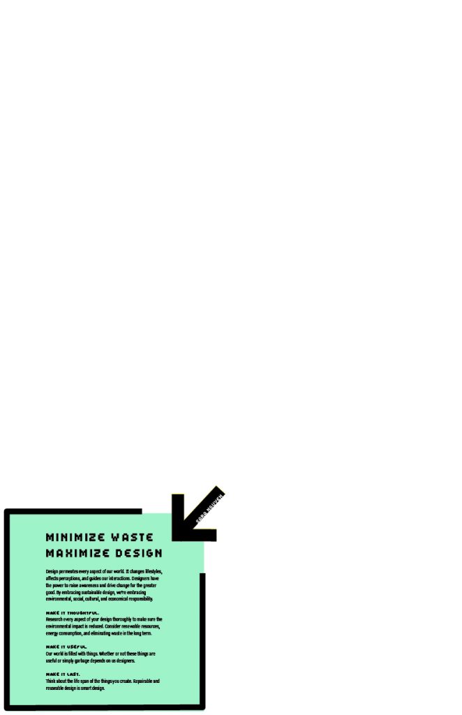
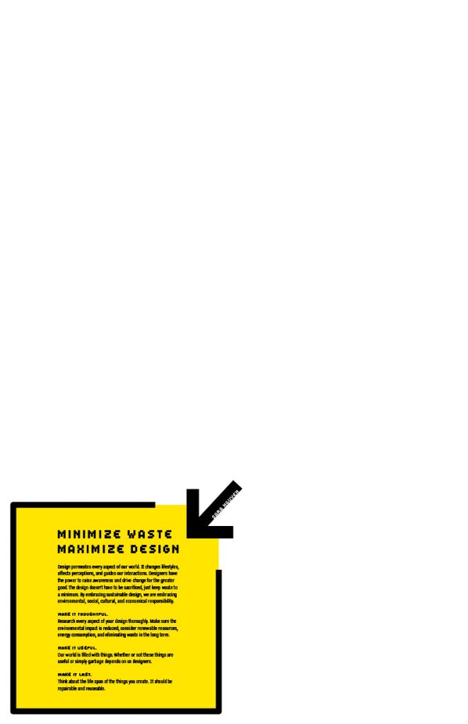

Originally, I wanted to keep all aspects of the design as eco-friendly as possible by using an ink saving typeface like Courier and kept the poster black and white. However, the typefaces were not blending well and the poster felt like it lacked impact without colour. I realized in the process that although we designers would like to be as eco-friendly as possible, that is simply unrealistic. In the end, we can not sacrifice the entire aesthetic of our designs, though the overall waste should still be accounted for. So I chose the pixel typeface to complement the digital theme and the minimization symbol, and the yellow and black combination is supposed to make people feel the message in the box is a warning like traffic signs.
I would give my solution a 9/10. I did my best to keep my concept consistent through my write up which makes the message more effective. I learned that sometimes simplifying the concept and design gets the message of across much faster. The overall design is appealing and would stand out from other posters which would get potential employers’ attention. However, I realize that my usage of the minimization symbol is not obvious to everybody which would make the pixel typeface choice a little obscure.
Resources
- https://gdc.design/about/sustainable-design/about-sustainability
- https://www.aiga.org/aiga/content/why-design/living-principles/your-roadmap-for-sustainable-design/
- https://www.aiga.org/aiga/content/inspiration/corporate-awards/method/
- http://certifyd.org/manifesto/
- https://www.core77.com/posts/40586
- http://spacepirate.org/alrdesign/dam.html
- http://www.visualcomplexity.com/vc/blog/?p=644
- http://www.platform21.nl/download/4453
- http://www.manifestoproject.it/ten-principles-for-good-design/
- https://www1.eere.energy.gov/femp/pdfs/buscase_section2.pdf