The goal for my project is to include every Canadian in part of the decolonizing process and to show that colonization and the struggle against it for the Indigenous Peoples persist to this day. I chose to target new immigrants from ages 23-50 which is the usual working age when they come over to Canada.
Canada is a melting pot of culture and many immigrants who come over are interested in connecting with their new community and learning more about their new country. However, most immigrants do not know about Canada’s history involving the Indigenous Peoples. They lack the resources to learn more about the historical context, partly due to the fact most of the resources are only in English and French while many immigrants that come over to Canada do not speak either as their first language.
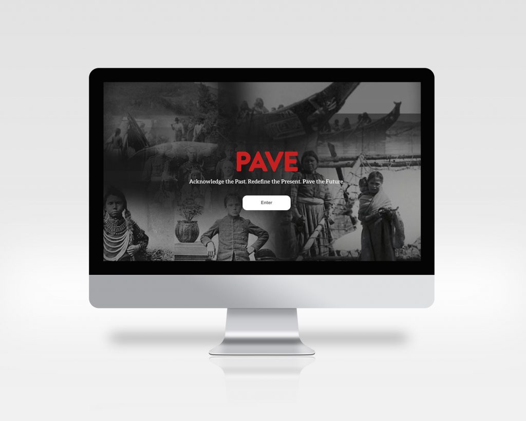
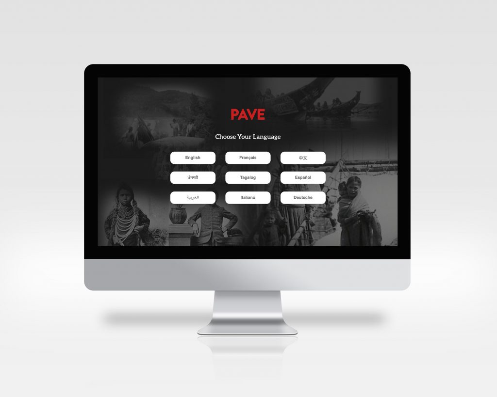
Pave is an interactive educational microsite about Canadian history, told through the perspective of the Indigenous Peoples. This site will be linked to the Government of Canada’s website so that immigrants who are looking to come to Canada can see and access this resource. The site will be translated into the top seven most common immigrant languages aside from English and French.
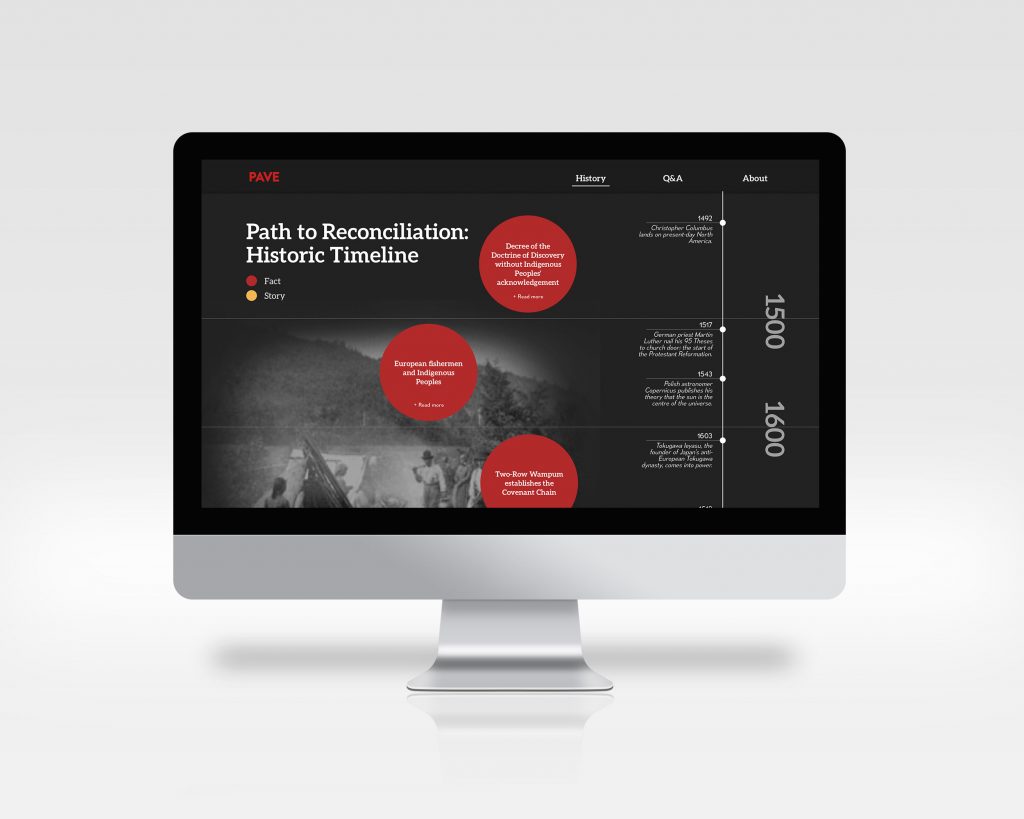
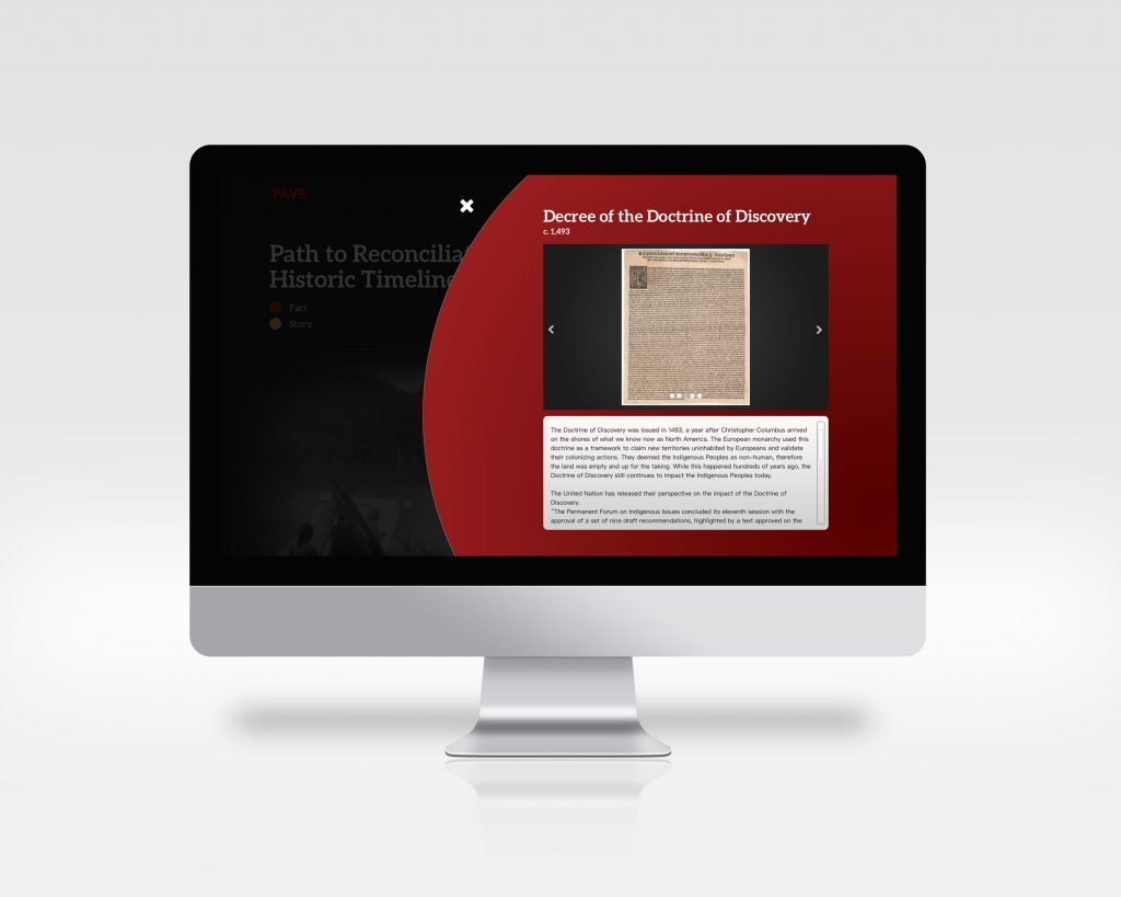
The site design keeps a serious, reflect tone while addressing the sensitive historic context and issues. To keep users engaging throughout the historic timeline, interactive elements and more personal stories or stories that have been passed down in a tribe is added within the timeline. The circles that form a path down the timeline are clickable and will flip over and zoom into the screen to reveal more information about the fact/story. The black and white photos on the side change depending where you are on the timeline. The photos fading in and out of the background of the timeline adds another level of movement and interaction to encourage the users to learn more about what is next in the timeline. Adding stories on top of facts on the timeline gives a more realistic and humanistic side to history through the lens of the Indigenous people.
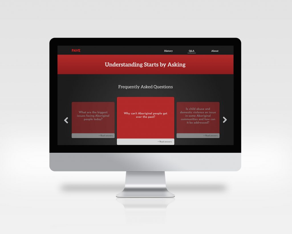
There is a questions and answers section where three Indigenous elders will answer non-Indigenous peoples’ questions to add another opportunity to understand the issue of Reconciliation. Hearing people’s feelings and first-hand thoughts make the issue feel more real and present to this day. The Q&A section is another way for non-Indigenous people to break their misconceptions and biases towards the Indigenous Peoples.
I would give myself an 8/10. I could not accomplish the extensive research and connect with various Indigenous elders to gather a truthful Indigenous telling of history because of time restrictions. Nonetheless, I believe that this project was an overall success in terms of design in keeping the site engaging enough, but formal enough for a government microsite about history. If possible, I would have liked to create some more interesting features of the site, but realistically speaking, for a site like this to be coded and read in 9 different languages, it would have to be fairly simpler in the design and interactions to be able to accommodate the varying text paragraph lengths.
