I forgot to mention in the previous post, but 123w had their 8th year anniversary last Saturday!!
Day 30–31
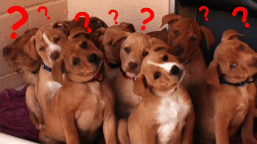
I’m wrapping up my practicum at 123w by revising and finishing up my illustration as much as possible. I also got to do a peer review of some ad spots I helped reference photos for John. I didn’t realize how much post-editing goes into these videos. And honestly, it was a little hard to critique and choose a favourite version because some of the objects were still missing, and I had a hard time imagining if I understood the scenes without those more minor details. It makes me realize how hard critiquing, and a creative director’s job is. Having to come in to guide the overarching vision and give a helpful, objective, but empathetic opinion is such a tricky balance to strike.
Finding that balance, ft. goats.
Good news though, I will be continuing to work contract freelance with 123w for the next couple of months! 🎉 They’re a great team, and I hope to learn more from them while in an official work dynamic. I am also a little scared because now I’ll be getting paid for this work, haha. But I’m super grateful they believe in my potential enough to keep working with me. 🥰💛 It’s also nice to just work at my own hours. I’m not in a big rush to find any permanent job quite yet and I’m looking forward to doing my own personal projects and skills-building these next few months.
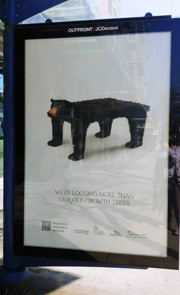
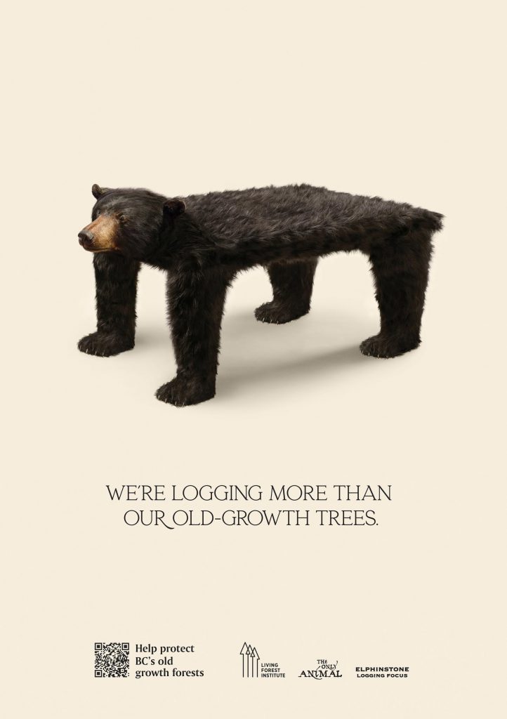
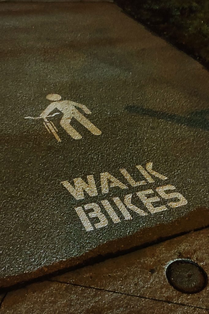
The electricity for my entire block shut down for a day. During my walk to find wifi, I spotted one of the recent 123w ads to help protect BC’s old-growth forests!
While reflecting on my entire practicum experience, I consider it was super important to go through. I know I missed out on a lot of things like casual conversations and connections with people, immersion into a culture, being able to listen into client meetings, and tag along and watch the shoots. But I improved my written communication skills, and I realized how much more polished your work needs to be, even for progress checks (at least at 123w). And it’s not like school where teachers help guide and direct your seeds of an idea, but it’s best when you come to the table with more concrete and fully formulated ideas. I feel there’s a greater sense of ownership of your concepts and expectations to progress yourself because you have the skills already—less handholding. It’s a crazy thought that this is how 4 years end, but I hope the class can meet up eventually to have an official send-off.
We’re done!! I heard our convocation ceremony is a drive-thru? I wonder how that’ll work…
This entire week was pretty slow. I mainly focused on finishing some mood boarding and handing off some files to production and the client for a couple of advertising projects.
There were a couple of things that were interesting this week, though. One was about the social media animations I’ve been working on. It has been a slow process, but a good experience nonetheless. I got to brief one of the animators I found on Thursday! Thankfully, I asked John to go over with me the main things I should cover before heading into that meeting so I wouldn’t get stuck. But overall, it was super exciting to be able to explain a project idea and goal to an outsourced talent, rather than being briefed to this time!
I’d like to believe I did pretty alright briefing the animator. They were super nice and easy to talk to.
I also started illustrating for one of the other animations in the same series. It’s been going a little slowly because it’s a vector-based illustration, and I haven’t done a textured illustrator on AI in such a long time. But what’s it’s been fun is working with the motion designer on the team to confirm what assets he needs and what new things are possible with After Effects plug-ins. He is super appreciative of designers who know how to do motion because his work process goes so much smoother. He explained how sometimes he has to recreate assets to make them usable for motion, which adds to his workload and time. So, good job IDEA, for touching on some motion design!
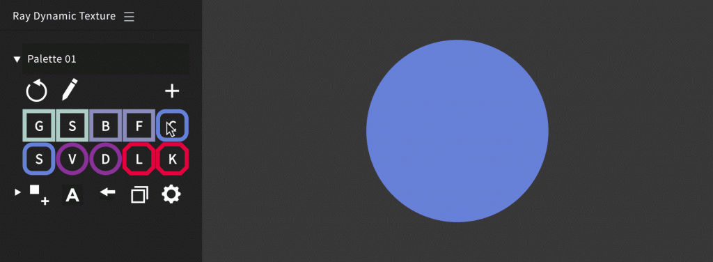
Ray Dynamic Texture is a really cool AE plug-in to easily add textures to objects! Definitely super useful to spice up flat vector illustrations.
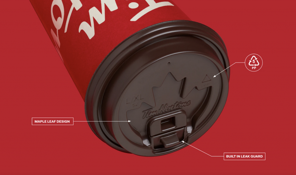
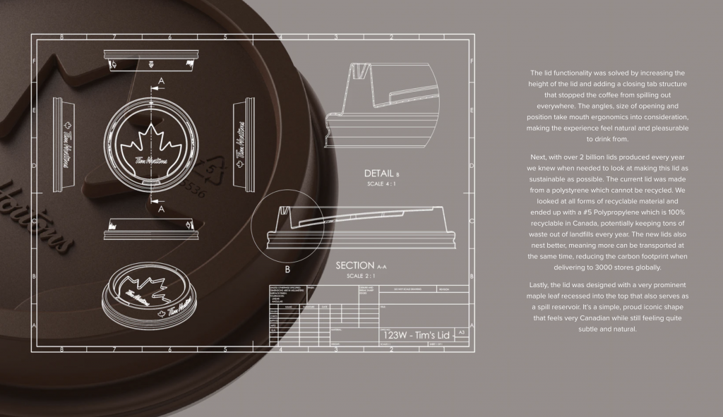
One last neat thing from this week was hearing Jeff Harrison go over his process working on the Tim Horton’s Lid Project! It’s been one of my favourite projects from 123w because of how user-focused the entire project was and how unique the product solution was. A couple of themes Jeff kept in mind was sustainability and ergonomics while still establishing a strong brand identity component special to Tim Horton’s. He produced an incredible amount of concepts and designs throughout a couple of years and researched and learned a ton of new things to make a functional product.
Screenshot of the lid design from their case study on the 123w website.
Jeff mentioned that this career is cool because we’re concept-driven. We can work on anything and with anybody to create something from a concept. For this project specifically, he worked closely with an engineer he knew from Hong Kong to work out the mathematics and eventually 3D printed samples of the lids to test. I’d love to be able to work on a project like this in the future!
Schematics of the lid from their case study on the 123w website.
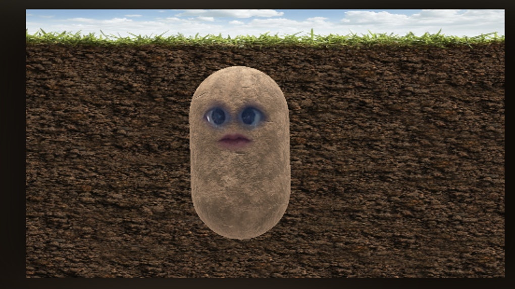
And finally, I ended the week with Friday Virtual Drinks—the last one of my practicum! I love 123w because of how casual and open everyone is to talk about a range of topics, from what to do about old TV shows and movies with racist and homophobic overtones to contemplating getting Gen Z curtain bangs and the potato filter on Zoom.
In case you’re wondering, this is the potato filter on Zoom.
The GDC (Graphic Designers of Canada) is a national member-based organization that connects professionals, educators, and students within the design & communication arts field in Canada. With the project, we worked with GDC as our client to address their current issue with the lack of student memberships given out per year and student engagement with the GDC as a whole. GDC offers a lot of value to their members but struggles in communicating this to the students. As a class, we wanted student across Canada, but especially the student members, to understand the benefits of GDC, thus, increasing student membership and engagement.
Insights & Strategy:
Our group focused specifically on the lack of the students’ lack of GDC events for students to participate in and see the benefits that come from being apart of GDC. We leveraged the fact that students value networking, portfolio reviews, and the appeal of mentorships the most. Mentorships are a great asset of being apart of GDC as a student member because they provide students the industry connections and insights of how to be a professional designer. However, students lack awareness of the GDC’s program, on top of their lack of 1:1 time with mentors. We also found out during our research process that students are put off by the heavy usage of the GDC red brand colour because it looks aggressive. Knowing this, my group consisting of Sharleen Ramos, Rachel Wong, and I, create a national annual student conference to add to the national calendar of GDC student events.
Goal:
The annual Shapers conference’s goal will promote and expose all communication design students to the GDC mentorship program and provide a taste of what mentorships could entail. After this experience, students are more likely to sign up for the full-time program with GDC.
Solution:
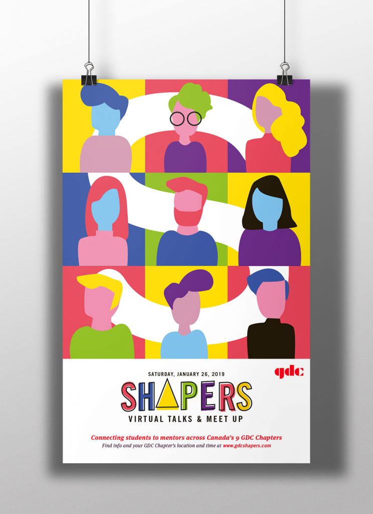
Shapers is an annual, 1-day virtual meetup with talks from speakers in GDC’s 9 Chapters that will be live-streamed across Canada and connect students with mentors. The speakers and the mentors who will provide feedback on portfolio reviews at the conference will share tips and stories on how to be a professional designer. There will be personalized Q&A’s at the end of each session and the interactivity and takeaways will attract students to participate in the event. Students will be able to gain insights from top designers across Canada that they would not normally be able to connect to.
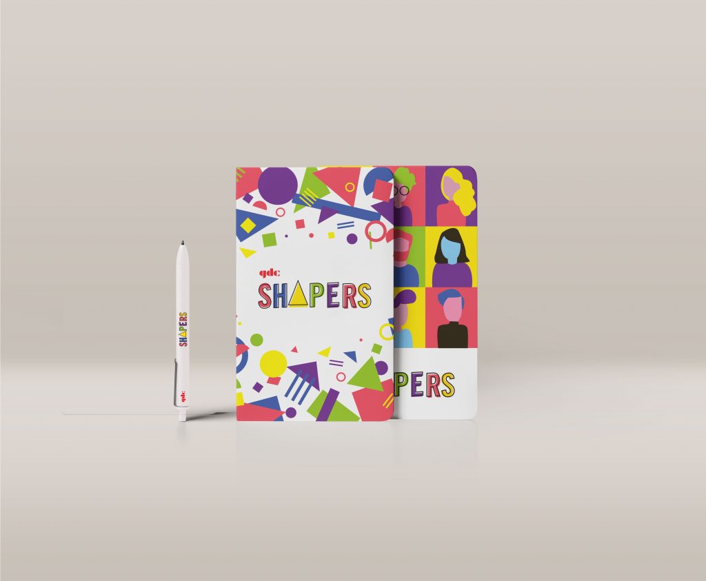
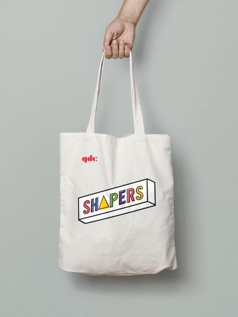
Shapers Conference logo
Another reason for creating a live-stream conference event is so that all 9 GDC Chapters can connect at a nationally level which will appeal to student. It will be assessable to students who are not able to make it in person and the talks will be archivable online which can draw in online presence and traffic. There will be a series of talks from each chapters and each speaker will each come from a different creative profession: creative director (branding and design), freelance designer, illustrator, content strategist, web designer, UX designer, and such. These talks could be about their work, their work schedule, how to freelance, their personal experiences and what they have learned along the way. The portfolio reviews will take place after the talk series and will last 1 hour with 15 minutes sessions. They will be reviewed by a group of GDC mentors in each GDC Chapter. At the end of the event, there will be a networking dinner as another way to get students and future mentors to connect and sign up for the mentorship program.
Final Direction and Products:
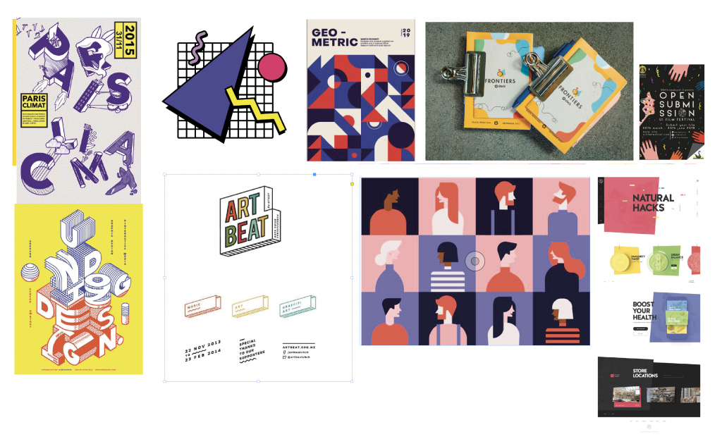
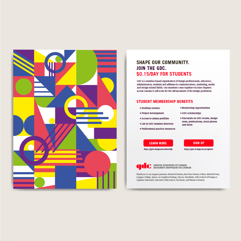
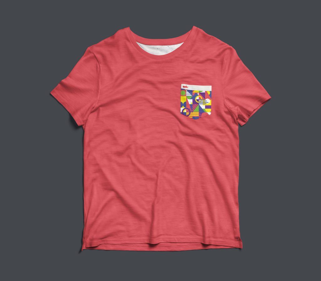
We chose to gear our conference towards a modern, playful direction by using geometric patterning and shapes in combination with bold colours to make it eye-catching. We wanted to increase engagement and excitement by bringing in the colours’ energy into our design. However, we had to keep in mind of the professionalism and pre-existing brand of GDC so we could not stray too far from though it is a national event. We made sure to include a lot of white space, especially on the website.
Condensed moodboard
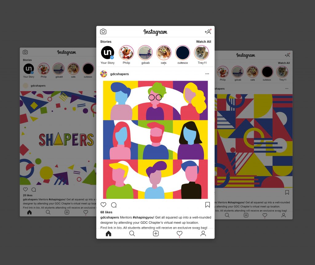
As part of our collateral, we create a poster that depicts the connection of the 9 GDC Chapters between the students that Shapers will provide. There will be badges for mentors and mentees at the conference and each badge design will be specific to each Chapter and the event location’s airport code. The example provided shows the Vancouver skyline with the “YVR” at the top of the card in the ball. At the back of the badge will be a QR code which mentors and mentees can scan at any time during the conference to be led to the GDC mentorship page to sign up for the full-time program. The event will be promoted through Instagram as it is the most effective way to reach younger, tech-savvy audiences such as students. It is also GDC’s main and most active media channel. The post will have fun copy to match the Shapers’ conference identity and end off with the hashtag, #gdcshapers.
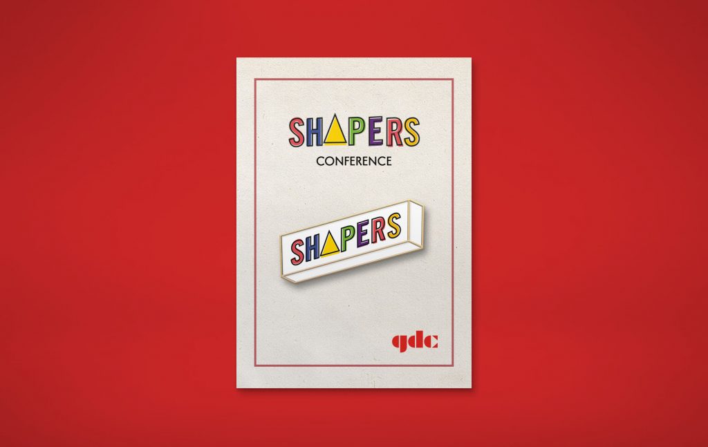
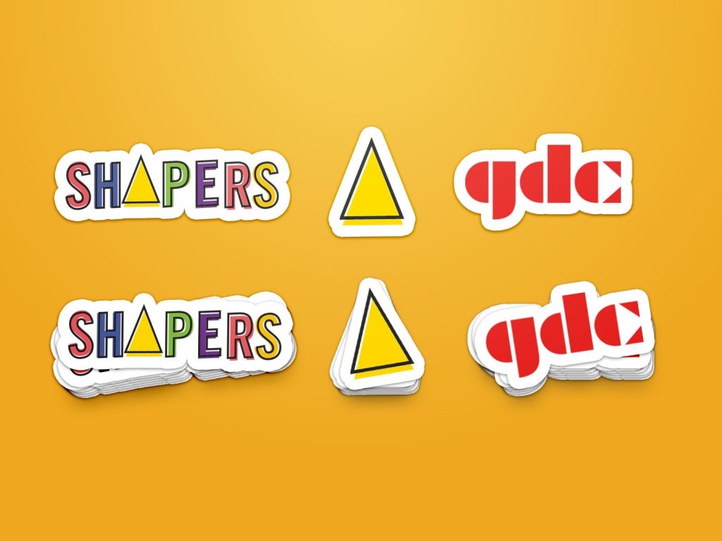
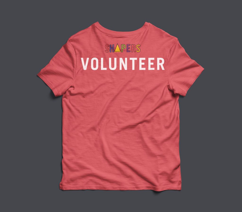
At the conference, each student will be given a special Shaper’s tote bag with stickers, notebooks and pens, an enamel pin, and a postcard that has information on the back about GDC, the benefits of being a GDC student member, and links to learn more or register. The front of the postcard only has an interesting, geometric pattern design on it so it is more likely for students to keep. Next, we designed a T-shirt specifically for volunteers to keep after the conference as a little incentive to help out.
I would give my group a 8.5/10 for our solution,but 10/10 for our teamwork. As a whole, I believe our team did really well in terms of teamwork, group productivity, and communication. We ideated and thought through the strategy, event logistics, design direction as a group through our meetings. Sometimes it was hard to combine our different ideas and different understandings of the problem to create one effective solution. We also have naturally different design styles that we had to combine into a cohesive project and identity, but all in all, we got through it with very few hitches and made it fun. In the group, I worked in doing quite a few of the design elements in the collateral such as the geometric patterns and the layouts and type treatment of the posters and postcards.
The goal for my project is to include every Canadian in part of the decolonizing process and to show that colonization and the struggle against it for the Indigenous Peoples persist to this day. I chose to target new immigrants from ages 23-50 which is the usual working age when they come over to Canada.
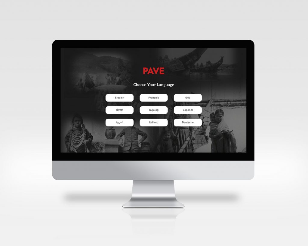
Canada is a melting pot of culture and many immigrants who come over are interested in connecting with their new community and learning more about their new country. However, most immigrants do not know about Canada’s history involving the Indigenous Peoples. They lack the resources to learn more about the historical context, partly due to the fact most of the resources are only in English and French while many immigrants that come over to Canada do not speak either as their first language.
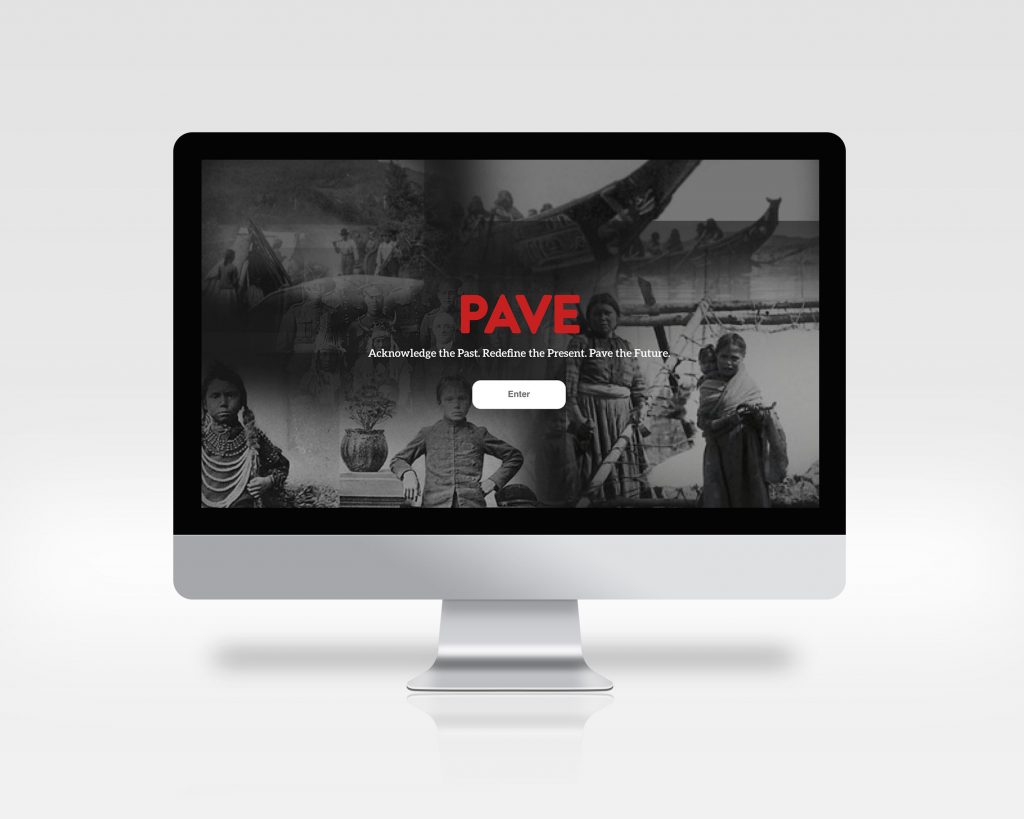
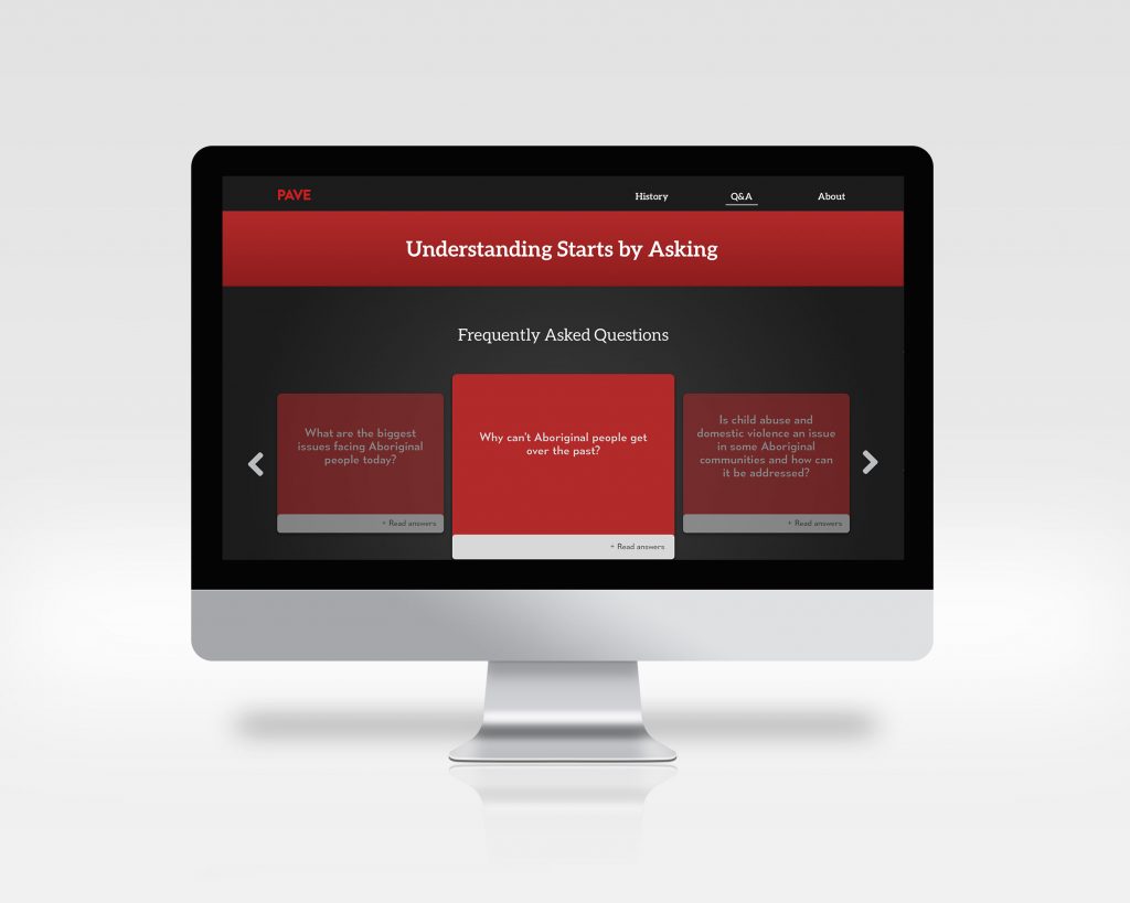
Pave is an interactive educational microsite about Canadian history, told through the perspective of the Indigenous Peoples. This site will be linked to the Government of Canada’s website so that immigrants who are looking to come to Canada can see and access this resource. The site will be translated into the top seven most common immigrant languages aside from English and French.
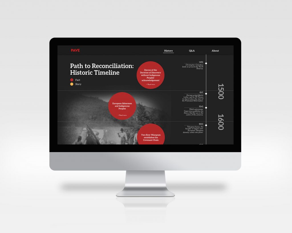
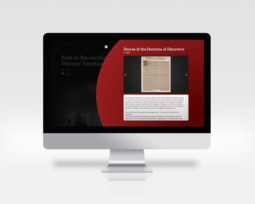
The site design keeps a serious, reflect tone while addressing the sensitive historic context and issues. To keep users engaging throughout the historic timeline, interactive elements and more personal stories or stories that have been passed down in a tribe is added within the timeline. The circles that form a path down the timeline are clickable and will flip over and zoom into the screen to reveal more information about the fact/story. The black and white photos on the side change depending where you are on the timeline. The photos fading in and out of the background of the timeline adds another level of movement and interaction to encourage the users to learn more about what is next in the timeline. Adding stories on top of facts on the timeline gives a more realistic and humanistic side to history through the lens of the Indigenous people.
There is a questions and answers section where three Indigenous elders will answer non-Indigenous peoples’ questions to add another opportunity to understand the issue of Reconciliation. Hearing people’s feelings and first-hand thoughts make the issue feel more real and present to this day. The Q&A section is another way for non-Indigenous people to break their misconceptions and biases towards the Indigenous Peoples.
I would give myself an 8/10. I could not accomplish the extensive research and connect with various Indigenous elders to gather a truthful Indigenous telling of history because of time restrictions. Nonetheless, I believe that this project was an overall success in terms of design in keeping the site engaging enough, but formal enough for a government microsite about history. If possible, I would have liked to create some more interesting features of the site, but realistically speaking, for a site like this to be coded and read in 9 different languages, it would have to be fairly simpler in the design and interactions to be able to accommodate the varying text paragraph lengths.
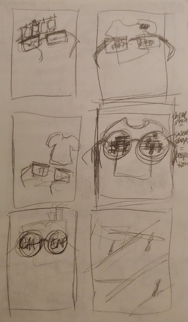
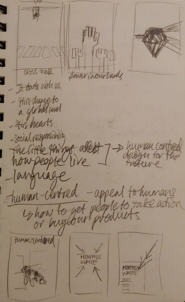
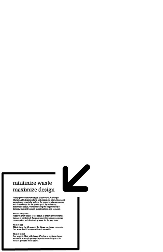
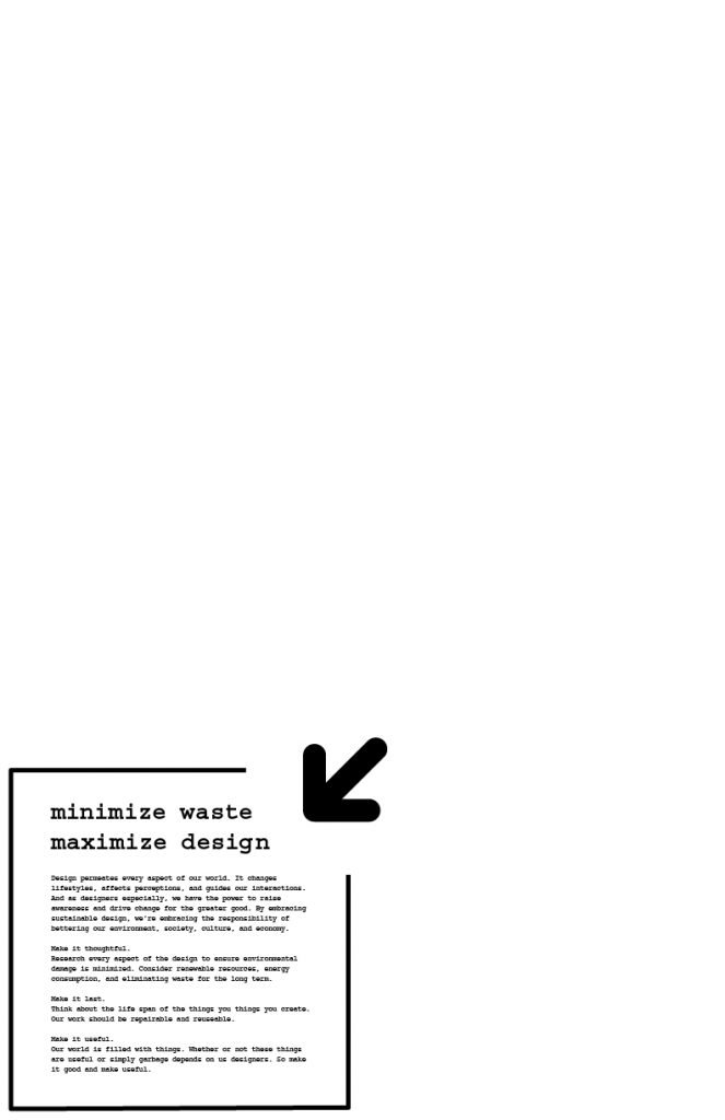
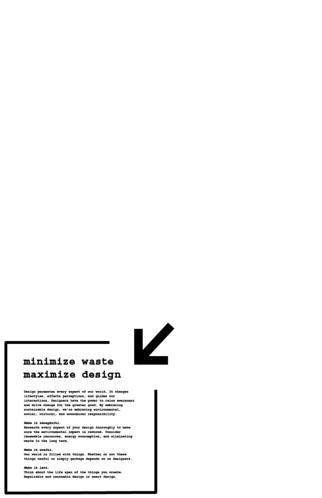
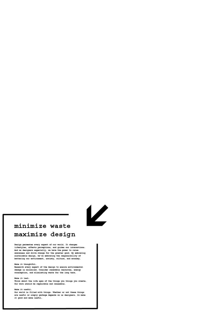
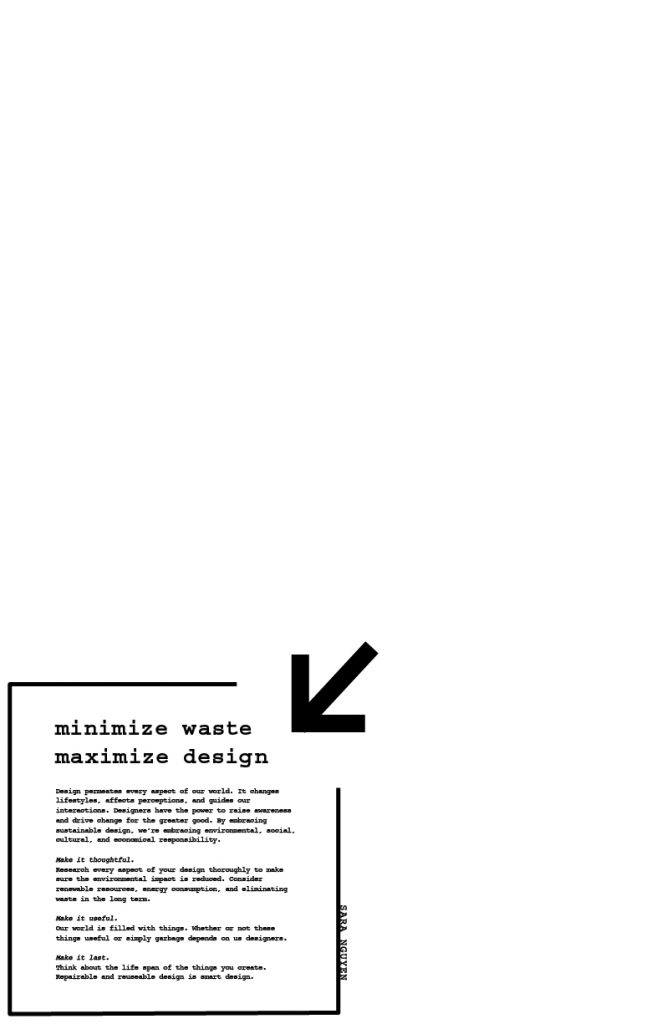
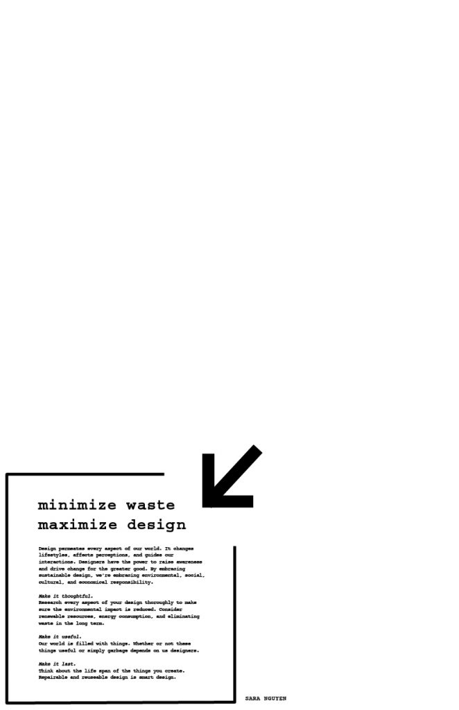
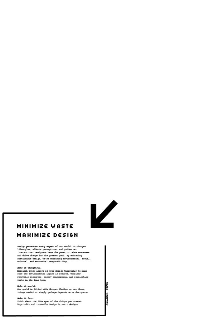
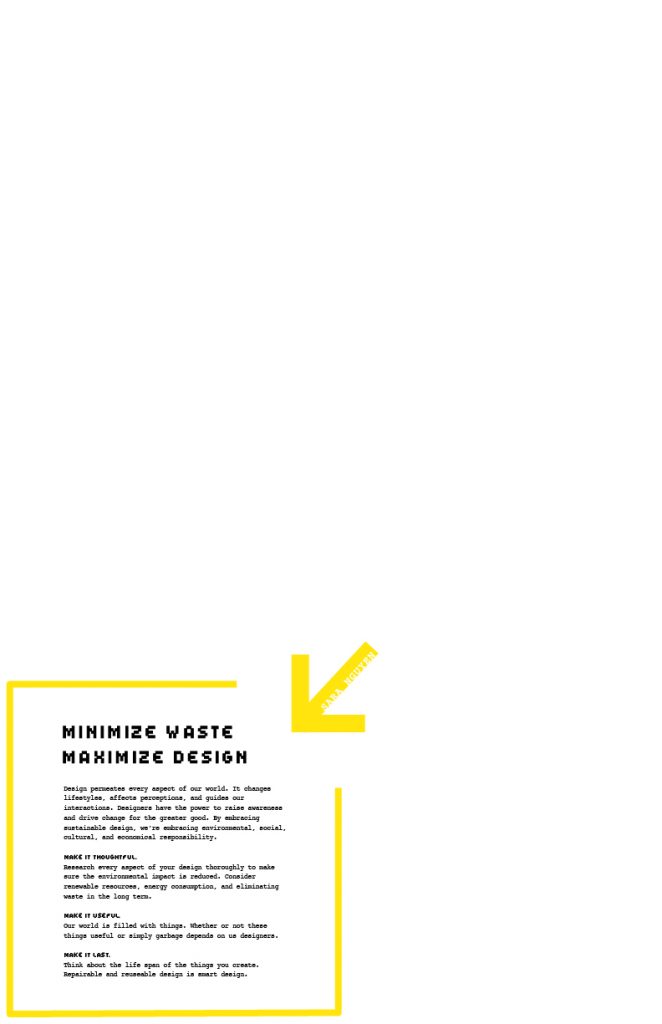
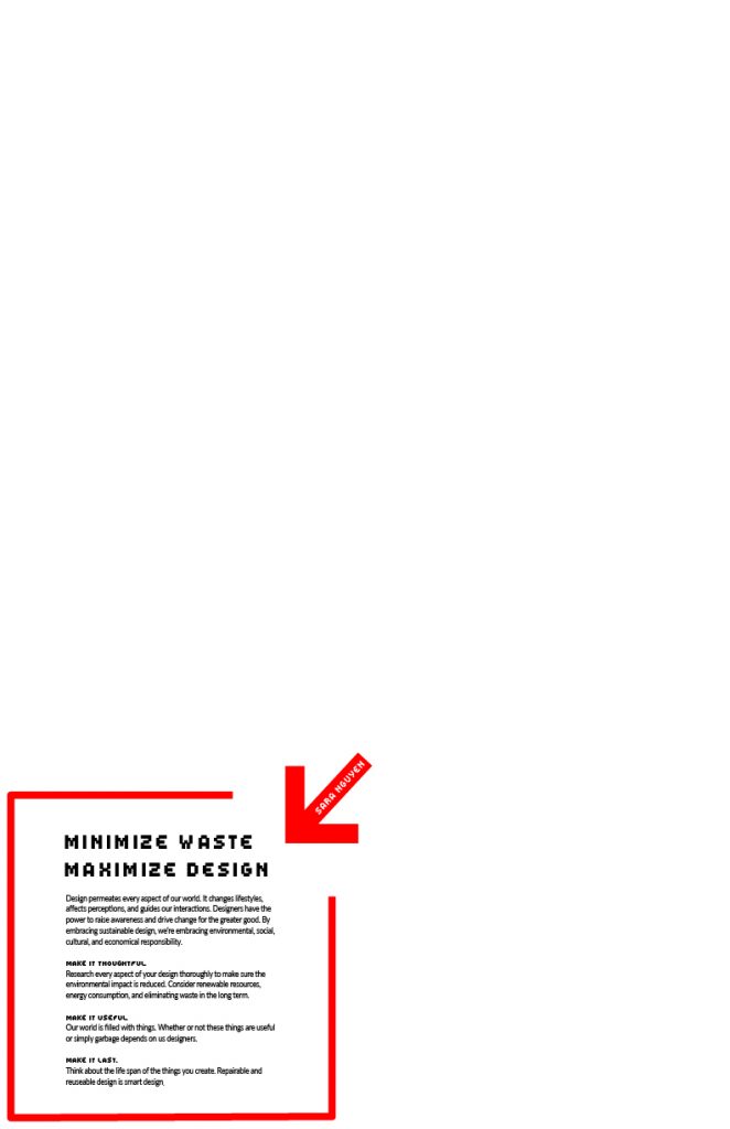
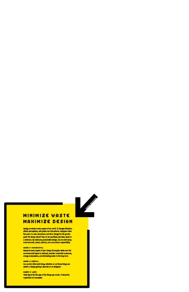
Sustainability is becoming a hot topic in the world and amongst the design community. As a young designer, the matter of sustainable design is very complex to me with all the various perspectives and aspects to consider, such as transparency, consumerism, global connectivity, etc.. After going through it all, the ideation process felt as convoluted as the topic, so, I decided to focus on what I believe is the core and purpose of sustainable design: reducing waste.
By taking the idea of reducing waste and combining it with the minimization symbol commonly seen on digital platforms, I emphasized the white space on the page to show that our resources can be reduced when we design smart. After this poster is taken down and finished its purpose, the blank page can be reused as scrap paper.
Another reason I chose to incorporate a digital theme into the poster is because, as a millenial, my life revolves around technology. Being a young designer as well, it’s important to realize that although I always had computers to rely on, going digital isn’t always greener. We need to know when it’s more effective to put our designs digital platforms and when to design for print. And if we print paper, be conscientious with the resources we have.
Originally, I wanted to keep all aspects of the design as eco-friendly as possible by using an ink saving typeface like Courier and kept the poster black and white. However, the typefaces were not blending well and the poster felt like it lacked impact without colour. I realized in the process that although we designers would like to be as eco-friendly as possible, that is simply unrealistic. In the end, we can not sacrifice the entire aesthetic of our designs, though the overall waste should still be accounted for. So I chose the pixel typeface to complement the digital theme and the minimization symbol, and the yellow and black combination is supposed to make people feel the message in the box is a warning like traffic signs.
I would give my solution a 9/10. I did my best to keep my concept consistent through my write up which makes the message more effective. I learned that sometimes simplifying the concept and design gets the message of across much faster. The overall design is appealing and would stand out from other posters which would get potential employers’ attention. However, I realize that my usage of the minimization symbol is not obvious to everybody which would make the pixel typeface choice a little obscure.
Monday was also another jam-packed day making layouts for the social media campaign John brought me on last week, which is being presented to the client tomorrow. Other than that, I was also experimenting with supers for a video that I think should be due this week. I’m a little confused about the timeline for that project because the art director working on it quit because he’s pursuing another full-time job. But, I learned that supers are what the industry calls the video text in video ads. I’m not sure why, but apparently, it’s a production term?
Me being confused again, but just rolling with it.
Day 22:
After the hectic day yesterday, today was much more chill, but enough work and things to keep me going. I had a quick, spontaneous chat with Jeff Harrison, and he mentioned that it’s a great time to be looking for a job in the industry and that I should have confidence as an IDEA grad—we have some street cred to our name—and with my portfolio, if I’m at 123w. He gave me some advice and said I should build a super conceptual digital campaign piece rather than another brand identity project to add to my portfolio. As much as it’s important to be conceptual, the craft is just as significant, and they make sure people can think in digital too. So, make sure to keep your rags nice and clean because it’s something that Jeff looks at during portfolio reviews.
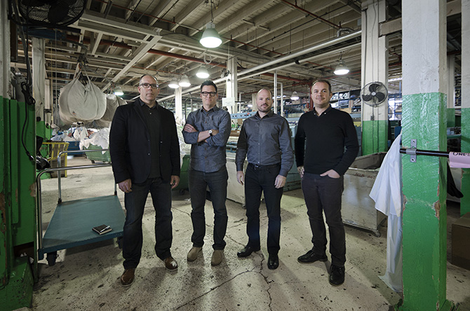
I forgot to take photos this week, so here’s a photo I grabbed of the founders of 123w in their old office, a laundry mat. That’s Jeff on the very right!
Day 23:
There was a lot of confusion for this supers project like I mentioned before, because the people I was working with/reporting changed a couple of times. Anyway, by the end of the day, we got the general direction for that supers project. I thank Danielle Haythorne so much for jumping in, getting a handle on who exactly is a part of the team and what we needed to do, and making the client’s presentation deck.
Aside from that, I had a quick catch-up chat with Eric, who walked me through the whiskey packaging project he’s been finishing up—super cool concepts—and met Lisa Good, a production artist on the team! Lisa assured me I don’t need to spend any time making my files organized and production-ready at all, which still leaves me uncomfortable at the thought of someone trying to navigate through a disorganized file. But she was very sweet about it all.
That’s Lisa telling me that I can just focus on creating as a creative, and she’ll handle the rest.
Day 24:
We started the day with a creative team meeting and dove into how 123w will handle creative resourcing and team structure. I’m still somewhat getting used to the 123w agency structure, but I figure there’s usually a creative team and another CD that acts as a third party to give an objective view on the project. It’s an interesting structure because almost all of the group is technically CD level, so they can’t work the traditional agency way; it would just be inefficient.
I guess I wonder because the team is so senior, how do they handle smaller projects that are fit for junior-intermediate level designers? Do they take on a lot of those jobs? I guess this is something to add to the question list on my next chat.
Afterwards, I worked on the revisions for the social media campaign we had to turn in earlier in the week and briefed the first animator for the social media animation series. It’s exciting to see things moving and hear an animator’s opinions on my ideas and see them thinking of ways to turn them into reality. This animator works in 3D animation, and my student designer heart is so happy that I can finally turn a project into a 3D illustration art style after mood boarding it.
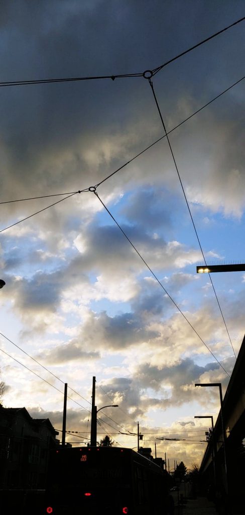
Some photos from my end of the week walk. I’m so happy the sun sets at 8 pm now!
I started working on my personal project and booked in some more chats for this week. I’m hoping to see all the creatives (at least) by the end of my practicum!! We also got the social media animations I started in Week 1 approved, so we’re moving into the final art direction and production phase—exciting!
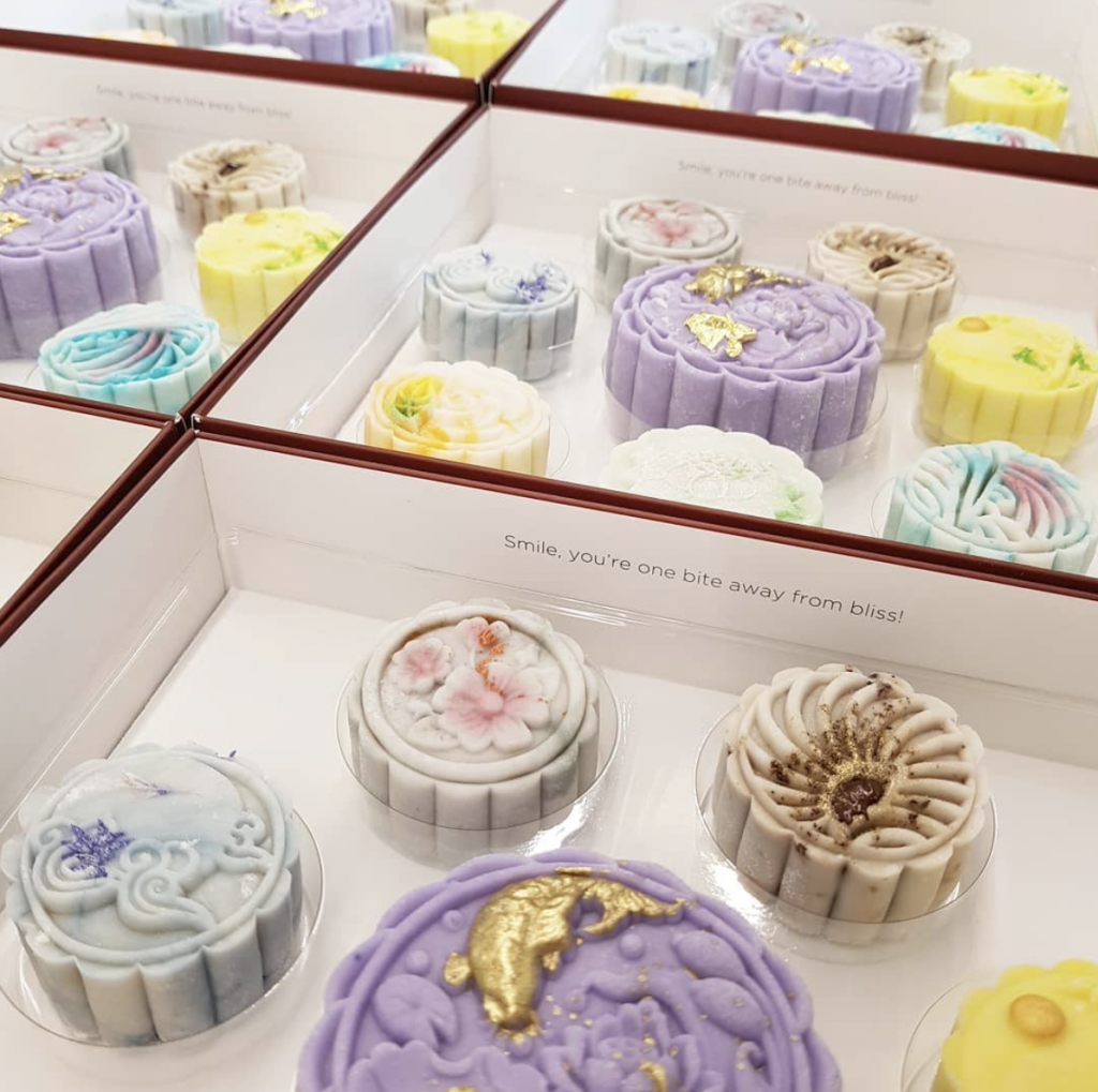
P.S. Positioning mooncakes is more challenging than I thought it would be.
These are some really beautiful (competing) mooncakes from Soirette in Vancouver!
Day 17:
Today was a super busy day full of meetings. I got briefed on quite a few things to do this week, with some ongoing tasks lasting till the following week. But I guess this is another challenge of time management and efficiency. One of the biggest things I’m learning is how to measure out my time effectively and efficiently. There are only so many hours in a working day.
This is baby designer me hard at work.
We’re finally starting to roll into the social media animations’ production phase, meaning I can start reaching out to illustrators/animators. And I can illustrate some simple assets for Jesse (the motion designer at 123w) to animate too! We got super cool things in store!
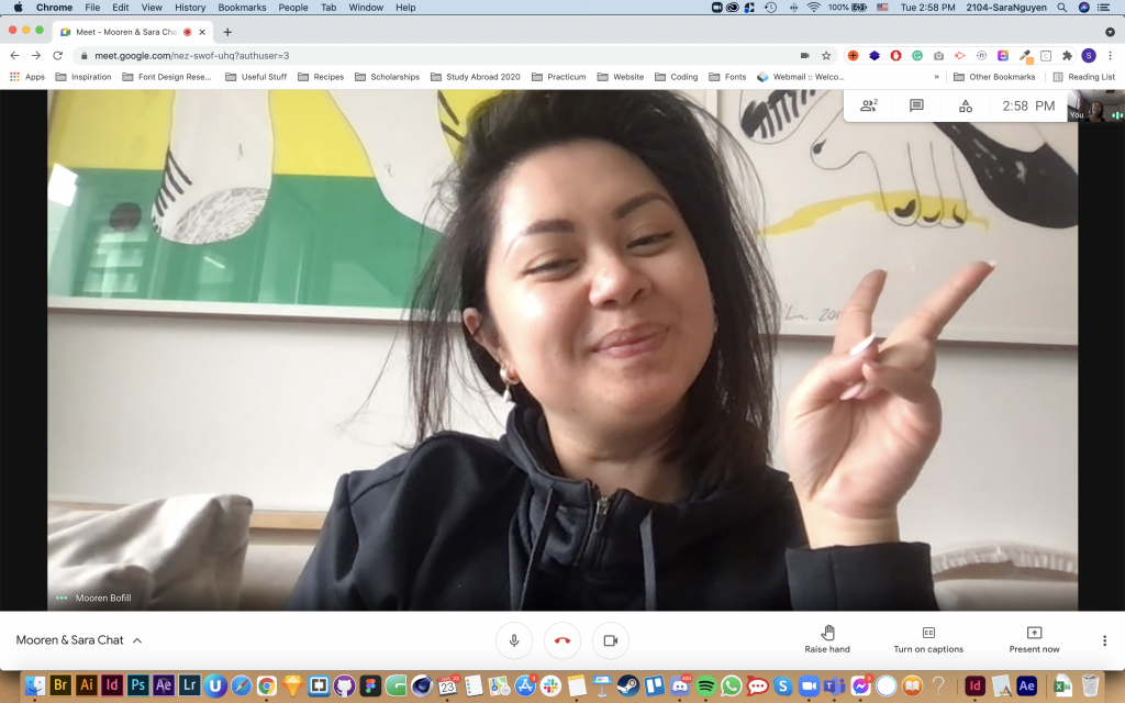
I also had another quick chat with Mo today about how 123w is going. We also went over some brand guideline decks and tips on brand strategy and positioning. Unfortunately, I lacked sleep, so I was out of it today. But Mo was patient enough to chat with my tired, slow-brain self.
It’s Mo’s signature pose! And that’s me in the tiny corner of the screen.
Day 18:
I chatted with Kate today and asked her a bit about her working in big agency life and small agency life. She said it’s good to learn about that bureaucracy life, but it’s nice being in a scrappy agency where you can see your ideas go through and the big guys in the agency are reachable. Kate prefers the scrappy small agency life. And she has made career advancements at 123w, from writer up to creative director, so there are opportunities there in smaller agencies too! She mentioned that when COVID hit at 123w, everyone was cared for, and the small scale played a big part in that.
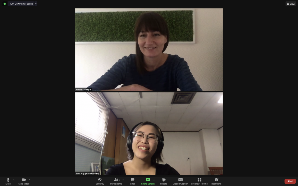
I also chatted with Addie in the afternoon about industry life, the difference between art direction and design, and working collaboratively. We both miss working collaboratively in person.
I forgot to take a photo with Kate and I, but here’s Addie and I!!
Day 19:
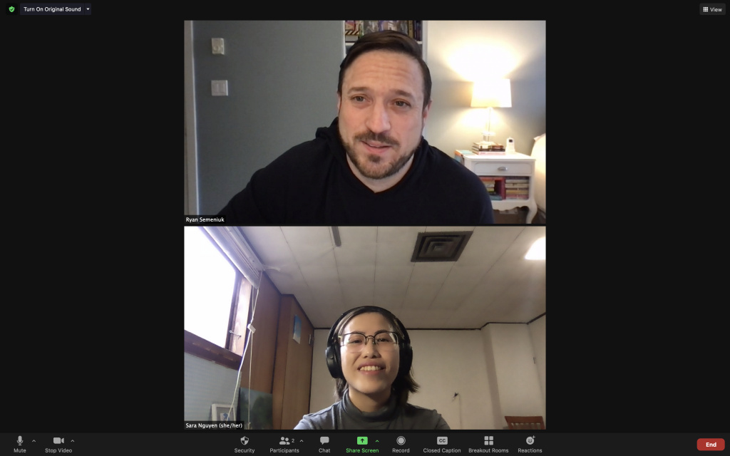
I talked to Ryan today, and his advice to young designers was to work hard as you can and absorb everything. It’s a matter of practicing constantly and getting more efficient, and refining your craft. And talk to everyone, learn from everyone—accounts, production, etc.
My inner self talking after hearing Ryan’s advice,
I also asked him what his favourite project was in his career, and it sounded like the most interesting ones to him were where he was not just creative with the idea, but the process was just as enjoyable. The project he explained was where his team spent a lot of time and money in the research phase to build the most trustworthy character. Using the information, they hired an actor fitting all the characteristics to act as a fake scammer as part of an awareness campaign on how easy it is to get scammed. It was interesting to hear how you can distribute your budget creatively to create different, memorable campaign experiences.
I think I may have caught Ryan as he was preparing for the photo.
Also, the CapU IDEA Grad Show site went live today!! I was able to help contribute to the quality assurance stage while at 123w, and I’m glad everything launched smoothly. There were quite a few bugs that resurfaced after a few times in the development process. I guess that shows how the creative process is never linear and that truth doesn’t change in the working industry.
This week has been jammed pack with different projects. I finished up reskinning a deck, clipping video clips for the deck and making some wordmark proposals for the company today.
I had to make layout options for a project with John that he brought me onboard earlier this week under a time crunch. What was different about this project was that none of the design assets will be produced by 123w. We just had to make mock-ups of the design for the client’s internal design team to replicate all in Google Slides. So that was a strange design experience because, no, Google Slides is not suitable for designing layouts at all. It has been a hectic week, and I didn’t get to hit everything on my to-do list, sadly, but hopefully next week.
We started the day with another weekly team meeting and then went straight into work. I adjusted some of the beer packaging layouts I worked on yesterday and finished my notes for the website QA phase. I caught quite a bit of minor problems in the text and links, so I’m glad I could contribute to the reviewing. I ended off the day with some quick photo sourcing for the ad campaign and a new, quick video editing task I got this morning.
I learned that (once again) rationales are super important to include in presentations. I forget that since we don’t present anything verbally and communicate asynchronously, I need to share everything through text.
Better to over-communicate than under-communicate.
Day 12:
Today was very quiet; I just finished clipping some videos today and then on-boarded to help do some branding moodboards for a social media management tool. I’m super stoked about the direction and the images I get to source for it!
I also got to talk to Jesse, the motion graphics designer, which was a super fun discussion on motion graphics, the industry, video games and anime.
He showed me a personal animation he was working on and we exchanged some cool animation tools we knew about.
Day 13:
There was nothing too new on the work end, but I got to sit into the diversity committee meeting today. It was super exciting hearing experienced industry professionals discuss how to actively do better after recognizing their working structures’ flaws. It honestly got me emotional and teary-eyed as someone who’s one part of the demographic they talked about being more mindful of. I felt I was seen and heard as a young creative.
This is me being emotional and supportive from the side.
As a relatively small and new-ish agency, I hope that their structural changes will bear fruit. It was a wholesome talk overall and a highlight of the practicum so far at 123w. It was very telling of their culture, I’d say, and I hope I can contribute in some way.
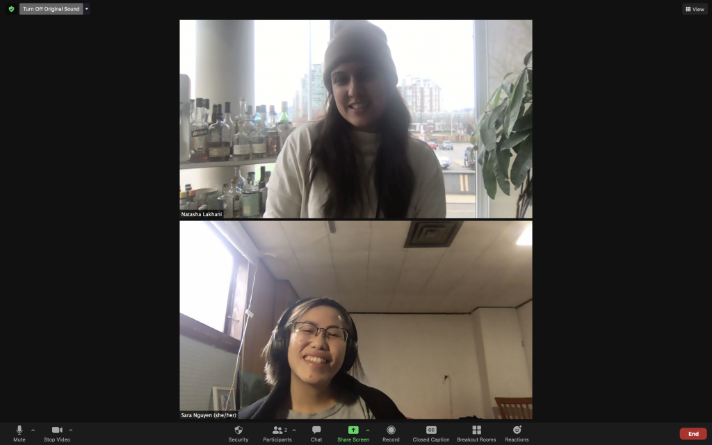
Later, I had a quick chat with Natasha Lakhani, the Production director! We mostly chatted about 123w and what’s it like working there from both our sides. It seemed like a pretty busy week for most people, so I didn’t get to ask too many questions.
Natasha is a master at creating her own fancy cocktails with the stacked cart behind her.
Day 14:
I mostly helped with odd tasks for the other CDs today while working on my ongoing projects. Tim show me the large brand identity project he was working on with Mo, and it was super amazing seeing the brand development and strategy behind the creative. The deck must have been 100+ pages long, covering everything from the logo to improved photography style to different promotional applications and brand extension guidelines. Sadly, our talk was short because I needed to jump into another call, but I hope to help out with that project in the future.
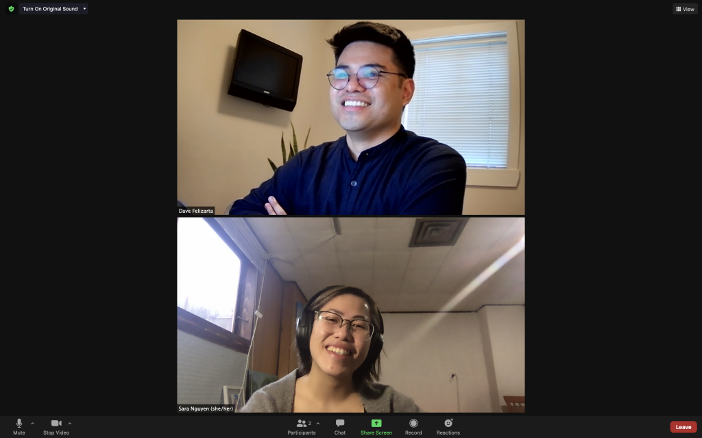
In the afternoon, I took a break and chatted with an accounts person, David Felizarta, about the company and his different experiences working in a big versus small agency. He mentioned there are both pros and cons about each side, so it depends on your work style. Also, his connections have been a huge asset on his career journey. Most of his jobs have been gotten through another person.
Apparently it’s a 123w mysterious whether or not that TV behind him actually works.
Day 15:
I had a quick chat with Pierre Chan in the morning about some work. He gave me great advice on how to show the various options to clients without overwhelming them through a slide deck. Pierre also gave me a (much-needed) push to make the most of my practicum aside from doing the small odd jobs. As a result, in my weekly check-in with John, I brought up attempting a personal project to work on while at 123w.
The push I needed. (Thanks, Pierre, if you ever read this.)
We decided on a fictional brand, and packaging design with an advertising campaign would be good. I’ve wanted to showcase my culture and style in my work, so I’m leaning towards creating mooncake packaging and brand identity. It will be a fun mentoring experience going through the 123w project development process!
I can feel my creative spark lit up again! John sounded pretty stoked about it too.
John’s work tip: when doing ad campaigns, always account for the layout and sketch it out precisely. It’s expensive to do the shoot and then realize that there is no room for the text afterward. You most likely won’t have the money to redo it.
Like every other week, I ended the day with Friday with virtual drinks, but it must have been a busy week for people since only 2-3 other accounts people were there.
We started with our weekly status check-in with the entire team, and for the rest of the day, I continued to work on the social media animations from last week. Trying to find art style references, finding illustrators, and refining the ideas. Incredibly, I might be able to hire illustrators I find and recommend!
Day 7:
My morning started with a 1:1 chat with Eric Seymour and heard about her design journey, too 123w. After, he brought me on board to do some concept sketches for an ad campaign he and his partner, Pierre Chan, is working on. I got to sit in their call as they spitballed ideas. I didn’t have much to contribute to the discussion, but it was cool seeing how fast CDs ideate.
In the afternoon, I had a 1:1 chat with Mo. Sadly, for all my calls today, I forgot to take screenshots after. But I had a great time hearing about what Moreen (Mo) Bofill is doing at 123w as a new partner, how quickly the team is expanding, and a bit of how she deals with imposter syndrome. It’s comforting to know that every creative will always have moments of self-doubt, even after years of experience! I even got to discuss my portfolio with her and got some tips on presenting my work. If you can’t explain your project in one sentence, you don’t know your concept well enough.
And finally, the day ended off with a regroup with John on the social media animations. We went through the refined ideas and chosen art directions. Everything was pretty solid, and I just had some quick refinements to my presentation and a couple of ideas. I might get to present these to Rob Sweetman later this week—exciting!
Day 8:
I spent my morning finishing up the sketches I started yesterday for Eric and Pierre and worked on the social media animation presentation fixes. Everything is looking pretty good. Later in the afternoon, John briefed me for the next phase in the alcohol TV ad from last week. It’ll be nice being able to take a break from projects to reference source again!
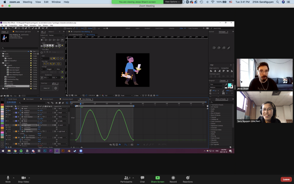
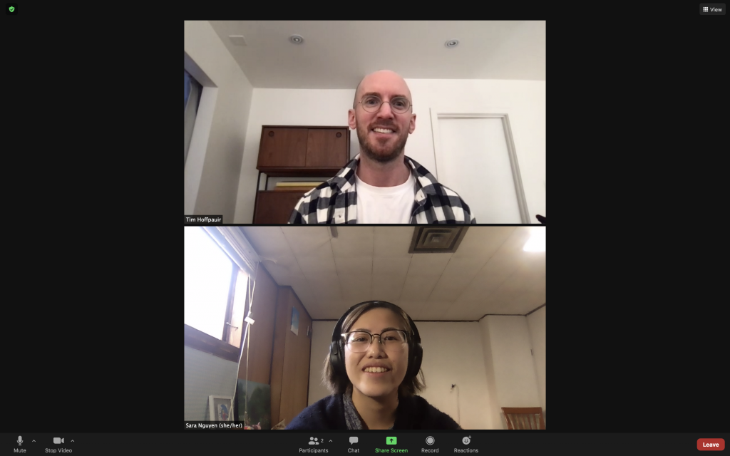
At the end of the day, I got to chat with Tim Hoffpauir, a workshop teacher at IDEA! I had a fun time chatting about projects, the design industry, and how meditating layouting type can be after tons of project concepting (like the InDesign type nerds we are). Hopefully, we get to work on a project together soon!
Luckily, I finally remembered to take a screenshot of my call!
Thanks for your time, Tim!
Day 9:
Eric brought me onto a beer packing project today! So far, I’ve been tasked to do the base layouts for their new 12-pack box and cans. It’s pretty interesting working to a real 12-pack box template and working around what is possible and not possible to do in terms of designs. The draft layouts are due tomorrow; luckily this is just a brand extension, so I’m not building anything out of scratch, just testing new configurations with previous assets.
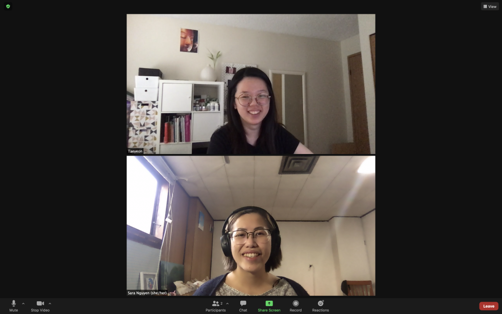
Aside from switching between old projects, I took some time in the afternoon to talk to previous IDEA grad, Taeyeon Kim! She was lovely, and we connected over IDEA. My biggest takeaways from our convo were that it’s essential to have a concept, always keep your progress sketches to show, and ask for portfolio reviews (especially if you’re a new grad)!!
Taeyeon fixed her camera angle for this shot. Thanks for your time and for the photo!
Day 10:
I met with Rob Sweetman and John today to present the animation concepts. It went well, and Rob had great feedback on improving the concepts to make them more cohesive and concise. I’m excited to fix the concepts further and potentially move onto the next phase sometime next week.
Say hi to my mentor John! I finally remembered to take a photo with him today during our check-in, haha.
I also got brought into a website project to do some Quality Assurance (QA) in the afternoon. It’s interesting to see how 123w works on their digital website projects and use different tools like Trello, Invision, etc., to collaborate. I didn’t know Trello could be used as a task manager as well!
I handed in the beer layouts and ended my Friday with some virtual drinks with the 123w team.
My first day was easygoing overall! The 123w group has a great atmosphere that makes me feel welcome. We start Mondays off with a group meeting to go over what everyone will be working on for the week. In the call, the team felt bigger than I expected, but partly because I’m used to only seeing 19 people in Zoom for class.
Afterward, I got briefed on a few projects, and I am set for the rest of the week! One involves ideating social media animations, another is finding art direction photo examples for an alcohol TV advertisement, and the last one is updating the photos on a client’s website. It sounds like a lot of art direction and photo sourcing for this week,
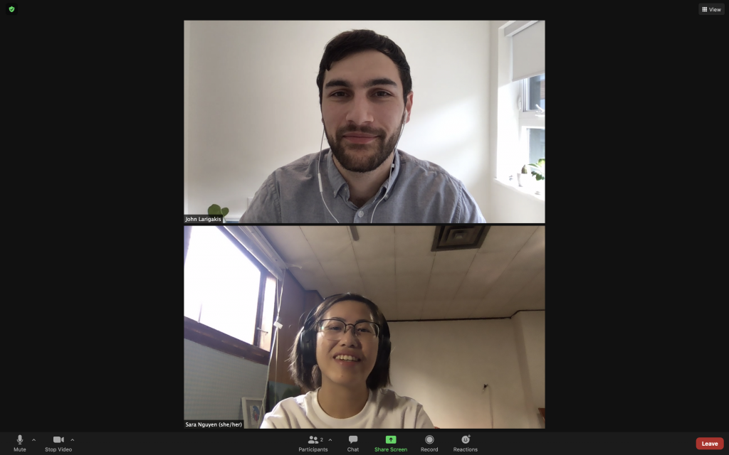
Previous IDEA alumni John Larigakis (IDEA Grad 2010) is my support mentor, and I’m working on a project with Kim Ridgewell (IDEA Grad 2007). IDEA represents, woohoo!
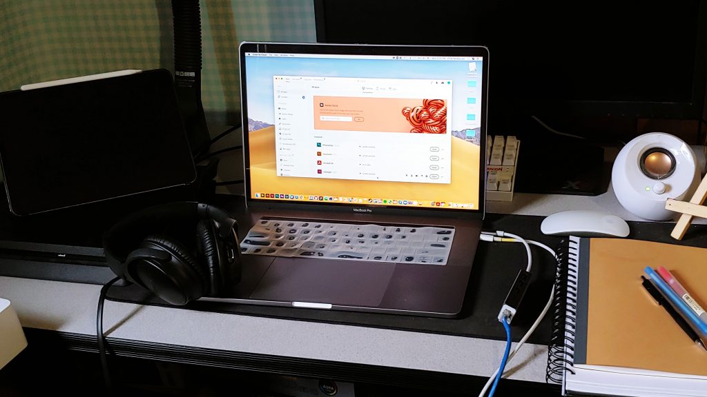
My current work set up.
Day 2:
Today felt slower because there were no meetings, but it was a nice day full of ideation, image sourcing and focused work time. It’s been a while since I last brainstormed for abstract prompts, but I’m hoping to get at least 50 ideas out before my critque session. I realized it’s super important to set time limits when working at home. Holding 30–45 minute sprints have been helping me keep track of my time and remind me to take breaks.
Side note: I introduced myself via email this morning to the entire group and attached this GIF I made before. I found out there is a fellow cheesecake enthusiast in the group and some gamers.
Warning: Video may trigger epilepsy and there’s a long break after 8 seconds so people don’t get headaches when the video loops.
Day 3:
I’m just continuing the day where I left off yesterday. I’m starting to hit a wall in ideation and I’m unsure if I’m finding good enough photos for image references. Nevertheless, I am glad I was just thrown in the deep with the projects; now I can see how I float. And it’s a total coincidence, but image sourcing for reference photos is probably one of my least practiced skills, so it’s great I can work on it.
Another side note: I finally figured out how to join the 123w Strava club. They do monthly physical activity challenges and reward gift cards to the most active people. Glad to see teams are staying healthy together while working remotely. Now I’m more motivated to take walks after sitting at a desk all day!
Night walk photos
Day 4:
Big relief to get through my first critique session with my mentor for my animation brainstorm. I was worried I wouldn’t have enough ideas but it sounds like my ideas were good. The next step is to polish my top ideas, decide on the art styles for each idea, and make detailed descriptions of how the animation will play out.
One thing I’m still uncertain about is how to improve the website photography for my third project. The brief sounded vague, so I spent quite a bit of time yesterday trying to understand the client’s current website and branding and how to mesh it with their request. I got a better grasp of how to go about the project after asking some questions today, but I’m still steeling myself for tomorrow’s critique session.
Yes, I’m still alive and kicking!
Day 5:
Friday started a little rocky with a rescheduled meeting and a missed call, but overall it was a lovely Friday, chatting with different people. I had a check-in and a little mentorship session with John in the morning. We went over my portfolio and had talked about his journey after graduating.
In the afternoon, I had a regroup for the website project I was uncertain about. I expected the worst, but Kim said it was a good start to the project. Unfortunately, we couldn’t meet up earlier, but I did as much as I could by Friday and handed it off to her to finish since it was due at the end of the day. I’m excited to see where Kim takes the project. I definitely think seeing the final presentation will teach me how to go about future art direction projects like these. If anything, this will become a good learning experience to see how to handle vague client briefs.
I ended my first Friday at 123w with virtual drinks with some people from the team (and sushi for myself!)—a beautiful wrap-up to the week.
Celebrating the end of the first week with some delicious take out!
With the growing presence of technology in our age and the way it is continuously evolving to fill all our basic needs, the question of what’s the difference between working traditionally versus working digitally is always on our minds. Some believe there is not much of a difference, but I believe there is a huge difference based on my own personal experience.
I have used my computer and other technology to do things such as take notes in class, write essays, journal and process thoughts, sketch ideas, and draw. I find when I type or draw digitally, there is always this unconscious fixation to write and be perfect in what I’m doing. Especially with the convenience of undo and redo, I always find myself trying to perfect my lines and my words. I believe this hinders me in reaching my greatest creative potential and tapping into my unfiltered self.
When I look at the greatest European master painters of all time, such as Rembrandt, they have only ever gotten messier and freer in their art as they aged. They might have started out drawing and painting very precisely to get all the structure and details and forms correctly, but afterwards, they strayed from that and tried to tap into the liveliness that embodied what they were capturing. They tried to capture all the senses into their art form. What I find is that in this generation of children, we have a tendency to be perfect and we are actually lacking the originality and imperfection that comes with experiencing and embracing our mistakes. Sometimes when we stunt our creativity and prevent ourselves to explore and think laterally enough before thinking vertically/critically. I believe that technology amplifies this tendency we have as children of the digital era.
As I use my computer to takes notes in class, I always find myself hitting the backspace button and trying to perfectly record everything that the professor is saying. However, that isn’t the point of note-taking. I am supposed to be writing down a condensed version what I am hearing and thus interpreting and shortening what I am hearing into note form. I believe this is a skill that must be built and a skill that technology has overshadowed. When I am writing by hand or taking notes by hand, I may not be as clean or as quick as I can be when I type, but I find myself being able to pay greater attention to the professor’s lecture and actually focusing in on capturing the essence of what they are saying. I believe that there is a different part of our brain that is accessed when we are typing or drawing digitally compared to doing this hands-on, and it is evident in the difference in words and especially in the way we draw.
When I sketch online on the iPad or using a tablet, I automatically draw neater and in a way that I can visually understand what I am seeing. Usually, this isn’t even something I think as much when I sketch in my sketchbook. My focus when I draw is to get my ideas out and put pen to paper so that I can visually capture what I am seeing or imagining in my mind. I think this desire is the same when I draw digitally, but there is something that is lost, an aspect of originality or spontaneity when drawn digitally because of the constraints and cleanliness that comes from the clean white blank screen with the tablet pen. Technology will always try to improve and upgrade the pen pressure sensitivity and brushes to mimic real-life mediums, but moving through real space to grab and hold your tools and feeling the pressure change as you use your whole body to move can never be fully captured through technology’s space limitations.
However, I must commend technology for everything that I put it down for. Technology has opened many doors in writing and art to precision, time-convenience, cost-efficiency, and many techniques that could not be available through working solely hands-on. From copying and pasting to word counting and editing, working digitally has given people the means to save time, money, and supplies by being able to fix their mistakes and going back to refine their work. Art techniques like linocut and screen printings can be mimicked through digital technology so artists are saved the extensive and costly process. Also, simple things like resizing heads to proper proportions through Photoshopping, or inserting words that you missed out as you wrote our your thoughts can save someone the trouble of going back and cleaning up their work. Some may say that that is part of the beauty of working by hand and it builds your skills by redrawing and rewriting the same thing over again, but in our fast-paced period of time, we do not have the time to spare on fixes minor details either.
All-in-all, I do find that there is a difference in working digitally versus hands-on and this difference can be seen in my sketches and work. Though I recognize and acknowledge all that technology has done for me, I know there is nothing like working and creating something organically through hands-on mediums and techniques. No technology can truly imitate and replace reality and handmade work. As an artist, I prefer working hands-on and though I would never restrict anyone from working digitally, I would highly encourage and even advocate working hands-on before working digitally. I would recommend working with physical mediums and on real paper to draw or write notes freely with any of the structure that comes from working digitally in order to experience and express the full extent of their creativity.
Here are some written out thoughts I was going to include into the introductory paragraph of my final essay project. These are not completely connected yet and can transition from thought-to-thought rather abruptly.
…
With over twenty-five years dedicated to his craft of comic books and illustrations, Adrian Tomine brings storytelling to a whole new level of empathy through his minimalistic drawings and subtlety details.
Tomine has a knack of using subtle hints and changes within the environment he draws to build context and his characters.
Adrian Tomine is most known for his published works, Optic Nerve, Shortcomings, and Killing and Dying, and his illustrations in the New York Times.
His voice in his storytelling hits a huge audience the same way the American writer and poet Raymond Carver resonates with people. Carver was known to reflect and write to a greater audience. Raymond Carver used dirty-realism to capture the heartbreaking reality that middle-class people faced in their everyday lives—something that Adrian Tomine utilizes very clearly.
In the book, there is a sense of universality by the way Tomine draws with his simplified, iconic drawings, but also through the voice and realistic themes that border on dark. He is able to capture the modern, everyday American very clearly, including all the thoughts, personal struggles, and joy.
Even in contemporary times, we as a society struggle with understanding the concept that comic books can be used as a medium to tell stories just as hard-hitting as any other novel—that comics are not just for kids.
Adrian Tomine is at the forefront of contemporary comic books, and Killing and Dying is the epitome of fiction to the new era.
Additive combination – when words or images are used to strengthen the meaning or explain the other. They basically show the same sort of idea unlike interdependent combination and build upon each other.
Amplification through Simplification – is what cartooning is essentially. Pictures can be put on a scale from complex – simple, realistic – iconic. By stripping an image down to the specific details and bare bones of the image, an artist can amplify the meaning by making the reader focus in on the important aspects and meaning of the drawn forms instead of the details. It opens the door to more relatability for the reader and universality in the imagery because the defining details are not present, thus making it easier to insert our own thoughts, conceptions, and even our own selves into the images.
Bleeding – When a panel runs off the page instead of being enclosed and contained within borders. The image can set a mood and give a sense of timelessness as time escapes the borders into space. This technique is commonly used in Japanese manga and Western comics are beginning to adopt it as well.
Closure – the grammar of comics and something we do unconsciously every day. When we see parts only parts of a whole through our senses, our mind mentally connects the pieces together to perceive the entire whole. Believing in this perception is an act of faith.
Comics – “Juxtaposed pictorial and other images in deliberate sequence, intending to convey information and/or to produce an aesthetic response in the viewer.” A.K.A. sequential art.
Gutter – the space that separates each panel in a comic. It represents both time and space in comics between the two images and where we assume something happens there that is not drawn. Combined with closure, we are able to connect the two different images aside one another and transform them into a single idea or storyline.
Icon – an image that is used to represent a person, place, thing, or idea. There are different categories of icons such as symbols, icons of language/science/communication, and pictures. Within pictures, they can range from being very photo realistic to simplified and abstracted versions of reality, meaning some icons are more “iconic” than others.
Interdependent – when words and pictures go hand in hand to convey an idea. They are two separate ideas that play off each other and could not work or be as strong as they are when put together compared to when they are seen separately.
Mono-sensory medium – a medium that only uses one sense to create an experience. Comics solely uses imagery to convey information visually for readers to experience the story’s world, including sounds.
Montage – when words have been treated as part of the picture, and can even be integrated/woven into the imagery or vice versa.
Non-sequitur – a panel-to-panel transition within a comic that has no logical relationships between the panels.
Pictorial – images having a resemblance to the subjects they are representing. Their meanings are more fluid and ever changing depending on the appearance of the picture compared to non-pictorial icons.
Synaesthetics – the idea of uniting all senses, specifically by using uniting the art forms which appeal to the different senses. Within comics, lines hold expressive potential depending on how it is drawn, what it is drawn in, and the direction it is drawn, thus, giving the art form emotions and other senses. For example, wavy lines and flies around a garbage can visually convey the garbage’s rotten smell.
Zip ribbon – the motion line within comics to show the path of movement of objects through space. These lines have become more refined and stylized over the years and have been used to create drama in action, especially in American comics. The background or the subject can be streaked into motion lines depending on the desired viewpoint the author wants the viewer to see.