Cross-Platform Design – GDC + Students: Shapers Conference

Background & Challenge:

The GDC (Graphic Designers of Canada) is a national member-based organization that connects professionals, educators, and students within the design & communication arts field in Canada. With the project, we worked with GDC as our client to address their current issue with the lack of student memberships given out per year and student engagement with the GDC as a whole. GDC offers a lot of value to their members but struggles in communicating this to the students. As a class, we wanted student across Canada, but especially the student members, to understand the benefits of GDC, thus, increasing student membership and engagement.

Insights & Strategy:

Our group focused specifically on the lack of the students’ lack of GDC events for students to participate in and see the benefits that come from being apart of GDC. We leveraged the fact that students value networking, portfolio reviews, and the appeal of mentorships the most. Mentorships are a great asset of being apart of GDC as a student member because they provide students the industry connections and insights of how to be a professional designer. However, students lack awareness of the GDC’s program, on top of their lack of 1:1 time with mentors. We also found out during our research process that students are put off by the heavy usage of the GDC red brand colour because it looks aggressive. Knowing this, my group consisting of Sharleen Ramos, Rachel Wong, and I, create a national annual student conference to add to the national calendar of GDC student events.

Goal:

The annual Shapers conference’s goal will promote and expose all communication design students to the GDC mentorship program and provide a taste of what mentorships could entail. After this experience, students are more likely to sign up for the full-time program with GDC.

Solution:

Shapers is an annual, 1-day virtual meetup with talks from speakers in GDC’s 9 Chapters that will be live-streamed across Canada and connect students with mentors. The speakers and the mentors who will provide feedback on portfolio reviews at the conference will share tips and stories on how to be a professional designer. There will be personalized Q&A’s at the end of each session and the interactivity and takeaways will attract students to participate in the event. Students will be able to gain insights from top designers across Canada that they would not normally be able to connect to.

Shapers Conference logo

Another reason for creating a live-stream conference event is so that all 9 GDC Chapters can connect at a nationally level which will appeal to student. It will be assessable to students who are not able to make it in person and the talks will be archivable online which can draw in online presence and traffic. There will be a series of talks from each chapters and each speaker will each come from a different creative profession: creative director (branding and design), freelance designer, illustrator, content strategist, web designer, UX designer, and such. These talks could be about their work, their work schedule, how to freelance, their personal experiences and what they have learned along the way. The portfolio reviews will take place after the talk series and will last 1 hour with 15 minutes sessions. They will be reviewed by a group of GDC mentors in each GDC Chapter. At the end of the event, there will be a networking dinner as another way to get students and future mentors to connect and sign up for the mentorship program.

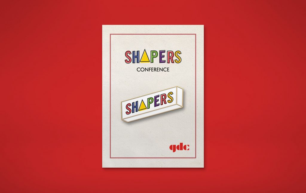
Final Direction and Products:

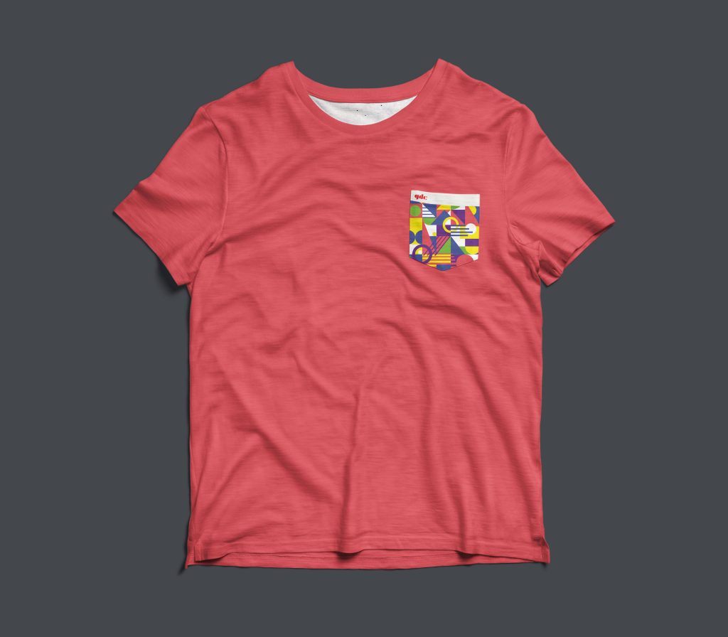
We chose to gear our conference towards a modern, playful direction by using geometric patterning and shapes in combination with bold colours to make it eye-catching. We wanted to increase engagement and excitement by bringing in the colours’ energy into our design. However, we had to keep in mind of the professionalism and pre-existing brand of GDC so we could not stray too far from though it is a national event. We made sure to include a lot of white space, especially on the website.

Condensed moodboard

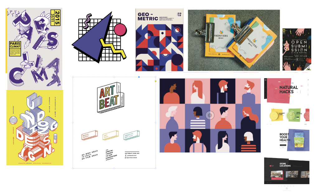
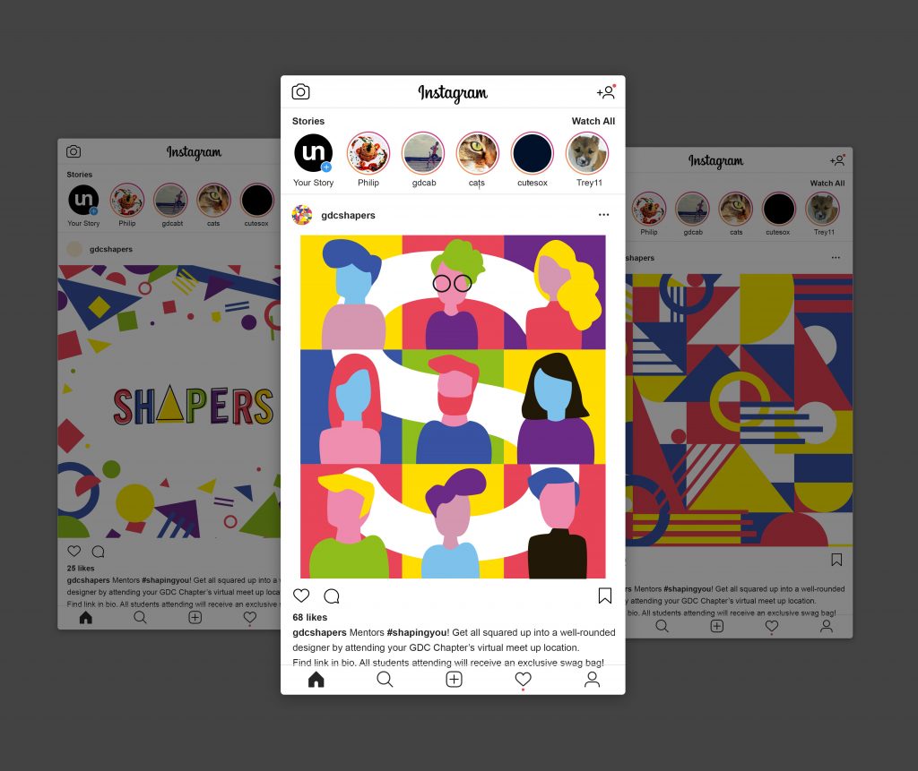
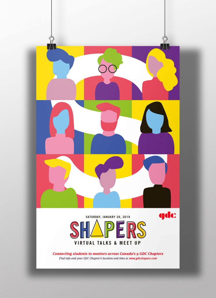
As part of our collateral, we create a poster that depicts the connection of the 9 GDC Chapters between the students that Shapers will provide. There will be badges for mentors and mentees at the conference and each badge design will be specific to each Chapter and the event location’s airport code. The example provided shows the Vancouver skyline with the “YVR” at the top of the card in the ball. At the back of the badge will be a QR code which mentors and mentees can scan at any time during the conference to be led to the GDC mentorship page to sign up for the full-time program. The event will be promoted through Instagram as it is the most effective way to reach younger, tech-savvy audiences such as students. It is also GDC’s main and most active media channel. The post will have fun copy to match the Shapers’ conference identity and end off with the hashtag, #gdcshapers.

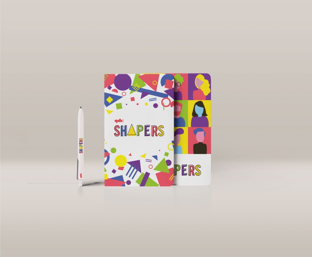
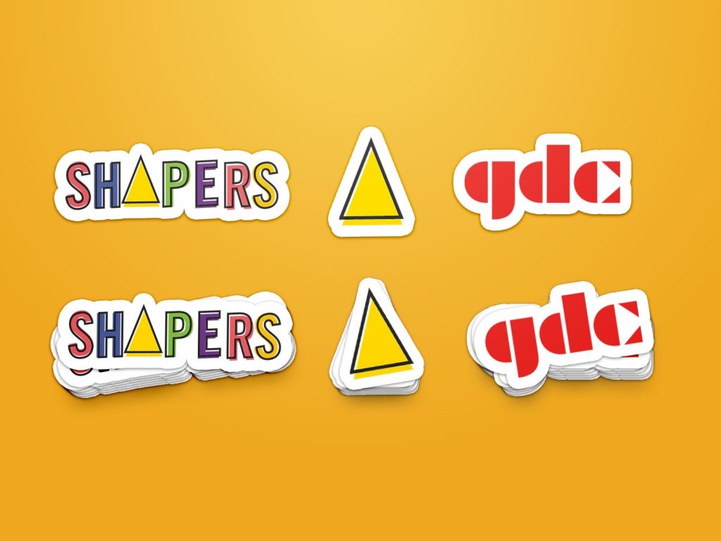
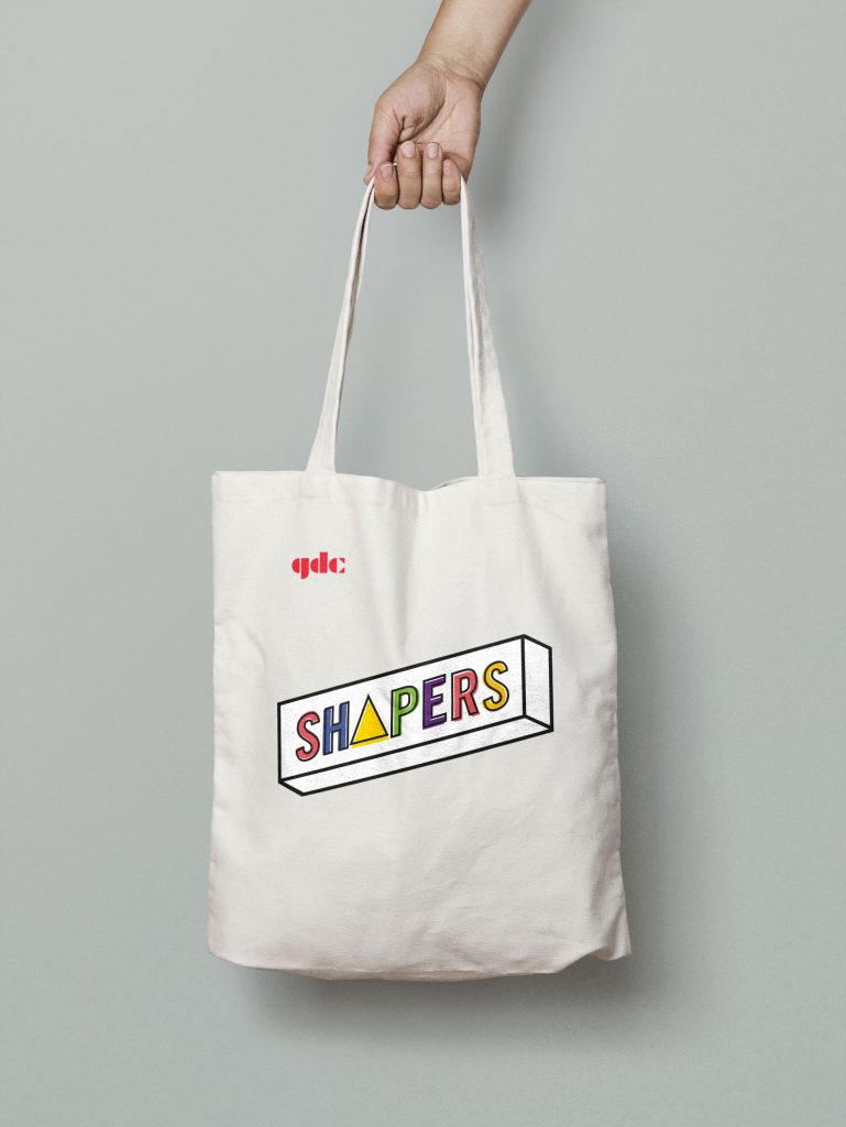
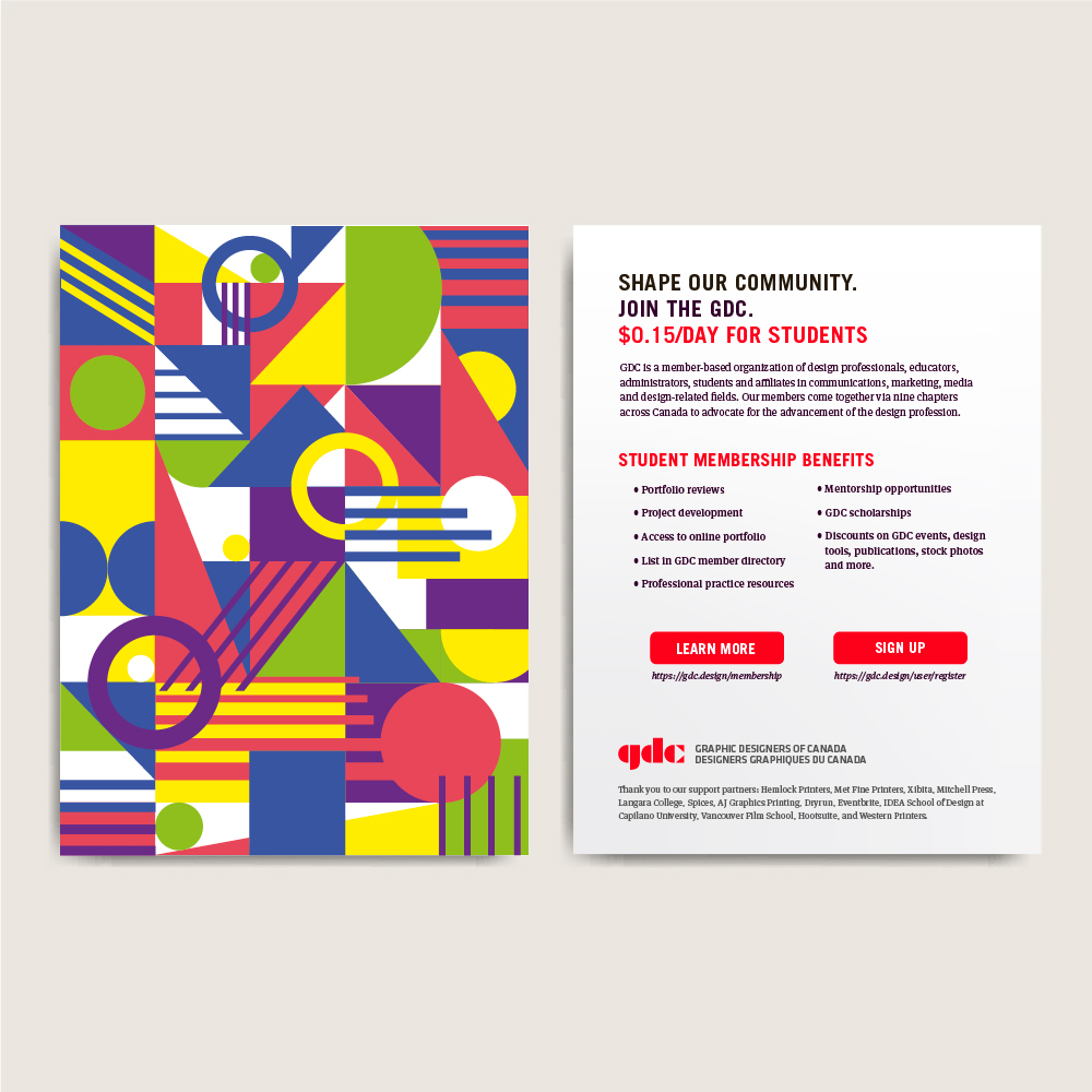
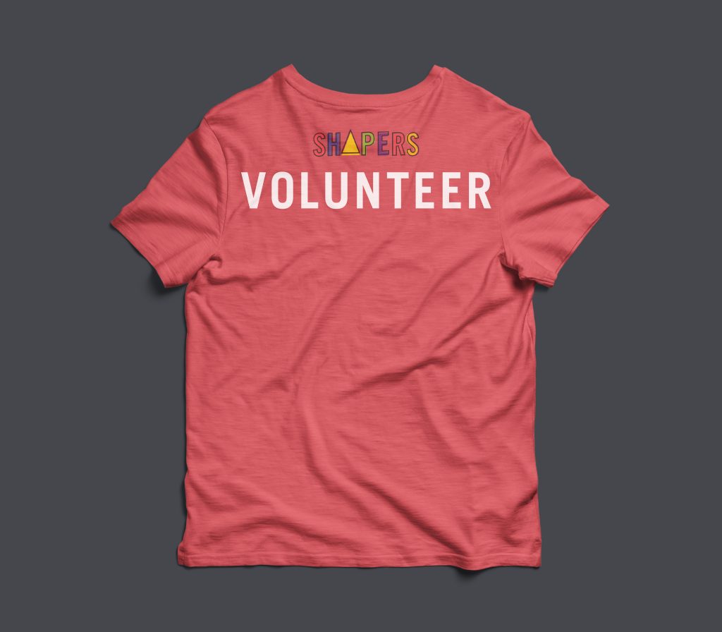
At the conference, each student will be given a special Shaper’s tote bag with stickers, notebooks and pens, an enamel pin, and a postcard that has information on the back about GDC, the benefits of being a GDC student member, and links to learn more or register. The front of the postcard only has an interesting, geometric pattern design on it so it is more likely for students to keep. Next, we designed a T-shirt specifically for volunteers to keep after the conference as a little incentive to help out.

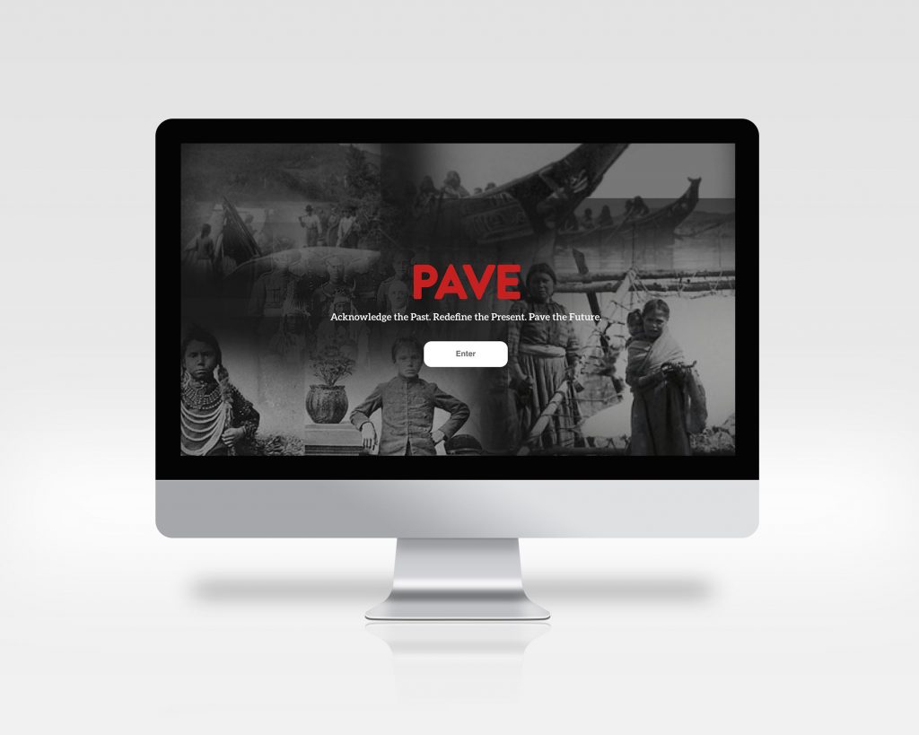
Finally, we designed a website for the event: https://invis.io/7SRFIPGVYQB#/355330903_Desktop_HD

Self-Assessment:

I would give my group a 8.5/10 for our solution, but 10/10 for our teamwork. As a whole, I believe our team did really well in terms of teamwork, group productivity, and communication. We ideated and thought through the strategy, event logistics, design direction as a group through our meetings. Sometimes it was hard to combine our different ideas and different understandings of the problem to create one effective solution. We also have naturally different design styles that we had to combine into a cohesive project and identity, but all in all, we got through it with very few hitches and made it fun. In the group, I worked in doing quite a few of the design elements in the collateral such as the geometric patterns and the layouts and type treatment of the posters and postcards.

Decolonizing IDEA

The goal for my project is to include every Canadian in part of the decolonizing process and to show that colonization and the struggle against it for the Indigenous Peoples persist to this day. I chose to target new immigrants from ages 23-50 which is the usual working age when they come over to Canada.

Canada is a melting pot of culture and many immigrants who come over are interested in connecting with their new community and learning more about their new country. However, most immigrants do not know about Canada’s history involving the Indigenous Peoples. They lack the resources to learn more about the historical context, partly due to the fact most of the resources are only in English and French while many immigrants that come over to Canada do not speak either as their first language.

Pave is an interactive educational microsite about Canadian history, told through the perspective of the Indigenous Peoples. This site will be linked to the Government of Canada’s website so that immigrants who are looking to come to Canada can see and access this resource. The site will be translated into the top seven most common immigrant languages aside from English and French.

The site design keeps a serious, reflect tone while addressing the sensitive historic context and issues. To keep users engaging throughout the historic timeline, interactive elements and more personal stories or stories that have been passed down in a tribe is added within the timeline. The circles that form a path down the timeline are clickable and will flip over and zoom into the screen to reveal more information about the fact/story. The black and white photos on the side change depending where you are on the timeline. The photos fading in and out of the background of the timeline adds another level of movement and interaction to encourage the users to learn more about what is next in the timeline. Adding stories on top of facts on the timeline gives a more realistic and humanistic side to history through the lens of the Indigenous people. 

There is a questions and answers section where three Indigenous elders will answer non-Indigenous peoples’ questions to add another opportunity to understand the issue of Reconciliation. Hearing people’s feelings and first-hand thoughts make the issue feel more real and present to this day. The Q&A section is another way for non-Indigenous people to break their misconceptions and biases towards the Indigenous Peoples.

I would give myself an 8/10. I could not accomplish the extensive research and connect with various Indigenous elders to gather a truthful Indigenous telling of history because of time restrictions. Nonetheless, I believe that this project was an overall success in terms of design in keeping the site engaging enough, but formal enough for a government microsite about history. If possible, I would have liked to create some more interesting features of the site, but realistically speaking, for a site like this to be coded and read in 9 different languages, it would have to be fairly simpler in the design and interactions to be able to accommodate the varying text paragraph lengths.

Sustainability 101 Design Manifesto

Sustainability is becoming a hot topic in the world and amongst the design community. As a young designer, the matter of sustainable design is very complex to me with all the various perspectives and aspects to consider, such as transparency, consumerism, global connectivity, etc.. After going through it all, the ideation process felt as convoluted as the topic, so, I decided to focus on what I believe is the core and purpose of sustainable design: reducing waste.

By taking the idea of reducing waste and combining it with the minimization symbol commonly seen on digital platforms, I emphasized the white space on the page to show that our resources can be reduced when we design smart. After this poster is taken down and finished its purpose, the blank page can be reused as scrap paper.

Another reason I chose to incorporate a digital theme into the poster is because, as a millenial, my life revolves around technology. Being a young designer as well, it’s important to realize that although I always had computers to rely on, going digital isn’t always greener. We need to know when it’s more effective to put our designs digital platforms and when to design for print. And if we print paper, be conscientious with the resources we have.

Originally, I wanted to keep all aspects of the design as eco-friendly as possible by using an ink saving typeface like Courier and kept the poster black and white. However, the typefaces were not blending well and the poster felt like it lacked impact without colour. I realized in the process that although we designers would like to be as eco-friendly as possible, that is simply unrealistic. In the end, we can not sacrifice the entire aesthetic of our designs, though the overall waste should still be accounted for. So I chose the pixel typeface to complement the digital theme and the minimization symbol, and the yellow and black combination is supposed to make people feel the message in the box is a warning like traffic signs.

I would give my solution a 9/10. I did my best to keep my concept consistent through my write up which makes the message more effective. I learned that sometimes simplifying the concept and design gets the message of across much faster. The overall design is appealing and would stand out from other posters which would get potential employers’ attention. However, I realize that my usage of the minimization symbol is not obvious to everybody which would make the pixel typeface choice a little obscure.

Resources

In-Class Essay Response: This is Not a Slum: What the World can learn from Dharavi

This piece is an in-class essay that has been revised for my ENGL 100 Creative Writing class. We were told we had to assess an article we had read before and summarize and respond to it within a time period of three hours. For my essay, I chose to respond to Matias Echanove and Rahul Srivastava’s article, “This is Not a Slum: What the World can learn from Dharavi,” written in 2016. They talk about the importance of a neighbourhood called Dharavi located in Mumbai, India, as well as the dangers the citizens face and what Dharavi can do for the world.


As our world’s human population continues to grow, we have to reexamine our current city models and restructure them. In Matias Echanove and Rahul Srivastava’s article, “This is Not a Slum: What the World can learn from Dharavi,” (2016), we are introduced to one of Mumbai’s “slums”, better known as a “home-grown neighbourhood,” which attract the attention of many tourists every year due to their “enterprising spirit” and “hard-working and skilled labor force” (19-20). The authors describe Dharavi as a highly productive place with dense, mixed-use buildings, and it welcomes people of low-class who are in need of housing and work (20). Due to Dharavi’s loose construction regulations and little to no support from the government, the residents have been given the creative opportunity to design and build their own city buildings when needed, resulting in the work-intensive and efficient mixed-use spaces they have today (22). This city structure is manageable and possible in home-grown neighbourhoods in the world such as Dharavi, but it may be more difficult to recreate it in larger cities such as Vancouver which has different standards of living and social values. Although Sharavi demonstrates an interesting concept of a home-grown neighbourhood by showing cities can be inclusive and productive when utilizing mixed-use spaces creatively, it is not a realistic model to integrate into city models worldwide entirely.

Dharavi’s “slum” status causes misunderstandings by portraying a negative image of dirty, uncultured, and unmodernized neighbourhoods, but it is quite the opposite (20). Echanove and Srivastava’s article mentions city planners who desire to rebuild Dharavi into modern buildings, “but they are not developing it for the people of Dharavi,” but rather, “for the richer class” (22). These city planners argue that Dharavi is a shameful and unstructured neighbourhood with confusing streets filled with factories and shrines, but they do not see the beauty within those highly dense streets (22). The authors emphasize the importance and efficiency of Dharavi’s mixed-use building as they have been the basis of how workers can “produce about $500 million in exports a year,” and despite the lack of infrastructure, their multipurpose public venues can be used for rallies, festivals, and more while cultivating a community-based support system (20-22). Dharavi is a welcoming place not only because of the opportunities that can be found there, but because of the sense of safety and security residents feel while walking down the streets from the tight-knit community atmosphere (21). Only in organic neighbourhood communities such as Dharavi, one with nowhere to go can find comfort.

Echanove and Srivastava discover that the foundation for Dharavi’s city structure is credited to the loose construction regulations. According to Echanove and Srivastava, “residents could make their own homes and design the interiors” (22). Most of these housing developments were created by residence demand, thus creating fewer chances of unused spaces which is the problem with current buildings and businesses nowadays (22-23). The authors realized that through the system put in place and the adaptable structures, residents were able to maximize the  spaces given to them by creating mixed-use buildings which in turn, saves money, time and space. It is undeniable that Dharavi is a highly developed and successful city considering the lack of support given to them.

Despite Dharavi’s success, I do not believe the current economic and social conditions of large cities worldwide match with the city structure of a home-grown neighbourhood. Echanove and Srivastava describes that “the live-work conditions of Dharavi- characterized by what we refer to as the preponderance of the tool house, a variation of the shophouse and home factory found in other parts of Asia,” is a lifestyle that not every person is used to or is able to adjust to (24). Echanove and Srivastava are mistaken when they believe we can adopt the same live-work system because people and their tendencies to switch careers and jobs compared to Dharavi where there majority of the jobs are in factories. Furthermore, larger cities are structured around traveling by vehicles and require order in the way the city is laid out; the chaotic roads of Dharavi would not suit the structure of larger Western city systems. That would only cause disorder and accidents within the cities, and as the authors point out, “it is remarkable how schizophrenic the experience of visiting homes in Dharavi can be” (22). Because of how unplanned the locations of public venues and mixed-use buildings are and how narrow the roads are, it is difficult to navigate yourself through the city. On top of the lack of infrastructure and toilets in the city, residents of larger cities would not be keen on adopting such a city structure. Though I concede that integrating more aspects of home-grown communities into modern city models such as increasing high-density mixed-use spaces as done in some stores and homes in Vancouver such as Brentwood Mall, I still insist that it would be impossible to recreate entire cities of home-grown neighbourhoods like Dharavi worldwide and expect similar successful results.

Even though Dharavi demonstrates an interesting concept of a home-grown neighbourhood and proves that cities can successfully be inclusive while being highly productive when creating their own mixed-use spaces, it would be unrealistic to complete integrate such a model into cities worldwide. Echanove and Srivastava clearly describe the wonderful aspects and the dangers that Dharavi is facing, and it is easy to sympathize and support Dharavi after reading such a passionate article. However, it is still difficult to agree to completely recreate these home-grown neighbourhoods. By focusing on the amazing efficiency, productivity, and culture built in Dharavi, Echanove and Srivastava overlook the deeper problem of realistically applying this city structure into cities worldwide which embody much different economic and social situations. The urban planning’s lack of order and infrastructure- although creative and resourceful- would not be able to merge with the developed lifestyle in certain modernized and popular cities. Nonetheless, there are a few key attributes that can be taken from Dharavi and revised into a logical and adaptable concept catered to our societal values. As our human population continues to grow exponentially, it is essential that we take in all the ideas and successes around us in order to create a more adaptable future.


Photo Source : https://bethanyclarke.co.uk/editorial/stories/slums/