I had taken a look at some examples in Drawn and Quarterly: 25 Years of Contemporary Cartooning, Comics and Graphic Novels. I looked at the range from more serious, realistic and funny cartoonish styles. I wanted to be in the middle but also be conceptual/abstract as I tend to think that way too. I feel that this fits the story I chose with it’s mood and also I can play around with some more abstract image.
The narrowed down examples I show have minimal colour and are subdued as I decided my comic be that or just black and white. Ive arranged the one below from realistic to abstract and my comic is more closer to the 3rd and 4th examples. As you see from my last characters blog, I sketched out the abstract style for the characters.
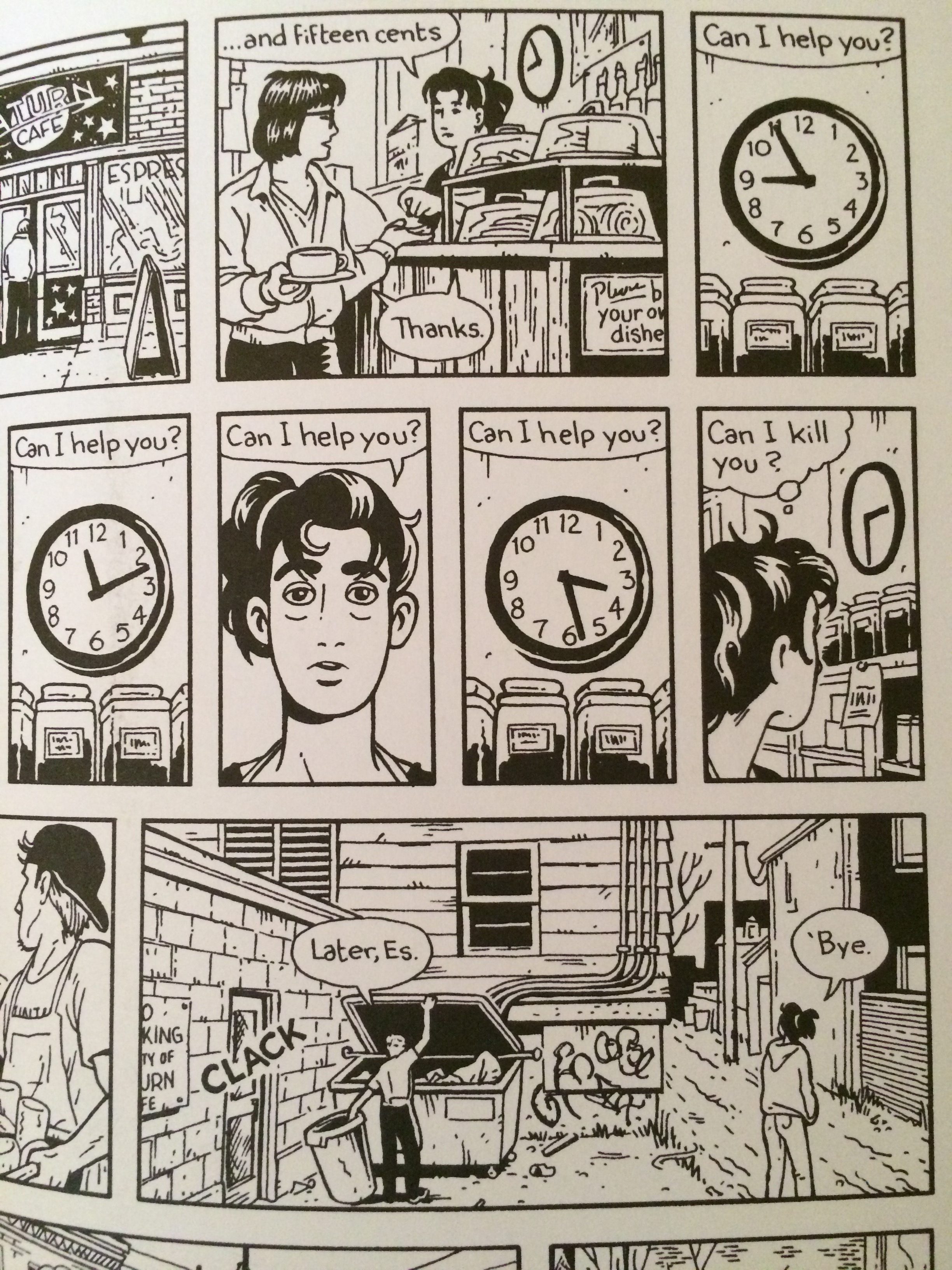
- Jason Lutes – Jar of Fools. This is the most “realistic” I could go but I think the characters faces are too realistic. I like how the background scenes in this are sometimes depicted or sometimes just give an indication.
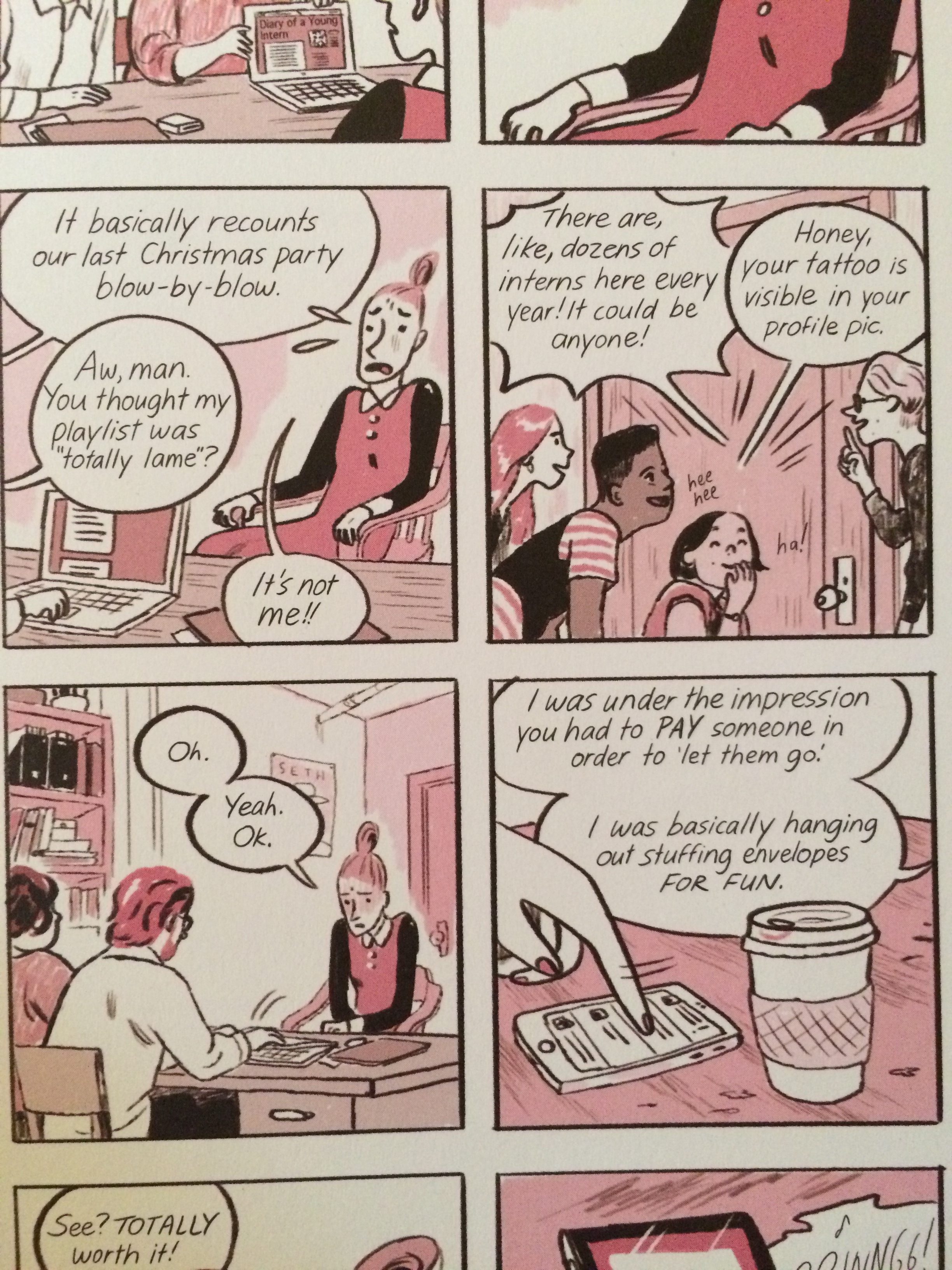
2. Jillian Tamaki – Tru Bunny. I like the spot colouring/various shades of red in this example. Also the comedic facial expressions are cute and effective.
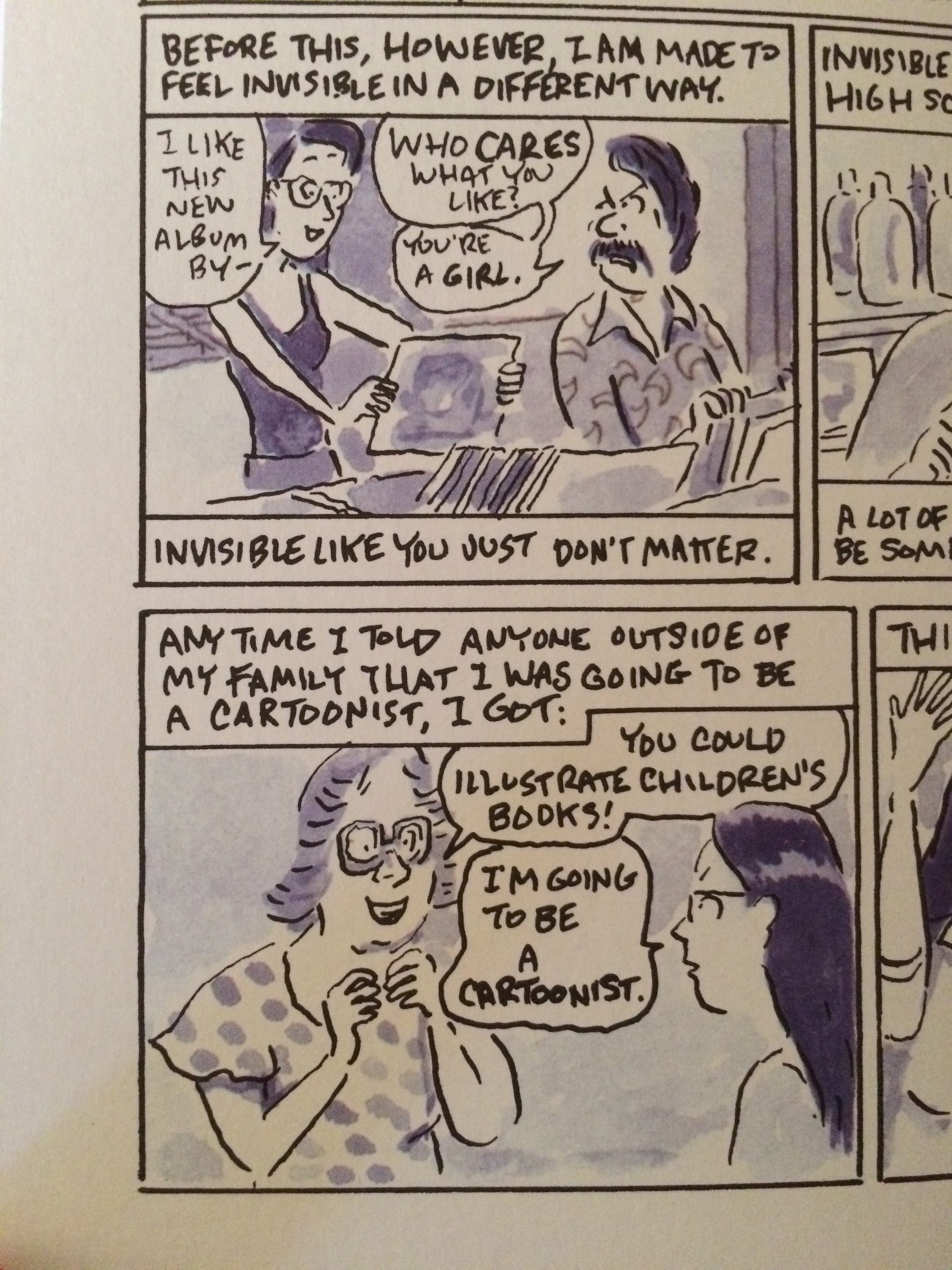
3. Mimi Pond – ?. This reminds me of Lynda Barry’s style and I will be doing the text structure like this. The people and the backgrounds are getting more cartoony. I also like the tones of this.
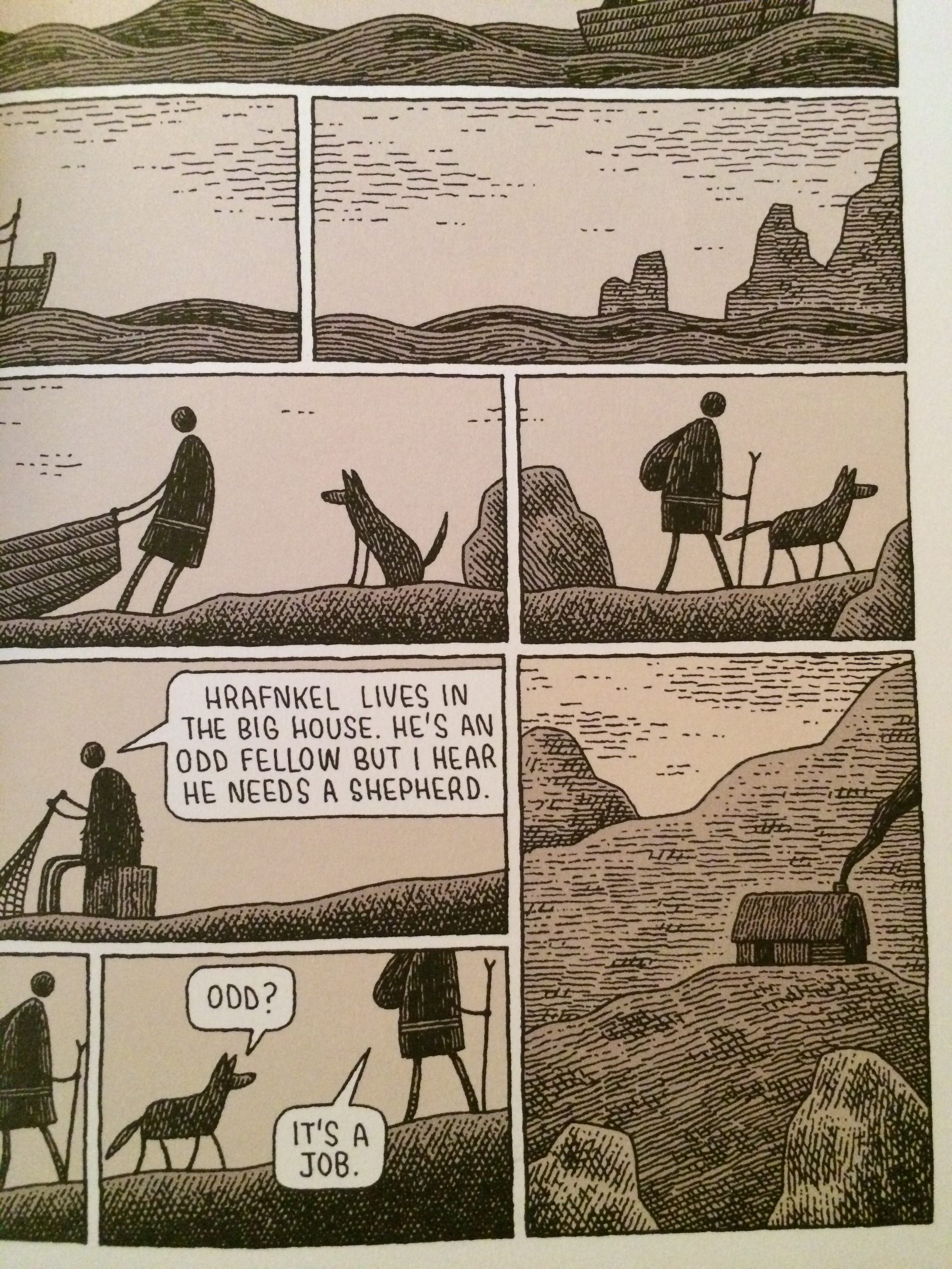
4. Tom Gauld – Freyfaxi. I really like Tom’s style, subdued tones and abstract figures. I will be using more abstract figures for the zoomed out scenes of the comic.
Leave a Reply