Your Pen is Mighty Rationale
We were tasked to write a vision for my career through a personal manifesto in poster format. It has to show our understanding of sustainable design, how we may use it and show our design and communication skills to future industry employers.
My approach for this project was to tackle it in stages to capture the evolution of ideas and understanding. I chose the concept that connected with me personally. The concept of “Your Pen Is Mighty”, represented my own personal connection to nature, being a steward and how the work of a designer makes an impact. I was struck by the keywords of connection, stewardship, agents of change, influencer and awareness.
In the process, I came up with two main concepts and further refined the top concept with further sketches. The stages in the process of this project are below with pictures:
- Brainstorming from lecture and tasked design manifesto
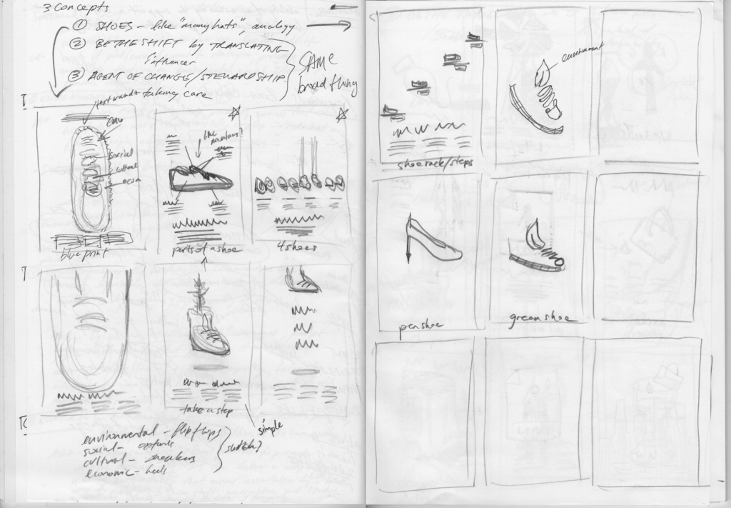
- Initial sketches and text from the first idea that came to mind: Shoes/tracks as a metaphor.
- Sketches for the concept of design as a connection to nature.
- Idea refinement by reviewing design manifesto examples and finalizing the idea and top sketches.
- Digital drafts and refinements.
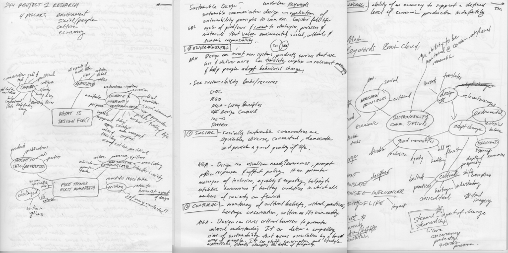


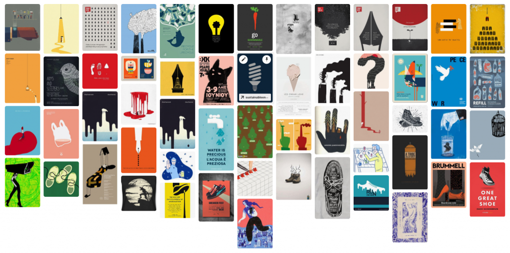
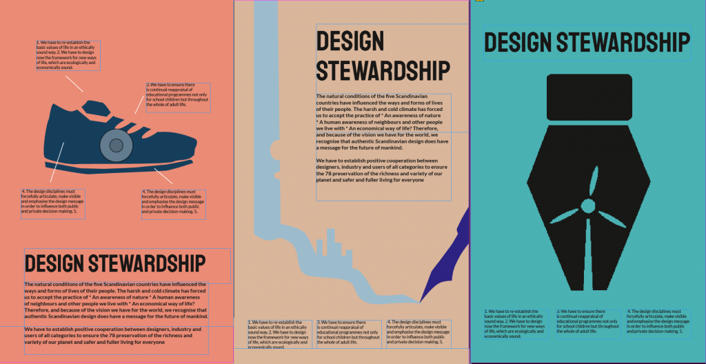

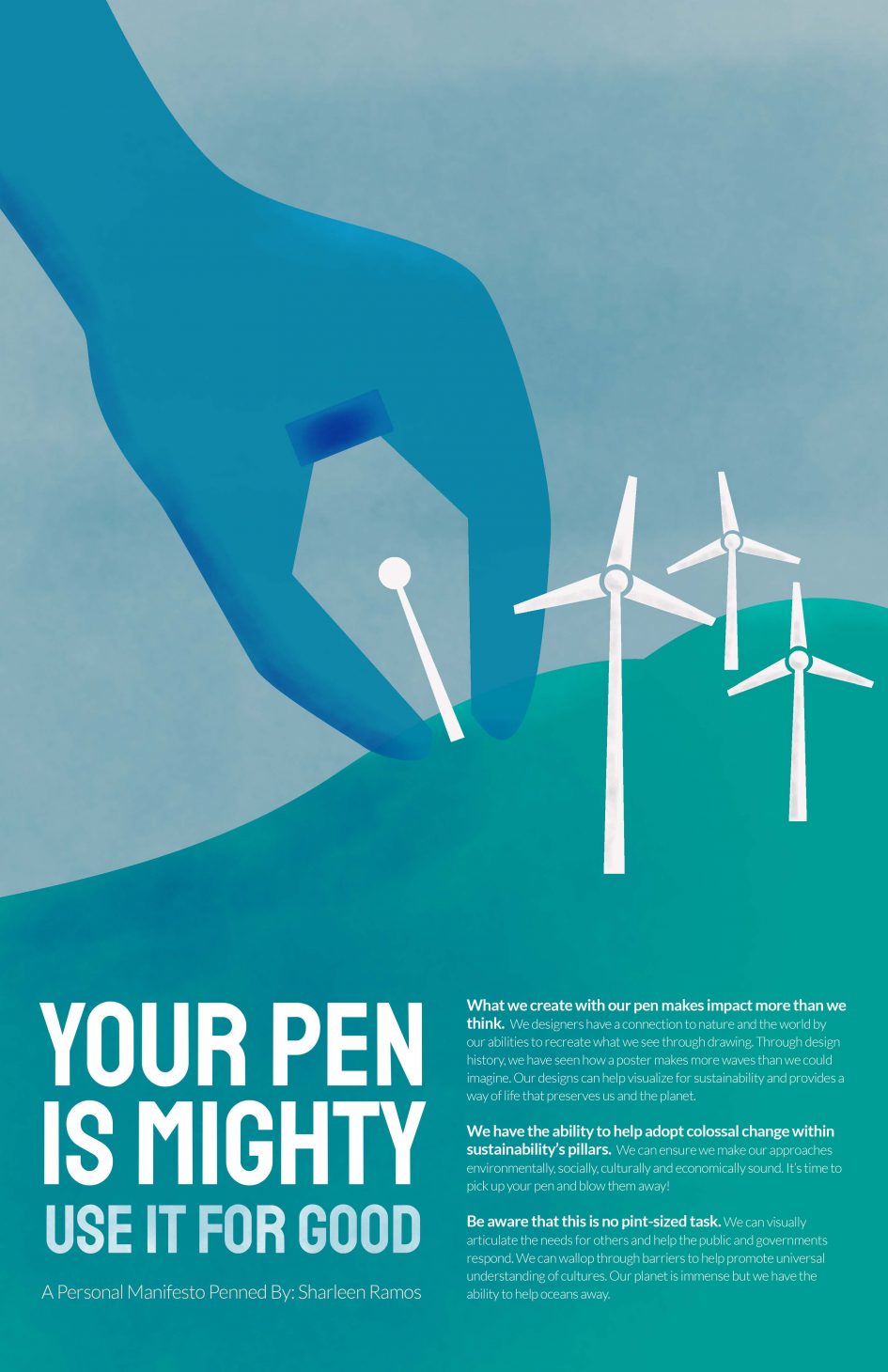
Through the research process, I discovered the keywords, design concept and approach that resonated with me. From the sketches, I narrowed my focus to the symbol of a digital pen with symbols of sustainability. I was drawn to the manifestos that used design icons (eg. Designers Against Monoculture – wrench) and our own awareness about nature into the design (eg. Scandinavian manifesto). I chose the type Staatliches, paired with Lato to give a clean-cut and serious but friendly tone. The style was influenced by Noma Bar and Saul Bass because their graphics are effective and conceptual.
I chose this concept as I wanted to show that our designs (the pen) can have a big (mighty) impact to sustainability. We can be a steward and agent of change. This is due to our ability as artists to help interpret the world and nature with our skill of drawing. This graphic conceptual poster helps people think about the message and see the visual wit. This connects design (pen) with sustainability (wind turbine). The text also mentions “big” words to help connect the image to text.


Grading comments: I think the solution is effective but the challenge was to ensure the graphic was clear enough as the first draft was unclear to some. What I did well was making decisions throughout the project to help narrow down my concept. I’ve spent more time refining an idea more than I had before. I personally felt strong about my message. I also tried to do the digital examples early which helped me decide the final topic. I would take forward this experimentation but would also try to come up with more ideas and ask for more feedback to ensure the message was executed. Self Grade: 8.5
Leave a Reply