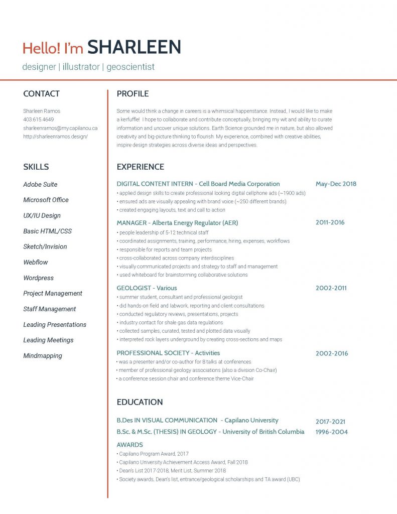
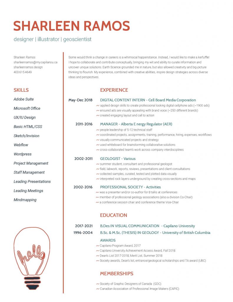
In this project, we were asked to create a letter-sized resume for applying for internships or summer jobs. We were asked to pick a potential employer to get a better sense of our audience, the employer.
I firstly chose Carter Hales as the design company. They do branding, packaging, websites, and environments. Some keywords that I jotted for the company are: inspired, illuminate, translate, strategic-thinking, interdisciplinary, and opensource thinking.
As I had another career and a wordy and technical 2-page resume, I had to distill the information. I chose a chronological resume format and decided to try for a clean layout and focus on the hierarchy (no logo/images). I wanted to show some wit in the USP text and also bring out any creative and strategic tasks I did my previous work. I reviewed past student resumes and chose a few formats to start with and edited with my content. I also removed any information that was the least relevant and took away from any extra white space (eg. memberships, hobbies and other jobs).
I ended up deciding on a three column design (contact/skills, main content, dates) and bullet point listed the information. I chose a blue-green/orange-red colour pastel scheme and a Cabin/Roboto type pairings for a friendly/open but clean and professional look. Because I like to use witty copy in some of my assignments and I am playful, I gave that tone in the profile paragraph.
I would give myself an 8. Below are both the original and revised copy, post critique. At first, it was a task to reduce the content as I was used to technical resumes, but I am pleased with the results. I wanted to make sure I captured what I did creatively in past work that would match what Carter Hales or any design company would find appealing. I could see putting the resume down and revisiting it later helped me further edit it. So I’m comfortable taking resume forward, looking at adding design in the next round and incorporating the feedback!


Leave a Reply