This project was entertaining and engaging because it was combining so much in so small, such as eight pages of visual information in just a tiny 8.5 x 11 paper. Moreover, it was helpful for me because I learned more about the specific typeface I choose, which was Futura. I learned on a deeper level about its history, development, and use in our modern days. Also, besides a better understanding of the specific typeface, I learned how to make a small book with just a small piece of paper.
To give me a mark, I think I will put eight of the ten because I always think that I could make it better.
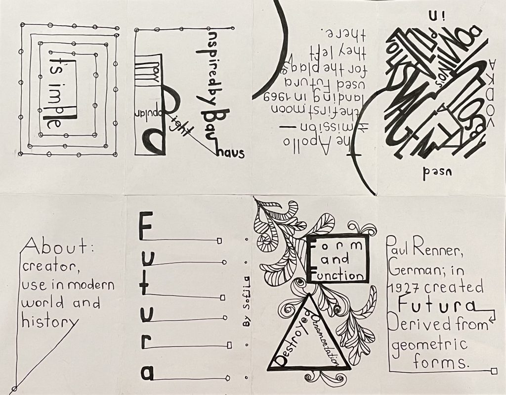
The actual process of making took me approximately four hours, it is including the research and making parts. The whole design I did in simple, black and white colors to reflect the stylistic idea behind the chosen typeface. Again, the visual part of the work is minimalistic and it combines forms, lines, dots with the Futura font, excluding colors and another visual weight that was believed by its creator to be unnecessary. In simple words (maybe not so), it was “utopia by design”.
Also, I want to include the amazing source where I mostly took all the information and inspiration for this project: https://99designs.ca/blog/design-history-movements/know-your-typeface-futuras-amazing-past/
Thank you and I hope that you will like it!