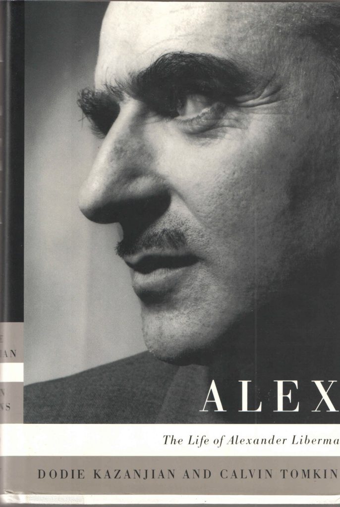
Alexander Liberman was an artist with a huge past and unique view and way of thinking, which was full of artistic passion and which made people remember him throughout history. To understand more about this artist in the first lines of this blog, this quote from the Artnet, “known for his signature red steel sculptures and geometric paintings, in addition to his 30-year tenure at the helm of Condé Nast as its editorial director”, suits the best.
.
Alexander Liberman was born on September 4, 1912, in Kyiv, Ukraine. In 1921 he left his home country which was part of the Soviet Union and settled in Paris, where he was studying and gaining precious experience and knowledge at the Sorbonne and the École des Beaux-Arts, focusing on philosophy and architecture. In New York he arrives in 1941, bringing in it a modern, protean approach, ideas, and feel of true beauty, combined with European delicacy and Soviet’s futuristic Constructivism. All that was a beautiful and unique mix of taste, which then was translated into the Vogue magazine, as this man was an art director in it too.
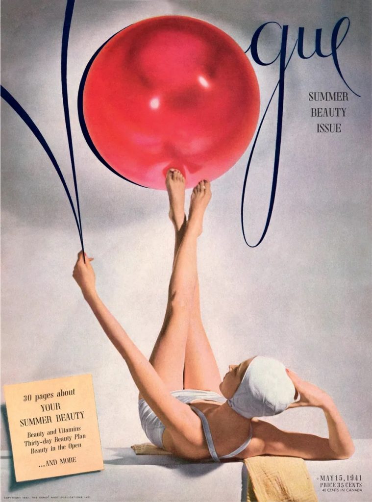
One of his works.
He was a graphic designer, but it did not stop him from being a sculptor, painter, architect. His artworks on the same scale made him recognizable in the world of art. “His minimalist paintings are often comprised of circular forms in primary colors and display his [experience and] knowledge of graphic design. Liberman’s industrial-sized sculptures are almost all in the same cherry-red color and intertwined geometric and organic forms.”, Kelly Koester in Galerie magazine.
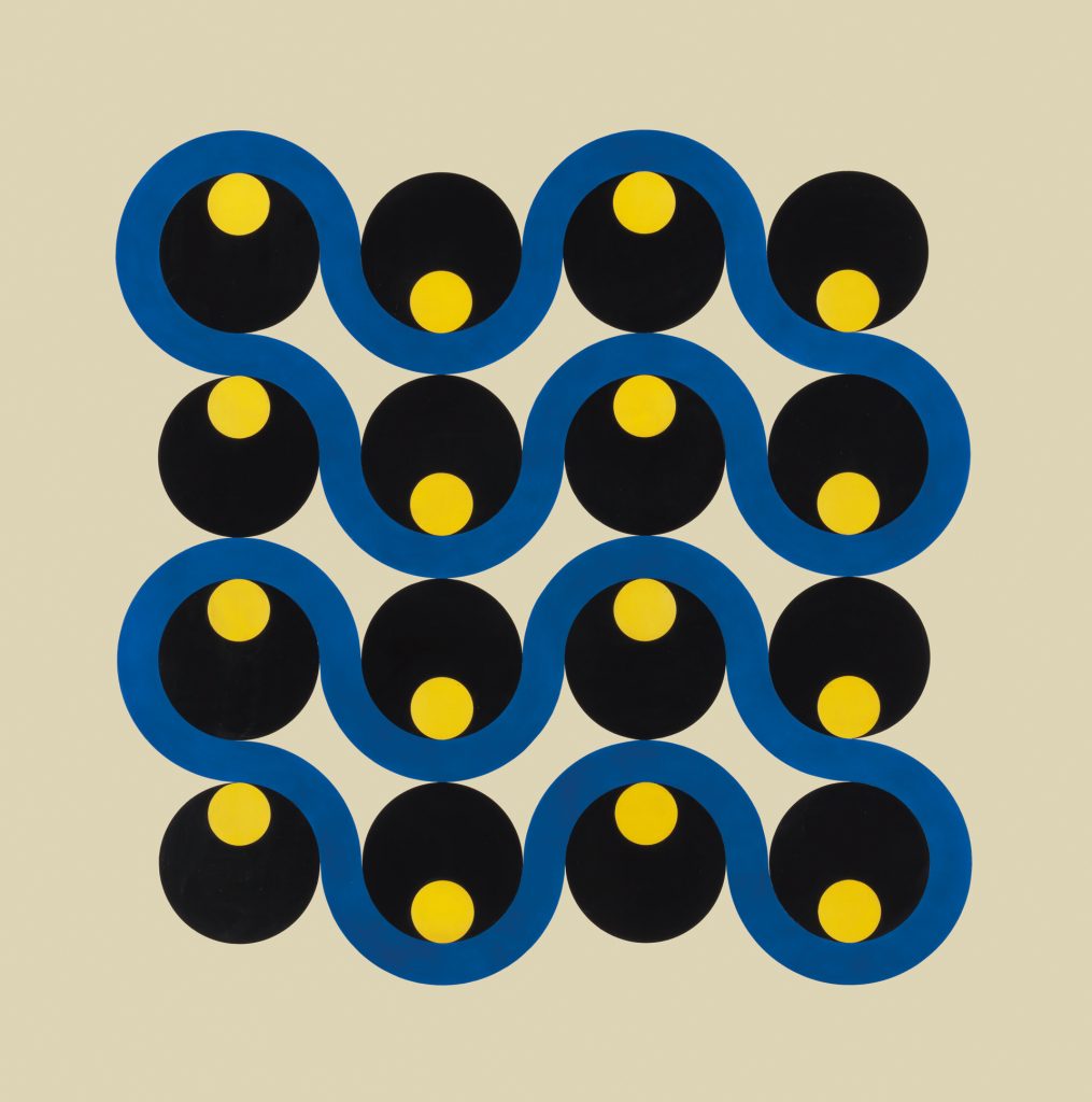
“The repetition and interweaving of shapes and lines in Liberman’s 1952 Beat give the enamel-on-aluminum work a dynamic energy”, Galerie magazine.
I can state that I am deeply inspired by this man, but I think it also important to include the opinion of a former Design Director at Vogue and Vanity Fair, who had the same aftertaste of pure emotion and respect, “by [offering] graphic proof of the consistency of his vision, which married the iconoclasm of Russian Constructivism with old-world savoir-faire and American know-how. It is also a disciple’s affectionate tribute to an elusive master”, Vogue magazine.
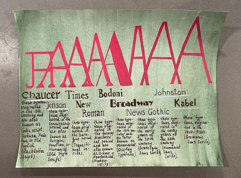
For this assignment I came up with a simple design which was meant to not distract from the typefaces and their “biography”. I included complementary colours with a slight gradient, which in my opinion worked out just fine. The small detail with the white lines under the examples of each typeface are meant to focus and divide from each other. In general, I am pleased with the final work and its minimalistic approach which reflects assigned epoch, so I will mark myself just excellent. The time spent was around three hours and for this work I used gouache.
“With the KODAK Camera in 1888, Eastman put down the foundation for making photography available to everyone. Pre-loaded with enough film for 100 exposures, the camera could be easily carried and handheld during operation. It was priced at $25. After exposure, the whole camera was returned to Rochester. There the film was developed, prints were made and new film was inserted — all for $10”, Kodak company.
The first version of the Kodak camera.
With the slogan “you press the button, we do the rest”, George Eastaman, who was born on July 12, 1854, in the village of Waterville, some 20 miles southwest of Utica, in upstate New York, created a phenomenal product, which then led him through the winding path of different sorts of difficulties, which helped him gain the precious knowledge and experience, by that pushing him to create all the same phenomenal company, which then became the leading of its time and even as for today.
George Eastaman in his early years.
This man was the youngest child (he had two sisters) in the family of Maria Kilbourn and George Washington Eastaman. When he was five years old, his father, who devoted his energy to establishing Eastman Commercial College, moved the family to Rochester, but, unfortunately, it is never going smooth in the life as it was initially planned, and so boy’s father died. The college, where the man was working failed and the family became financially “wrecked”.
Because of the horrible situation, the boy ended school when he was fourteen years old and right after forced to find employment. And so right here starts his “real” journey. But again, it never starts smooth, and so his first job was just as a messenger boy with an insurance firm, where he was paid $3 a week. Nevertheless, after a year working there, he quit and became an office boy where he got paid a little bit better, $5 per week, because of his own initiative to take charge of policy filing and even writing policies. But, of course, it was not enough money, especially for a family he had, so he studied accounting at night because he believed that by studying he will improve a lot, and so, he will get a better paying job he urgently needed. But, it did not come quickly, and only after five years, he was hired as a junior clerk at the Rochester Savings Bank, where he got a chance to have a salary of $15 per week.
The interesting side of his life starts when he was planning his trip to Santo Domingo at twenty-four with his co-worker. Back then, he decided to take his camera with him, which back in the days was pretty heavy and at the same time uncomfortable, or, as he stated himself it “was a pack-horse load”, so you can imagine.
The trip was canceled, but, it did not mean that it was the end of a “photo side” in his life, because to be able take pictures on his vacation he payed $5 to actually learn how to take them, so it was basically his “push of a fate”, because eventhough he eventually did not had a journey, he instead became absorbed by the photography and everything that is connected to it.
Some day, he read in the article that amatuer photographers were making gelatin emulsions for plates (part of the camera) and because of that, they remain sensitive after they were dry and could be exposed at leisure. And right there, George Eastaman was inspired to try it on his own, by finding the right formula of it in all the same Brithish magazine he read.
He was working in the bank at the day, and right when the night appeared, he was experimenting at home in his mother’s kitchen. It continued for over three years, and then he created what he needed. “By 1880, he had not only invented a dry plate formula, but had patented a machine for preparing large numbers of the plates. He quickly recognized the possibilities of making dry plates for sale to other photographers”, Kodak company.
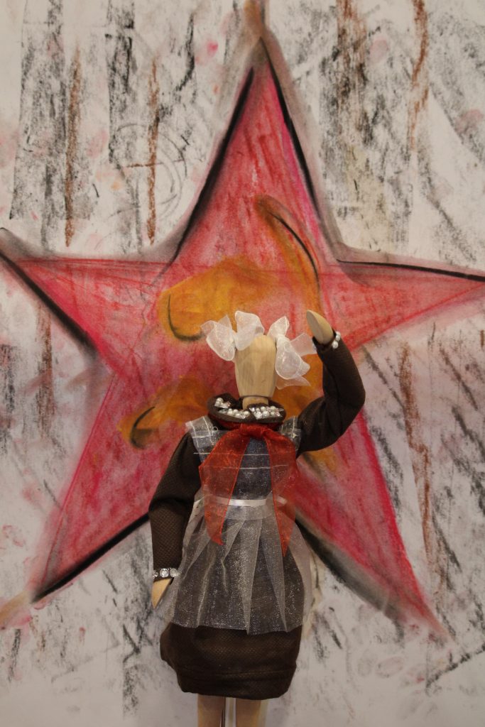
For this project, I decided to make a USSR School Pioneer Dress for the student of 1940. And I am satisfied with the final results, so I think I will mark myself 9 out of 10. Also, it took me approximately 4 hours to make.
To be more specific about the topic, “The Vladimir Lenin All-Union Pioneer Organization abbreviated as the Young Pioneers was a mass youth organization of the Soviet Union for children and adolescents aged age 9–15 that existed between 1922 and 1991. Similar to the Scouting organizations of the Western Bloc, Pioneers learned skills of social cooperation and attended publicly funded summer camps”, Wikipedia.
The Pioneer School Dress.
Museum Label.
For this work, my main inspiration was my mother, who had a chance to wear such a dress in her young years too, so I can confidentially state that she curated me in this process.
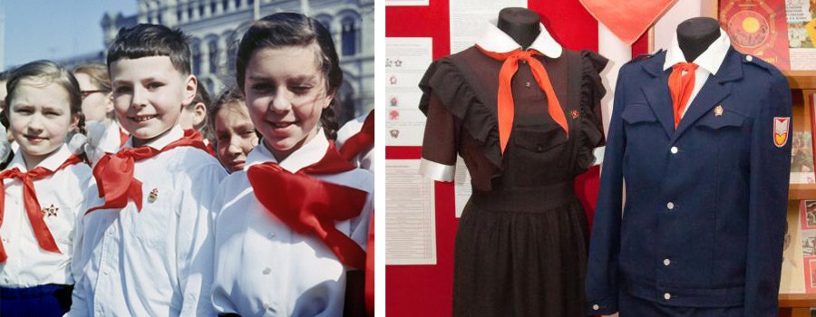
Also, I want to show you a couple of examples of how it “originally” looked like.
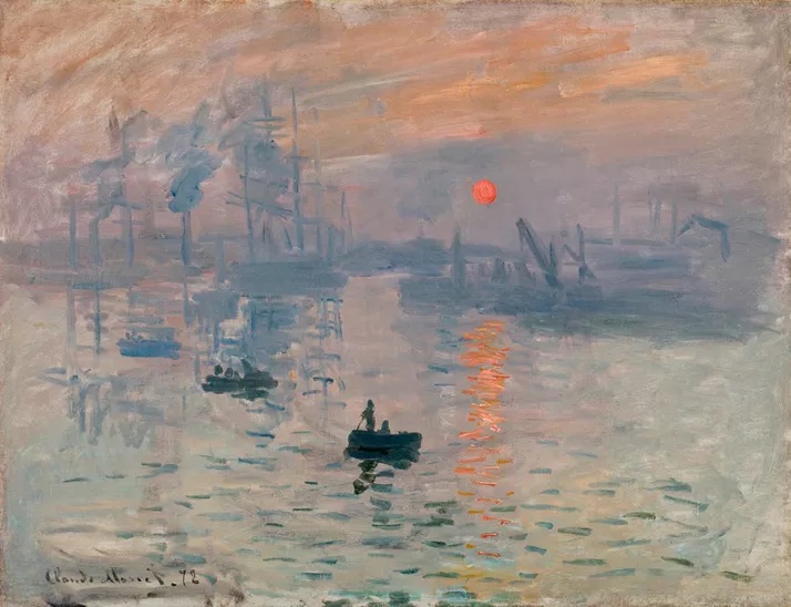
“It is lively, brisk, light – captivating. What a rapid grasp of the object and what an amusing facture. It is summary, agreed, but how spot on the marks are!”, once said about the impression, Sunrise artwork by Claude Monet, Jules Castagnary, a French liberal politician, journalist and progressive, influential art critic, who embraced the new term “Impressionist” in his positive and perceptive review of the first Impressionist show, in Le Siècle, 29 April 1874.
And I agree with his statement because it is short but accurate, precise and it knowingly reflects the whole art movement of the great and daring Impressionism.
Impression, Sunrise by Claude Monet.
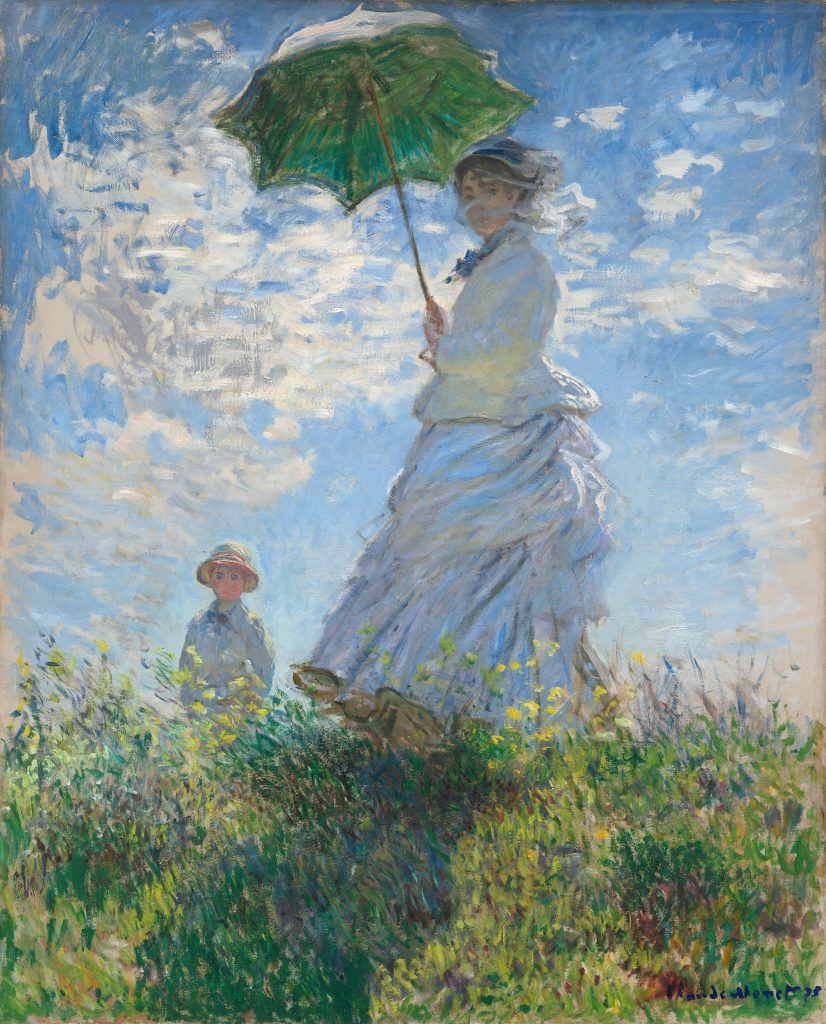
In the late nineteenth century, life was getting faster and busier, that is why art at that time was changing accordingly. Paris, the city in France where Impressionism was born, was getting a new facial drastically and enormously too, where after the wholesale renovation, which started in 1890, it became cleaner, safer, lighter. This light we could observe in the works of artists of that time, where they saw the inspiration and opportunity in the rapid changes and where they were not afraid to reflect it in their fresh, renewed, and original paintings.
Woman with a Parasol by Claude Monet.
Artists such as Pierre-Auguste Renoir, Edgar Degas, Berthe Morisot (yeah, women artists started to shine at this art period) and others, noticed capturing atmospheric effects and life moments that would change with the passing minutes, that is why you could almost feel the touch of the improvisation in their art. Claude Monet, for example, worked with several canvases at ones, returning to each in the different times of the day because of the light of the sun, by that the artist decided to work with the different paintings in the different time span because apparently, he wanted to capture what he saw right at that time when the desired condition was there for him.
Also, during the 1870s and 1880s new technologies, inventions and possibilities started to appear, including brighter pigments, which made the colors on the painting more vivid and interesting. To note, shadows in the artworks under the brushes of artists of that time became colorful, not just black, grey, or brown anymore. Studies on color by the chemist Michel Eugène Chevreul in 1839 brought to the world the color theory which was revolutionary to the world of art and Impressionism as well, providing the knowledge of the complementary colors.
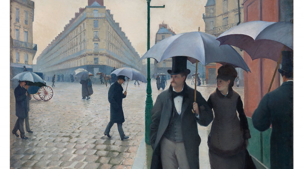
Paris Street; Rainy Day by Gustave Caillebotte.
The influence of the arrival of photography made its mark too, not only giving the new experience of the view to the artist, but also the space for the experimentation, as that the world back then had an opportunity to see still and real images of the photos, but not the colorful ones yet, so that is why it was the impulse for the artist to begin creating something new and with the totally different techniques; colorful, something what only they uniquely saw.
Art critic Frederick Wedmore was saying that the Impressionism artists were creating paintings “not just as they are, but just as they appear to be”, and this is the revelation and unique zest of the Impressionism movement, where the optical delights and open ideas became prominent and hugely important, and to be honest, even today they give us inspiration and the feel of expression, because, well, Impressionism is the attained origin of it.
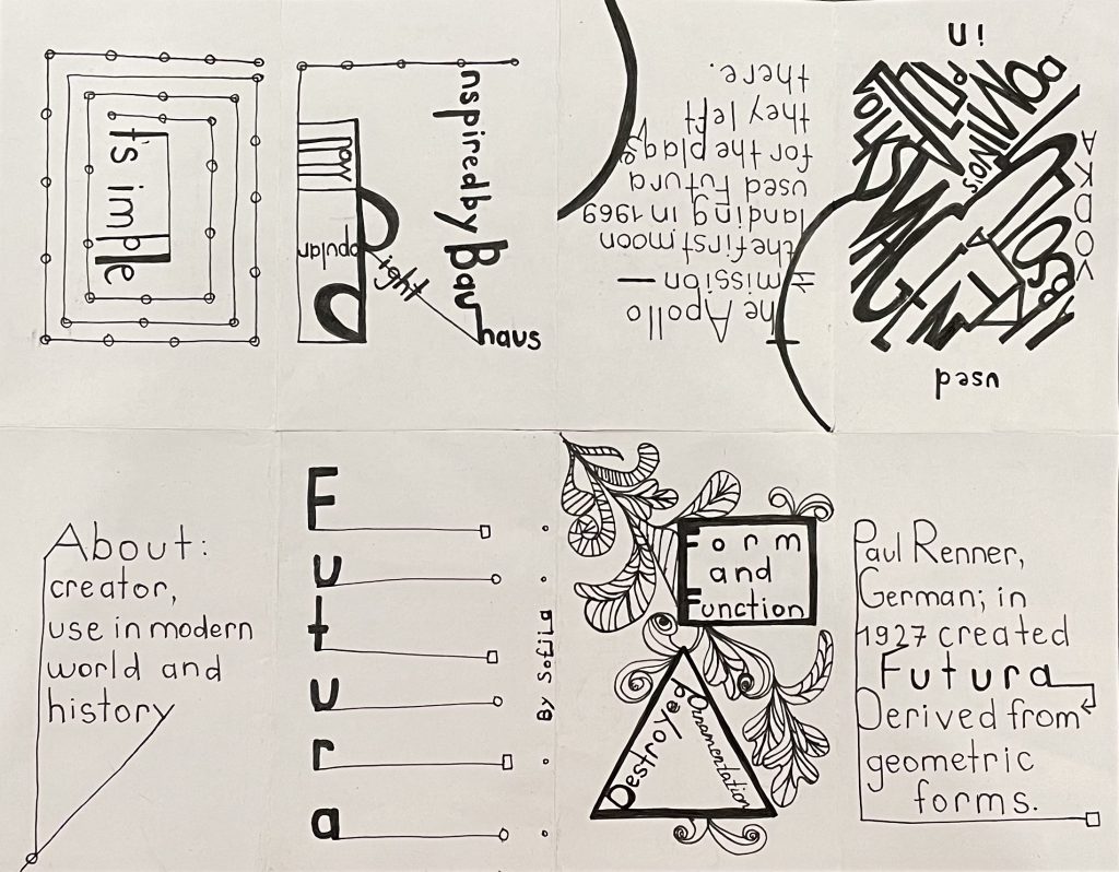
This project was entertaining and engaging because it was combining so much in so small, such as eight pages of visual information in just a tiny 8.5 x 11 paper. Moreover, it was helpful for me because I learned more about the specific typeface I choose, which was Futura. I learned on a deeper level about its history, development, and use in our modern days. Also, besides a better understanding of the specific typeface, I learned how to make a small book with just a small piece of paper.
To give me a mark, I think I will put eight of the ten because I always think that I could make it better.
The actual process of making took me approximately four hours, it is including the research and making parts. The whole design I did in simple, black and white colors to reflect the stylistic idea behind the chosen typeface. Again, the visual part of the work is minimalistic and it combines forms, lines, dots with the Futura font, excluding colors and another visual weight that was believed by its creator to be unnecessary. In simple words (maybe not so), it was “utopia by design”.
.
Also, I want to include the amazing source where I mostly took all the information and inspiration for this project: https://99designs.ca/blog/design-history-movements/know-your-typeface-futuras-amazing-past/
The conversation is about Gothic Architecture of course. It is full of eeriness and some sort of sharp, rude look which makes you feel some sort of astonishment and genuine adoration. It looks mysterious, and this is what attracts you.
“Gothic architecture is an architectural style in Europe that lasted from the mid-12th century to the 16th century, particularly a style of masonry building characterized by cavernous spaces with the expanse of walls broken up by overlaid tracery”, Britannica.
Duomo di Milano, Italy.
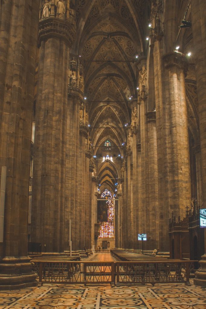
“Britain, Germany, and Spain produced variations of this style, while Italian Gothic stood apart in its use of brick and marble rather than stone”, Britannica. As you can see in the example above of Milan’s Cathedral, which is located in Italy, the use of white marble translates its special, “out of this world” atmosphere.
Inside of the Duomo di Milano.
“The style represented giant steps away from the previous, relatively basic building systems that had prevailed. The Gothic grew out of the Romanesque architectural style when both prosperity and relative peace allowed for several centuries of cultural development and great building schemes. From roughly 1000 to 1400, several significant cathedrals and churches were built, particularly in Britain and France, offering architects and masons a chance to work out ever more complex and daring designs”, Khan Academy.
Seven Sisters, Russia.
“It originated in the Île-de-France region of northern France as the development of Norman architecture. The defining design element of Gothic architecture is the pointed or ogival arch. The use of the pointed arch, in turn, led to the development of the pointed rib vault and flying buttresses, combined with elaborate tracery and stained glass windows”, Wikipedia.
“With the development of Renaissance architecture in Italy during the mid 15th century, the Gothic style was supplanted by the new style, but in some regions, notably England and Belgium, Gothic continued to flourish and develop into the 16th century. A series of Gothic revivals began in mid-18th century England, spread through 19th-century Europe, and continued, largely for churches and university buildings, into the 20th century”, Wikipedia.
It was notable in, for example, Russia too. The concept of “Gothic taste” arose in the Russian Empire in the middle of the 18th century and meant all artistic phenomena that opposed themselves to classicism.
There are a lot of details and points which would lead you to long discussions about this art movement, and it conveys the vastness and fullness of this style to a greater extent.
And I think that you, same as me, feel the aftertaste of the administration.
In general, I think that I did a nice job of explaining and comparing the three chosen topics with the given groups of all the 10 surveys my professor provided me with. I enjoyed the process of researching the main information about the artworks and the artists I have chosen and it took me approximately four hours long (including this reflection).
Which mark I would give myself? I think it will be a solid eight because I feel that I could have done better with providing and filtering the information I put in this work.
What did I learn from this exercise? I think I did one more step to develop my personal qualities such as research, patience, and creativity. Also, the information which shed some light on the overall knowledge about the artist I researched was that Kazimir Malevich and Alexander Liberman were both from Kyiv, Ukraine…
To conclude, the work I did made me dive into the simple forms, looks, and approaches while keeping it intense and full of thinking.
Yeah, that is how it looks in today’s realities. Because besides their famous pyramids, mummies, artifacts and so on, that same hieroglyphic script on the same level was Egyptian great inheritance, which opened the door to the further development of the languages, knowledge, civilizations as we can see it today, shedding some light and providing with a legacy which still resonates with people of 21st century.
But let’s start from the beginning.
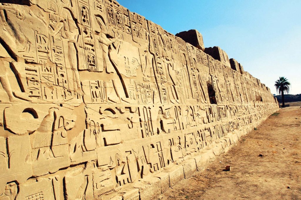
Luxor, Valley of Kings.
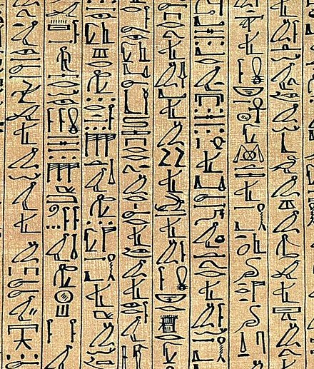
When you look at the image above, what do you see? This simple and at the same time complicated question forces you to notice some abstract images, forms, shapes that look like something you already envisioned, something alike, right?
Well, the answer is “right”. These symbols represent things that may seem similar to you, being the form of writing, by which people of ancient Egypt (spoiler alert: small percentage) communicated.
It included pictographs or literal representations of something they saw. Same as ideographs or an idea that hides behind the object. Also, some of it was phonograms or rebus, which meant to represent a sound like vowels and syllables.
The bottom line (joking) is that this language is Hieroglyphic script (3,200 BCE – AD 400), which is unique in its own way. The first Egyptian hieroglyphs appeared around the time of King Menes (a pharaoh of the Early Dynastic Period of ancient Egypt) formed the first Egyptian dynasty, that unified the country.
It was hard to learn and eventually use, because of its complex structure of making (writing) and pictorial forms, that is why only a small percentage of people used to have appropriate level expertise, such as priests, nobility or Pharaon.
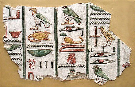
The translation of the actual word “hieroglyphic” from Greek means “sacred carving”, such meaning does make sense, because the cursive hieroglyphs inscriptions were used in temple walls, public monuments or graves of royals (or wealthy) to guide their souls into the “other world” or to the afterlife. This fact resembles the hieratic scripted papyrus scroll called the Book of the Dead.
Papyrus of Ani.
This writing system has 1,000 distinct characters. I know, it is a lot, but that is why throughout the time it was distinguished into two other forms of Egyptian writing that were written with ink on papyrus or another smooth surface aside from the stone that used to be the main source of script infliction. “These were known as the hieratic, which was still employed during the time of the ancient Greeks for religious texts, and the demotic, the cursive script used for ordinary documents”, Peter F. Dorman, Britannica.
Tomb of Seti 1.
Before the appearance of hieroglyphs in the history of humanity, there was another ancient writing system, much older, which is called Cuneiform (4,000 – 3,500 BCE). It was depicted on the stones as well, however, with the shaped reeds inscribing (pressing, not dragging) some sort of triangular marks.
Cuneiform, same as hiroglyph shares a script type – logography. Also, from the first glance, they look kind of similar but share some key differences contrasting to the hieroglyphic script, which could be readen right to left, cuneiform does it in opposite direction.
As historians tell us, cuneiform was created by Sumerians (one of the earliest civilizations), who may have created the first cities and religion. Many of the great developments of the bronze and iron ages are thought to have taken place in Sumer, which was a Southern Mesopotamia, Fertile Crescent or today’s Southern Iraq (and parts of Syria; Kuwait).
“Why she is talking about the Cuniform if the topic was about different things?”, you will probably ask yourself. Well, coming back to the Cuniform was an intentional move to emphasize a lean towards practical usefulness developed by ancient progress. Since hieroglyphics nevertheless were the ones that lasted much longer, retaining for almost 3,500 years. And yeah, I am persuaded that it is a real “flex” indeed.