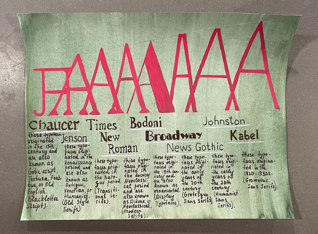
For this assignment I came up with a simple design which was meant to not distract from the typefaces and their “biography”. I included complementary colours with a slight gradient, which in my opinion worked out just fine. The small detail with the white lines under the examples of each typeface are meant to focus and divide from each other. In general, I am pleased with the final work and its minimalistic approach which reflects assigned epoch, so I will mark myself just excellent. The time spent was around three hours and for this work I used gouache.