Douglas Coupland

Douglas Coupland OC OBC is a Canadian novelist, designer, and visual artist who was born on December 30, (1961) in CFB Baden–Solingen, Germany. His first novel, the 1991 international bestseller Generation X: Tales for an Accelerated Culture, popularized the terms Generation X and McJob.

Digital Orca, in the lovely Vancouver, BC, Canada.

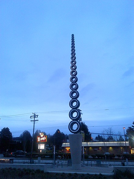
Nevertheless, his creations are seen all around Vancouver. Artworks such as a Golden Tree which was made in 2016 at the Marine Drive and Cambie Street and Bow Tie which was made in 2015 at the Park Royal, West Vancouver, or a Terry Fox Memorial which was made in 2011 at the Terry Fox Plaza, BC Place Stadium, etc.

Charm Bracelet, all the same Vancouver.

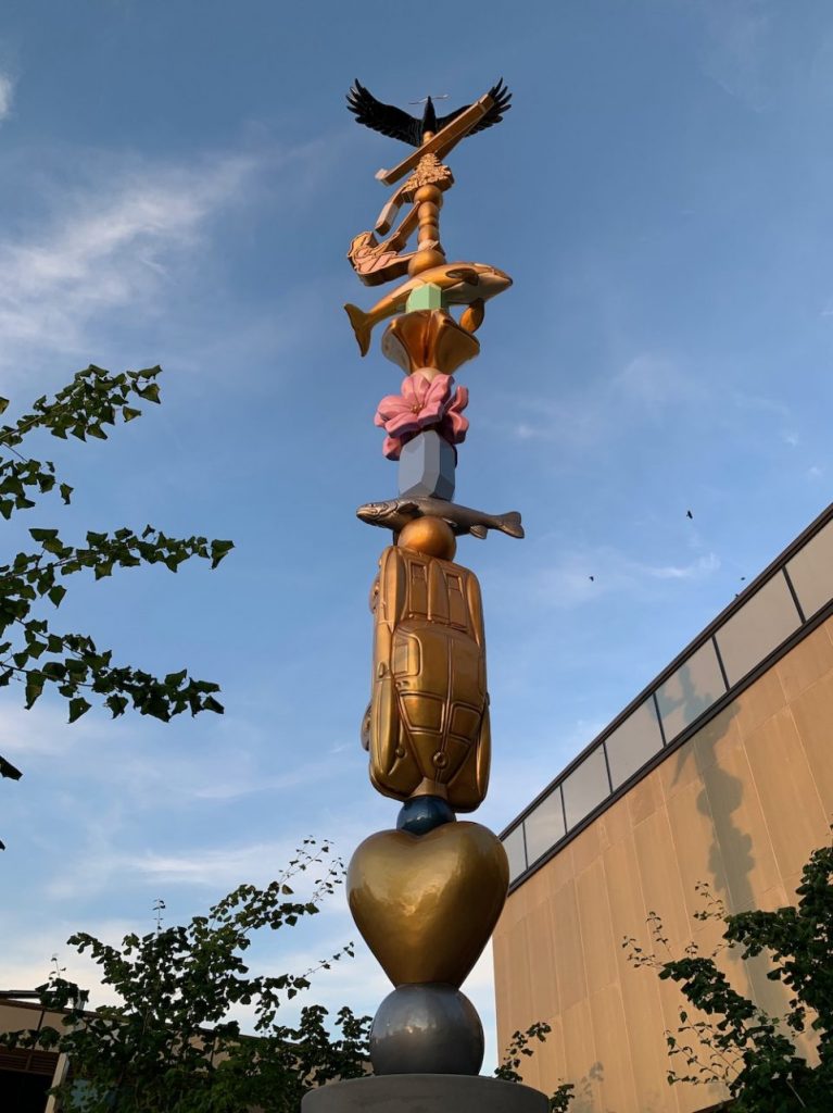
When I first arrived in Canada, I saw the works of this amazing artist in Toronto, Ontario, and back then I was impressed and interested in the works of this creator. When I arrived in Vancouver, BC, my love for such art pieces got even stronger. Bold, unique ideas are mixed with physical materials that create architecturally pleasing installations. For sure I like this combination!

Infinite Tire, yes, it is also in Vancouver.

Susan Kare

Susan Kare is an American artist and graphic designer who was born on February 5, (1954) in New York. She is best known for her interface elements and typeface contributions to the first Apple Macintosh from 1983 to 1986. She worked in Apple and after was a Creative Director at NeXT, the company formed by Steve Jobs after he left Apple in 1985.

You should have, even once in your life interact with her design creations (especially if you are reading this now). Because all those icons where initially born by the hands of this unprecedented designer. “Woman who gave the Macintosh a smile” and a distinct characteristic. She gave not only the smile to it, but also the quality of a something more humane and living because her designs reflect just that.

“Bitmap graphics are like mosaics and needlepoint and other pseudo-digital art forms, all of which I had practiced before going to Apple,” recalled Kare. “I didn’t have any computer experience, but I had experience in graphic design.”

Barbara Stauffacher Solomon

Barbara “Bobbie” Stauffacher Solomon is an American landscape architect and graphic designer, who was born in 1928 in California. She is well known for her large-scale interior Supergraphics that were highly influential in the 1960s and 70s, same as the exterior signage at Sea Ranch in Sonoma County, California (which you will see down below).

The influential Sea Ranch Tennis Club.

Her signature is bold and impressive shapes which she combines into magnificent and massive forms that easily and as if freely blend, and at the same time stand out in the architectural solutions and overall designs she creates. The way she plays with the colours is interesting too because it never looks too much. It emphasizes the idea of movement, the energy that elegantly and a little bit rebelliously looks, and feels.

Her expressiveness reflects through the feeling of motion that she develops in her visual compositions that catch the eye (and the breath). Movement, I think that it is her second signature.

Milton Glaser

Milton Glaser is an American graphic designer who was born on June 26, (1929) in New York and died on June 26, (2020) in the same New York. His most notable designs include the I Love New York logo, a 1966 poster for Bob Dylan, and the logos for DC Comics, Stony Brook University and Brooklyn Brewery.

He, to claim, is a legend in the graphic design industry, and I, as a graphic designer myself understand why is that when I am looking at his works.

“Logic is not as powerful as intuition”, this artist once said, and I think that this quote is important because it reflects the intuitive side of the treatment of the ideas and the professional experience which then pours out into the success, worldwide recognition.

One of my favourite details I found about the approach of Milton Glazer is that all the time he tried to come up differently with ideas for different situations. As for the artworks above and below. They share similar colour palettes and imitations of the person, but the way they look is totally different. I will not state that it is because of the different design principles in the first place, but more about the feel, the style of the drastically different ideas and works in conclusion.

Paul Rand

Paul Rand is an American art director, who was born on August 15, (1914) in New York and died on November 26, (1996) in Connecticut. He is a legendary graphic designer, best known for his corporate logo designs, including the logos for IBM, UPS, ABC, etc. He was one of the first American commercial artists to embrace and practise the Swiss Style of graphic design and one of the earliest pioneers of the New York School of design.

His works are truly unique, especially in the way how this artist picked up the colours and combined them into the interesting art choices with the use of design principles and rules, which include contrast, shape, material, type, font and imagery.

Vol. 9, No. 1, July/August 1938

Even though this artist is more about the “Swiss” approach, it did not bother him to dive into the expressiveness and new lands of the creative world of his imagination. And, in my opinion, it made him stand out from the rest of the designers of his time, because our unique ideas, same as many of Paul Rand’s ones, are the key to the success and a truly interesting life which, by the way, can inspire others…