For my final blog post, I decided to research Marian Bantjes. As a student who is more passionate about illustration, yet still enjoys graphic design, seeing examples of Bantjes’ work was delightful.
An example of a typical Bantjes piece https://loisgordon.github.io/design-essay/design-essay.html
Despite leaving book typesetting earlier in her career, Bantjes’s work often includes type in one form or another, although she prefers to call it graphic art. She has successfully co-founded and run a design studio and currently works as a freelance artist and designer. Alongside visual art, she also loves writing, often sharing her strong opinions through her written work.
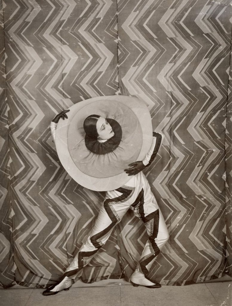
“Want It!” for a campaign, featuring her trademark flowing lines http://nubbytwiglet.com/2010/03/31/the-typofiles-56-marian-bantjes-for-saks/
Her art and her approach to it are quite all-encompassing and power-driven. She likes to be tasked with doing every aspect of a piece, is quite happy doing as much work as possible, and never shying away from a big project. If anything, she faces it heads on.
Her hand-drawn Valentine’s day project, where she drew over 100 hearts https://bantjes.com/work/valentines-2007/
As someone who loves multiple facets of art, often torn between what to actually pursue in her career and always trying to think of a way to combine illustration and graphic design, reading about Bantjes was quite reassuring and personally, I found her inspirational. If she wants the job done, she’ll do all of it herself and be at peace with it.
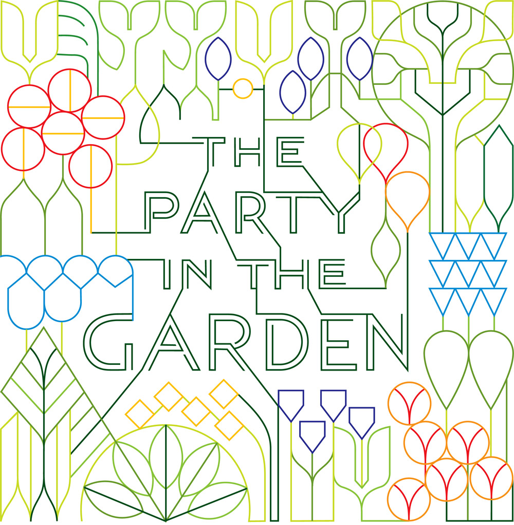
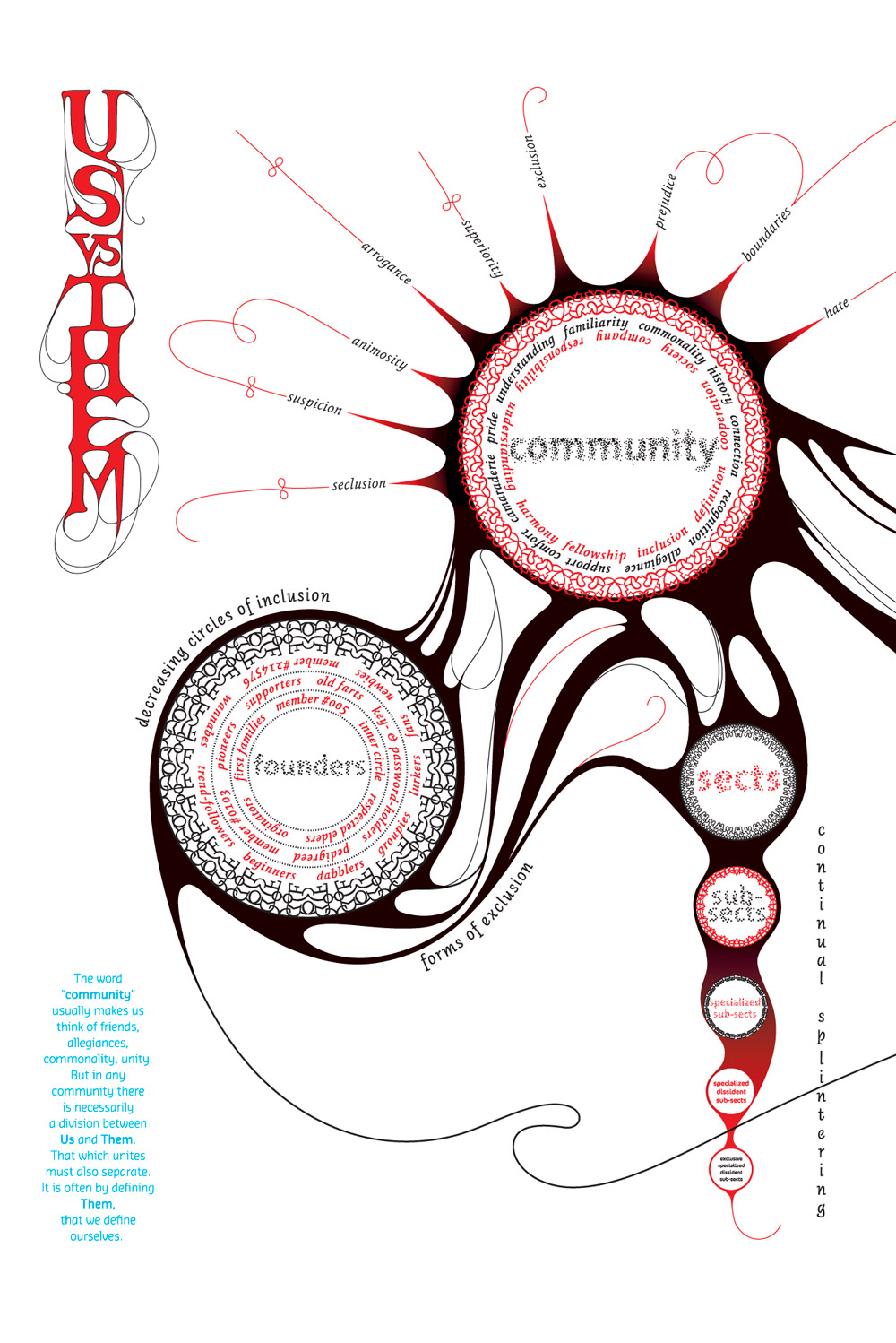
“The party in the Garden” designed as an invitation https://bantjes.com/work/party-in-the-garden/A spread based on “Community” https://bantjes.com/work/community/
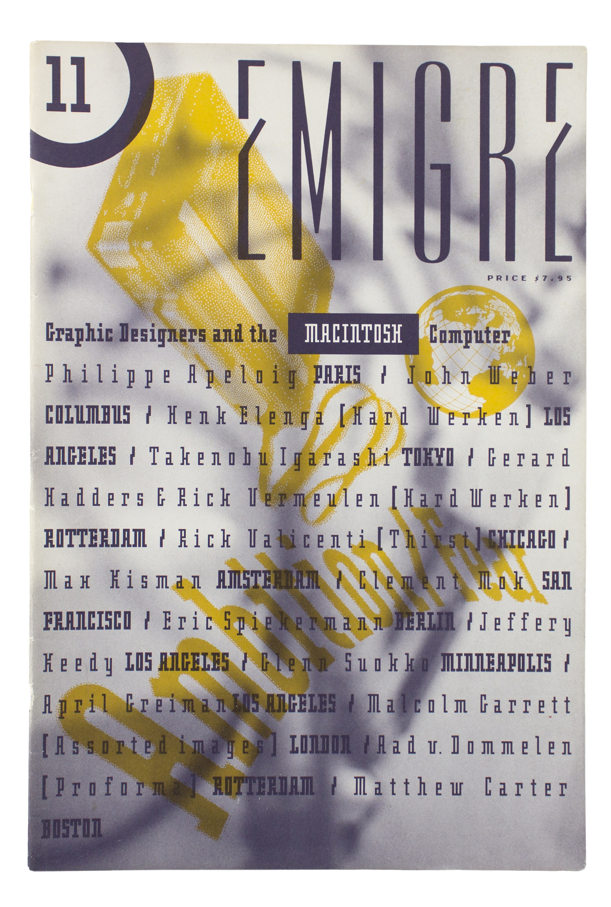
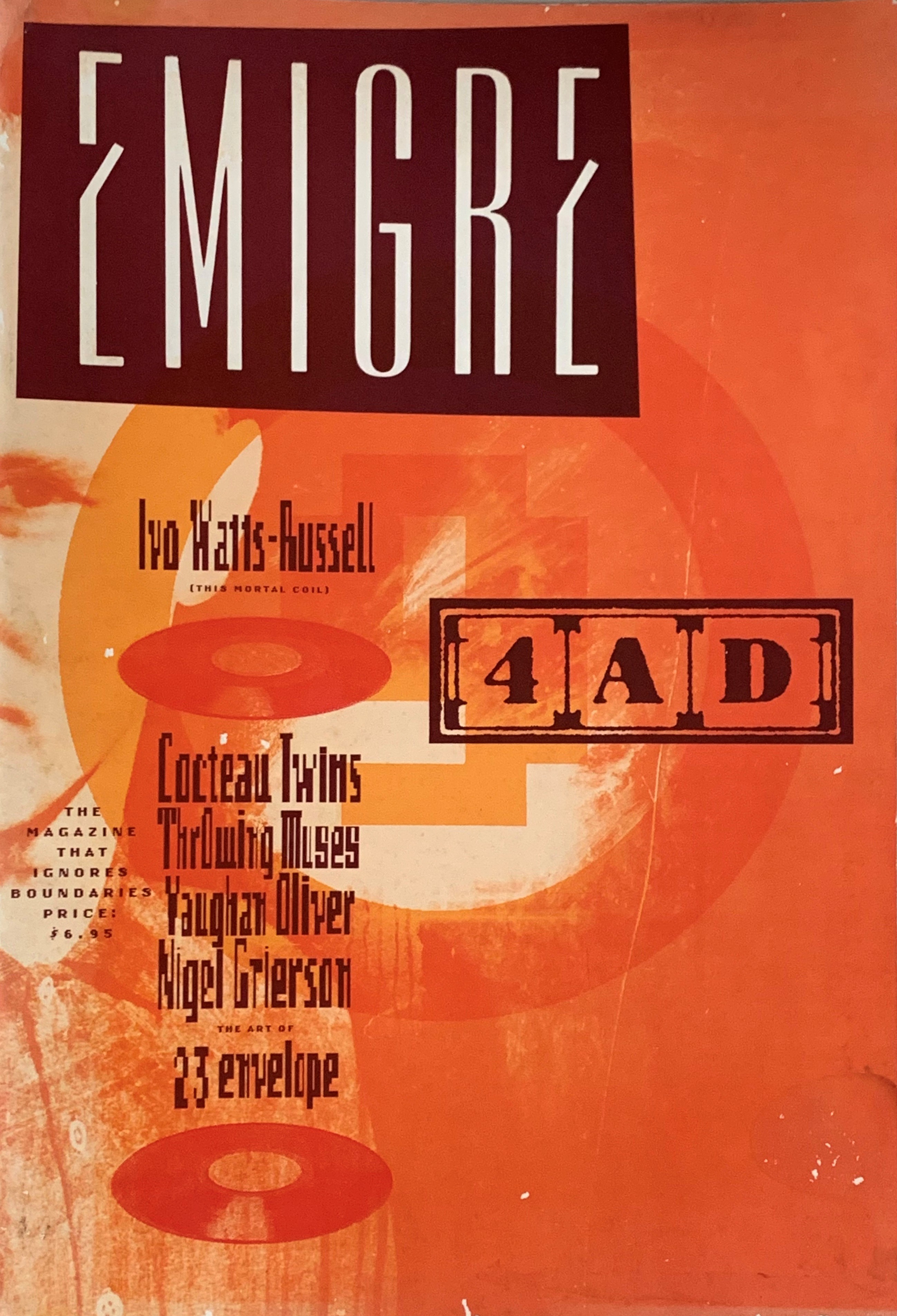
Once more, my blog post is not about an artist, but instead about Émigré magazine. If I’m being completely honest, that’s because a lot of the designers we’re going over at the moment are being presented in Pecha Kuchas and my brain is flooded with information.
A couple of issues of Émigré https://www.pbagalleries.com/view-auctions/catalog/id/428/lot/137326/Emigre-A-Magazine-for-Exiles-The-Magazine-That-Ignores-Boundaries-issues-1-8
With 69 issues that were published between 1984 and 2005, Émigré was a huge well of visual knowledge of typefaces. No doubt, Emigre magazine is to thank for an easier, smoother transition into the digital age. By assembling, using, and experimenting with digital fonts, let these new forms of type join the ranks of traditional typefaces that had been around for years. Alongside this, it allowed, via experimentation, for contemporary fonts to be made rapidly.
The inside of Émigré #19 https://fontsinuse.com/uses/16582/emigre-19-starting-from-zero
What drew me into researching more about Emigré was not only the concept of normalizing new, perhaps scary fonts into the general consciousness but also the idea of allowing equal access to information, especially in the digital age.
A cover, of issue 11 https://blogs.reading.ac.uk/typography-at-reading/2017/06/07/emigre-magazine-design-discourse-and-authorship/
Now, I’m not claiming that Émigre is a groundbreaking magazine that broke down the weird culture of gatekeeping surrounding fonts and their usage. But researching for this blog post led me to believe that creating spaces where artists and designers can experiment freely and without a sort of “preciousness” surrounding their work could be beneficial to art as a whole. To both spread information on art, share resources, and close the gap between the art world and the regular world – which has been expanding for centuries.
Another Cover, #15 https://www.amazon.com/Emigre-Magazine-Kisman-Zuzana-Jeffrey/dp/B08DP1KK7ZYet another cover, #9 https://www.abebooks.de/erstausgabe/EMIGRE-ESSAYS-TEXTS-WRITINGS-GRAPHIC-DESIGN/30719414967/bd
Originally, this was going to be a blog post on Bruce Mau. His supergraphics captured my attention during the weekly lecture and I wanted to find out more about him. Unfortunately, I fell down a sort of rabbit hole, instead, finding myself staring at pictures of the Seattle Central Library. I got sidetracked and this blog post is a testament to that.
the Seattle Central Library from the outside https://en.wikipedia.org/wiki/Seattle_Central_Library
What drew me in about the Seattle library was the way it evoked a sort of childhood nostalgia. When I did more research about how the library was supposed to not only be a library but also a “lived-in” area, I couldn’t help but remember hours spent at the local library in the town I grew up in and realize that I wanted to write a little informational post about the Seattle Central Library
The interior of the Seattle Central Library https://www.hoffmancorp.com/project/seattle-central-library/
The Seattle public library is an anomaly amongst libraries and an anomaly amongst buildings. Not only does it have surprising little books, but it has the design of a modern business building with an interior inspired by 70s trends. With 12 stories, rigid, geometric architecture, and an abundance of glass, this Library is a sight to behold
Another view of the interior https://www.pinterest.com/pin/740560732458893989/
The library, which opened to the public in 2004, relies heavily on technology: from the supergraphics characterizing its look to the literal information it stores. It captures the zeitgeist of the 21st century. Especially during a period when libraries are at a higher risk of dying out and disappearing, the Seattle central library prevails, keeping its relevance. This is mostly due to the emphasis on the idea of access to information, instead of raw information. Thus, the use of supergraphics in its interior is fitting.
an example of the interior Supergraphics https://www.entro.com/project/seattle-public-library/
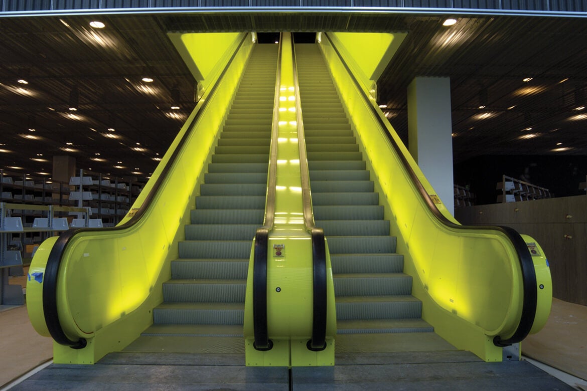
Bruce Mau paired with OMA to create the supergraphics for the Seattle Central Library. The graphics line and decorate the simple, yet slightly harsh interior of the library. They transform what could have been a cold, stark, and unwelcoming design into a cheeky one. Through the supergraphics, the library became less about books and more about living.
the infamous escalator in the library https://www.ideasoforder.com/features/profiles/the-architect-of-innovation/
Two environmental activists, at some point in the 70s https://www.pbs.org/wgbh/americanexperience/features/earth-days-modern-environmental-movement/
This blog post isn’t about a certain designer, but rather about an art movement that I feel quite passionate about Environmental art. This was inspired by the section of our lecture where Paul brought up the early beginnings of the environmental movement, which I wanted to look into. That led me here. During my research, it was almost funny to look back at the history of art, design, and architecture and see just how long the artists behind some of the most influential movements have been advocating for nature. Climate awareness as it turns out has been around longer than the word “climate change”. That being said, there has never been a time it is needed more than right now.
The environmental movement has been a long process. As of the early days of industrialization, there have been actions taken to protect nature from it. National parks were created and sanctuaries established, all with the aim of protecting our ecosystem. Perhaps most monumental was the creation of Greenpeace in Vancouver in 1971. This organization would grow to become one of the spearheads of the modern climate movement
The New York Times article on a climate protest https://www.pps.org/article/happy-earth-day-reframing-the-environmental-movement
Since its founding, Greenpeace has fought against many potentially harmful acts against the environment. They have blocked the dumping of certain materials in the ocean, protested nuclear testing, organized and enforced animal sanctuaries, created petitions, designated world heritage spots, and lobbied against multiple governments
A contemporary Green Peace protest https://workfor.international.greenpeace.org/
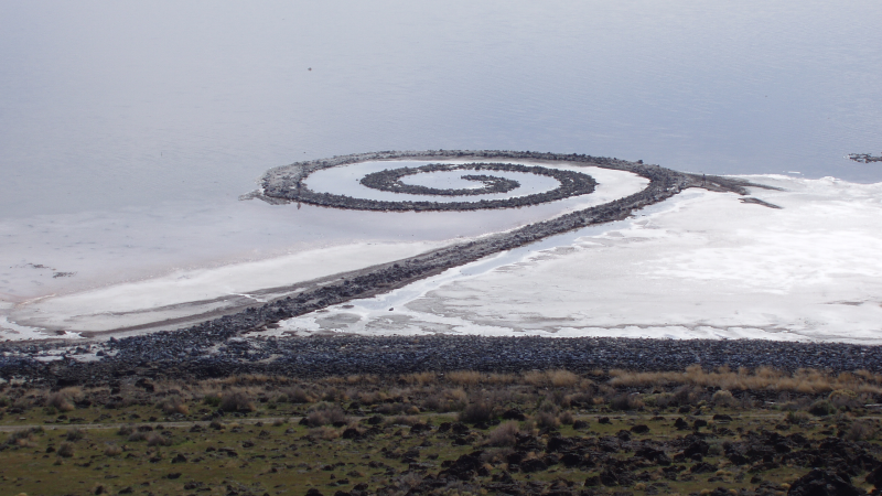
Nowadays, we not only have design and illustration based on the environmental movement but environmentally-themed art has become its own category of art: Land art. Land art aims to link and observe the relationship between nature and humans, with art serving as a sort of bridge connecting the two. Artists that create this art aim to alter materials found in nature in a non-destructive way. The harmless alteration of position or formation infuses nature with the human element.
“Spiral Jetty” is one of the most famous pieces of land art to exist https://en.wikipedia.org/wiki/Land_art
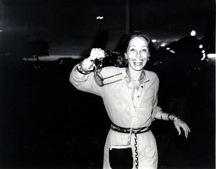
For the first blog post for Paul’s 142 class, I decided to look into and learn more about art director and designer Bea Feitler. Not only does she have an impressive career, becoming an art director at Harpers Bazaar at 25, but as one of the only female art directors of the time, she had a unique visual language that resonates in the art world to this day
Young Bea Feitler https://www.ripostemagazine.com/bea-feitler
Bea Feitler was a Brazilian designer, most well known for her art direction for well-known fashion magazines. She graduated from Parson’s school of design and during her career, she aimed to change the female body from a subject of over-sexualization to an artistic element, using an objective lens to integrate pictures of women into her magazine covers.
A body spread of Feitler’s https://www.anothermag.com/art-photography/gallery/9042/bea-feitler/4
Bea Feitler was aware of the graphic designer’s influence on society, noticing how design could shape populations. Therefore, she purposefully wanted to expose the theme of gender equality
Throughout her career, she faced similar problems as women do to this day. From negotiating her salary to a lack of proper credit, she struggled with it all. Due to this, she purposefully made it her mission to establish femininity as a force to be reckoned with.(She quit Harper’s Bazaar due to their inability to give her a raise)
A collection of Feitler’s work https://www.uks.no/archive/bea-feitler/
In 1965, Feitler and Richard Avedon hired the first black model to be on the front cover of Harpers Bazaar. Due to an overwhelming amount of backlash, Feitler and the other fashion magazine designers didn’t dare try to hire black models until a good couple of years afterward.
When mentioned in class, Feitler immediately caught my attention. As someone who had tried to enact change earlier than history would have it – hiring a black model for a front cover – I wanted to read more into her work and who she was as a person. It was satisfying, to learn that she had a very strong personality and wanted to push the limits of pretty much every aspect of her life. But it was also disappointing because there was just so little on her that I could find. I think she truly embodies what I believe artists should strive for: enact good and aim to improve society through art.
For my final blog post, I researched…drum roll please…you guessed it! A female artist. In a similar fashion to Sonia Delauney, I stumbled across the artist I researched this week through her husband, much to my own displeasure.
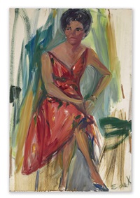
Elaine de Kooning was a skilled and proficient American painter and wife of Willem de Kooning. She was skilled across the board, from figurative art, abstract art, writing, art criticism, and proto-feminist. She had entrepreneurial skills from a young age, selling portraits of her classmates at the age of 8 and a special fearlessness, garnering her a reputation as a daredevil.
a young Elaine De Kooning painting
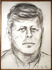
Elaine De Kooning specialized in portraits. This figurative approach was unusual at the time of Abstract Expressionism but is a breath of fresh air with the power of her strokes and use of color. She loved to paint portraits of her friends and was even commissioned for a portrait by John F. Kennedy
Tina Singer, 1963John F. Kennedy #10, 1980
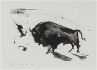
Influenced by cave paintings, her paintings possess a raw quality.
Home, 1953Bull, 1983
Willem de Kooning used to be her old teacher, who she married after being his student. Their relationship was hard due to Willem’s own psychological issues facing abuse and the hyper-sexualization of his mother from a young age.
Unfortunately, she also sacrificed her career for her husband. She believed he was a genius and gave up everything to help convince the world of it. For the promotion of art, she even went so far as to sleep with people who could help Willem be successful. I admire that she did this and believed in him so, but it’s sad that she had to put her paintbrush down to achieve this. When has there ever been a female artist whose husband gave up his craft for her? I’m afraid this is only ever expected of women, leading me to believe there must have been countless other female artists who were lost to time, willfully so as to support the men in their life. I hope one day that women will be recognized, not only for their skill and talent, but their sacrifices made for art history. The lost mothers, sisters, daughters, and wives of our heroes deserve a place beside them in the canon of art history.
In the early years of the 20th century, art was thriving. Several movements, from impressionism to the Bauhaus movement were prominent in Germany. Here, many artists grew to be famous, such as Kathe Kollwitz or Auguste Macke. Movements such as new Objectivity and Dadaism were taking flight in Weimar Germany in the 20s. New, experimental forms were being practiced, with artists exploring integrating photography, satyr and so much more into their pieces. It was an era of rebirth and exploration within art. Until it wasn’t.
Early German Cubist art https://www.pbagalleries.com/content/early-20th-century-german-artists/
The catalyst
Just as the field of art branched off and new branches were created, something similar happened to politics. New movements like Fascism and Communism rose to compete with democracy. In Weimar Germany, the streets quite literally ran red due to the conflict between the far right and the far left. After many years of grappling, fascism slowly trumped socialism and in 1933, Adolf Hitler was elected the Chancellor of Germany. The world was never the same.
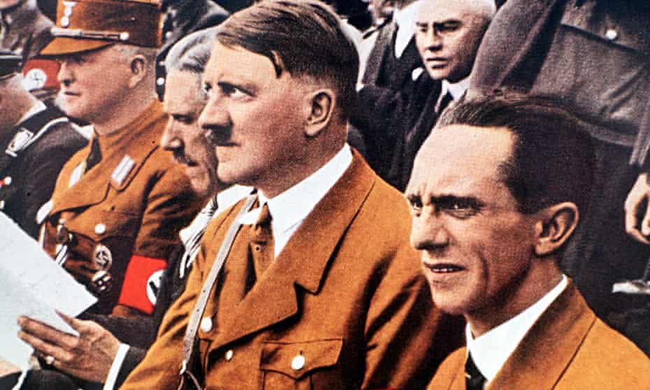
Adolf Hitler with a member of the Hitler Youthhttps://www.history.com/news/how-the-hitler-youth-turned-a-generation-of-kids-into-nazis
The fall of truthful art
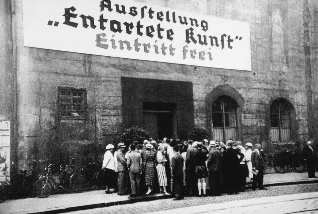
All forms of art faced backlash with the rise of fascism in Germany. In literature, the devastating book burnings wiped through years of stories, poems, and prose. Specifically, Jewish, and contemporary German writers, like Franz Kafka, feared for their lives and lost much of their work too. But the Nazis were especially cruel to visual artists. They took hundreds of pieces of art from museums and collected them for a special exhibit of their amusement. This exhibit was dubbed “Entartete Kunst”, degenerate art in English. Here, these pieces were lazily displayed and laid out for members and supporters of the Nazi party to make fun of. This was not just for their enjoyment, however. They started manipulating German society by twisting and controlling the art they consumed. Via art, the fascist government saw a pipeline for controlling the narrative within Germany at the time. No man understood this better than Joseph Goebbels.
A “book-burning” in action https://www.cbc.ca/news/world/the-books-have-been-burning-1.887172The degenerate art exhibit, here displayed as free for all https://www.moma.org/calendar/exhibitions/3868
Joseph Goebbels, the master manipulator
Chief propagandist for the Nazi party, Goebbels was set apart due to his methods. He was quick to join Adolf Hitler, expressing antisemitic views throughout his early adulthood and seeing Hitler’s trial for treason in the early 1920s as a way to spread propaganda of his choosing. He was quick to take action after joining the Nazi party in 1924, rapidly being given many responsibilities. But the role that shaped him the most was his position as the propaganda minister
Hitler and Goebbels, the architects of the holocaust https://www.theguardian.com/books/2015/may/17/goebbels-man-behind-nazi-myth-peter-longerich-review
How art was weaponized
As the Nazi party slowly took control of Germany, Goebbels quickly controlled the media. He was especially keen on using media such as films and radio to spread his propaganda. He presented the Nazi party and the atrocities they were inflicting as good and favorable, brainwashing most of German society into supporting and believing Nazi ideals. Most famously, Goebbels helped contribute to the myth of the fuehrer and helped build Hitler up as this larger-than-life figure. This helped turn the tide of people’s opinions on Hitler, this image of him being a form of messiah for Germany buying his “success” in the Nazi party. Under Goebbel’s watchful eye, propaganda flourished and pushed the boundaries of representative art at the time. Styles were explored to keep the German population engrossed in the war and supporting the Nazis. New ways were created to manipulate people, twisting the way design communicates with people.
Nazi propaganda https://www.ushmm.org/information/press/press-kits/traveling-exhibitions/state-of-deception/he-is-to-blame-for-the-war
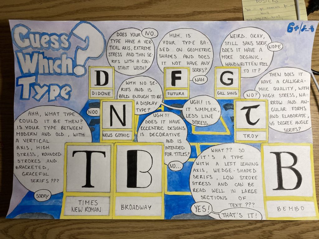
For Judy’s 141 Survey class, our assignment was to make a type identification poster.
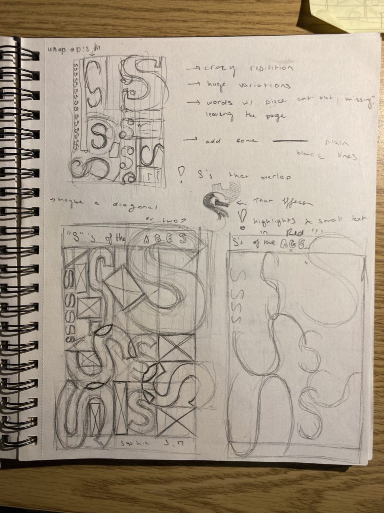
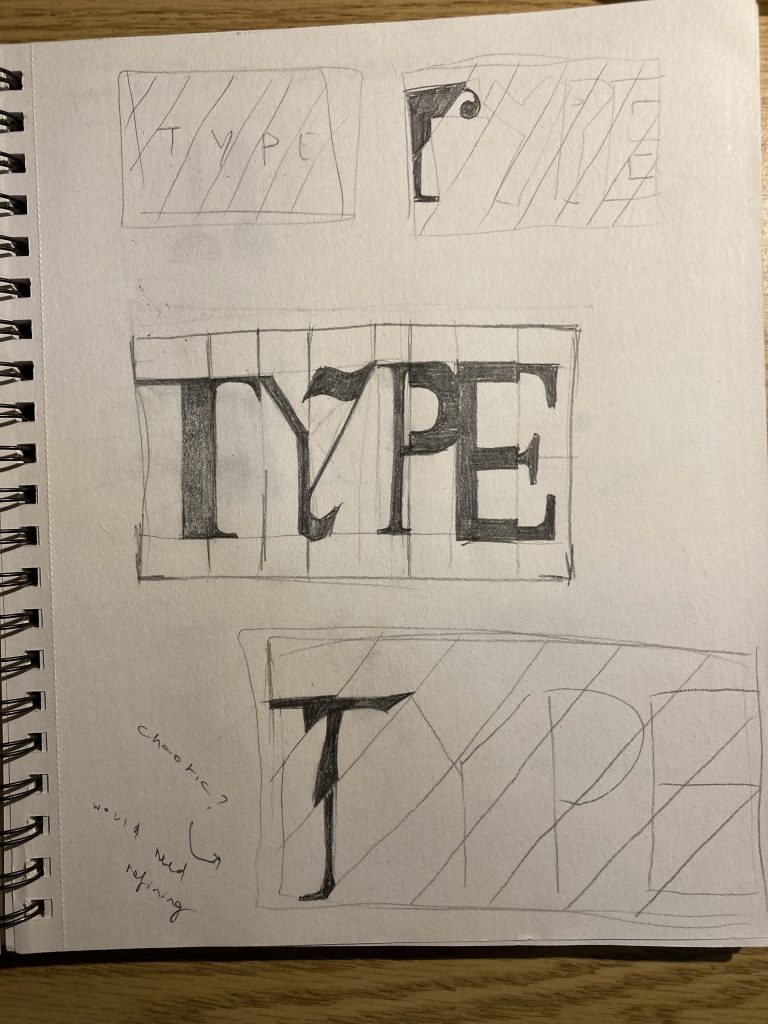
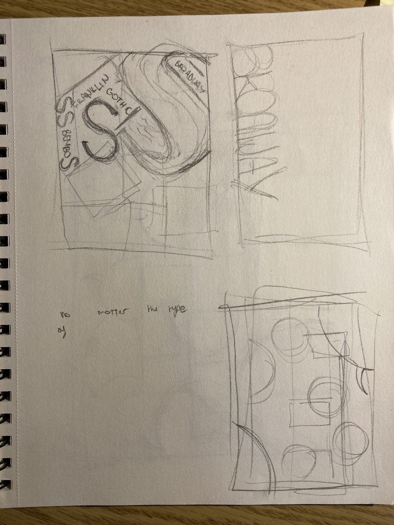
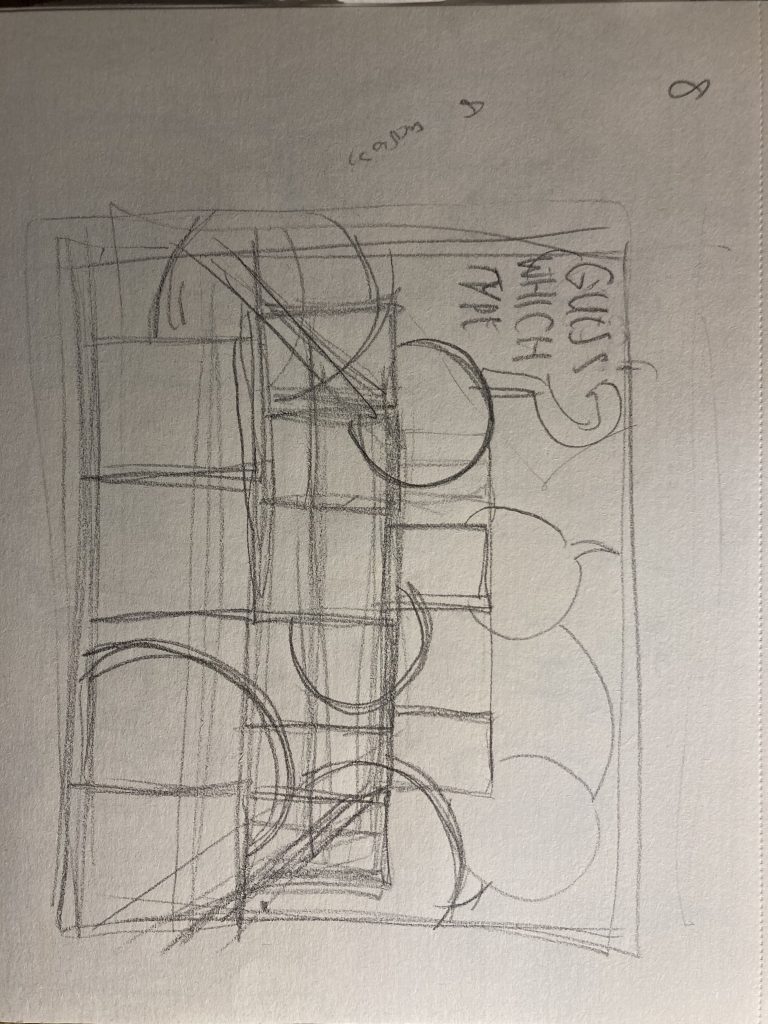
If I’m being entirely honest, I both started and ended this project struggling. Going into the project I started off weakly with only a couple of sketches as I wasn’t quite sure what to make and how exactly to present it. I went back and forth between whether I should do entire words, just a letter, if it should have figurative elements or be more design-like, should it be an infographic or more illustrative? After many hours of unsuccessful brainstorming and a headache, I decided on an idea that I later scrapped. I then chose a third idea, one that harks back to the board game “Guess Who?”. I decided to give the piece a sense of narration and comic feel, as I enjoy the way comics deliver information. Also, the childhood game is about identifying a person, so switch people out for types of type and I feel like I touched upon the theme of identification well. Where the piece is lacking is information, and due to the way I set up the piece and its storytelling aspect, it loses on pure information.
idea 1idea 2further testing of idea 1sketch of the final idea
Throughout the entire process of this piece, I fumbled and second-guessed my choices, unsure if what I was doing was right. Perhaps it was the subject matter, as I struggle with type, or maybe it was because I couldn’t wrap my head around how to present 8 different fonts in one poster without confusing the reader. And how to include being creative into that
This project left me frustrated and creatively drained and lost. I spent around 7 hours on it and would give myself a 5/10 on a personal scale.
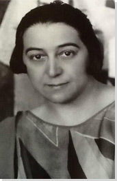
For my fourth blog post for Jeff’s 131 class, I continued my trend on researching female artists. This week, my subject was Sonia Delauney. As a big fan of Robert Delauney’s work and his depictions of the chaotic, loud, and overwhelming Parisian life at the beginning of the 20th century, I felt almost ashamed for not knowing his wife was a successful artist like him.
Propeller (Air Pavilion)
Sonia Delauney considered an “avant-garde queen” and half of the “avant-garde power couple” of the 1910s, pushed the boundaries of the art of her time. Privileged to get a cultured upbringing in St. Petersburg, Sonia was originally born in Ukraine before moving at the age of 7. Her childhood memories of Ukraine later influenced her choice of bright, vibrant colors
traditional Ukrainian dresses
Sonia Delauney was proficient at painting, creating an impressive amount of pieces that followed the ideals of Orphism and concentrated on color and its influence on the viewer. She specifically used the “simultane” technique, a method that both Delauneys infused and used in their art. The main principle of the technique, which was a branch of Orphism, was the simultaneous contrast of colors in paintings. In Sonia’s works, this principle was expressed by the way she lined shapes, lines, and colors up next to each other, allowing for a dynamic relationship between the elements that evoked life and rhythm
Prisme Électriques
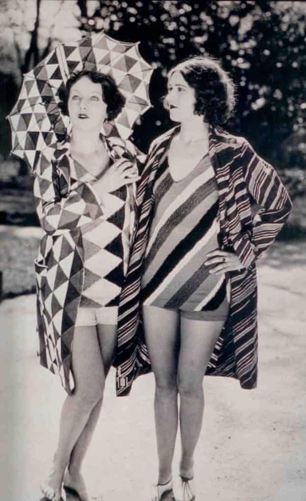
Much to my dismay, I discovered Sonia put painting down as a medium to allow Robert to pursue his career and not be a potential competitor. But she didn’t let this stop her from being successful. Letting her husband fiddle with paint, she set her gazes elsewhere, entering the domain of multidisciplinary art. She created a fashion store “Casa Sonia”, designed the set and costumes for the play “Le Coeur a Gaz” and many other set and costume designs for many films. She proved that this limitation only gave her the room to push herself and her creative potential.
Bathing suits designed by SoniaA costume designed by Sonia
I wrote this summary for English 100 on the article “The importance of Urban Forests”
In “The importance of Urban Forests” (2016) Amy Fleming shares research on the effects of including greenery in modern cityscapes. Jill Jones, a historian, explains the importance of the presence of trees and their canopies with a series of examples. Despite what city officials think, Jones shows that trees aren’t mere “expensive ornaments” (qtd in Fleming 2). From economic savings and ecological benefits, with to improved mental and physical health, cities and their residents require nature. Jones reports that “one tree can absorb 150kg of carbon” (2) and Fleming elaborates that trees have an “economic impact (…) added up to 120m a year” for cities. They stress this, wanting to establish canopies as more than just being easy on the eye. Furthermore, Jones insists that environmental equality must also be established. She states, “Everyone knows, if you look at fancy neighborhoods, they are the ones with the most trees” (qtd. In Fleming 3). Her point here is that richer neighborhoods have trees for a reason: more nature equals a better quality of life. However, Fleming reveals that in certain urban areas, tree populations are facing a multitude of dangers. Diseases and human growth pose a threat to a green cityscape. This, combined with the social-economic circumstances means a large chunk of the urban demographic don’t experience nature as much as they should. William Bird, a British GP, and public health expert expresses the urgency of the situation, underlining how future generations will become out of touch and apathetic with nature as their exposure to it declines.