For our second visual research assignment for Paul Brokenshire’s 121 class, we were tasked to choose 2 of the Gestalt principles and 2 of the Visual Design principles that we went over in class and find either a graphic or illustrated example of their use.
Gestalt Principles
Similarity
For my first example, I chose the Gestalt principle of “Similarity”. To show its use, I decided to take a poster for the 2021 Disney and Pixar animated film “Luca”.

At first, this piece doesn’t seem like it relies heavily on the principle of similarity: The poster is visually cut in half by a wave, running as a solid line through the bottom section of the poster. On top of that, the upper half of Luca is one color palette – browns and beige – while the bottom half has completely different colors: greens and blues.
But the placement of the body and head (both above and below water) and the fact that the two halves of the boy are the same shape and size means that despite it looking like two different characters, we perceive Luca as one person throughout the entirety of the poster. He just has more human and more fish-like characteristics depending on where we look.
Closure
For this next example, I chose the Toblerone logo as a good example of closure.
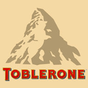
At first glance, the logo seems to be merely a mountain placed above the type of Toblerone. But if one looks at the left mountainside long enough, the shadows of the mountain shape a bear. This isn’t an actual depiction of a bear. Instead, the bear’s outlines are created by the shadow and the eye perceives its presence. The brain completes the image with the knowledge that we already have on what bears look like.
Visual Design principles
Contrast
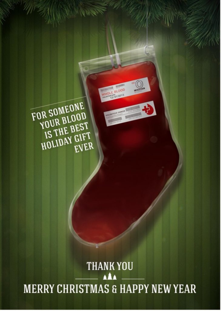
My third choice is a great example of contrast to catch a casual viewer’s attention. This is a Christmas advertisement created for the Red Cross in 2013 by Provide, Ukraine.
There are multiple usages of contrast here. Firstly, the colors: the green background paired with the red stocking catches the eye. The type is white, bright enough to differentiate from the background, but not large enough to overshadow the main element, the Christmas stocking.
Then there’s the scale contrast, with the stocking enlarged and taking up most of the foreground of the advertisement, with the writing being much smaller, almost tucked away.
Lastly, the contrast in texture is also important. The stocking, imitating a plastic bag used in hospitals to hold blood, looks very surgical and clean. It seems detached from the homely, familiar background of traditional wallpaper. This underlines the contrast between how some people may be spending their holidays. While some are at home, sitting by a fire and opening presents, others are at the hospital and desperate for any help they could get.
Repetition
For the last example of this blog post, I decided to find a piece that relied on repetition. This visual design principle is tricky. Repetition usually includes the entirety of a brand or a repeated pattern. I decided not to use a brand to display this principle, rather, a series of book covers where instead of a design, certain elements such as scale, type, and color repeat themselves to create a cohesively connected trilogy of cover art.

E. L. James’ “Fifty shades” book covers have excellent repetition: “Fifty shades” is always in a bolder type face in contrast to the smaller, thinner subtitle that’s different for each book. The color palette is monotone, a blue/gray hue for every cover so that despite each one featuring a different object, they look like they belong to a series together. These objects are also all zoomed in on, sharing a similar scale.