Category: 141

Goebbels and the weaponization of art in Nazi Germany – Blog Post 5

The german golden age of art

 In the early years of the 20th century, art was thriving. Several movements, from impressionism to the Bauhaus movement were prominent in Germany. Here, many artists grew to be famous, such as Kathe Kollwitz or Auguste Macke. Movements such as new Objectivity and Dadaism were taking flight in Weimar Germany in the 20s. New, experimental forms were being practiced, with artists exploring integrating photography, satyr and so much more into their pieces. It was an era of rebirth and exploration within art. Until it wasn’t.

Early German Cubist art
https://www.pbagalleries.com/content/early-20th-century-german-artists/

The catalyst

Just as the field of art branched off and new branches were created, something similar happened to politics. New movements like Fascism and Communism rose to compete with democracy. In Weimar Germany, the streets quite literally ran red due to the conflict between the far right and the far left. After many years of grappling, fascism slowly trumped socialism and in 1933, Adolf Hitler was elected the Chancellor of Germany. The world was never the same.

Adolf Hitler with a member of the Hitler
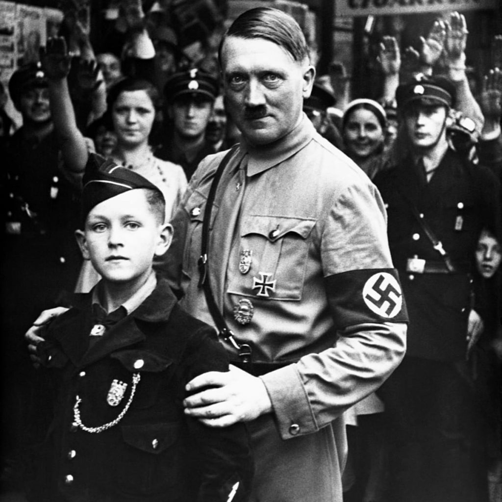
Youthhttps://www.history.com/news/how-the-hitler-youth-turned-a-generation-of-kids-into-nazis

The fall of truthful art

All forms of art faced backlash with the rise of fascism in Germany. In literature, the devastating book burnings wiped through years of stories, poems, and prose. Specifically, Jewish, and contemporary German writers, like Franz Kafka, feared for their lives and lost much of their work too. But the Nazis were especially cruel to visual artists. They took hundreds of pieces of art from museums and collected them for a special exhibit of their amusement. This exhibit was dubbed “Entartete Kunst”, degenerate art in English. Here, these pieces were lazily displayed and laid out for members and supporters of the Nazi party to make fun of. This was not just for their enjoyment, however. They started manipulating German society by twisting and controlling the art they consumed. Via art, the fascist government saw a pipeline for controlling the narrative within Germany at the time. No man understood this better than Joseph Goebbels.

A “book-burning” in action
https://www.cbc.ca/news/world/the-books-have-been-burning-1.887172
The degenerate art exhibit, here displayed as free for all
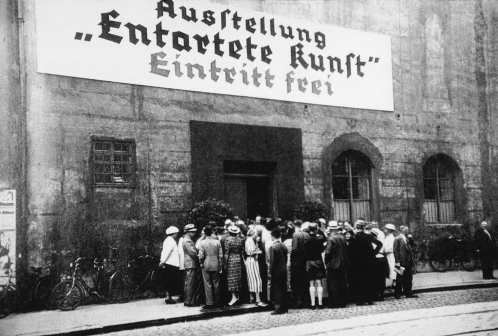
https://www.moma.org/calendar/exhibitions/3868

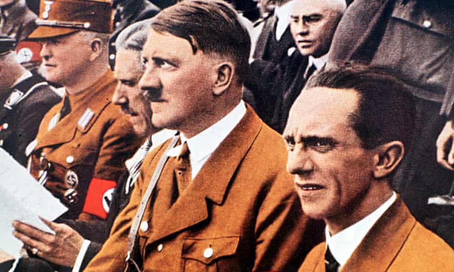
Joseph Goebbels, the master manipulator


Chief propagandist for the Nazi party, Goebbels was set apart due to his methods. He was quick to join Adolf Hitler, expressing antisemitic views throughout his early adulthood and seeing Hitler’s trial for treason in the early 1920s as a way to spread propaganda of his choosing. He was quick to take action after joining the Nazi party in 1924, rapidly being given many responsibilities. But the role that shaped him the most was his position as the propaganda minister

Hitler and Goebbels, the architects of the holocaust
https://www.theguardian.com/books/2015/may/17/goebbels-man-behind-nazi-myth-peter-longerich-review

How art was weaponized

As the Nazi party slowly took control of Germany, Goebbels quickly controlled the media. He was especially keen on using media such as films and radio to spread his propaganda. He presented the Nazi party and the atrocities they were inflicting as good and favorable, brainwashing most of German society into supporting and believing Nazi ideals. Most famously, Goebbels helped contribute to the myth of the fuehrer and helped build Hitler up as this larger-than-life figure. This helped turn the tide of people’s opinions on Hitler, this image of him being a form of messiah for Germany buying his “success” in the Nazi party. Under Goebbel’s watchful eye, propaganda flourished and pushed the boundaries of representative art at the time. Styles were explored to keep the German population engrossed in the war and supporting the Nazis. New ways were created to manipulate people, twisting the way design communicates with people.

Nazi propaganda
https://www.ushmm.org/information/press/press-kits/traveling-exhibitions/state-of-deception/he-is-to-blame-for-the-war

Sources:

https://www.britannica.com/biography/Joseph-Goebbels

https://www.khanacademy.org/humanities/art-1010/german-art-between-the-wars/xdc974a79:nazi-fascist-visual-culture/a/art-in-nazi-germany

https://fcit.usf.edu/holocaust/arts/artreich.htm

Type identification poster

my final piece

For Judy’s 141 Survey class, our assignment was to make a type identification poster.

If I’m being entirely honest, I both started and ended this project struggling. Going into the project I started off weakly with only a couple of sketches as I wasn’t quite sure what to make and how exactly to present it. I went back and forth between whether I should do entire words, just a letter, if it should have figurative elements or be more design-like, should it be an infographic or more illustrative? After many hours of unsuccessful brainstorming and a headache, I decided on an idea that I later scrapped. I then chose a third idea, one that harks back to the board game “Guess Who?”. I decided to give the piece a sense of narration and comic feel, as I enjoy the way comics deliver information. Also, the childhood game is about identifying a person, so switch people out for types of type and I feel like I touched upon the theme of identification well. Where the piece is lacking is information, and due to the way I set up the piece and its storytelling aspect, it loses on pure information.

idea 1
idea 2
further testing of idea 1
sketch of the final idea

Throughout the entire process of this piece, I fumbled and second-guessed my choices, unsure if what I was doing was right. Perhaps it was the subject matter, as I struggle with type, or maybe it was because I couldn’t wrap my head around how to present 8 different fonts in one poster without confusing the reader. And how to include being creative into that

This project left me frustrated and creatively drained and lost. I spent around 7 hours on it and would give myself a 5/10 on a personal scale.

Blog post 4 – The Prairie Style

When nature triumphs functionality

As someone growing up in the 21st century, some of my earliest memories are tied to climate change. I remember attending an assembly in elementary school and watching a video that the 6th graders made about greenhouse gases and the destruction of the earth. Perhaps one of the most pressing issues in anyone’s day-to-day life is global warming.
In the general public, there’s a want to be as environmentally friendly as possible, searching for opportunities to save water, conserve electricity or reduce one’s carbon footprint. This includes living as consciously as possible. Although certain routines can lead to lower carbon emissions, sustainable architecture as a solution is on the rise in the design and architectural circles. If one looks back into the history of architecture, there is a movement that was aware of nature, that could serve as a model for environmentally friendly architecture: the prairie style.

One of Frank Llyod Wright’s most famous buildings
(https://www.nps.gov/articles/000/the-20th-century-architecture-of-frank-lloyd-wright-world-heritage-site.htm)

The love child of infrastructure and nature

The prairie style was a movement in architecture that focuses on the environment surrounding architecture.
American architects were understandably tired of the European tendency of rebirthing classical architectural forms, as was the case during the early 20th century. Ornate facades, intricate columns, and interweaving metalwork were all prominent in European architecture at the time. The American architects wanted to break away completely from tradition, and thus they turned to the “prairie style” of houses. Here, not dissimilar from the arts and crafts movement, nature played a big role. It would be a key component to how buildings would be designed
Taking the center front stage, the interaction between environment and house was the main principle of prairie architecture.

the Taliesin
(https://franklloydwright.org/site/taliesin-hillside/)


Architectural elements that popped up were open spaces that let in lots of light and air, large windows with a view out into greenery, and simple interior designs that meshed well with the curves and edges of natural elements. Buildings should be humble and prioritize functionality over decoration. Despite focusing on the function of design, the style didn’t revolve around it in such extreme ways as the Bauhaus school did.

A prairie style interior
(https://www.pinterest.com/pin/516295544754843117/ )

Frank Lloyd Wright – The champion of the prairie

The Prairie style was founded by Frank Lloyd Wright. A young American architect, part of the “The New School of the Middle West”, he is nowadays considered the “greatest American architect of all time”. He started designing houses for the prairie, hence the name of the style, before exploring his style through international commissions. He then founded the Taliesin Fellowship, hoping to teach others about his Prairie style through involving them in his projects.
Inspired by Prairie houses, some of his notable works include the “Robie House” and are characterized by two- or one-story buildings.

the Robie House
https://www.travelandleisure.com/travel-news/robie-house-frank-lloyd-wright


By the end of his career, he had designed over 1100 works and over 500 had been turned into actual buildings. He was internationally acclaimed and traveled the world holding lectures about his architecture

the Frank Lloyd Wright logo
https://franklloydwright.org/

The future of architecture – design during the climate crisis

As mentioned in my introduction, the prairie style can serve as a basis for sustainable architecture. The main idea of having our external and internal climates communicate with each other is key for moving forward and creating infrastructure in a world plagued with a climate crisis. The external world is ever-changing, especially rapidly and dangerously nowadays. If we can re-learn to link our everyday life to our climate, the degree of separation between everyday people and the world they’re destroying will be one step closer to smaller. Getting in touch with nature again, especially in places such as urban areas, is key to developing an architecture that not only is aware, but proactive with our environment. I believe that the prairie style could be the transitional style between our present way of living and the much-needed, climate active, future way of living.

an example of sustainable architecture
https://www.straitstimes.com/singapore/when-good-design-works-with-nature-to-shape-a-sustainable-future

Sources:

https://franklloydwright.org/frank-lloyd-wright/

https://www.britannica.com/topic/Robie-House

https://www.thespruce.com/prairie-style-architecture-4797907

https://www.architecture.org/learn/resources/architecture-dictionary/entry/prairie-style/

https://flwright.org/researchexplore/prairiestyle

Historical artifact

As I have been more and more intrigued by the ukiyo-e art of Japan during the Edo period, I found it only appropriate to examine and reproduce the techniques and aesthetics of this art form for my historical artifact.

My final product!

Reference sources:

https://www.fujiarts.com/cgi-bin/item.pl?item=910376

https://www.britannica.com/art/ukiyo-e

https://issuu.com/hercampusamerican/docs/typebook

Reference images:

for the mountains (https://www.vam.ac.uk/articles/japanese-woodblock-prints-ukiyo-e)
for the textures! (https://en.wikipedia.org/wiki/Eight_Views_of_%C5%8Cmi)
for the perspective and general flow of the painting! (https://www.pinterest.com/pin/557039047650511126/)

For this project, I struggled with it more than I wanted to. Specifically, I spent a lot of time trying to decide on a subject for my ukiyo-e painting. I wanted to do a scene from mythology but realized that required more research than I could properly put into this project and I wanted to avoid rushing through it and not respectfully treating the subject. Then, I considered a historical moment, but again, stumbled across the problem of needing a certain amount of time to do the proper research which was lacking. A scene from a brothel was also off the table. I sketched out an idea for a beautiful woman, but when trying to decide what style I wanted to draw her in, found myself in the same predicament: If I wanted to draw her in a typical Ukiyo-e style, I would need to study many paintings and prints to do it properly and respectfully. So finally, I found a subject I could paint that would require the least amount of research, studying, and time to execute it: A beautiful landscape.

I chose mountains, as this was a typical element in ukiyo-e prints. That paired with clouds and the sun, I felt like I covered a sufficient amount of elements from traditional paintings. Then, I looked into just how to paint them. For the mountains, I painted them going from red to green. The foreground has yellow slowly added to it. For the cliffs, I used a flat brush to paint the curved ledges and the trees on the mountains.

I wanted to add a certain contemporary and personal touch and added an element of perspective into the piece. Usually, ukiyo-e prints don’t have much of a perspective, but I wanted the viewer to feel like they were looking up into the mountain-scape. I achieved this by bending the mountains inwards slightly and curving the clouds.

my sketches!

To complete the piece, I made it into a scroll, gluing two wood rods to the ends of the painting (which I wrapped up the back) and attaching bamboo string so I could hang it up. this was something I wanted to achieve since the beginning and getting it to hang properly and look like a traditional scroll was quite satisfying!

I would give myself an 8/10! very proud of what I was able to make, and I felt like I did my subject and this area of art justice. I spent probably close to 8-10 hours on it, between sketching, researching, painting, and putting together the scroll.

141 blog post 3 – Japanism: The fall of the Edo period

For Judy’s 141 blog post 3, I decided to research more about Japan during its isolation period.

A tumultuous past

Before the opening of trade with Europe. Japan was thriving. It was multiple centuries into one its most prosperous rules: the Edo period, also called the Tokugawa era. This period started after the Sengoku one, which was tremulous and chaotic. The Sengoku period had been plagued with wars, with “daimyo” fighting each other for control of the country. It was so violent and bloody that today it’s also called the “Warring States Period”

This chaos was ended in 1600 by an infamous samurai.


Samurai armor of the Sengoku period
https://www.reddit.com/r/ArmsandArmor/comments/av4y6u/sengoku_era_samurai_armour/

The world-class warlord

The great warrior Tokugawa Ieyasu became the ruler of Japan (Shogun) after winning the battle of Sekigahara. This was in October 1600. With his emergence, the Tokugawa period started, beginning a new era of peace in Japan.


The legendary Tokugawa Ieyasu
https://en.wikipedia.org/wiki/Tokugawa_Ieyasu#/media/File:Tokugawa_Ieyasu2_full.JPG

When division creates unity

Remarkably, this peace was due to division. Japanese society was divided during the Edo period. When one thinks of a successful society, the first image that comes to mind is one without segregation or division of any sort. One where everyone is equal. This wasn’t the case in Japan during the Edo period. Everyone was separated into one of four categories, straight out of a dystopian YA novel: warriors, merchants, artisans, and farmers. And merchants? Bottom of the barrel, with warriors at the top of the societal food chain.

For a heavily militarized and controlled society, people were quite happy. This was because the military force, called Shogunate, was in charge of establishing brothels and other hotspots where the Japanese population could relax and have fun safely. Sadly, the Tokugawa Shogunate was the last shogunate to exist.


A daily scene of Japan during the Edo period.
https://www.japanvisitor.com/japanese-culture/history/edo-japan-history

The concrete jungle of the 1800’s

During this time there was extreme urban growth. Cities and town expanded. One of the cities that grew demographically and in popularity was Edo. It was the seat of the Tokugawa government, hence the name of the period. Within the Edo castle, Ieyasu set up base and it became the political center of Japan, although Kyoto remained the capital. By 1721, it had a population of 1 million, becoming one of the largest metropolises of its time.

Today, Edo is called Tokyo and has a population of 14 million, stretching for 850 square miles.

Tokyo now!
https://www.goodhousekeeping.com/uk/lifestyle/travel/a29363117/tokyo-olympics/

Tokyo then!
https://www.123rf.com/photo_3560994_edo-tokyo-museum-tokyo-japan.html

When brothels ruled the art world

Art, as did many other areas, flourished in Japan under the Tokugawa period. Woodblock printing in particular rose in popularity. These prints were called ukiyo-e. They were a combination of realism and decorative style, often representing scenes from brothels or urban backdrops.

One of the most famous pieces of art ever created is a ukiyo-e print, made during the Edo period: “The great wave off Kanagawa” by Katsushika Hokusai


Hokusai’s masterpiece
https://www.metmuseum.org/art/collection/search/45434

The introvert nation

Much of this demographic, cultural, and artistic growth was the result of extreme isolation. For nearly 300 years, Japan had little to no interaction with any other nation. No one was allowed in or out. This started in 1639, enforced by the shogunate after the intrusion of European and Christian influences.

Pandora’s box

Inevitably, by the hand of western powers, Japan was forced to open trade with Europe in 1858. Japan had stayed separated and independent from the influence of the west for centuries. It flourished and had its own rich culture and history. Then it was made to mingle with the Europeans, who were “inspired” by their way of life and art. They took their genre of self-expression and dubbed it “Japanism” like it was a fleeting movement in the canon of art history. From kimonos to the way Japanese artists flattened their backgrounds and applied color in flat sheets of paint. Everything was taken and turned over in the hands of the French, the Germans, and many others. In 1868, the Meiji restoration started, and the great Edo period officially came to an end.


Monet using Japanese influences in his art
https://www.sothebys.com/en/articles/7-things-you-need-to-know-about-japonisme

Sources:

https://en.wikipedia.org/wiki/Edo

https://courses.lumenlearning.com/boundless-arthistory/chapter/the-edo-period/
https://courses.lumenlearning.com/boundless-worldhistory/chapter/from-the-edo-period-to-meiji-restoration-in-japan/

https://www.britannica.com/art/ukiyo-e

https://www.metmuseum.org/toah/hd/shga/hd_shga.htm

https://www.metmuseum.org/toah/hd/plea/hd_plea.htm

https://www-oxfordartonline-com.ezproxy.capilanou.ca/groveart/view/10.1093/gao/9781884446054.001.0001/oao-9781884446054-e-7000024954#oao-9781884446054-e-7000024954

141 – Zine rationale

For Judy’s 141 Zine project, I chose to research and make a zine on constructivism and constructivist type. When I had taken art history before this art movement had piqued my interest. I took this project as an opportunity to expand my knowledge.

The first thing I did after receiving the instructions for this project and deciding on constructivism was research. Then, I created a mood board. There, I collected ideas and aesthetic inspiration from famous constructivist art pieces. Right off the bat, I knew that I not only wanted each page to look “constructivist” but that when laid out, the zine as a whole would look like a Rodchenko artwork. To do this, I made about 5 sketches in my sketchbook to elaborate certain layout ideas, before creating two drafts.

my sketches
My first draft (with mistakes! one half was upside down D:)
Success! Final draft completed

There, I included certain artistic elements I knew I wanted to include. Some of these elements were cutouts of the creators of the constructivist type and a Russian city in the 20s. I also intentionally only used black, white, and red because these were the primary colors of the constructivist artists. I also ended up including a megaphone, random geometric shapes, and lines.

I would give myself an 8/10 as I did a lot of preparation for this piece and spent a lot of time executing it. I would take points off due to the slightly chaotic layout of the entire zine and the “connotation” page, which is lacking in design.
I probably spent around 10 hours on this assignment, many spent on my fully-fledged drafts, and then my slow working time as I’ve been sick.

final zine!

Blog post 2 : Gutenberg – Genius on trial

I was inspired to base my second blog post for Judy’s Survey 141 class on Gutenberg after finding out he was put on trial and lost his invention.
I think the theme of geniuses being lost to time due to unfortunate circumstances is tragic and very prominent in our history. It is an interesting experience to relearn what one knows or what one has been taught. Thus, I found myself researching more about Gutenberg and the situation that got him written out of history for a considerable amount of time.

The man himself: Johannes Gutenberg

History’s acclaimed hustler

Johannes Gensfleisch zur Laden zum Gutenberg was a German craftsman and inventor, born in Mainz. He is most well known as the “inventor” of movable type. I use the word inventor lightly, as printing and movable type existed in many other places beforehand.
Gutenberg was infamous for entering into contracts with partners and keeping his process secret from them. This led many of his partners to second guess and suspect Gutenberg of crookedness. Often, partners would request to become a partner after such stunts. This supposed genius was considered by many to be a con man, requesting an insane amount of money and shutting his investors out when he received it.

The very invention that garnered him immortality was born from an intricate web of loans. The actual reason why anyone even knew of this creation was due to another partner suing him – legal documents revealed his recent financial proceedings. For his printing press, Gutenberg borrowed materials from a goldsmith, a carpenter, and had been requesting money for his secret project.

his secret invention: the printing press

The trial of trials

As was typical for the time, artists often needed either a commission or a patron who would support them financially to produce their craft. Back then, writers were considered craftsmen and thus needed a source of money. Johannes Gutenberg was no exception, especially with his invention of the printing machine. To create his 42-line bible, he approached the rich financier Johann Fust to borrow money.
Fust agreed, lending Gutenberg 1550 guilders, a modern equivalent of about 1,066 CAD.

Gutenberg caught up in a quest for perfection, didn’t pay Fust back promptly enough. This led Fust to sue him.

the printing machine in action!

Justice is served?

The treacherous outcome of the trial was the switch of ownership of Gutenberg’s printing machine. The invention which Gutenberg had spent many years of his life developing now lay in the hands of Fust.

In his last years of life, Gutenberg was provided with food and clothing by the Archbishop of Mainz. He was also exempt from select taxes, meaning he most likely died impoverished. 

The document recording the result of the trial

Sources:

https://en.wikipedia.org/wiki/Johannes_Gutenberg

http://www.gutenbergdigital.de/gudi/eframes/helma/not_g/not1000.htm

https://www.britannica.com/biography/Johannes-Gutenberg/Printing-of-the-Bible

https://search.credoreference.com/content/entry/ebbwmip/johannes_gutenberg/0

Blog post #1 – Cuneiform, the Netflix of Mesopotamia: Storytelling in 4000 BCE

Introduction to Cuneiform

Cuneiform was one of the earliest and first forms of writing to exist. Created by the Sumerians, it was used in the middle east, specifically the fertile crescent for nearly three millennia. Derived from Latin, the word cuneiform means “wedge-shaped” which is an illusion to the forms of the symbols, which were carved into wet clay with reeds. Cuneiform was used to record transactions, establish laws, and perhaps most interestingly note myths that had previously only been passed from generation to generation verbally.

Akkadian

Cuneiform was used to record many languages throughout its existence, from Sumerian to Persian. One of the most prominent was Akkadian.
Akkadian was the language spoken by the people of the Akkadian empire, which spread all across the middle east and was one of the first ancient empires to exist. Unfortunately, the Akkadian language died out with the fall of Nineveh in 627 BCE.

Sumer

Before there was Akkadian Empire, there was Sumer. Sumer was an ancient Mesopotamian civilization that is credited with the invention of cuneiform. Nowadays, it is considered the origin of modern culture as we know it, consisting of many city-states, one of which was the legendary Uruk.

Uruk

Some of the first recorded forms of Cuneiform found were from the ancient city of Uruk, populated by the Sumerians. This city was the very first true city, with somewhere between 40.000 and 80.000 inhabitants.

Epic of Gilgamesh:

The Sumerians of Uruk had an especially important connection with cuneiform. One of the most pertinent pieces of cuneiform storytelling was linked to the ancient metropole. This story was the “Epic of Gilgamesh”. It is probably one of, if not the most famous pieces of cuneiform literature. The Epic of Gilgamesh is a Mesopotamian Odyssey that recounts the story of Gilgamesh, an old king of Uruk, who was tyrannical and menaced the people of his kingdom. To bring Gilgamesh to his senses, the gods create Enkidu, who is half animal, to battle him. Despite their start as divine enemies, the two of them become friends and go on adventures together. Unfortunately, they offend the gods on one of their quests and the gods decide to kill Enkidu to punish them. After his death, sorrowful Gilgamesh journeys to find immortality and decides that being a fair and just ruler over a successful city that would outlive him was the secret to never being forgotten.

Symbolically, Gilgamesh did find this immortality, as his story has been written down and recounted for millennia.

Gilgamesh was truly once the ruler of Uruk in 2800 BCE. Only 200 years after that he became deified and started showing up in writing as a mythological figure. The Epic is an enormous piece of writing, one of the longest ever written in Cuneiform, spreading across 11 clay tablets. The oldest known copy of the poem dates from 2100, nearly 700 hundred years after the real Gilgamesh was king.

Sources:

https://search.credoreference.com/content/entry/hmencyclwh/the_sumerians_and_the_akkadians/0

https://www.history.com/topics/ancient-middle-east/sumer

https://en.wikipedia.org/wiki/Cuneiform

https://www.britannica.com/topic/Epic-of-Gilgamesh

https://www.britannica.com/topic/cuneiform

https://en.wikipedia.org/wiki/Sumerian_literature

https://eds.a.ebscohost.com/eds/pdfviewer/pdfviewer?vid=2&sid=017b5a30-b0cd-4a9c-9d75-bcbfdfa4aa1b%40sessionmgr4006

Yearbook spread

For my yearbook spread, I knew right off the bat that it would be inspired by Ancient Greek art. In class, we discussed heritage, and so I wanted to dive into my own for this project.

I used mainly black fine liners for the art and text on my spread, because ever since I was young, I’ve loved comic books, specifically black and white ones with strong, expressive and intricate black outlines. I tried to capture my love for design in this spread, specifically the balancing act of placing elements in a harmonic arrangement to one another. I tried to stay visual with the prompts, as in Ancient Greek art even the most complicated of battles were depicted on vases, often with minimal text.

References to the things I love, like my cat, clouds, the sun and Greek architecture are peppered on the left half of the spread. The temple pillar on the left is specifically a Corinthian style pillar – this style represents young women, so I chose it as a reflection of me at this point in my life.

The different elements on my spread are often very carefully drawn and well separated from one another. The colors are flat and strong. This is a good introduction to my style as an artist, as I love to incorporate white space, many details and an overload of information into my pieces, all while trying to keep each element unique.

I would give myself an 8/10. Unfortunately, the illustrations on the right get lost in the background, especially with the bright white vase pulling all the attention to it. That right there cost me a point. Then, I would take a point off for messiness of the spread. Although I intentionally roughened up the paper to make it seem older and give it a bit of depth (it was supposed to imitate the values of an old Greek vase) it just looks…dirty. That effect doesn’t land well, and I find myself being pulled to the edges of the piece in a distracting manner due to their prominence.

All in all, I still put a lot of work into this and am quite happy with the outcome.