Category: 142

Blog 5: Canadian Design Today

For my final blog post, I decided to research Marian Bantjes. As a student who is more passionate about illustration, yet still enjoys graphic design, seeing examples of Bantjes’ work was delightful. 

Poster, Seduction, for Yale School of Architecture Symposium, January  20-21, 2007 | Objects | Collection of Cooper Hewitt, Smithsonian Design  Museum
An example of a typical Bantjes piece
https://loisgordon.github.io/design-essay/design-essay.html

Despite leaving book typesetting earlier in her career, Bantjes’s work often includes type in one form or another, although she prefers to call it graphic art. She has successfully co-founded and run a design studio and currently works as a freelance artist and designer. Alongside visual art, she also loves writing, often sharing her strong opinions through her written work.

The Typofiles #56: Marian Bantjes for Saks | Nubby Twiglet
“Want It!” for a campaign, featuring her trademark flowing lines
http://nubbytwiglet.com/2010/03/31/the-typofiles-56-marian-bantjes-for-saks/

Her art and her approach to it are quite all-encompassing and power-driven. She likes to be tasked with doing every aspect of a piece, is quite happy doing as much work as possible, and never shying away from a big project. If anything, she faces it heads on. 

Valentines 2007 - Marian Bantjes : Marian Bantjes
Her hand-drawn Valentine’s day project, where she drew over 100 hearts
https://bantjes.com/work/valentines-2007/

As someone who loves multiple facets of art, often torn between what to actually pursue in her career and always trying to think of a way to combine illustration and graphic design, reading about Bantjes was quite reassuring and personally, I found her inspirational. If she wants the job done, she’ll do all of it herself and be at peace with it.

Party in the Garden - Marian Bantjes : Marian Bantjes
“The party in the Garden” designed as an invitation
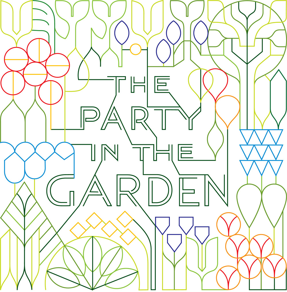
https://bantjes.com/work/party-in-the-garden/
Community - Marian Bantjes : Marian Bantjes
A spread based on “Community”
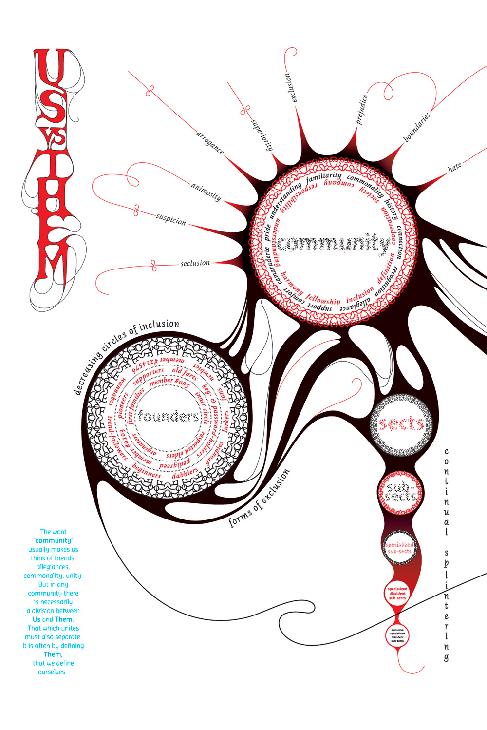
https://bantjes.com/work/community/

Blog 4: Postmodernism in Europe

Once more, my blog post is not about an artist, but instead about Émigré magazine. If I’m being completely honest, that’s because a lot of the designers we’re going over at the moment are being presented in Pecha Kuchas and my brain is flooded with information. 

Emigre: A Magazine for Exiles / The Magazine That Ignores Boundaries,  issues 1-8 - Price Estimate: $2000 - $3000
A couple of issues of Émigré
https://www.pbagalleries.com/view-auctions/catalog/id/428/lot/137326/Emigre-A-Magazine-for-Exiles-The-Magazine-That-Ignores-Boundaries-issues-1-8

With 69 issues that were published between 1984 and 2005, Émigré was a huge well of visual knowledge of typefaces. No doubt, Emigre magazine is to thank for an easier, smoother transition into the digital age. By assembling, using, and experimenting with digital fonts, let these new forms of type join the ranks of traditional typefaces that had been around for years. Alongside this, it allowed, via experimentation, for contemporary fonts to be made rapidly. 

Emigre #19: Starting From Zero - Fonts In Use
The inside of Émigré #19
https://fontsinuse.com/uses/16582/emigre-19-starting-from-zero

What drew me into researching more about Emigré was not only the concept of normalizing new, perhaps scary fonts into the general consciousness but also the idea of allowing equal access to information, especially in the digital age.

Emigre magazine: design, discourse and authorship | Typography at Reading
A cover, of issue 11
https://blogs.reading.ac.uk/typography-at-reading/2017/06/07/emigre-magazine-design-discourse-and-authorship/

Now, I’m not claiming that Émigre is a groundbreaking magazine that broke down the weird culture of gatekeeping surrounding fonts and their usage. But researching for this blog post led me to believe that creating spaces where artists and designers can experiment freely and without a sort of “preciousness” surrounding their work could be beneficial to art as a whole. To both spread information on art, share resources, and close the gap between the art world and the regular world – which has been expanding for centuries.

Emigre Magazine No. 15 "do you read me?" (Max Kisman, Zuzana Licko, Jeffrey  Keedy, Karrie Jacobs): Rudy Vanderlans, Peter Mertens: Amazon.com: Books
Another Cover, #15
https://www.amazon.com/Emigre-Magazine-Kisman-Zuzana-Jeffrey/dp/B08DP1KK7Z
EMIGRE : ESSAYS, TEXTS AND OTHER WRITINGS ABOUT GRAPHIC DESIGN NO. 9: 4AD +  VAUGHAN OLIVER von EMIGRE MAGAZINE) (V23) (4AD). Vanderlans, Rudy,  Editor/Designer. Typeface Designs by Zuzana Licko: Good +. Stapled
Yet another cover, #9
https://www.abebooks.de/erstausgabe/EMIGRE-ESSAYS-TEXTS-WRITINGS-GRAPHIC-DESIGN/30719414967/bd

Blog 3: Supergraphics Innovator

Originally, this was going to be a blog post on Bruce Mau. His supergraphics captured my attention during the weekly lecture and I wanted to find out more about him. Unfortunately, I fell down a sort of rabbit hole, instead, finding myself staring at pictures of the Seattle Central Library. I got sidetracked and this blog post is a testament to that.

Seattle Central Library - Wikipedia
the Seattle Central Library from the outside
https://en.wikipedia.org/wiki/Seattle_Central_Library

What drew me in about the Seattle library was the way it evoked a sort of childhood nostalgia. When I did more research about how the library was supposed to not only be a library but also a “lived-in” area, I couldn’t help but remember hours spent at the local library in the town I grew up in and realize that I wanted to write a little informational post about the Seattle Central Library

Hoffman Construction — Seattle Central Library
The interior of the Seattle Central Library
https://www.hoffmancorp.com/project/seattle-central-library/

The Seattle public library is an anomaly amongst libraries and an anomaly amongst buildings. Not only does it have surprising little books, but it has the design of a modern business building with an interior inspired by 70s trends. With 12 stories, rigid, geometric architecture, and an abundance of glass, this Library is a sight to behold

Öffentliche Bibliothek in Seattle von OMA + LMN | Standort: Seattle, USA. ▫  Fotografie Vi … - architektur | Public library design, Seattle library,  Seattle central library
Another view of the interior
https://www.pinterest.com/pin/740560732458893989/

The library, which opened to the public in 2004, relies heavily on technology: from the supergraphics characterizing its look to the literal information it stores. It captures the zeitgeist of the 21st century. Especially during a period when libraries are at a higher risk of dying out and disappearing, the Seattle central library prevails, keeping its relevance. This is mostly due to the emphasis on the idea of access to information, instead of raw information. Thus, the use of supergraphics in its interior is fitting.

SEATTLE PUBLIC LIBRARY | Entro Communications
an example of the interior Supergraphics
https://www.entro.com/project/seattle-public-library/

Bruce Mau paired with OMA to create the supergraphics for the Seattle Central Library. The graphics line and decorate the simple, yet slightly harsh interior of the library. They transform what could have been a cold, stark, and unwelcoming design into a cheeky one. Through the supergraphics, the library became less about books and more about living.

The Architect of Innovation and His Modern Cathedral to Books | Ideas of  Order
the infamous escalator in the library
https://www.ideasoforder.com/features/profiles/the-architect-of-innovation/

Blog 2: Psychedelic Design Hero

The Modern Environmental Movement | American Experience | Official Site |  PBS
Two environmental activists, at some point in the 70s
https://www.pbs.org/wgbh/americanexperience/features/earth-days-modern-environmental-movement/

This blog post isn’t about a certain designer, but rather about an art movement that I feel quite passionate about Environmental art. This was inspired by the section of our lecture where Paul brought up the early beginnings of the environmental movement, which I wanted to look into. That led me here. During my research, it was almost funny to look back at the history of art, design, and architecture and see just how long the artists behind some of the most influential movements have been advocating for nature. Climate awareness as it turns out has been around longer than the word “climate change”. That being said, there has never been a time it is needed more than right now.

A Fierce Green Fire | Timeline of Environmental Movement and History |  American Masters | PBS
Greenpeace activists
https://www.pbs.org/wnet/americanmasters/a-fierce-green-fire-timeline-of-environmental-movement/2988/

The environmental movement has been a long process. As of the early days of industrialization, there have been actions taken to protect nature from it. National parks were created and sanctuaries established, all with the aim of protecting our ecosystem. Perhaps most monumental was the creation of Greenpeace in Vancouver in 1971. This organization would grow to become one of the spearheads of the modern climate movement 

Reframing the Environmental Movement with Placemaking
The New York Times article on a climate protest
https://www.pps.org/article/happy-earth-day-reframing-the-environmental-movement

Since its founding, Greenpeace has fought against many potentially harmful acts against the environment. They have blocked the dumping of certain materials in the ocean, protested nuclear testing, organized and enforced animal sanctuaries, created petitions, designated world heritage spots, and lobbied against multiple governments

Careers - Jobs - Greenpeace International
A contemporary Green Peace protest
https://workfor.international.greenpeace.org/

Nowadays, we not only have design and illustration based on the environmental movement but environmentally-themed art has become its own category of art: Land art. Land art aims to link and observe the relationship between nature and humans, with art serving as a sort of bridge connecting the two. Artists that create this art aim to alter materials found in nature in a non-destructive way. The harmless alteration of position or formation infuses nature with the human element.

Land art - Wikipedia
“Spiral Jetty” is one of the most famous pieces of land art to exist
https://en.wikipedia.org/wiki/Land_art

Blog 1: New York Style and Editorial Designers

For the first blog post for Paul’s 142 class, I decided to look into and learn more about art director and designer Bea Feitler. Not only does she have an impressive career, becoming an art director at Harpers Bazaar at 25, but as one of the only female art directors of the time, she had a unique visual language that resonates in the art world to this day

Bea Feitler — Riposte
Young Bea Feitler https://www.ripostemagazine.com/bea-feitler

Bea Feitler was a Brazilian designer, most well known for her art direction for well-known fashion magazines. She graduated from Parson’s school of design and during her career, she aimed to change the female body from a subject of over-sexualization to an artistic element, using an objective lens to integrate pictures of women into her magazine covers.

Bea Feitler | AnOther
A body spread of Feitler’s https://www.anothermag.com/art-photography/gallery/9042/bea-feitler/4

Bea Feitler was aware of the graphic designer’s influence on society, noticing how design could shape populations. Therefore, she purposefully wanted to expose the theme of gender equality

Throughout her career, she faced similar problems as women do to this day. From negotiating her salary to a lack of proper credit, she struggled with it all. Due to this, she purposefully made it her mission to establish femininity as a force to be reckoned with.(She quit Harper’s Bazaar due to their inability to give her a raise)

A collection of Feitler’s work https://www.uks.no/archive/bea-feitler/

In 1965, Feitler and Richard Avedon hired the first black model to be on the front cover of Harpers Bazaar. Due to an overwhelming amount of backlash, Feitler and the other fashion magazine designers didn’t dare try to hire black models until a good couple of years afterward. 

When mentioned in class, Feitler immediately caught my attention. As someone who had tried to enact change earlier than history would have it – hiring a black model for a front cover – I wanted to read more into her work and who she was as a person. It was satisfying, to learn that she had a very strong personality and wanted to push the limits of pretty much every aspect of her life. But it was also disappointing because there was just so little on her that I could find. I think she truly embodies what I believe artists should strive for: enact good and aim to improve society through art.

cover by Bea Feitler | Harpers bazaar covers, Magazine cover, Fashion  magazine cover
A cover spread by Feitler