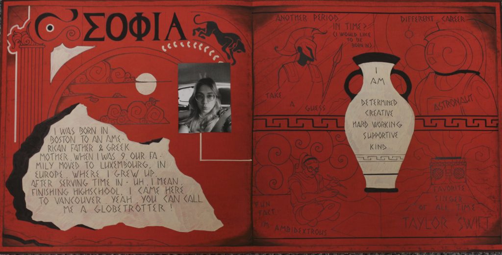
For my yearbook spread, I knew right off the bat that it would be inspired by Ancient Greek art. In class, we discussed heritage, and so I wanted to dive into my own for this project.
I used mainly black fine liners for the art and text on my spread, because ever since I was young, I’ve loved comic books, specifically black and white ones with strong, expressive and intricate black outlines. I tried to capture my love for design in this spread, specifically the balancing act of placing elements in a harmonic arrangement to one another. I tried to stay visual with the prompts, as in Ancient Greek art even the most complicated of battles were depicted on vases, often with minimal text.
References to the things I love, like my cat, clouds, the sun and Greek architecture are peppered on the left half of the spread. The temple pillar on the left is specifically a Corinthian style pillar – this style represents young women, so I chose it as a reflection of me at this point in my life.
The different elements on my spread are often very carefully drawn and well separated from one another. The colors are flat and strong. This is a good introduction to my style as an artist, as I love to incorporate white space, many details and an overload of information into my pieces, all while trying to keep each element unique.
I would give myself an 8/10. Unfortunately, the illustrations on the right get lost in the background, especially with the bright white vase pulling all the attention to it. That right there cost me a point. Then, I would take a point off for messiness of the spread. Although I intentionally roughened up the paper to make it seem older and give it a bit of depth (it was supposed to imitate the values of an old Greek vase) it just looks…dirty. That effect doesn’t land well, and I find myself being pulled to the edges of the piece in a distracting manner due to their prominence.
All in all, I still put a lot of work into this and am quite happy with the outcome.

Leave a Reply