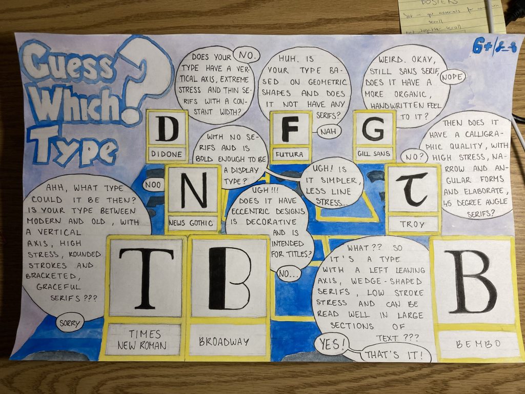
For Judy’s 141 Survey class, our assignment was to make a type identification poster.
If I’m being entirely honest, I both started and ended this project struggling. Going into the project I started off weakly with only a couple of sketches as I wasn’t quite sure what to make and how exactly to present it. I went back and forth between whether I should do entire words, just a letter, if it should have figurative elements or be more design-like, should it be an infographic or more illustrative? After many hours of unsuccessful brainstorming and a headache, I decided on an idea that I later scrapped. I then chose a third idea, one that harks back to the board game “Guess Who?”. I decided to give the piece a sense of narration and comic feel, as I enjoy the way comics deliver information. Also, the childhood game is about identifying a person, so switch people out for types of type and I feel like I touched upon the theme of identification well. Where the piece is lacking is information, and due to the way I set up the piece and its storytelling aspect, it loses on pure information.
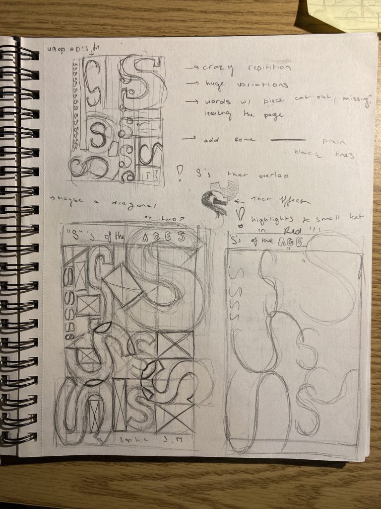
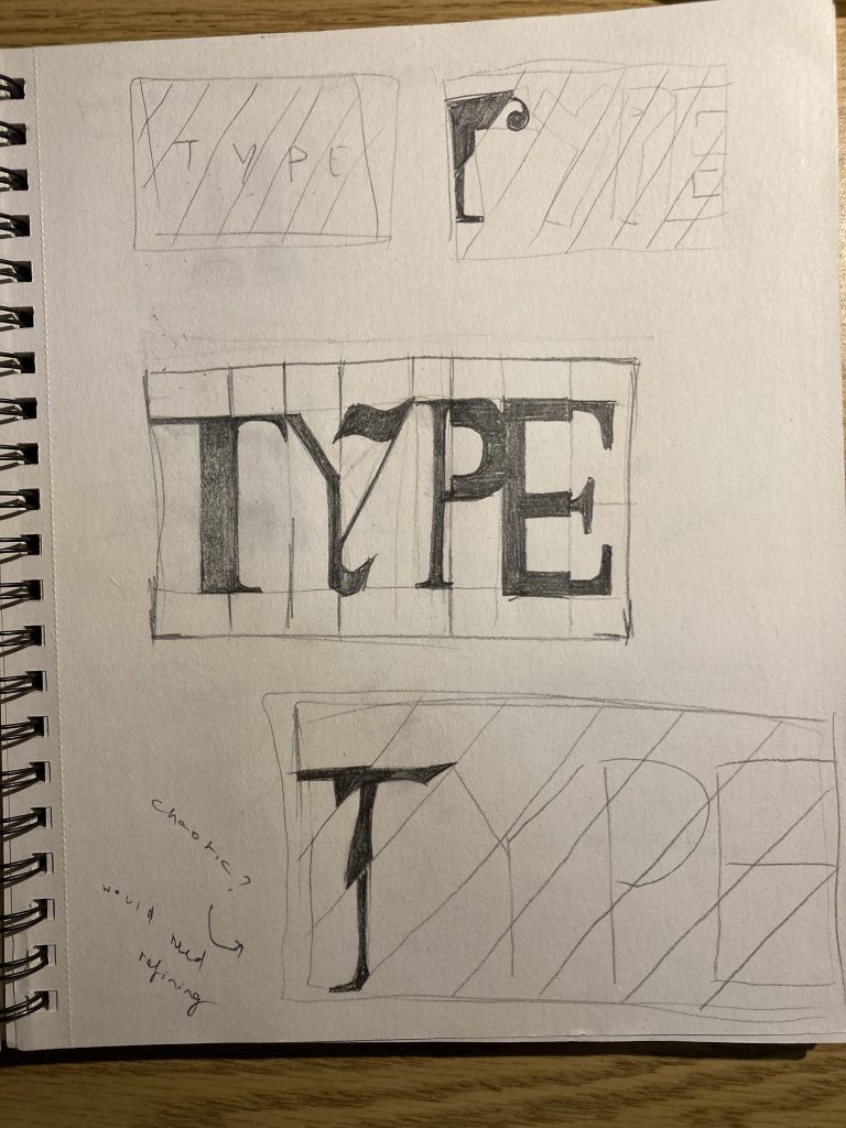
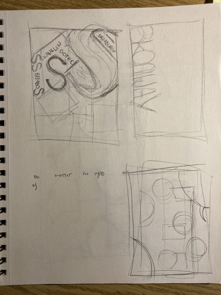
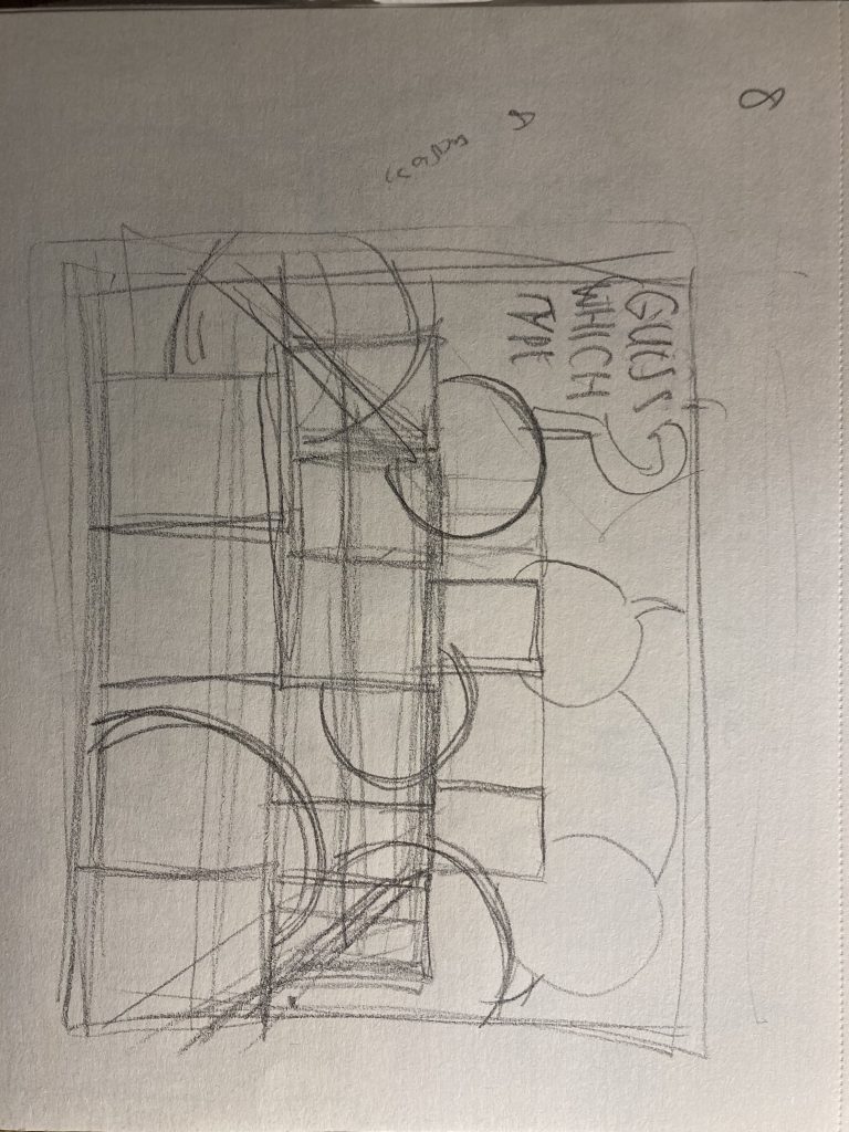
Throughout the entire process of this piece, I fumbled and second-guessed my choices, unsure if what I was doing was right. Perhaps it was the subject matter, as I struggle with type, or maybe it was because I couldn’t wrap my head around how to present 8 different fonts in one poster without confusing the reader. And how to include being creative into that
This project left me frustrated and creatively drained and lost. I spent around 7 hours on it and would give myself a 5/10 on a personal scale.
Leave a Reply