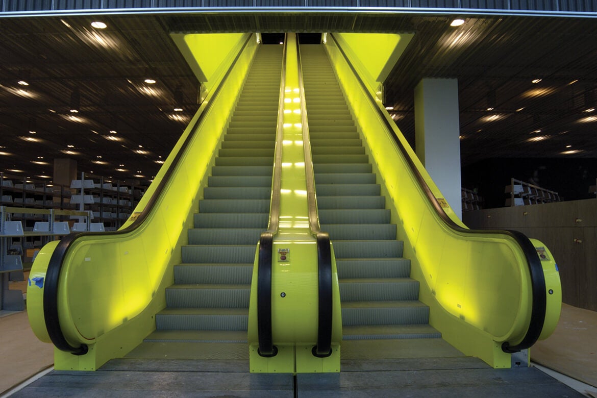
Originally, this was going to be a blog post on Bruce Mau. His supergraphics captured my attention during the weekly lecture and I wanted to find out more about him. Unfortunately, I fell down a sort of rabbit hole, instead, finding myself staring at pictures of the Seattle Central Library. I got sidetracked and this blog post is a testament to that.

https://en.wikipedia.org/wiki/Seattle_Central_Library
What drew me in about the Seattle library was the way it evoked a sort of childhood nostalgia. When I did more research about how the library was supposed to not only be a library but also a “lived-in” area, I couldn’t help but remember hours spent at the local library in the town I grew up in and realize that I wanted to write a little informational post about the Seattle Central Library

https://www.hoffmancorp.com/project/seattle-central-library/
The Seattle public library is an anomaly amongst libraries and an anomaly amongst buildings. Not only does it have surprising little books, but it has the design of a modern business building with an interior inspired by 70s trends. With 12 stories, rigid, geometric architecture, and an abundance of glass, this Library is a sight to behold

https://www.pinterest.com/pin/740560732458893989/
The library, which opened to the public in 2004, relies heavily on technology: from the supergraphics characterizing its look to the literal information it stores. It captures the zeitgeist of the 21st century. Especially during a period when libraries are at a higher risk of dying out and disappearing, the Seattle central library prevails, keeping its relevance. This is mostly due to the emphasis on the idea of access to information, instead of raw information. Thus, the use of supergraphics in its interior is fitting.

https://www.entro.com/project/seattle-public-library/
Bruce Mau paired with OMA to create the supergraphics for the Seattle Central Library. The graphics line and decorate the simple, yet slightly harsh interior of the library. They transform what could have been a cold, stark, and unwelcoming design into a cheeky one. Through the supergraphics, the library became less about books and more about living.

https://www.ideasoforder.com/features/profiles/the-architect-of-innovation/
Leave a Reply