Hi! This is a post for Paul Brokenshire’s Design 121 class, where we were asked to find 3 examples of an illustration or design piece and elaborate which element, from the ones we had gone over together in class, each piece relied on the most.
Space
My first example for this blog entry is this illustrated movie poster for the 2019 Jordan Peele movie “Us”.

The main element that this poster relies on is space, specifically white space. Here, the illustrator Cealin White fills the centre of the piece with two black mirrored profiles of a head. It imitates an ink blot, with the emptiness of the white background forcing the viewer to focus on the centrepiece and realize that the right head is slightly altered.
Line
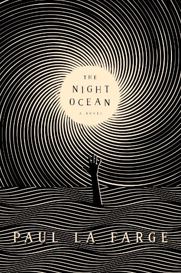
For my second example, I chose an illustrated book cover of novel “the night ocean” by Paul La Farge.

Will Steahle’s illustration relies heavily on line, using wavy, repetitive and horizontal lines to represent the water on the bottom half of the cover, from which an outstretched hand emerges. Similar lines, although arranged in a spiral, converge to the centre of the cover, filling the rest of the illustration. They simultaneously create a sky and a celestial body, by reducing in size before coming to a stop completely.
Scale
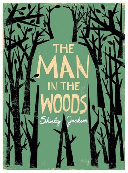
In my final example, I chose another book cover. This time it is an illustration by Edel Rodriguez for “The Man in the Woods” by Shirley Jackson.

Contrasting scales is the element that this example relies the heaviest on. Here, the geometric trees lining the outside of the cover, create with their outline the shape of an enormous man, that towers over them. Without their explicit lines, the man would be invisible to the viewer’s eye.
Leave a Reply