Blog post #1 – Cuneiform, the Netflix of Mesopotamia: Storytelling in 4000 BCE

Introduction to Cuneiform

Cuneiform was one of the earliest and first forms of writing to exist. Created by the Sumerians, it was used in the middle east, specifically the fertile crescent for nearly three millennia. Derived from Latin, the word cuneiform means “wedge-shaped” which is an illusion to the forms of the symbols, which were carved into wet clay with reeds. Cuneiform was used to record transactions, establish laws, and perhaps most interestingly note myths that had previously only been passed from generation to generation verbally.
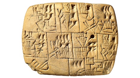
Akkadian

Cuneiform was used to record many languages throughout its existence, from Sumerian to Persian. One of the most prominent was Akkadian.
Akkadian was the language spoken by the people of the Akkadian empire, which spread all across the middle east and was one of the first ancient empires to exist. Unfortunately, the Akkadian language died out with the fall of Nineveh in 627 BCE.
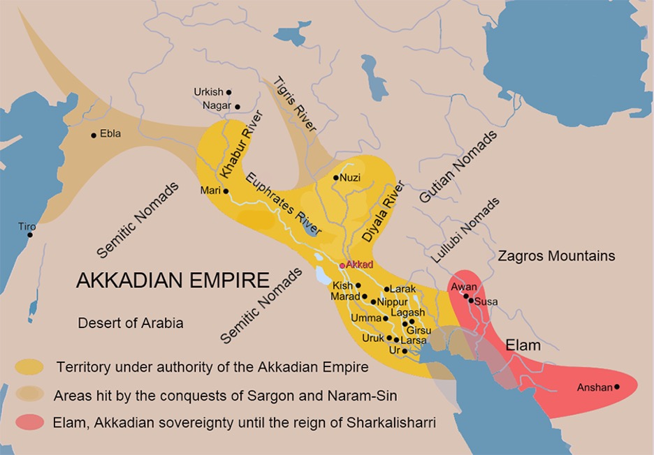
Sumer

Before there was Akkadian Empire, there was Sumer. Sumer was an ancient Mesopotamian civilization that is credited with the invention of cuneiform. Nowadays, it is considered the origin of modern culture as we know it, consisting of many city-states, one of which was the legendary Uruk.
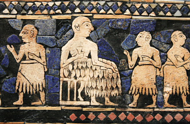
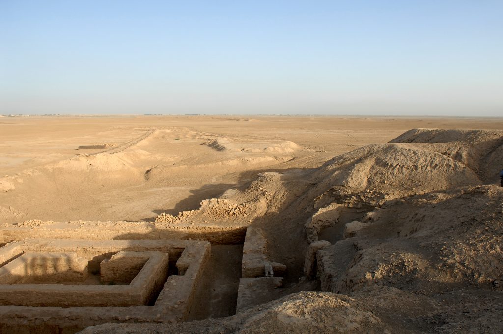
Uruk

Some of the first recorded forms of Cuneiform found were from the ancient city of Uruk, populated by the Sumerians. This city was the very first true city, with somewhere between 40.000 and 80.000 inhabitants.
Epic of Gilgamesh:

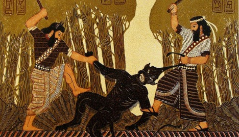
The Sumerians of Uruk had an especially important connection with cuneiform. One of the most pertinent pieces of cuneiform storytelling was linked to the ancient metropole. This story was the “Epic of Gilgamesh”. It is probably one of, if not the most famous pieces of cuneiform literature. The Epic of Gilgamesh is a Mesopotamian Odyssey that recounts the story of Gilgamesh, an old king of Uruk, who was tyrannical and menaced the people of his kingdom. To bring Gilgamesh to his senses, the gods create Enkidu, who is half animal, to battle him. Despite their start as divine enemies, the two of them become friends and go on adventures together. Unfortunately, they offend the gods on one of their quests and the gods decide to kill Enkidu to punish them. After his death, sorrowful Gilgamesh journeys to find immortality and decides that being a fair and just ruler over a successful city that would outlive him was the secret to never being forgotten.

Symbolically, Gilgamesh did find this immortality, as his story has been written down and recounted for millennia.

Gilgamesh was truly once the ruler of Uruk in 2800 BCE. Only 200 years after that he became deified and started showing up in writing as a mythological figure. The Epic is an enormous piece of writing, one of the longest ever written in Cuneiform, spreading across 11 clay tablets. The oldest known copy of the poem dates from 2100, nearly 700 hundred years after the real Gilgamesh was king.
Sources:

https://search.credoreference.com/content/entry/hmencyclwh/the_sumerians_and_the_akkadians/0

https://www.history.com/topics/ancient-middle-east/sumer

https://en.wikipedia.org/wiki/Cuneiform

https://www.britannica.com/topic/Epic-of-Gilgamesh

https://www.britannica.com/topic/cuneiform

https://en.wikipedia.org/wiki/Sumerian_literature

https://eds.a.ebscohost.com/eds/pdfviewer/pdfviewer?vid=2&sid=017b5a30-b0cd-4a9c-9d75-bcbfdfa4aa1b%40sessionmgr4006

Visual Research 2

For our second visual research assignment for Paul Brokenshire’s 121 class, we were tasked to choose 2 of the Gestalt principles and 2 of the Visual Design principles that we went over in class and find either a graphic or illustrated example of their use.

Gestalt Principles

Similarity

For my first example, I chose the Gestalt principle of “Similarity”. To show its use, I decided to take a poster for the 2021 Disney and Pixar animated film “Luca”.

At first, this piece doesn’t seem like it relies heavily on the principle of similarity: The poster is visually cut in half by a wave, running as a solid line through the bottom section of the poster. On top of that, the upper half of Luca is one color palette – browns and beige – while the bottom half has completely different colors: greens and blues.
But the placement of the body and head (both above and below water) and the fact that the two halves of the boy are the same shape and size means that despite it looking like two different characters, we perceive Luca as one person throughout the entirety of the poster. He just has more human and more fish-like characteristics depending on where we look.

Closure

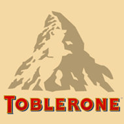
For this next example, I chose the Toblerone logo as a good example of closure.

At first glance, the logo seems to be merely a mountain placed above the type of Toblerone. But if one looks at the left mountainside long enough, the shadows of the mountain shape a bear. This isn’t an actual depiction of a bear. Instead, the bear’s outlines are created by the shadow and the eye perceives its presence. The brain completes the image with the knowledge that we already have on what bears look like.

Visual Design principles

Contrast

My third choice is a great example of contrast to catch a casual viewer’s attention. This is a Christmas advertisement created for the Red Cross in 2013 by Provide, Ukraine.
There are multiple usages of contrast here. Firstly, the colors: the green background paired with the red stocking catches the eye. The type is white, bright enough to differentiate from the background, but not large enough to overshadow the main element, the Christmas stocking.
Then there’s the scale contrast, with the stocking enlarged and taking up most of the foreground of the advertisement, with the writing being much smaller, almost tucked away.
Lastly, the contrast in texture is also important. The stocking, imitating a plastic bag used in hospitals to hold blood, looks very surgical and clean. It seems detached from the homely, familiar background of traditional wallpaper. This underlines the contrast between how some people may be spending their holidays. While some are at home, sitting by a fire and opening presents, others are at the hospital and desperate for any help they could get.

Repetition

For the last example of this blog post, I decided to find a piece that relied on repetition. This visual design principle is tricky. Repetition usually includes the entirety of a brand or a repeated pattern. I decided not to use a brand to display this principle, rather, a series of book covers where instead of a design, certain elements such as scale, type, and color repeat themselves to create a cohesively connected trilogy of cover art.

E. L. James’ “Fifty shades” book covers have excellent repetition: “Fifty shades” is always in a bolder type face in contrast to the smaller, thinner subtitle that’s different for each book. The color palette is monotone, a blue/gray hue for every cover so that despite each one featuring a different object, they look like they belong to a series together. These objects are also all zoomed in on, sharing a similar scale.

Visual Research – 1

Hi! This is a post for Paul Brokenshire’s Design 121 class, where we were asked to find 3 examples of an illustration or design piece and elaborate which element, from the ones we had gone over together in class, each piece relied on the most.

Space

My first example for this blog entry is this illustrated movie poster for the 2019 Jordan Peele movie “Us”.

The main element that this poster relies on is space, specifically white space. Here, the illustrator Cealin White fills the centre of the piece with two black mirrored profiles of a head. It imitates an ink blot, with the emptiness of the white background forcing the viewer to focus on the centrepiece and realize that the right head is slightly altered.

Line

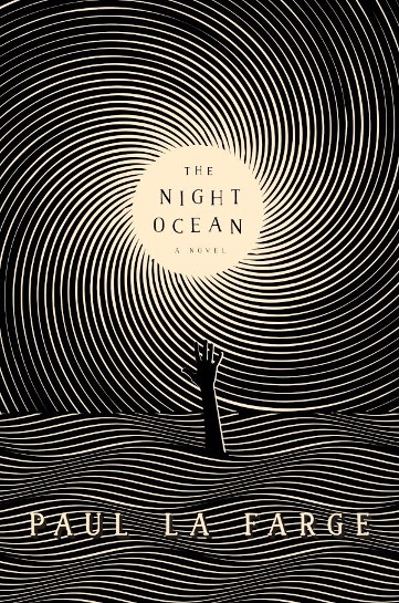
For my second example, I chose an illustrated book cover of novel “the night ocean” by Paul La Farge.

Will Steahle’s illustration relies heavily on line, using wavy, repetitive and horizontal lines to represent the water on the bottom half of the cover, from which an outstretched hand emerges. Similar lines, although arranged in a spiral, converge to the centre of the cover, filling the rest of the illustration. They simultaneously create a sky and a celestial body, by reducing in size before coming to a stop completely.

Scale

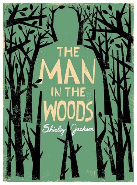
In my final example, I chose another book cover. This time it is an illustration by Edel Rodriguez for “The Man in the Woods” by Shirley Jackson.

Contrasting scales is the element that this example relies the heaviest on. Here, the geometric trees lining the outside of the cover, create with their outline the shape of an enormous man, that towers over them. Without their explicit lines, the man would be invisible to the viewer’s eye.

Yearbook spread

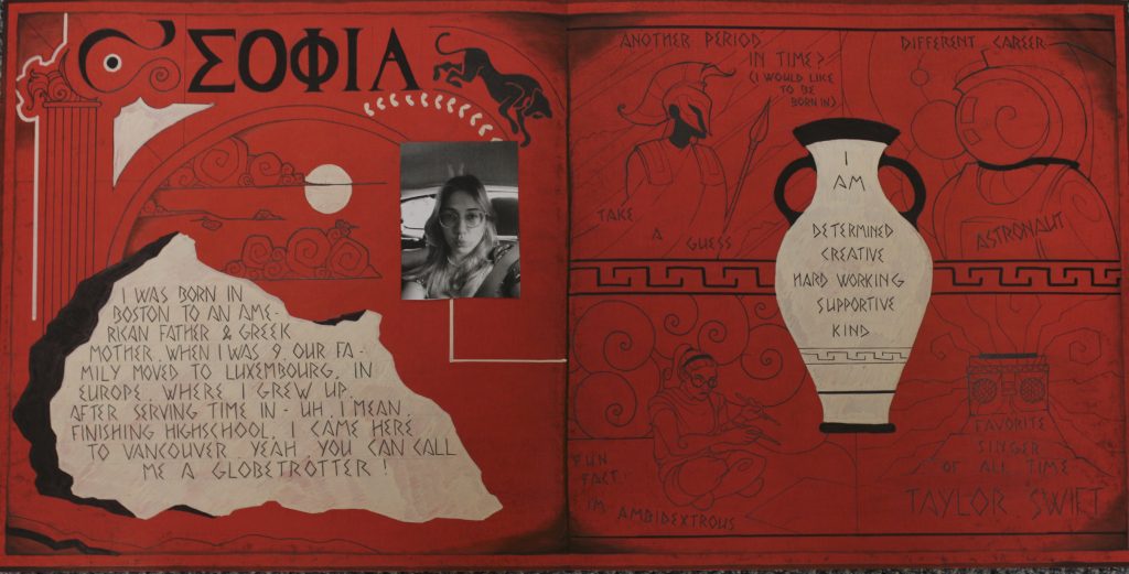
For my yearbook spread, I knew right off the bat that it would be inspired by Ancient Greek art. In class, we discussed heritage, and so I wanted to dive into my own for this project.

I used mainly black fine liners for the art and text on my spread, because ever since I was young, I’ve loved comic books, specifically black and white ones with strong, expressive and intricate black outlines. I tried to capture my love for design in this spread, specifically the balancing act of placing elements in a harmonic arrangement to one another. I tried to stay visual with the prompts, as in Ancient Greek art even the most complicated of battles were depicted on vases, often with minimal text.

References to the things I love, like my cat, clouds, the sun and Greek architecture are peppered on the left half of the spread. The temple pillar on the left is specifically a Corinthian style pillar – this style represents young women, so I chose it as a reflection of me at this point in my life.

The different elements on my spread are often very carefully drawn and well separated from one another. The colors are flat and strong. This is a good introduction to my style as an artist, as I love to incorporate white space, many details and an overload of information into my pieces, all while trying to keep each element unique.

I would give myself an 8/10. Unfortunately, the illustrations on the right get lost in the background, especially with the bright white vase pulling all the attention to it. That right there cost me a point. Then, I would take a point off for messiness of the spread. Although I intentionally roughened up the paper to make it seem older and give it a bit of depth (it was supposed to imitate the values of an old Greek vase) it just looks…dirty. That effect doesn’t land well, and I find myself being pulled to the edges of the piece in a distracting manner due to their prominence.

All in all, I still put a lot of work into this and am quite happy with the outcome.