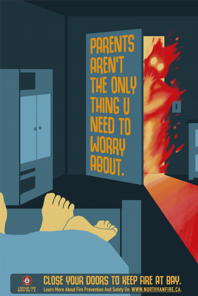
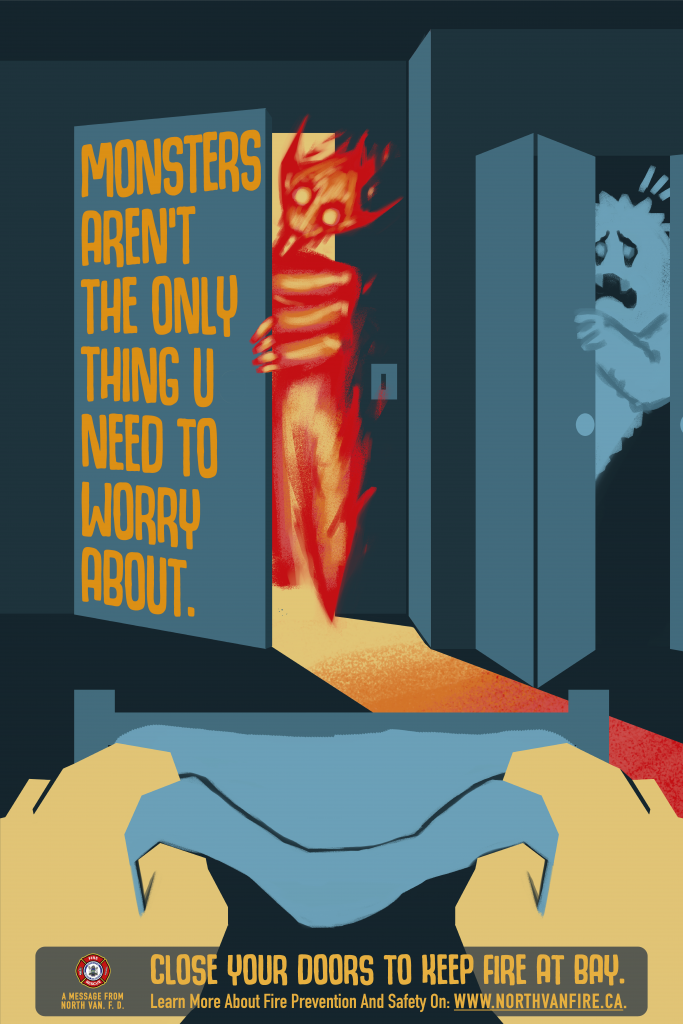
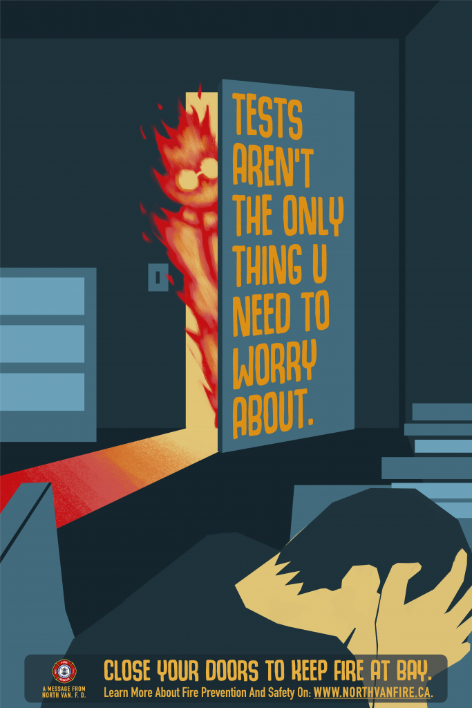
Sisy wong, Terence Zhu and I teamed up again as a small creative agency, which named ourselves “AWA creative(Asian with attitudes)”, inspired by the rap group “NWA,nixxa with attitude”. In the project, we were given 2 options which is one for the fire department and one for invasive plants. Our group chose the first one. In the last project, our group chose the typographic approach, so we decided to create illustrated posters for this one. Through the research, we nailed down 3 initial ideas; cooking fire, smoke alarm, and closed doors. After meeting with the client, we narrowed it down to the idea of “closed-door”. Our illustrator, Terence, provided us great sketches and illustrations. Although the illustrations are interesting and work well on their own, however, we made some compositional changes and cropping to make the typographies fit perfectly. From the first stage to the end, we made improvements little by little and created 7 versions, which include font choices, layouts, colour choices and more.
In addition to the poster, I designed a logo for our group so we could look like a professional creative team.
For this project. I think I did a good job of adjusting the composition and came up with a solution where the typography draws the eye to the focal point of the poster.
Leave a Reply