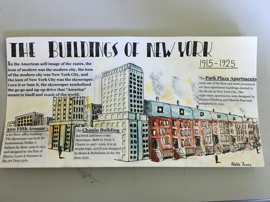
I believe I deserve a grade of 7.5/10. In this spread, their are several successful elements as well as several unsuccessful elements. Some of the successful elements include the right amount of information on each building as well as the general info. Another successful element is the title because of the Art Deco style which it portrays and helps connect with the time period. The illustrations are well done, however, it doesn’t really connect with New York and the Art Deco style such as the title does. One of the things I could have improved on was the overall concept and feeling of the spread; it may be nice to look at, however, it doesn’t scream New York architecture. The last thing I could have improved on is the integration of the text, as it is quite blocky and and out of place.
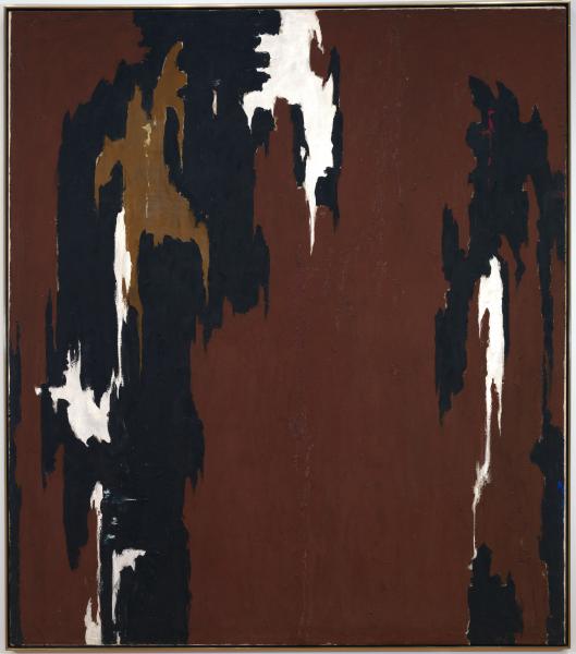
PH-950 (1950), Clyfford Still. Clyfford Still Museum, Denver. https://www.apollo-magazine.com/a-rare-chance-to-see-works-by-clyfford-still-in-london/
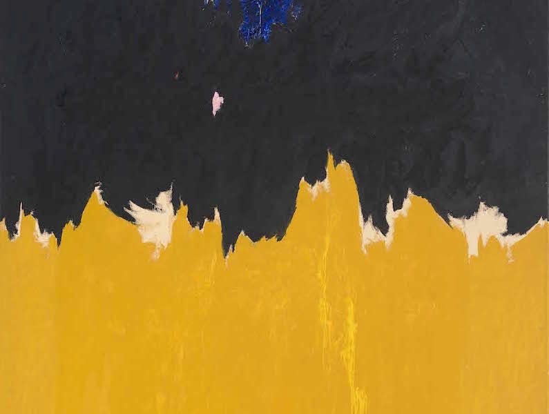
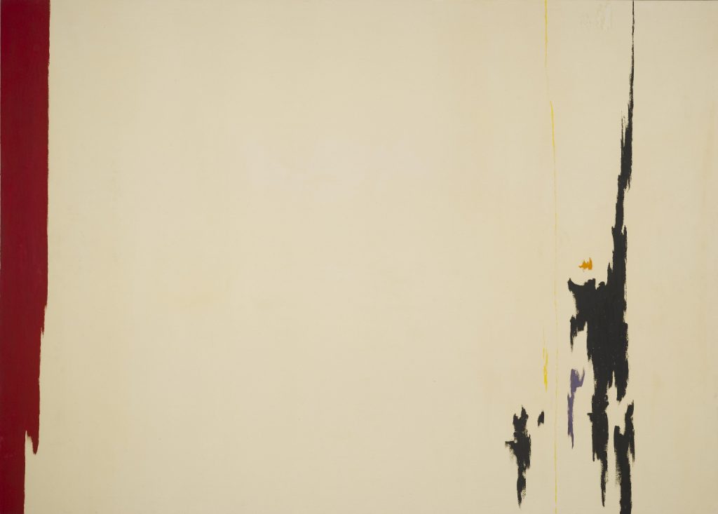
Clyfford Still was an American painter associated with the Abstract Expressionist movement. He is best known for his paintings that resemble flame-like brush strokes or shapes. Inspired by the windswept landscape of the Canadian prairie, he developed a technique of applying thick layers of paint onto the canvas using a palette knife, creating jagged flares of dark tones against lighter areas of yellows, oranges, and reds.
Untitled, Clyfford Still 1959 https://www.wikiart.org/en/clyfford-still
Clyfford Still began to quickly see national recognition. His paintings were embraced by other artists and critics, who considered Still to be one of the most original artist of the time. Jackson pollock even said that “Still’s work makes the rest of us look academic”.
To me, many of the shapes and patterns seen in Clyfford Still’s work resembles the patterns found in nature, such as the pattern on a cows fur or the pattern and shapes of the markings on a koi fish. Although there might not be any meaning behind his paintings, I find them visually pleasing to look at, and I find it interesting that everyone will have a slightly different feeling from the paintings when viewing them.
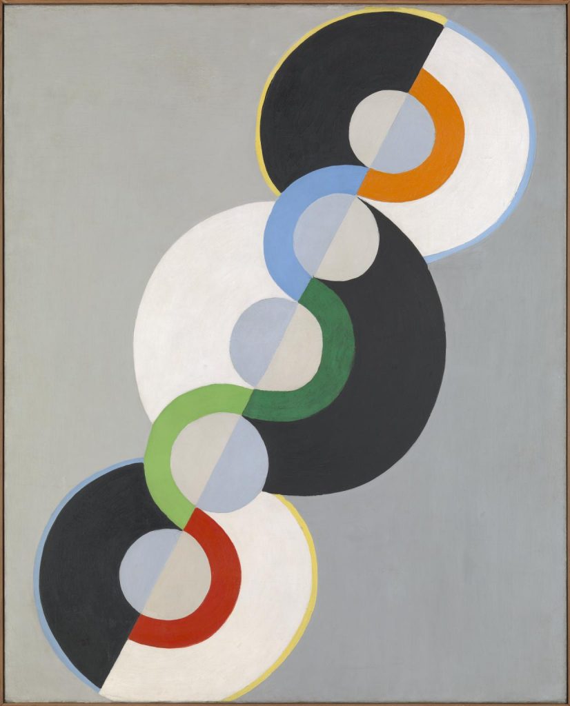
Endless Rhythm 1934 Robert Delaunay 1885-1941 Purchased 1970 http://www.tate.org.uk/art/work/T01233
Robert Delaunay was a French painter who first introduced vibrant colour into Cubism and thereby originated the trend in Cubist painting known as Orphism. He was one of the earliest completely nonrepresentational painters, and his work affected the development of abstract art based on the compositional tensions created by opposite planes of colour.
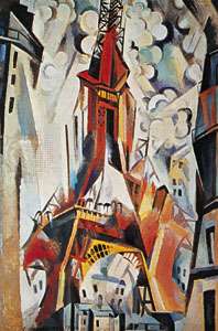
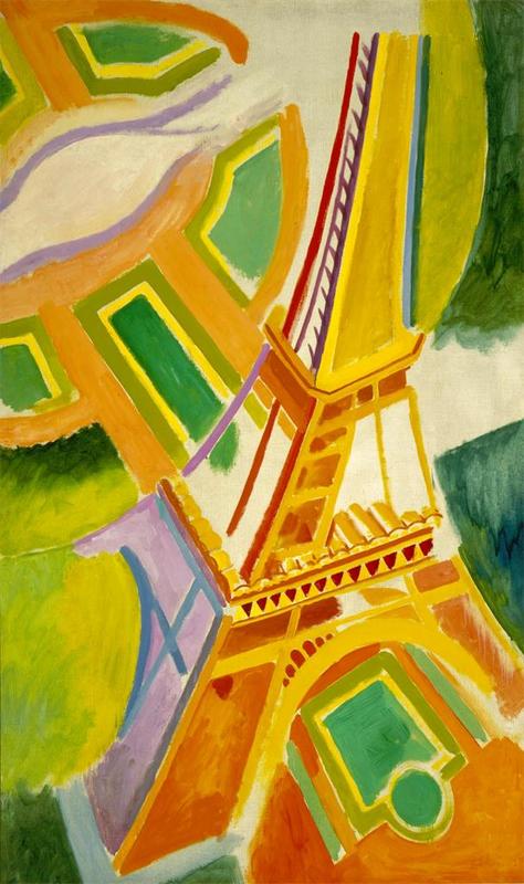
Robert Delaunay, “Eiffel Tower,” 1910. Oil on Canvas, 20 cm x 16 cm. Solomon Guggenheim Museum, New York City https://www.britannica.com/biography/Robert-Delaunay
Delaunay was at first a theatre designer and painted only part-time. But he soon came under the influence of the Neo-Impressionists’ use of colour. By 1910 he had made his own contribution to Cubism in two series of paintings, cathedrals and the “Eiffel Tower,” which combined bits of Cubist form with dynamic movement and vibrant colour.
I admire Robert’s work. His work looks very modern and is quite minima which is pleasant to look at. He uses color well to make his paintings more playful and lively.
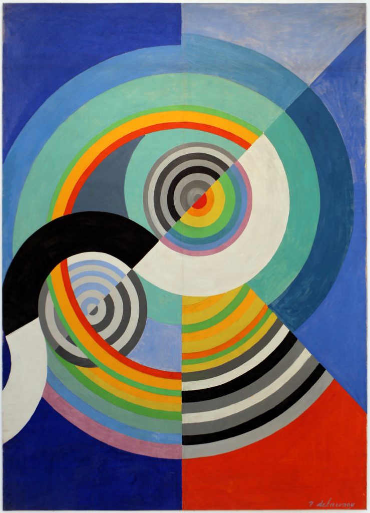
Robert Delaunay, “Eiffel Tower,” 1924. Oil on Canvas, 161.6 cm x 96.8 cm. Saint Louis Art Museum, Saint Louis. https://www.britannica.com/biography/Robert-Delaunay
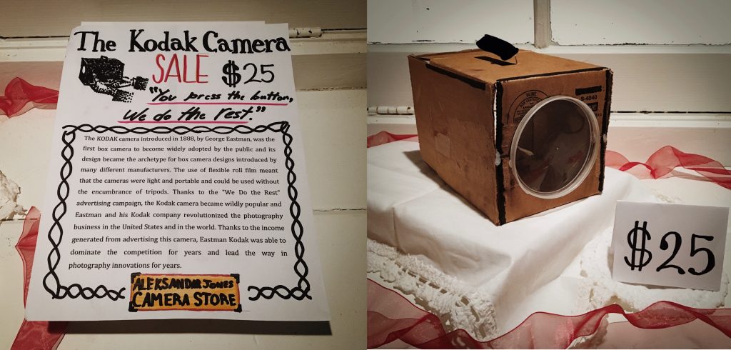
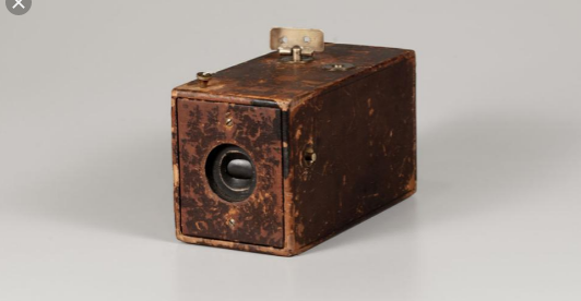
I am happy with my final result. I believe I have a strong concept for my artifact, as I displayed my artifact as if it was for sale in a store. My information about the camera on the first page is quite informative yet still is easy and fun to read. I think I resembled the build of the camera quite well, however, I made the lens of the camera too large. Another thing I could have done better was to integrate the writing with the artifact into one photo, instead of having two separate photos which makes it feel a little disconnected. Overall I think I did quite well and I’d give myself a 9/10.
Research:
The Kodak Company was born in 1888 with the debut of the first Kodak camera. It came pre-loaded with enough film for 100 exposures and could easily be carried and handheld during its operation. “You press the button, we do the rest,” Eastman promised in the advertising slogan for his revolutionary invention.
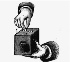
After the film was exposed—meaning all 100 shots were taken—the whole camera was returned to the Kodak company in Rochester, New York, where the film was developed, prints were made, and a new roll of photographic film was inserted into the camera. The camera and prints were then returned to the customer, for the whole cycle to be repeated again.
George Eastman though long and hard about the perfect name for his company. “A trademark should be short, vigorous, incapable of being misspelled,” George Eastman said, explaining the process by which he’d come to name his company. “The letter ‘K’ had been a favorite of mine. It seems a strong, incisive sort of letter. It became a question of trying out a great number of combinations of letters that made words starting and ending with “K.”
Bellis, Mary. “The History of Kodak: How Rolled Film Made Everyone a Photographer.” ThoughtCo, ThoughtCo, 5 Oct. 2019, https://www.thoughtco.com/george-eastman-history-of-kodak-1991619.
“From the Camera Obscura to the Revolutionary Kodak.” George Eastman Museum, https://www.eastman.org/camera-obscura-revolutionary-kodak.
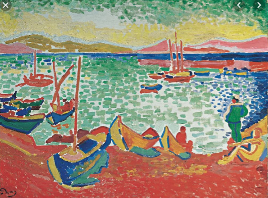
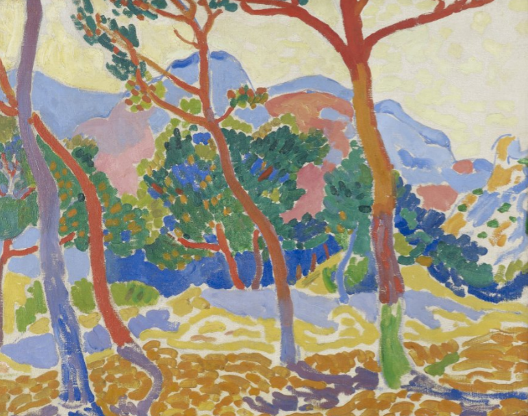
Derain studied painting in Paris at the Académie Carriere from 1898 to 1899. He developed his early style in association with Maurice de Vlaminck, who he met in 1900, and with Henri Matisse, who had been Derain’s fellow student at the Académie Carriere. Together with these two painters, Derain was one of the major painters of Fauvism from 1905 to 1908. Like the other artists who worked in this style, he painted landscapes and figure studies in brilliant, sometimes pure colors and used broken brushstrokes and impulsive lines to define his spontaneous compositions.
I personally do not like his artwork. I find his paintings are too saturated. Derain also uses too many colors, which makes a lot of his paintings look like messy, distorted rainbows.
Derain broke with Fauvism in 1908, when he was temporarily influenced by the works of the Post-Impressionist painter Paul Cézanne. Derain worked for a few years in a stylized form of Cubism, but by the 1920s his paintings of nudes, still lifes, and portraits had become increasingly Neoclassical. His art underwent virtually no change after the 1920s, though his more conservative style brought him financial success.