Peter is one of the most successful creative directors and copywriters in Canada. Under his leadership, Cossette was named Canadian “Agency of the Year” by Strategy Magazine in 2016 and 2017. He brought the same honor to BBDO in 2011. In both cases, firsts for the agencies. As a copywriter, he was twice included in the Top Ten list globally by The Gunn Report. He has won over 20 Cannes Lions for 10 different clients in categories ranging from film to cyber to integrated.
A native of Hamilton, Ontario, Peter earned a B.Sc. in Chemistry from McMaster University before enjoying a successful career as a research chemist with Dow Chemical in Germany. He also has an MBA from McGill University. Peter has worked as a Copywriter and Creative Director in Toronto and New York for such agencies as TAXI, McCann, and Downtown Partners DDB. In 2015, Peter brought his skills to Cossette where he runs a variety of blue-chip accounts, including McDonald’s, General Mills and SickKids.
https://vimeo.com/263571655
Heres an interesting video about the designs that shaped Canada.
Citations
The One Club / The One Show – Archive of Award Winners. (n.d.). Retrieved from https://www.oneclub.org/awards/theoneshow/-judge/2456/peter-ignazi
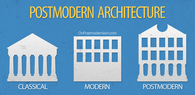
Postmodernism was probably the most radical and also the most misunderstood style of the 20th century. it offered creative freedom and self-awareness, breaking all the rules of convention, defying definition and pronouncing the death of Modernism. It was unstable, unstoppable and thrilling. The photo below describes postmodernism perfectly; the previous modernism was all about only keep the most crucial elements of a design, create a very minimal feel, whereas postmodernism is the opposite, instead of eliminating elements, elements are added.
A perfect explanation of Postmodernism.
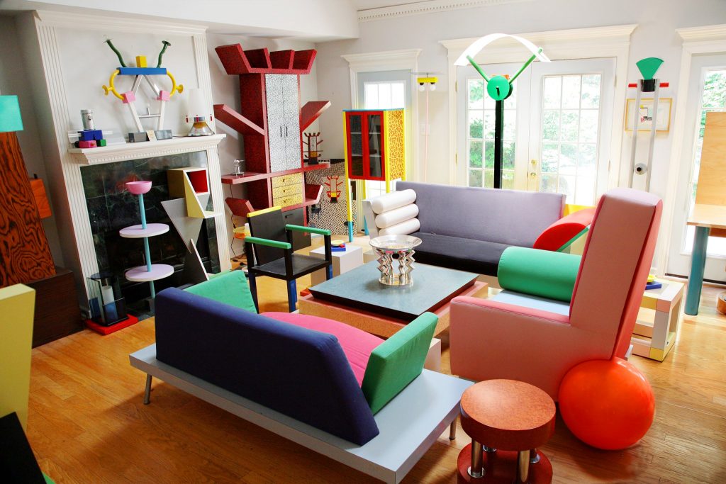
One of the key supporters of the movement were the Memphis Group. The Memphis Group was an Italian design and architecture group founded by Ettore Sottsass in 1980 that designed Postmodern furniture, fabrics, ceramics, glass, and metal objects. The Memphis group’s work often incorporated plastic laminate and was characterized by ephemeral design featuring colorful and abstract decoration as well as asymmetrical shapes, sometimes getting into exotic or earlier styles.
The Memphis Group totally reimagined what design meant, their work was so different and abstract, that it could be categorized as art rather than furniture. They basically transformed abstract art into physical designs. Since this is how they went about designing, they had endless design freedom.
Citations
Carson, N. (2018, January 19). 10 iconic examples of Memphis design. Retrieved from https://www.creativebloq.com/inspiration/10-iconic-examples-of-memphis-design
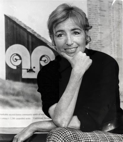
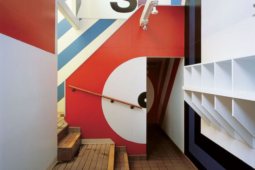
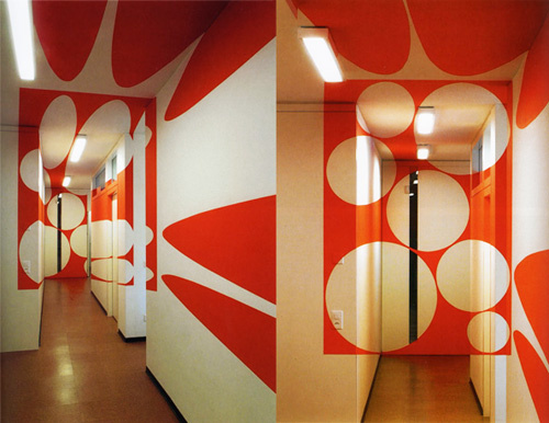
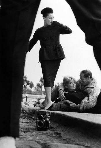
Barbara Stauffacher was born in 1928 in San Francisco, California. She is a graphic designer, landscape designer, and writer, who is best known for the enormous supergraphics she designed inside of buildings by mixing Swiss Modernism and West Coast Pop. Barbra’s work uses scale, color, and illusions to completely transform the feel and look of a space.
Before getting into art, she worked and trained as a dancer in San Francisco and it wasn’t until her husband died in 1956 that she went to Basel in Switzerland to study graphic design under Armin Hoffman at the Basel Art Institute. She then later also studied architecture at the University of California, Berkeley. It is quite clear that her studies in architecture helped her with her supergraphics, as her work uses a mix of architecture, interior design, environmental design, and graphic design.
This is my favorite pieces of hers. It’s amazing that she is able to transform an otherwise boring hallway into an amazing piece of art that draws people in. Her use of illusion makes it so eye-catching and surreal.
Citations
Published by artkrawler View all posts by artkrawler, et al. “Supergraphic Innovators: Barbara Stauffacher Solomon.” Atrin Yazdani-Biuki | A Design Blog, 23 Apr. 2017, artkrawler.wordpress.com/2017/04/23/supergraphic-innovators-barbara-stauffacher-solomon/.
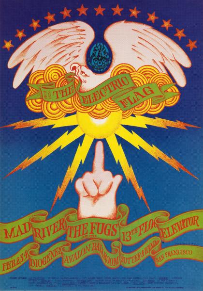
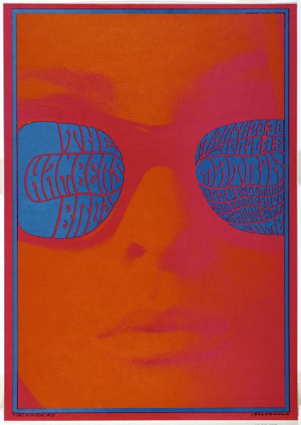
Born in Spain, Victor Moscoso was the first of the rock poster artists with academic training and experience. After studying art at Cooper Union in New York City and at Yale University, he moved to San Francisco in 1959, where he attended the San Francisco Art Institute, eventually becoming an instructor there.
At a dance at the Avalon Ballroom, Moscoso saw rock posters and decided that he could “make some money doing posters for those guys.” In the fall of 1966, he began designing posters for the Family Dog and also produced posters for the Avalon Ballroom. Under his own imprint, Neon Rose, he did a series for Matrix, a local nightspot. Moscoso’s style is most notable for its visual intensity, which is obtained by manipulating form and color to create optical effects. Moscoso’s use of intense color contrasts and vibrating edges and borders was influenced by painter Josef Albers, his teacher at Yale. Moscoso was the first of the rock poster artists to use photographic collage.
Victor Moscoso’s poster for the chamber bros is my favorite of his works. I love the way he cropped the photo as well as the minimal color palette and the strong use of contrast.
Citations
Rose, Neon, et al. “THE CHAMBERS BROS.” Smithsonian American Art Museum, americanart.si.edu/artwork/chambers-bros-36440.
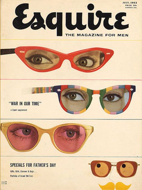
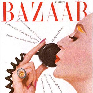
Henry Wolf was born in Vienna where he lived until 1938 when his family was forced to flee. In 1941, he immigrated to the US, where he studied at the New York City School of Industrial Arts. However, Wolf’s art studies were interrupted when, in 1943, he joined the army and served for three years. After the war, Wolf returned to New York and began working for an art studio. At the same time, he was studying photography and design under the legendary art director Alexey Brodovitch.
In 1952, Wolf took a job at Esquire as the junior art director. He soon went on to become graphics editor and, at twenty-six, was one of the youngest at any national magazine. It was not long until he was appointed art director of the magazine. Over the next two years, he shaped Esquire‘s image, featuring witty covers and newly discovered photographers, creating the look for which the magazine became known.
In 1958, Wolf succeeded Alexey Brodovitch as art director of Harper’s Bazaar. He worked there for three years where, he collaborated with editors to define the magazine, choosing what to feature on the covers and holding sway over the design of the publication as a whole.
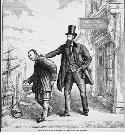
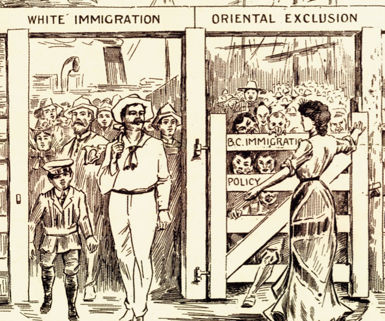
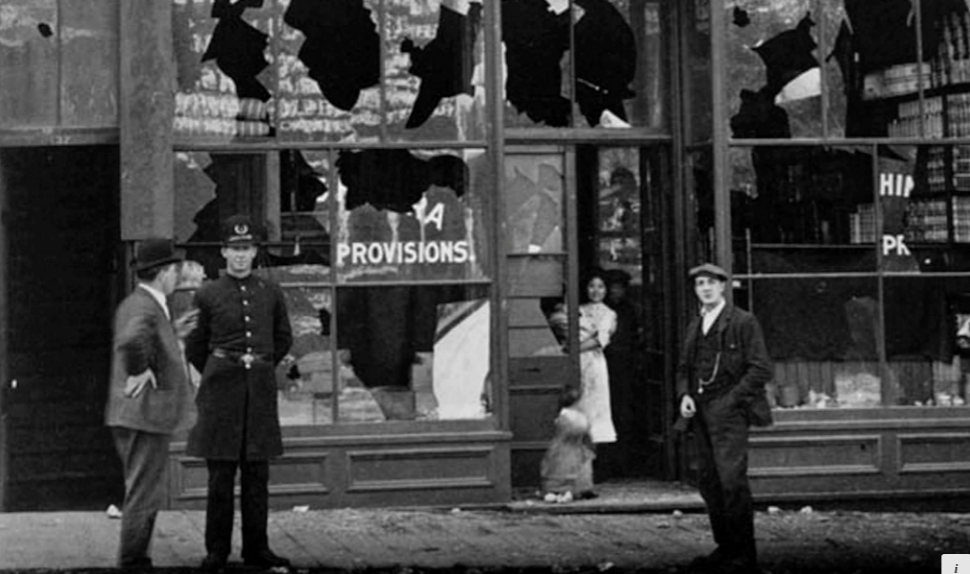
In 1907, an anti-immigration rally exploded into violence and vandalism in both Chinatown and Japantown in Vancouver. What began as riots in Bellingham as a movement to drive Punjabi Sikhs out of the lumber industry had eventually spread to white supremacist marches to Vancouver city with demands for a “White Canada.” In the riot, the property of Chinese and Japanese store owners was destroyed.
The riots were not only a landmark in the rise of racism in Canada, they signified the commencement of systematic federal intervention to prohibit Asian immigration to Canada through the imposition of quotas on Japanese emigration, continuous voyage regulations those from India, and the enforcement of laws against the Chinese.
The 1907 Riots were advertised in news reports, and by the time the parade arrived at the city hall, a huge crowd had gathered. Crowd estimates vary between four thousand and eight thousand people. As rioters attacked Chinatown, the angry mob eventually turned toward Japantown or Nihon Bachi, around the Powell Street grounds in what is now Oppenheimer Park.
Although news of the riot flashed reached different corners of the world, appearing on front pages in Ottawa, New York, and London, only three people were charged and only one person convicted of any offense. Not only had newspapers openly mocked the efforts of the court and police, few injuries were reported. All levels of government in Canada made vague apologies.
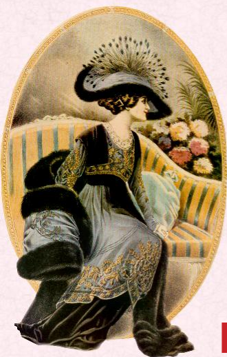
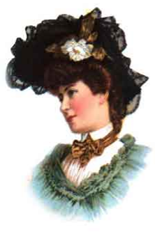
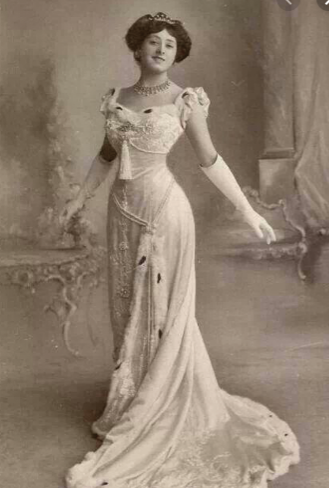
Edwardian fashion refers to the clothing that was in style between the late 1890s and 1914 or the beginning of the Great War (World War I). Also called La Belle Epoque, and the Gilded Age, this was a time when women’s fashions took on a new opulence and extravagance, inspired by the hedonistic lifestyle of Britain’s King Edward VII.
The popularity of the hourglass-shaped dress faded by the end of the Victorian age and the “S” curve became increasingly popular during the Edwardian Era. This new fashion style embraced a “healthier” corset that was far less constricting than the previous styles during the Victorian age and provided better support for the spine. Also at the beginning of the Edwardian Era (1901) ladies hats grew in size, but this trend only lasted until around 1911.
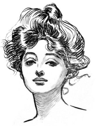
As the women’s suffrage movement continued through the Edwardian Era women began to mimic their style and attitude after the famous “Gibson Girl”. The “Gibson Girl” was a pen-and-ink drawing done by Charles Dana Gibson. She portrayed the modern women of the time, beautiful and independent. His drawings quickly became very popular and were displayed in all of the top magazines.
In 1910 fashion began to change once again. More women were working, playing sports and being more active in general and they needed clothing to reflect their new lifestyle. The “S” curve transformed into a pre-flapper style with more straight lines and less structure. This era of fashion is also said to be called “la Belle Epoque” (“The Beautiful Epoch”).
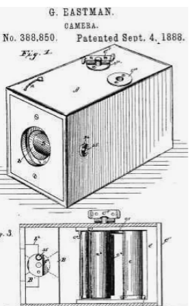
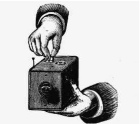
Today, almost everyone knows what a “selfie” is, however, the selfie would never be possible without a man named George Eastman. In 1888, inventor George Eastman invented a game-changing kind of dry, transparent, flexible photographic film that came in a roll. The film was designed for use in Eastman’s newly designed, user-friendly Kodak cameras. This innovative camera and film combination opened the pursuit of photography to a whole new breed of photographers, allowing amateurs to ply the craft alongside professionals with amazing and relatively easy to achieve results.
The Kodak Company was born in 1888 with the debut of the first Kodak camera. It came pre-loaded with enough film for 100 exposures and could easily be carried and handheld during its operation. “You press the button, we do the rest,” Eastman promised in the advertising slogan for his revolutionary invention.
After the film was exposed—meaning all 100 shots were taken—the whole camera was returned to the Kodak company in Rochester, New York, where the film was developed, prints were made, and a new roll of photographic film was inserted into the camera. The camera and prints were then returned to the customer, for the whole cycle to be repeated again.
George Eastman though long and hard about the perfect name for his company. “A trademark should be short, vigorous, incapable of being misspelled,” George Eastman said, explaining the process by which he’d come to name his company. “The letter ‘K’ had been a favorite of mine. It seems a strong, incisive sort of letter. It became a question of trying out a great number of combinations of letters that made words starting and ending with “K.”
Bellis, Mary. “The History of Kodak: How Rolled Film Made Everyone a Photographer.” ThoughtCo, ThoughtCo, 5 Oct. 2019, https://www.thoughtco.com/george-eastman-history-of-kodak-1991619.
“From the Camera Obscura to the Revolutionary Kodak.” George Eastman Museum, https://www.eastman.org/camera-obscura-revolutionary-kodak.
Many people know that braille is a system of touch reading and writing for blind people in which raised dots represent the letters of the alphabet, however, many people do not know the history behind it.
Charles Barbier
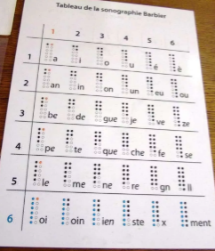
The history of braille goes all the way back to the early 1800s. A man named Charles Barbier who served in Napoleon Bonaparte’s French army developed a unique system known as “night writing” so soldiers could communicate safely during the night. As a military veteran, Barbier saw several soldiers killed because they used lamps after dark to read combat messages. As a result of the light shining from the lamps, enemy combatants knew where the French soldiers were and inevitably led to the loss of many men.
Barbier based his “night writing” system on a raised 12-dot cell; two dots wide and six dots tall. Each dot or combination of dots within the cell represented a letter or a phonetic sound. The problem with the military code was that the human fingertip could not feel all the dots with one touch.
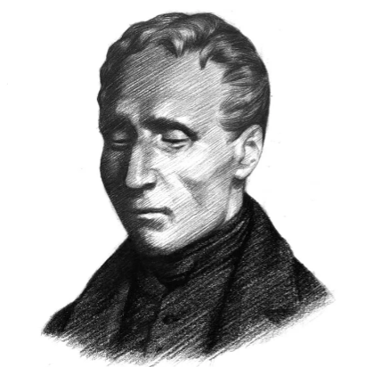
Louis Braille
Louis Braille was born in the village of Coupvray, France on January 4, 1809. He lost his sight at a very young age after he accidentally stabbed himself in the eye with his father’s awl. Braille’s father was a leather-worker and poked holes in the leather goods he produced with the awl.
At eleven years old, Braille found inspiration to modify Charles Barbier’s “night writing” code in an effort to create an efficient written communication system for fellow blind individuals. One year earlier he was enrolled at the National Institute of the Blind in Paris. He spent the better part of the next nine years developing and refining the system of raised dots that has come to be known by his name, Braille.
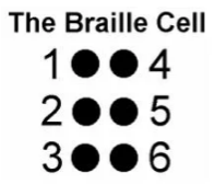
After all of Braille’s work, the code was now based on cells with only 6-dots instead of 12 (like the example shown below). This crucial improvement meant that a fingertip could encompass the entire cell unit with one impression and move rapidly from one cell to the next. Over time, braille gradually came to be accepted throughout the world as the fundamental form of written communication for blind individuals. Today it remains basically as he invented it.
Citations
“The History of Braille [Your Braille Resource].” Braille Works, https://brailleworks.com/braille-resources/history-of-braille/.
Britannica, The Editors of Encyclopaedia. “Braille.” Encyclopædia Britannica, Encyclopædia Britannica, Inc., https://www.britannica.com/topic/Braille-writing-system.
Britannica, The Editors of Encyclopaedia. “Braille.” Encyclopædia Britannica, Encyclopædia Britannica, Inc., https://www.britannica.com/topic/Braille-writing-system
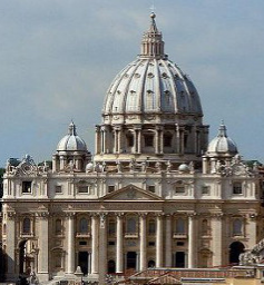
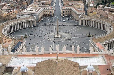
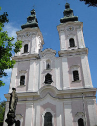
The foremost pioneer of Baroque architecture was Carlo Maderno, whose masterpiece was the facade of Saint Peter’s Basilica. The facade of Saint Peter’s contains a number of typical Baroque elements, including double columns, layered columns, colossal columns, and broken pediments. These elements were pioneered during the Late Renaissance, in mannerist architecture.
High Baroque 1625-75
The interiors of baroque churches became more and more present in the High Baroque and focused around the altar, usually placed under the dome. The most celebrated baroque decorative works of the High Baroque are the Chair of Saint Peter and the Baldachino of St. Peter, both by Gian Lorenzo Bernini, in St. Peter’s Basilica in Rome.
By the mid 17th century, the High Baroque style influence spread north of Rome. One of its main influencers being Guarino Guarini, who settled in Turin and is regarded as one of the masters of this style. Especially his executed designs in Paris, Prague, and Lisbon, along with his published works on architectural theory and design, helped spread Italian baroque ideals across Europe in the early 18th century.
Late Baroque 1675-1725
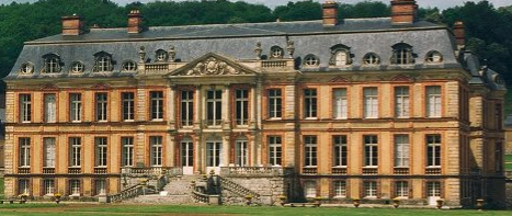
The Late Baroque marks the rise of France as the heart of Western culture. Baroque art of France tends to be restrained, such that it can be described as a classical-Baroque compromise. The most distinctive element of French Baroque architecture is the double-sloped mansard roof.
The most famous Baroque structures of France are magnificent chateaux, the greatest of which is the Palace of Versailles. One of the largest residences on earth, Versailles was built mainly under Louis XIV, whose patronage of the arts helped propel France to the crest of Western culture.
The palace facade illustrates the classical-Baroque compromise of northern Europe. The walls are characterized largely by simple classicism, although they do contain such Baroque elements as sculpted busts, a triple stringcourse, double pilasters, and colossal pilasters. Additionally, the mansard roof features a sinuous metal railing and rich molding around the dormer windows. Versailles became Europe’s model of palace architecture, inspiring similarly grand residences throughout the continent.
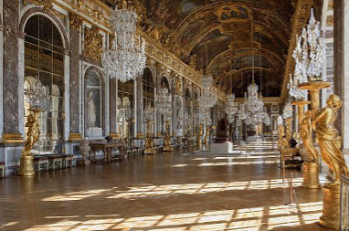
Versailles’ most famous room is the Hall of Mirrors, whose mirrors have the same dimensions as the windows they stand opposite.
Rococo 1725-1800
Rococo artists embraced the curves and elaborate ornament of Baroque but reigned in its weighty drama. The result was a gentle, playful style typified by pastel colors and delicate, asymmetrical decoration. Though most Rococo art was centered in France, Rococo architecture culminated in Austria and southern Germany, especially in the form of churches.