I was given the job of creating a front cover for the class’s history book. After a while of thinking I came to the conclusion that I wanted to focus on the bauhaus design style, since that’s what stood out to me the most out everything we learned in the class.
Original
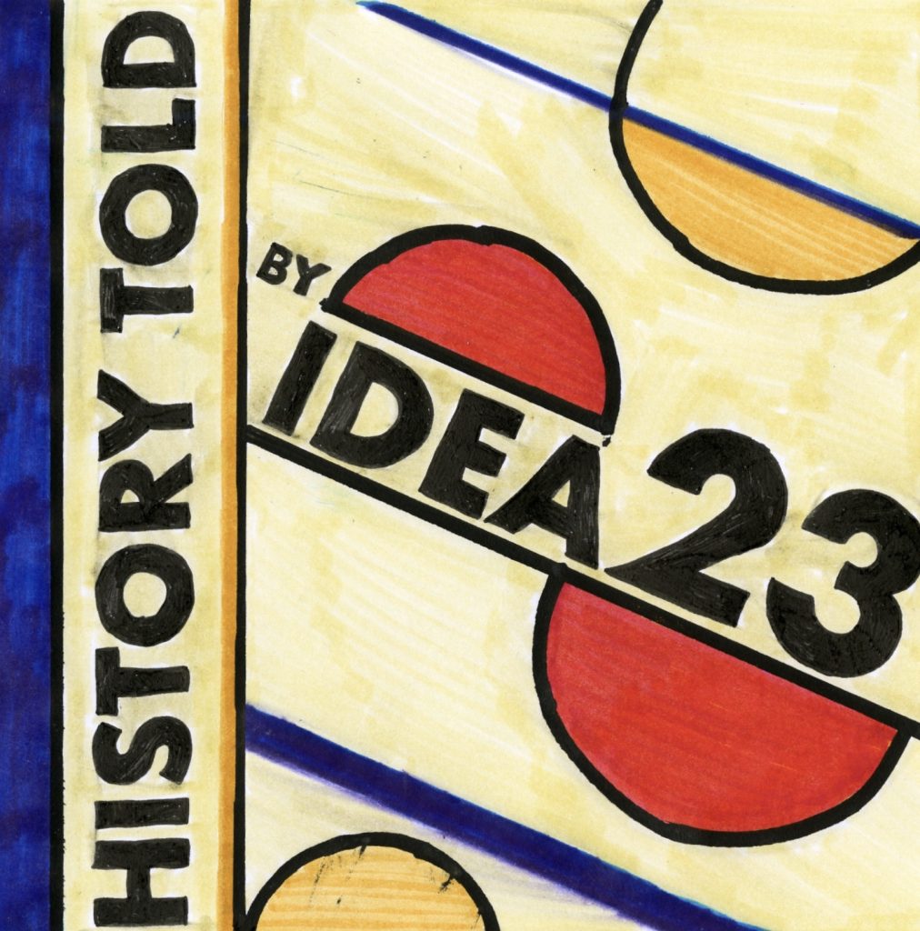
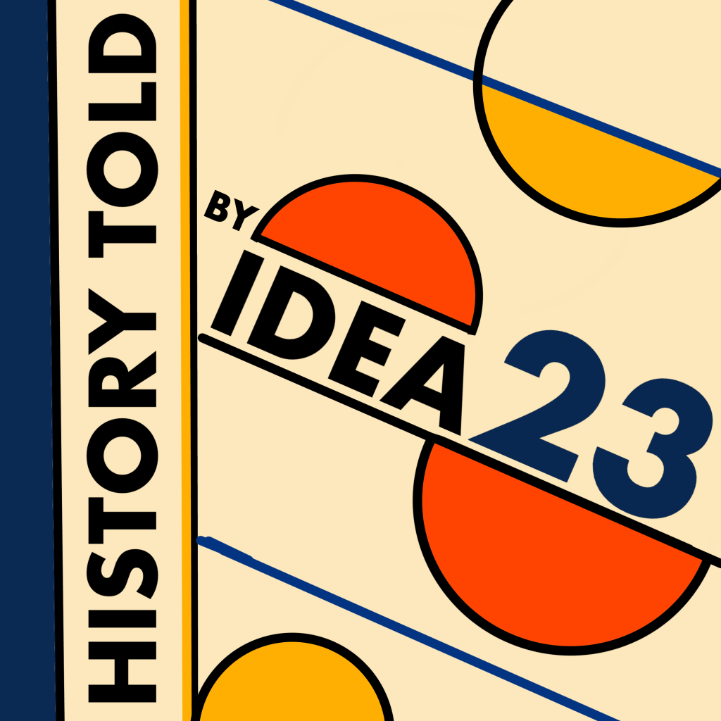
For my book cover I think I deserve a 6/10. I think I did a great job capturing the bauhaus design style in my cover. I did this by using the same font that they used and the colours and geometric shapes. I think the final result is quite pleasing to look at. However, I feel like I struggled with a greater concept and really summarizing our class. Also the light yellow colour is not uniform enough since I was using very transparent markers. Below is a digital version of the cover to show what I wanted the colours and shapes to look like.
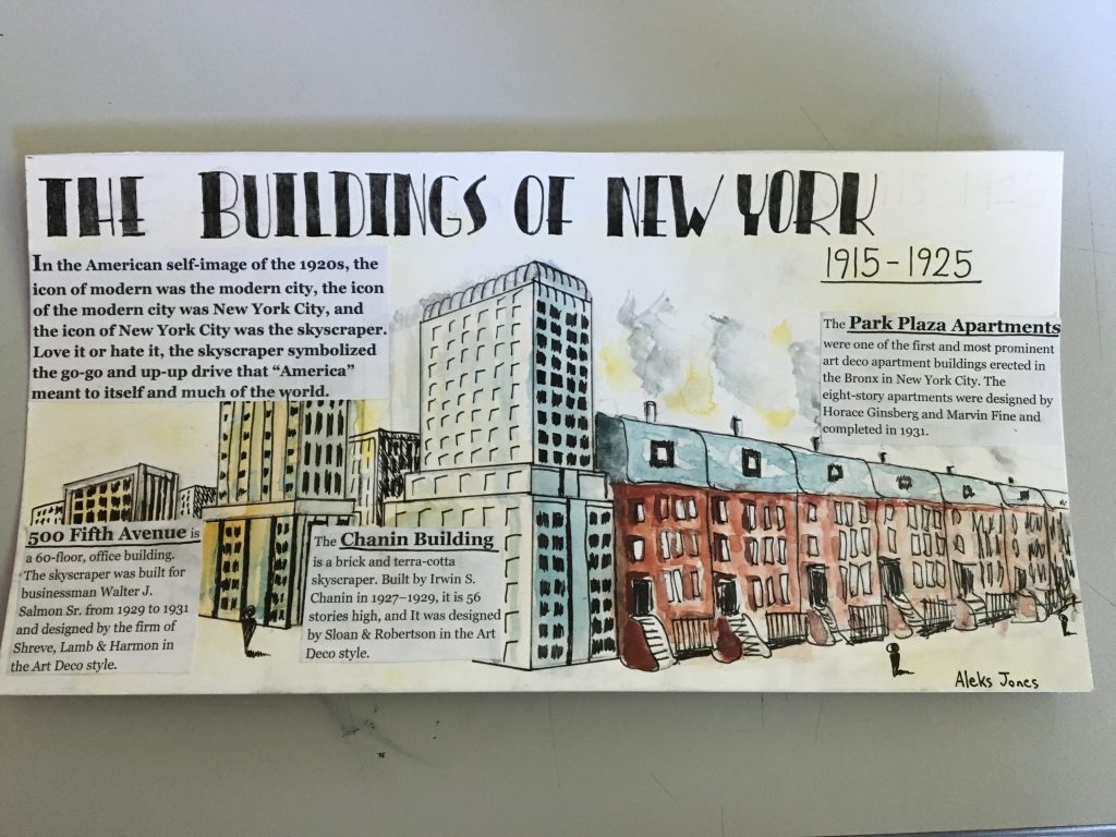
I believe I deserve a grade of 7.5/10. In this spread, their are several successful elements as well as several unsuccessful elements. Some of the successful elements include the right amount of information on each building as well as the general info. Another successful element is the title because of the Art Deco style which it portrays and helps connect with the time period. The illustrations are well done, however, it doesn’t really connect with New York and the Art Deco style such as the title does. One of the things I could have improved on was the overall concept and feeling of the spread; it may be nice to look at, however, it doesn’t scream New York architecture. The last thing I could have improved on is the integration of the text, as it is quite blocky and and out of place.
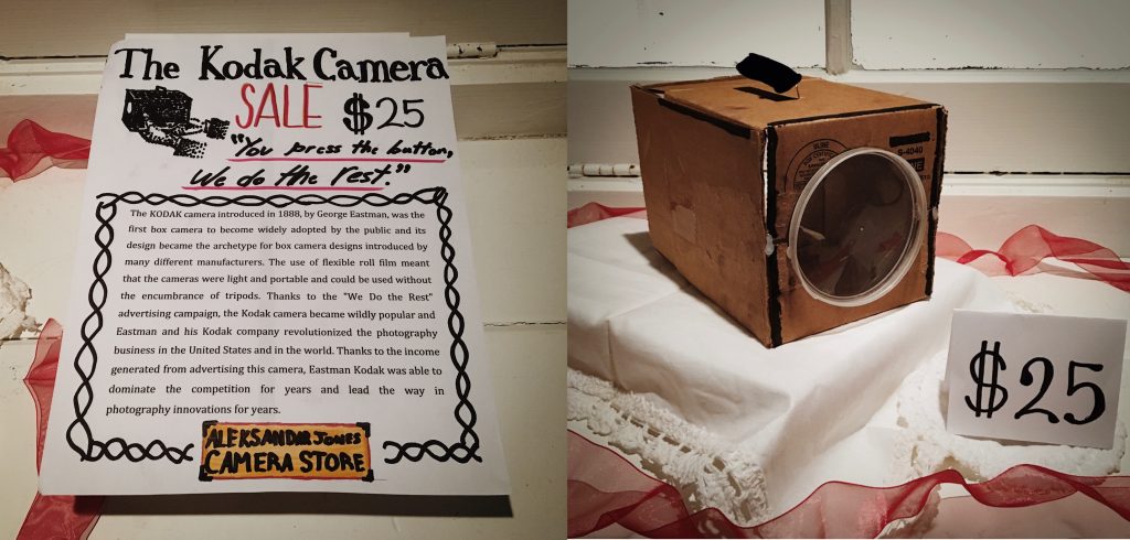
I am happy with my final result. I believe I have a strong concept for my artifact, as I displayed my artifact as if it was for sale in a store. My information about the camera on the first page is quite informative yet still is easy and fun to read. I think I resembled the build of the camera quite well, however, I made the lens of the camera too large. Another thing I could have done better was to integrate the writing with the artifact into one photo, instead of having two separate photos which makes it feel a little disconnected. Overall I think I did quite well and I’d give myself a 9/10.
Research:
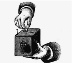
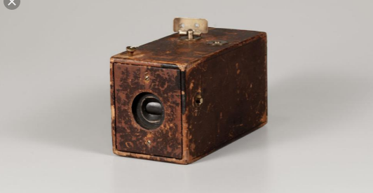
The Kodak Company was born in 1888 with the debut of the first Kodak camera. It came pre-loaded with enough film for 100 exposures and could easily be carried and handheld during its operation. “You press the button, we do the rest,” Eastman promised in the advertising slogan for his revolutionary invention.
After the film was exposed—meaning all 100 shots were taken—the whole camera was returned to the Kodak company in Rochester, New York, where the film was developed, prints were made, and a new roll of photographic film was inserted into the camera. The camera and prints were then returned to the customer, for the whole cycle to be repeated again.
George Eastman though long and hard about the perfect name for his company. “A trademark should be short, vigorous, incapable of being misspelled,” George Eastman said, explaining the process by which he’d come to name his company. “The letter ‘K’ had been a favorite of mine. It seems a strong, incisive sort of letter. It became a question of trying out a great number of combinations of letters that made words starting and ending with “K.”
Bellis, Mary. “The History of Kodak: How Rolled Film Made Everyone a Photographer.” ThoughtCo, ThoughtCo, 5 Oct. 2019, https://www.thoughtco.com/george-eastman-history-of-kodak-1991619.
“From the Camera Obscura to the Revolutionary Kodak.” George Eastman Museum, https://www.eastman.org/camera-obscura-revolutionary-kodak.
I am quite happy with my final product, which is a typography zine for survey 2, which was God and Gutenberg. I believe I deserve a grade of 9/10. I think I did a really good job of providing enough information while still making fun and easy to read. I think my illustrations do a good job a helping out with the information, while still being quite basic. I also think it worked well how I added a bit of the history of Chinese woodblock printing to give some context. However, this being said I did make a small mistake by adding color to my zine.
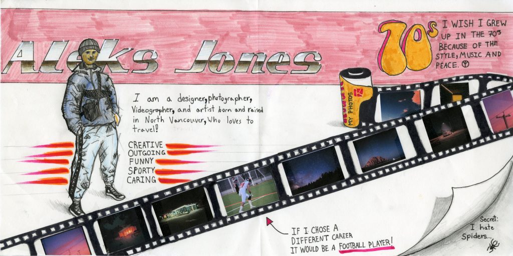
I am quite pleased with the final result of my yearbook spread project, for several reasons. The main reason is that I think I did a great job of showing who I am through the spread. Since I love to take photographs, I added some of my photos on a strip of film. I added the photos on a strip of film because I recently started taking photos with my new film camera. I also attached the photos to my spread using tape, since it has a glare, which mimics a real strip of film. Since I love vintage cars, I made my name resemble a chrome texture with a light pink background to look like one of my favorite vintage cars. I would give myself a 9/10 since I think it’s pretty unique and represents myself. The reason it’s not a 10/10 is because it looks a bit messy and not totally consistent.