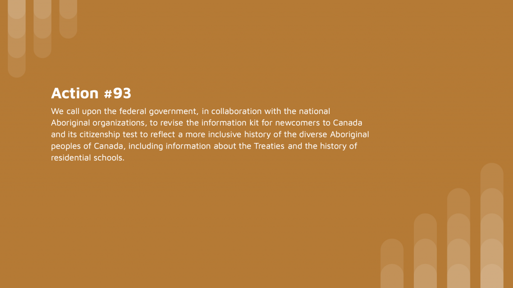
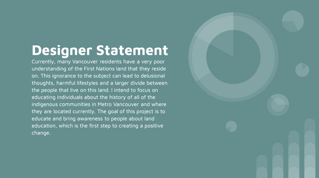
After reading all 94 calls to action in the truth and reconciliation document, I decided to go with action #93 because I felt that newcomers to Canada would be a great target audience to focus on since most of them don’t know much about indigenous topics, so I felt that this project could have a greater impact then if the target audience were locals. I decided to focus on educating people about indigenous land since land is a crucial part of indigenous cultures. I also felt that not too many people have a good understanding of current land issues.
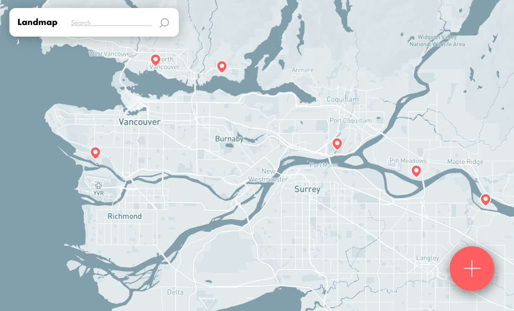
I decided that the best way to approach this was through an interactive map. I chose this because, an interactive map is much more engaging than a traditional map and the more interested and engaged a user is with the product, the easier it will be for them to learn.
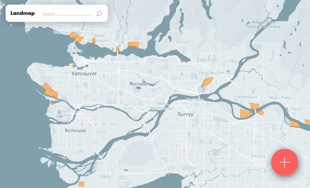
I used a green/blue and a red as the primary colours in my designs since those are the colours that are most commonly found within traditional indigenous art, apart from the colour black. I made the overall layout and elements quite simple and minimal since I wanted to make it easy to use and not overload users with information.
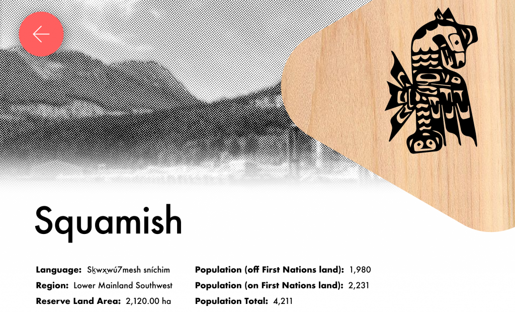
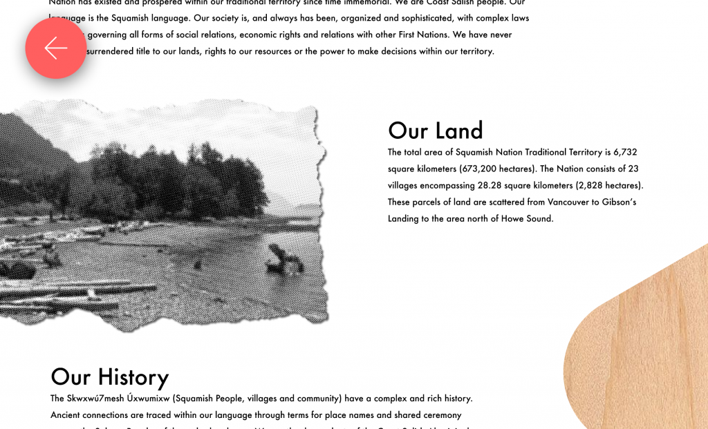
I added a wooden texture throughout the design to give it more indigenous imagery, as the use of wood is very prominent in indigenous cultures. I also made all the photos black and white to create a more cohesive feel throughout the website. I gave the photos an old paper effect to give a little more character and to make it a little more personable.
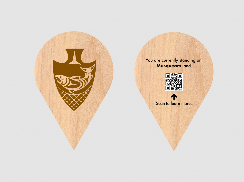
To market the campaign, my primary focus was public art installments, since they are quite unique and eye-catching. I played with the idea of location markers found on digital maps. So I designed life-sized location markers which would be placed around the city. Having a physical location marker is much more impactful than a little icon on a digital map. The location markers would be crafted by indigenous artists which would carve the first nations community logo onto the front of the marker. The back would say a message about where they are currently located and a barcode that they can scan which brings them to the website, where they can learn more.
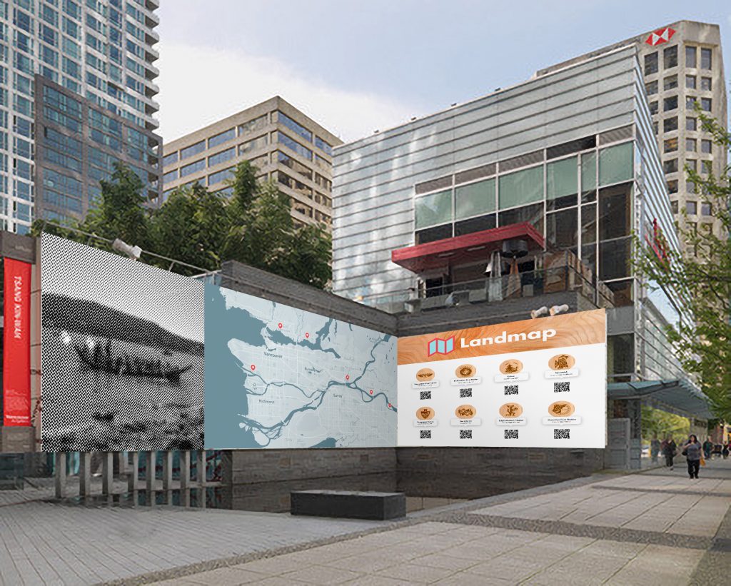
Another way to market the campaign is to have large murals around the city and airport to educate newcomers. The murals would feature a large map alongside 8 of the First Nations communities in Metro Vancouver with a barcode that can be scanned to learn more about the individual groups.
The final way to market the campaign would be to place these interactive bus shelter screens, which would function just like the website. It would be great for people to explore while waiting for the bus. These would be placed next to airports, universities, and city centers
I would give myself an 8/10 on this project. I felt like I was successful in creating a functional and cohesive brand and website and I believe my marketing strategies would be quite effective. However, I felt like I could have gone deeper into the research side of things and presented more realistic mockups.