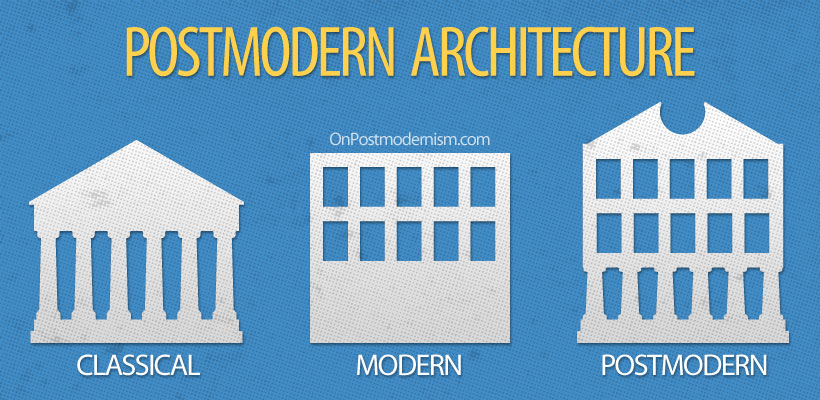
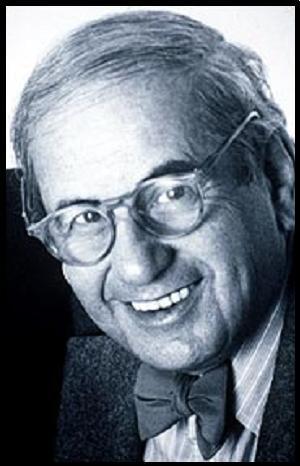
Canadian Design Today

Peter Ignazio

Peter is one of the most successful creative directors and copywriters in Canada. Under his leadership, Cossette was named Canadian “Agency of the Year” by Strategy Magazine in 2016 and 2017. He brought the same honor to BBDO in 2011. In both cases, firsts for the agencies. As a copywriter, he was twice included in the Top Ten list globally by The Gunn Report. He has won over 20 Cannes Lions for 10 different clients in categories ranging from film to cyber to integrated. 

A native of Hamilton, Ontario, Peter earned a B.Sc. in Chemistry from McMaster University before enjoying a successful career as a research chemist with Dow Chemical in Germany. He also has an MBA from McGill University. Peter has worked as a Copywriter and Creative Director in Toronto and New York for such agencies as TAXI, McCann, and Downtown Partners DDB. In 2015, Peter brought his skills to Cossette where he runs a variety of blue-chip accounts, including McDonald’s, General Mills and SickKids.

https://vimeo.com/263571655
Heres an interesting video about the designs that shaped Canada.

Citations

The One Club / The One Show – Archive of Award Winners. (n.d.). Retrieved from https://www.oneclub.org/awards/theoneshow/-judge/2456/peter-ignazi

Postmodernism in Europe

The Memphis Group

Postmodernism was probably the most radical and also the most misunderstood style of the 20th century. it offered creative freedom and self-awareness, breaking all the rules of convention, defying definition and pronouncing the death of Modernism. It was unstable, unstoppable and thrilling. The photo below describes postmodernism perfectly; the previous modernism was all about only keep the most crucial elements of a design, create a very minimal feel, whereas postmodernism is the opposite, instead of eliminating elements, elements are added.

A perfect explanation of Postmodernism.

One of the key supporters of the movement were the Memphis Group. The Memphis Group was an Italian design and architecture group founded by Ettore Sottsass in 1980 that designed Postmodern furniture, fabrics, ceramics, glass, and metal objects. The Memphis group’s work often incorporated plastic laminate and was characterized by ephemeral design featuring colorful and abstract decoration as well as asymmetrical shapes, sometimes getting into exotic or earlier styles.

The Memphis Group totally reimagined what design meant, their work was so different and abstract, that it could be categorized as art rather than furniture. They basically transformed abstract art into physical designs. Since this is how they went about designing, they had endless design freedom.

Citations

Carson, N. (2018, January 19). 10 iconic examples of Memphis design. Retrieved from https://www.creativebloq.com/inspiration/10-iconic-examples-of-memphis-design

Supergraphics Innovator

Barbara Stauffacher

Barbara Stauffacher was born in 1928 in San Francisco, California. She is a graphic designer, landscape designer, and writer, who is best known for the enormous supergraphics she designed inside of buildings by mixing Swiss Modernism and West Coast Pop. Barbra’s work uses scale, color, and illusions to completely transform the feel and look of a space.

Before getting into art, she worked and trained as a dancer in San Francisco and it wasn’t until her husband died in 1956 that she went to Basel in Switzerland to study graphic design under Armin Hoffman at the Basel Art Institute. She then later also studied architecture at the University of California, Berkeley. It is quite clear that her studies in architecture helped her with her supergraphics, as her work uses a mix of architecture, interior design, environmental design, and graphic design.

This is my favorite pieces of hers. It’s amazing that she is able to transform an otherwise boring hallway into an amazing piece of art that draws people in. Her use of illusion makes it so eye-catching and surreal.

Citations

Published by artkrawler View all posts by artkrawler, et al. “Supergraphic Innovators: Barbara Stauffacher Solomon.” Atrin Yazdani-Biuki | A Design Blog, 23 Apr. 2017, artkrawler.wordpress.com/2017/04/23/supergraphic-innovators-barbara-stauffacher-solomon/.

Psychedelic Design Hero

Victor Moscoso

Born in Spain, Victor Moscoso was the first of the rock poster artists with academic training and experience. After studying art at Cooper Union in New York City and at Yale University, he moved to San Francisco in 1959, where he attended the San Francisco Art Institute, eventually becoming an instructor there.

At a dance at the Avalon Ballroom, Moscoso saw rock posters and decided that he could “make some money doing posters for those guys.” In the fall of 1966, he began designing posters for the Family Dog and also produced posters for the Avalon Ballroom. Under his own imprint, Neon Rose, he did a series for Matrix, a local nightspot. Moscoso’s style is most notable for its visual intensity, which is obtained by manipulating form and color to create optical effects. Moscoso’s use of intense color contrasts and vibrating edges and borders was influenced by painter Josef Albers, his teacher at Yale. Moscoso was the first of the rock poster artists to use photographic collage.

Victor Moscoso’s poster for the chamber bros is my favorite of his works. I love the way he cropped the photo as well as the minimal color palette and the strong use of contrast.

Citations

Rose, Neon, et al. “THE CHAMBERS BROS.” Smithsonian American Art Museum, americanart.si.edu/artwork/chambers-bros-36440.

Henry Wolf

Advertising Art Director

Henry Wolf was born in Vienna where he lived until 1938 when his family was forced to flee. In 1941, he immigrated to the US, where he studied at the New York City School of Industrial Arts. However, Wolf’s art studies were interrupted when, in 1943, he joined the army and served for three years. After the war, Wolf returned to New York and began working for an art studio. At the same time, he was studying photography and design under the legendary art director Alexey Brodovitch.

In 1952, Wolf took a job at Esquire as the junior art director. He soon went on to become graphics editor and, at twenty-six, was one of the youngest at any national magazine. It was not long until he was appointed art director of the magazine. Over the next two years, he shaped Esquire‘s image, featuring witty covers and newly discovered photographers, creating the look for which the magazine became known.

In 1958, Wolf succeeded Alexey Brodovitch as art director of Harper’s Bazaar. He worked there for three years where, he collaborated with editors to define the magazine, choosing what to feature on the covers and holding sway over the design of the publication as a whole.