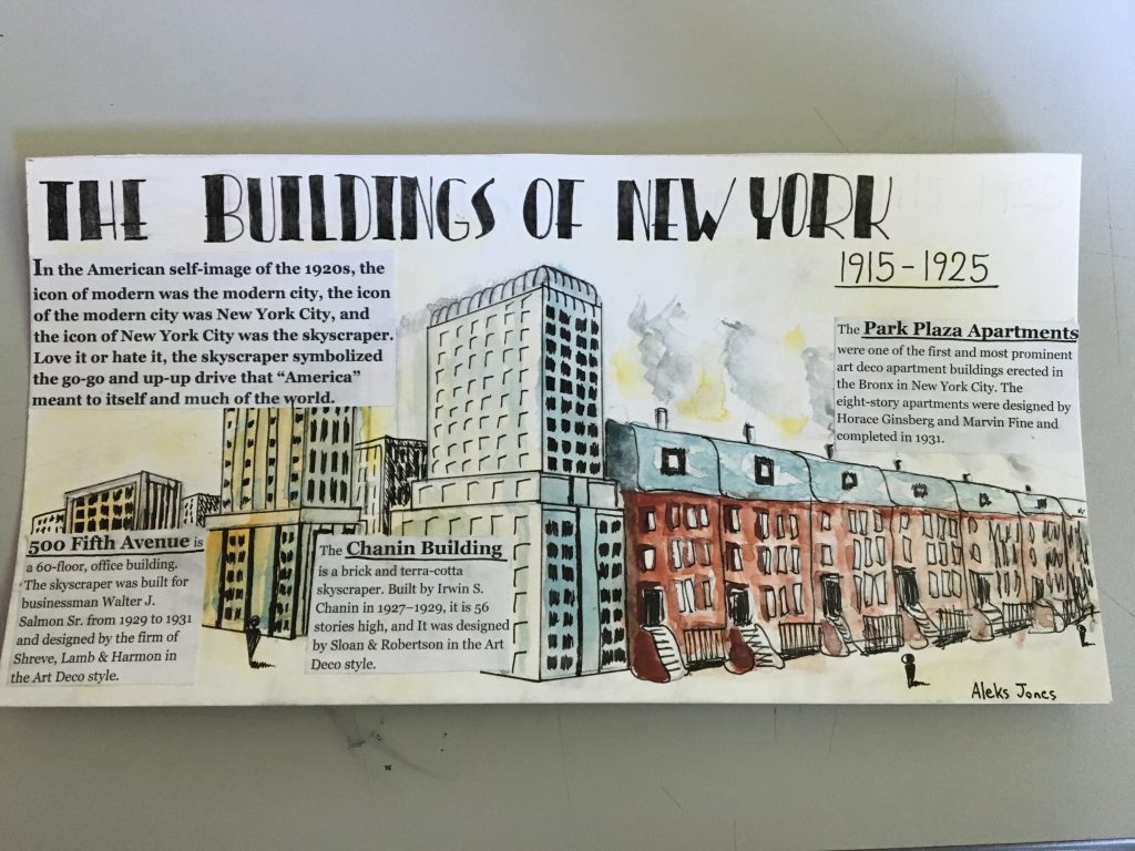
I believe I deserve a grade of 7.5/10. In this spread, their are several successful elements as well as several unsuccessful elements. Some of the successful elements include the right amount of information on each building as well as the general info. Another successful element is the title because of the Art Deco style which it portrays and helps connect with the time period. The illustrations are well done, however, it doesn’t really connect with New York and the Art Deco style such as the title does. One of the things I could have improved on was the overall concept and feeling of the spread; it may be nice to look at, however, it doesn’t scream New York architecture. The last thing I could have improved on is the integration of the text, as it is quite blocky and and out of place.
