Survey #5

How George Eastman Changed photography forever.

An image shot on Eastman’s Kodak camera.
https://www.thoughtco.com/george-eastman-history-of-kodak-1991619

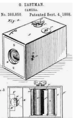
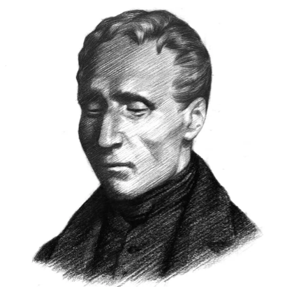
Today, almost everyone knows what a “selfie” is, however, the selfie would never be possible without a man named George Eastman. In 1888, inventor George Eastman invented a game-changing kind of dry, transparent, flexible photographic film that came in a roll. The film was designed for use in Eastman’s newly designed, user-friendly Kodak cameras. This innovative camera and film combination opened the pursuit of photography to a whole new breed of photographers, allowing amateurs to ply the craft alongside professionals with amazing and relatively easy to achieve results.

Eastman’s first Kodak camera.
https://www.thoughtco.com/george-eastman-history-of-kodak-1991619

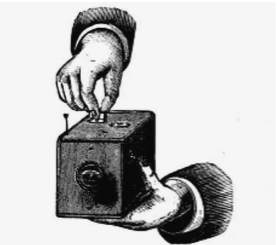
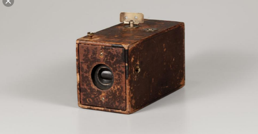
The Kodak Company was born in 1888 with the debut of the first Kodak camera. It came pre-loaded with enough film for 100 exposures and could easily be carried and handheld during its operation. “You press the button, we do the rest,” Eastman promised in the advertising slogan for his revolutionary invention.

This picture shows how the process works when winding the film.
https://www.thoughtco.com/george-eastman-history-of-kodak-1991619

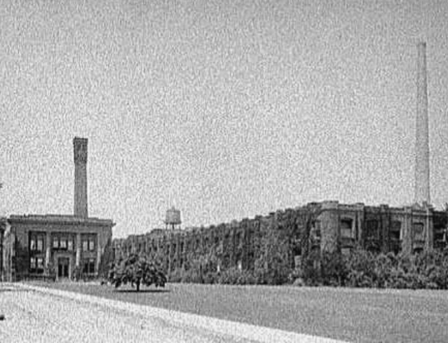
After the film was exposed—meaning all 100 shots were taken—the whole camera was returned to the Kodak company in Rochester, New York, where the film was developed, prints were made, and a new roll of photographic film was inserted into the camera. The camera and prints were then returned to the customer, for the whole cycle to be repeated again.

Kodak logo
https://en.wikipedia.org/wiki/Kodak

George Eastman though long and hard about the perfect name for his company. “A trademark should be short, vigorous, incapable of being misspelled,” George Eastman said, explaining the process by which he’d come to name his company. “The letter ‘K’ had been a favorite of mine. It seems a strong, incisive sort of letter. It became a question of trying out a great number of combinations of letters that made words starting and ending with “K.”

Eastman’s first camera.
https://www.eastman.org/camera-obscura-revolutionary-kodak

References

Bellis, Mary. “The History of Kodak: How Rolled Film Made Everyone a Photographer.” ThoughtCo, ThoughtCo, 5 Oct. 2019, https://www.thoughtco.com/george-eastman-history-of-kodak-1991619.

“From the Camera Obscura to the Revolutionary Kodak.” George Eastman Museum, https://www.eastman.org/camera-obscura-revolutionary-kodak.

Zine Rationale

I am quite happy with my final product, which is a typography zine for survey 2, which was God and Gutenberg. I believe I deserve a grade of 9/10. I think I did a really good job of providing enough information while still making fun and easy to read. I think my illustrations do a good job a helping out with the information, while still being quite basic. I also think it worked well how I added a bit of the history of Chinese woodblock printing to give some context. However, this being said I did make a small mistake by adding color to my zine.

Winslow Homer

Realism,Pre-Impressionism, & Pre Raphaeltes

Breezing Up
https://www.oceansbridge.com/shop/artists/h/hj-hop/homer-winslow/breezing-up

Winslow Homer was an American landscape painter and printmaker, best known for his marine landscapes, which are among the most powerful and expressive of late 19th-century American art. Largely self-taught, Homer started his career working as a commercial illustrator. He later took up oil painting and produced major studio works characterized by the weight and density he used from the medium. He also worked extensively in watercolor, creating a fluid and prolific numbers of work, primarily capturing his working vacations.

The Sponge Diver
https://www.1st-art-gallery.com/Winslow-Homer/The-Sponge-Diver.html

One of these paintings which he painted during his vacation was the painting above named “The Sponge Diver”. I found this painting interesting because the subject is an African American man, which was pretty uncommon during that time. This painting uses very soft colors which gives a very peaceful and relaxed vibe.

Gloucester Harbor
https://www.art.com/products/p10383547-sa-i846815/winslow-homer-gloucester-harbor.htm

One of my favorite paintings of his is titled “Gloucester Harbor”. I love the colors that are used and I really appreciate how Homer paints the average working citizens; it makes the paintings much more interesting.

Long Branch New Jersey
https://fineartamerica.com/featured/long-branch-new-jersey-by-winslow-homer-1869-winslow-homer.html

Another favorite of mine is titled “Long Branch New Jersey”. This painting makes me feel very relaxed and really gives off the summer atmosphere.

Houses On A Hill
https://www.judaica-art.com/winslow-homer/547-houses-on-a-hill-by-winslow-homer-art-gallery-oil-painting-reproductions.html

References

https://www.britannica.com/biography/Winslow-Homer

https://www.winslow-homer.com/

https://en.wikipedia.org/wiki/Winslow_Homer

Survey #4

The History of Braille

https://www.google.com/search?q=braille&rlz=1CASUUV_enCA839&source=lnms&tbm=isch&sa=X&ved=0ahUKEwia89TiiJ3lAhUSK30KHdizDUcQ_AUIEigB&biw=1366&bih=641#imgrc=w648O4Txe44B6M:

Many people know that braille is a system of touch reading and writing for blind people in which raised dots represent the letters of the alphabet, however, many people do not know the history behind it.

Charles Barbier

The history of braille goes all the way back to the early 1800s. A man named Charles Barbier who served in Napoleon Bonaparte’s French army developed a unique system known as “night writing” so soldiers could communicate safely during the night. As a military veteran, Barbier saw several soldiers killed because they used lamps after dark to read combat messages. As a result of the light shining from the lamps, enemy combatants knew where the French soldiers were and inevitably led to the loss of many men.

Charles Barbier’s Sonography Table, also known as “Night Writing”.
https://brailleworks.com/braille-resources/history-of-braille/

Barbier based his “night writing” system on a raised 12-dot cell; two dots wide and six dots tall. Each dot or combination of dots within the cell represented a letter or a phonetic sound. The problem with the military code was that the human fingertip could not feel all the dots with one touch.

Louis Braille

Louis Braille was born in the village of Coupvray, France on January 4, 1809. He lost his sight at a very young age after he accidentally stabbed himself in the eye with his father’s awl. Braille’s father was a leather-worker and poked holes in the leather goods he produced with the awl.

Louis Braille
https://brailleworks.com/braille-resources/history-of-braille/

At eleven years old, Braille found inspiration to modify Charles Barbier’s “night writing” code in an effort to create an efficient written communication system for fellow blind individuals. One year earlier he was enrolled at the National Institute of the Blind in Paris. He spent the better part of the next nine years developing and refining the system of raised dots that has come to be known by his name, Braille.

Braille’s system
https://brailleworks.com/braille-resources/history-of-braille/

After all of Braille’s work, the code was now based on cells with only 6-dots instead of 12 (like the example shown below). This crucial improvement meant that a fingertip could encompass the entire cell unit with one impression and move rapidly from one cell to the next. Over time, braille gradually came to be accepted throughout the world as the fundamental form of written communication for blind individuals. Today it remains basically as he invented it.

Citations

“The History of Braille [Your Braille Resource].” Braille Works, https://brailleworks.com/braille-resources/history-of-braille/.

Britannica, The Editors of Encyclopaedia. “Braille.” Encyclopædia Britannica, Encyclopædia Britannica, Inc., https://www.britannica.com/topic/Braille-writing-system.

Britannica, The Editors of Encyclopaedia. “Braille.” Encyclopædia Britannica, Encyclopædia Britannica, Inc., https://www.britannica.com/topic/Braille-writing-system

Francesco Guardi

Rococo Period

View of the Grand Canal with the Fabbriche Nuove di Rialto
https://pinacotecabrera.org/en/collezione-online/opere/veduta-del-canal-grande-con-le-fabbriche-nuove-di-rialto/

Francesco Guardi was born in Venice, the son of a minor painter, Domenico Guardi. Following Canaletto, he recorded both the architecture of the city and the celebrations of its inhabitants in interior and exterior scenes. These works brought him great success. While Guardi followed Canaletto in producing scenes, he soon developed his own style, based on a more loose handling of paint. He took particular pleasure in rendering the vibrant atmosphere of Venetian light and its dazzling effect on water.

https://www.hampel-auctions.com/a/Francesco-Guardi-1712-1793-Nachfolger.html?a=100&s=442&id=525745

A great example of his loose style is shown in this painting of his above. When you view this painting from a distance, it looks very detailed and quite realistic.

https://www.hampel-auctions.com/a/Francesco-Guardi-1712-1793-Nachfolger.html?a=100&s=442&id=525745

However, when you look very closely at the painting, you can notice his very loose brushstrokes and simplified figures. To me, this style gives his paintings a much greater scence of atmosphere, instead of the harsh reality. A great example of this is seen in his painting called “Fire in the Oil Depot in San Marcuola“.

Fire in the Oil Depot in San Marcuola (1789)
https://en.wikipedia.org/wiki/Francesco_Guardi#/media/File:Francesco_Guardi_-_Fire_in_the_San_Marcuola_Oil_Depot_-_WGA10885.jpg

Citations

“Francesco Guardi, 1712 – 1793, Nachfolger.” Hampel, https://www.hampel-auctions.com/a/Francesco-Guardi-1712-1793-Nachfolger.html?a=100&s=442&id=525745.

The National Gallery, London. “Francesco Guardi.” The National Gallery, https://www.nationalgallery.org.uk/artists/francesco-guardi.

“View of the Grand Canal with the Fabbriche Nuove Di Rialto – Francesco Guardi.” Pinacoteca Di Brera, https://pinacotecabrera.org/en/collezione-online/opere/veduta-del-canal-grande-con-le-fabbriche-nuove-di-rialto/.

Survey #3

The 4 Stages of Baroque Architecture

Early Baroque 1600-1625

Saint Peter’s Basilica
http://www.essential-humanities.net/western-art/architecture/baroque/

The foremost pioneer of Baroque architecture was Carlo Maderno, whose masterpiece was the facade of Saint Peter’s Basilica. The facade of Saint Peter’s contains a number of typical Baroque elements, including double columns, layered columns, colossal columns, and broken pediments. These elements were pioneered during the Late Renaissance, in mannerist architecture.

High Baroque 1625-75

The interiors of baroque churches became more and more present in the High Baroque and focused around the altar, usually placed under the dome. The most celebrated baroque decorative works of the High Baroque are the Chair of Saint Peter and the Baldachino of St. Peter, both by Gian Lorenzo Bernini, in St. Peter’s Basilica in Rome.

Saint Peter’s Square, Bernini
http://www.essential-humanities.net/western-art/architecture/baroque/

By the mid 17th century, the High Baroque style influence spread north of Rome. One of its main influencers being Guarino Guarini, who settled in Turin and is regarded as one of the masters of this style. Especially his executed designs in Paris, Prague, and Lisbon, along with his published works on architectural theory and design, helped spread Italian baroque ideals across Europe in the early 18th century.

Late Baroque 1675-1725

The Late Baroque marks the rise of France as the heart of Western culture. Baroque art of France tends to be restrained, such that it can be described as a classical-Baroque compromise. The most distinctive element of French Baroque architecture is the double-sloped mansard roof.

Baroque French Chateau
http://www.essential-humanities.net/western-art/architecture/baroque/

The most famous Baroque structures of France are magnificent chateaux, the greatest of which is the Palace of Versailles. One of the largest residences on earth, Versailles was built mainly under Louis XIV, whose patronage of the arts helped propel France to the crest of Western culture.

The palace facade illustrates the classical-Baroque compromise of northern Europe. The walls are characterized largely by simple classicism, although they do contain such Baroque elements as sculpted busts, a triple stringcourse, double pilasters, and colossal pilasters. Additionally, the mansard roof features a sinuous metal railing and rich molding around the dormer windows. Versailles became Europe’s model of palace architecture, inspiring similarly grand residences throughout the continent.

Hall of Mirrors (Versailles)
http://www.essential-humanities.net/western-art/architecture/baroque/

Versailles’ most famous room is the Hall of Mirrors, whose mirrors have the same dimensions as the windows they stand opposite.

Rococo 1725-1800

Rococo artists embraced the curves and elaborate ornament of Baroque but reigned in its weighty drama. The result was a gentle, playful style typified by pastel colors and delicate, asymmetrical decoration. Though most Rococo art was centered in France, Rococo architecture culminated in Austria and southern Germany, especially in the form of churches.

Rococo Church
http://www.essential-humanities.net/western-art/architecture/baroque/

Citations

“Baroque Architecture.” Baroque Architecture | Essential Humanities, http://www.essential-humanities.net/western-art/architecture/baroque/

Bély, Lucien, Louis XIV- Le plus grand roos du monde, (2005), Editions Jean-Paul Gisserot

Gerson, Daniel. “Baroque Architecture Explained – 16th – 18th Century.” Gentleman’s Gazette, 18 Mar. 2015, https://www.gentlemansgazette.com/baroque-architecture-guide-explained/

Boucher, Bruce, Italian Baroque Sculpture, (1998), Thames & Hudson (World of Art), 

Cabanne, Pierre, L’Art Classique et le Baroque (1988), Larousse, Paris

Bartolome Murillo

Baroque period

The Holy Family with a Bird – Bartolome Esteban Murillo 1617 – 1682
http://www.andalucia.com/history/people/artists/murillo

One of the most popular artists of his time, Bartolome Esteban Murillo was a Spanish Baroque painter, best known for his religious works, as well as realistic depictions of the everyday life of his times. His early work was influenced by the painters Zubaran, Jusepe de Ribera, and Alonzo Cano, who all held a realistic style to painting, a technique that was adapted by Murillo.

Bartolome Murillo’s work was characterized by both realism and chiaroscuro, or the contrast of light and shade, which he combined to make soft forms full of rich colors. To me, this resembles very much the work of a famous Italian painter named Caravaggio, who was very famous for his chiaroscuro in his paintings.

The image on the left is The Young Beggar by Bartolome Murillo and the image on the right is The Calling of Saint Matthew, by Caravaggio.
https://www.widewalls.ch/caravaggio-paintings/
https://www.theartstory.org/artist/murillo-bartolome-esteban/artworks/

His later works evolved into a polished style that attracted the interest of Bourgeois and aristocrats of his day, and he received many commissions for them.

The Assumption of the Virgin
https://www.wikiart.org/en/bartolome-esteban-murillo/the-assumption-of-the-virgin-1670

Citations

“Murillo Artworks & Famous Paintings.” The Art Story, https://www.theartstory.org/artist/murillo-bartolome-esteban/artworks/.

The National Gallery, London. “Bartolomé Esteban Murillo.” The National Gallery, https://www.nationalgallery.org.uk/artists/bartolome-esteban-murillo.

Survey #2

Instruction Manual: How To Woodblock Print Like The Chinese

Have you ever wondered how the Chinese used to print over 1000 years ago? Well with this instruction manual, you will not only learn how it was done but be able to recreate their great works today!

The intricate frontispiece of the Diamond Sutra from Tang-dynasty China, 868 AD (British Museum), which is widely seen as the earliest extant printed book.
https://en.wikipedia.org/wiki/History_of_printing_in_East_Asia#/media/File:Jingangjing.jpg

The manuscript is transcribed onto thin slightly waxed sheets of paper by a professional calligrapher. The wax prevents the ink from being as readily absorbed into the paper, allowing more ink to be absorbed onto another surface. The paper is placed ink side down onto a wooden block on which a thin layer of rice paste has been thinly spread. The back of the paper is rubbed with a flat palm-fiber brush so that the wet rice paste absorbs some of the ink and an impression of the inked area is left on the block. The engraver uses a set of sharp-edged tools to cut away the uninked areas of the woodblock, in essence, raising an inverse image of the original calligraphy above the background.

http://english.cri.cn/8706/2012/08/03/2921s715193.htm

While carving, the knife is held like a dagger in the right hand and guided by the middle finger of the left hand, drawing towards the cutter. The vertical lines are cut first, then the block is rotated 90 degrees and the horizontal lines cut.

Four proof-readings are normally required. the corrected transcript, first sample print from the block and after any corrections have been made. A small correction to a block can be made by cutting a small notch and hammering in a wedge-shaped piece of wood. Larger errors require an inlay. After this, the block is washed to remove any refuse.

To print, the block is fixed firmly on a table. The printer takes a round horsehair inking brush and applies ink with a vertical motion. The paper is then laid on the block and rubbed with a long narrow pad to transfer the impression to the paper. The paper is peeled off and set to dry. Because of the rubbing process, printing is only done on one side of the paper, and the paper is thinner than in the west, but two pages are normally printed at once.

Sample copies were sometimes made in red or blue, but black ink was always used for production. It is said that a skilled printer could produce as many as 1500 or 2000 double sheets in a day. Blocks can be stored and reused when extra copies are needed. 15,000 prints can be taken from a block with a further 10,000 after touching up.

The Pure Light Dharani Sutra is the world’s oldest surviving woodblock print.
https://en.wikipedia.org/wiki/History_of_printing_in_East_Asia#/media/File:Dharani_sutra.jpg

Citations:

  • Carter, Thomas Frances. The Invention of Printing in China, and its spread Westward 2nd ed., revised by L. Carrington Goodrich. NY:Ronald Press, 1955. (1st ed, 1925)
  • Fifty Wonders of Korea: Volume 1. Seoul: Samjung Munhwasa, 2007. 
  • Lane, Richard. (1978). Images from the Floating World, The Japanese Print. Oxford: Oxford University Press. Tsien, Tsuen-Hsuin (1985). Paper and Printing.
  • Needham, Joseph Science and Civilization in China. vol. 5 part 1. Cambridge University Press. pp. 201–217.
  • Twitchett, Denis. Printing and Publishing in Medieval China. New York, Frederick C. Beil, 1983.

Lucas Cranach

High Renaissance & Mannerism

The Feast of Herod
https://ferrebeekeeper.wordpress.com/2011/06/09/cranachs-obsession-with-severed-heads/

Lucas Cranach the Elder was a German painter and printmaker known for his portraits of German royalty, along with biblical scenes that portray semi-erotic nudes. Cranach’s used a fair amount of dark outlines and arabesque forms. This focus on strong contrast is brought to life through his concentration on woodcuts and engravings, rather than chiaroscuro or modeled color.

Bildnis einer lachenden jungen Frau
http://www.artnet.com/artists/lucas-cranach-the-elder

What caught my attention to do some research on Lucas Cranach was one of his portraits titled “Bildnis einer lachenden jungen Frau“, which is oil on wood. When I first saw this painting, the first thing I noticed was the woman’s cheeky smile. I thought this was interesting because I haven’t seen any other portraits where the individual is smiling during this period of time. To me, this smile makes the portrait much more interesting because it produces much more emotions rather than simply a blank face. The immediate question I get from this painting is what is she smiling about?

The Cambó Bequest
https://www.museunacional.cat

The earliest of his existing works date from about 1502 when he was 30 years old living in Vienna. While in Vienna, he gained the attention of Duke Friedrich III the Elector of Saxony, who assigned Cranach as a painter of his court in Wittenberg. He was a part of what is known as the German Renaissance, which included his contemporaries Matthias Grünewald, Albrecht Dürer, and Hans Holbein the Younger.

Unlikely Lovers
https://spokenvision.com/lucas-cranach-leading-german-master-in-the-15th-century/

Citations

“Lucas Cranach the Elder.” Artnet, http://www.artnet.com/artists/lucas-cranach-the-elder/.

“MNAC – Museu Nacional D’Art De Catalunya.” The Ill-Matched Couple | Museu Nacional D’Art De Catalunya, https://www.museunacional.cat/en/colleccio/ill-matched-couple/lucas-cranach-el-vell/065012-000.

King, Donald, and Friedrich Thöne. “Lucas Cranach, the Elder.” Encyclopædia Britannica, Encyclopædia Britannica, Inc., https://www.britannica.com/biography/Lucas-Cranach-the-Elder

Latin alphabet, the most widely used alphabetic writing system in the world.

Survey #1

https://www.tes.com/lessons/v2ZE5Q2UU9Nakg/typography-design-history-of-typography

As one of the first and fundamental forms of communication, writing, and typography trace their roots even back to the Upper Paleolithic times when cave paintings used symbols as a form of language. However, as the formal history says, writing has been developed by Sumerians around 3,500 B.C. As each civilization advanced, so their need for communication became more complex. From Egyptian hieroglyphics with symbols and ideograms to Ancient Greeks who used the alphabet created by Phoenicians, taken over by Romans afterward.

As there were many different civilizations evolving in typography, I will focus on the beginning of Latin. Latin had the largest impact on the world, with some of the upper case typography created at the time, which is still used to this day!

https://www.shutterstock.com/search/ancient+latin+alphabet

Have you ever been reading a book or an article and stumbled upon a word that looked familiar, but you weren’t too sure what it actually meant? Well, there’s a good chance that it has a Latin root word.

Latin was the parent language of a number of European languages spoken today, the most prominent being Italian, Spanish, Portuguese, French, and Romanian. It’s no surprise that bits of Latin appear in these languages, even after the Western Latin speaking half of the Roman empire fell in 476 AD, Latin continued for over a millennium as the language of the Roman Catholic church, science, philosophy, medicine, the language of law and more.

Developed from the Etruscan alphabet at some time before 600 BC, it can be traced through Etruscan, Greek, and Phoenician scripts to the North Semitic alphabet used in Syria and Palestine about 1100 BC.

https://en.wikipedia.org/wiki/Praeneste_fibula

The earliest inscription in the Latin alphabet appears on the Praeneste Fibula, a cloak pin dating from about the 7th century BC.

https://en.wikipedia.org/wiki/Old_Latin

The very first examples of the Latin alphabet resemble the Etruscan alphabet. Nearly all the letters were adopted with the same phonetic values and shapes. The direction of writing was like Etruscan, either right-to-left, boustrophedon, or even left-to-right for about a hundred years during the 6th century BCE. Slowly the Latin alphabet became increasingly standardized. Writing direction settled on left-to-right toward the 5th or 4th century BCE, and letter shapes became more or less the same in Latium. By Rome’s Republican period, the Latin alphabet has evolved to the modern form.

https://chez-ouam.foroactivo.com/t791-brief-history-of-the-traditional-arabic-type

“A View of Latin Typography in Relationship to the World by Peter Biľak.” Typotheque, https://www.typotheque.com/articles/a_view_of_latin_typography.

Ancient Scripts: Latin, http://www.ancientscripts.com/latin.html.

Britannica, The Editors of Encyclopaedia. “Latin Alphabet.” Encyclopædia Britannica, Encyclopædia Britannica, Inc., https://www.britannica.com/topic/Latin-alphabet.

“The History of Typography and Its Journey Through Art.” Widewalls, https://www.widewalls.ch/typography-history-art/.