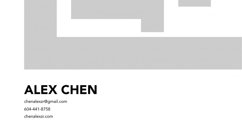
For this entry, I worked on a project that challenged me to create a self-made brand that reflects my own characteristics and who I am as a person. As the process developed, I had many opportunities to question myself and where I wanted to head. Overall this process was quite nice in finding out who I am inside and outside of the workplace.
Concept 1: @

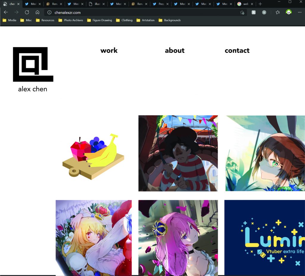
For this concept, this speaks to my design side of things. I liked creating a witty solution that solves intricate problems, this shows my ability to take creative stances on challenging topics. The execution itself is blocky with harsh angles to reflect my industriousness in my work ethic.
Concept 2: AC mark


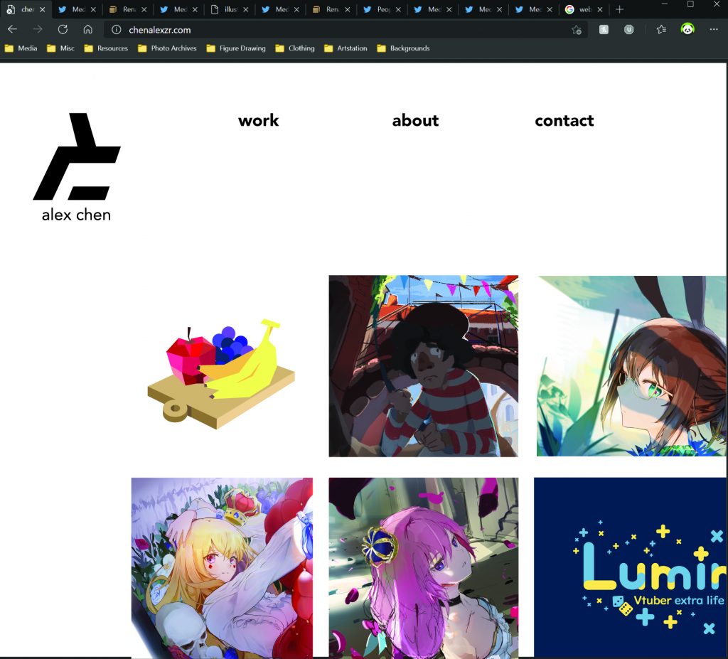
This logo was brought up with the idea of lost edges, a technique and art theory that I love when illustrating. The A and C are combined together and parts of it are taken away to create a unique icon. This logo is memorable and is multi-purpose, serving as a branding tool and an illustration wordmark.
Concept 3: AC Contained
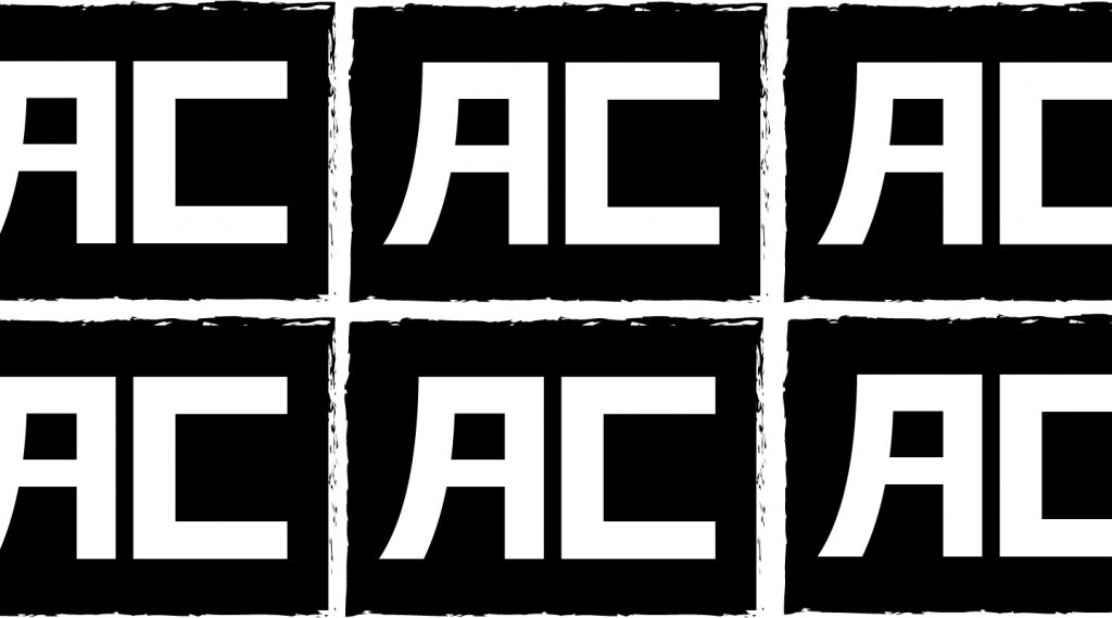

For this concept, I wanted to hint back at my ability to speak multiple languages (Chinese, English, Japanese). The letter forms were inspired by the languages I speak, and this form of logo could work as a stamp to brand my illustrations. The treatment could be both vertical and horizontal.
Looking back on the entire process, I enjoyed mood-boarding and discovering my own strengths and weaknesses. I quite enjoyed creating the SWOT, as that helped me identify weaknesses that I could work on, and be confident about my own strengths.
Finally, here is the personal branding pdf that you can see here for full detail:
Leave a Reply