IDES 244 GDC Cross-platform project

For the cross-platform project, I was tasked with revamping GDC’s National Instagram page. GDC struggled with getting people to engage with their National Instagram page due to a sparse amount of posts and little to no use of the “Instagram Stories” feature. The overall look and feel of the page also did not effectively reflect their brand.

For the cross-platform project, I was tasked with revamping GDC’s National Instagram page. GDC struggled with getting people to engage with their National Instagram page due to a sparse amount of posts and little to no use of the “Instagram Stories” feature. The overall look and feel of the page also did not effectively reflect their brand.

I created Instagram post templates for initiatives that would engage young designers and promote GDC’s values.

This consisted of posts that feature:

  • Canadian designers (CGD)
  • Design/Visual trends
  • Examples of great design for inspiration
  • A contest to directly engage students and provide incentive to follow GDC

I also wanted to make use of the Instagram stories and highlights sections and created:

  • A professional looking template for posts related to:
    • Industry
    • Teachers
    • Established designers
  • A trendy looking template for posts related to:
    • Students
    • Fun announcements
    • A younger demographic

If I were to evaluate myself on this project I would give myself a 7/10. This is because while I managed to create templates for the posts, I could have pushed it further. I felt as though I played it too safe and could have added more of a fun look and feel. I also felt as though the way I presented my work did not show the full extent of my work and I could have mocked it up in a more effective manner.

IDES 244 Decolonizing IDEA

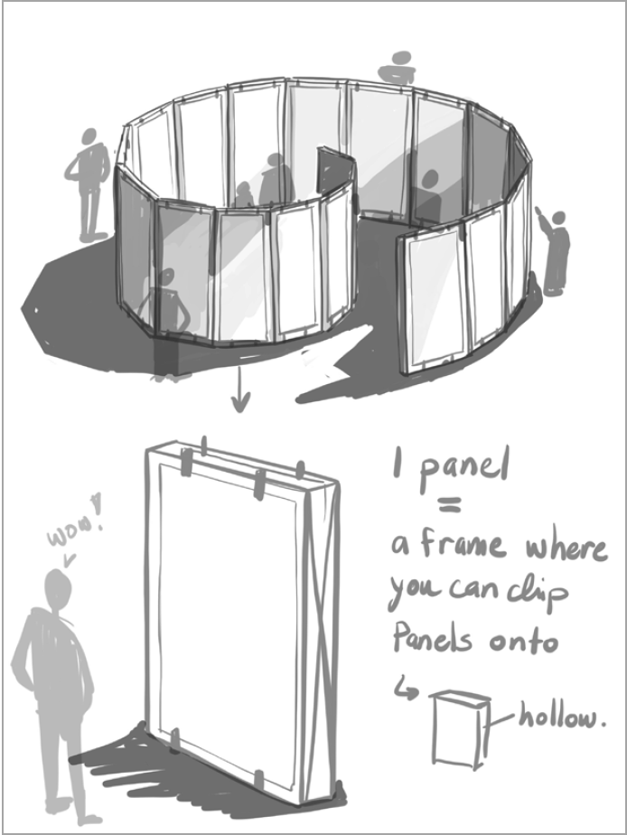
For our Decolonizing IDEA project, Alison, Sophie and I created a travelling pop-up gallery that featured contemporary Indigenous artists. This fictional gallery, sponsored by Fazakas Gallery, BC arts council and the Vancouver Art Gallery would be put in public places.

Introductory panel for the gallery installation

The goal of the project was to encourage self-motivated learning and interest in indigenous culture and art. We called it REgeneration to highlight how we as a society could heal and build relations with the Indigenous peoples of Canada through art.


Information panel of the gallery

We created this gallery because there has not been much space dedicated to contemporary Indigenous artists in mainstream galleries. In the last decade, out of the hundreds of exhibitions they have run, the Vancouver Art Gallery has created 4 only exhibitions completely dedicated to Indigenous artists. This was troubling as we still stand on the unceded territories of the Squamish, Tsleil-Waututh and Musqueam first nations.

We also felt as though creating this gallery was important because the general public’s perception of Indigenous peoples’ art was very traditional. While it is important to treasure and respect traditional art, exhibiting contemporary art created by Indigenous people would highlight the more current concerns, joys and frustrations they experience.

Since the beginning of the conception of this project, we wanted to incorporate words that had the prefix “RE”. Words such as Redefine, Reclaim and Reflect were assigned to artist who showed those values through their art.

the structure of our installation

We created:

  • Sketches for the gallery installation structure
  • The Panels of information and images for the installation
  • A microsite for information and promotion of the gallery
  • Promotional posters advertising and announcing the gallery
  • Promotional Instagram posts

In terms of self evaluation, I would give myself and the group an 8/10. This is because we had a couple bumps in the road towards the completion of our project, but we managed to pull through. While we managed our time well given our situation, our decision making process could have been much better. Our final design also erred on the safe side, though we wanted to create something more impactful. However, I believe our concept was strong and we managed to make everything cohesive and effective.

IDES 244 Assignment 2

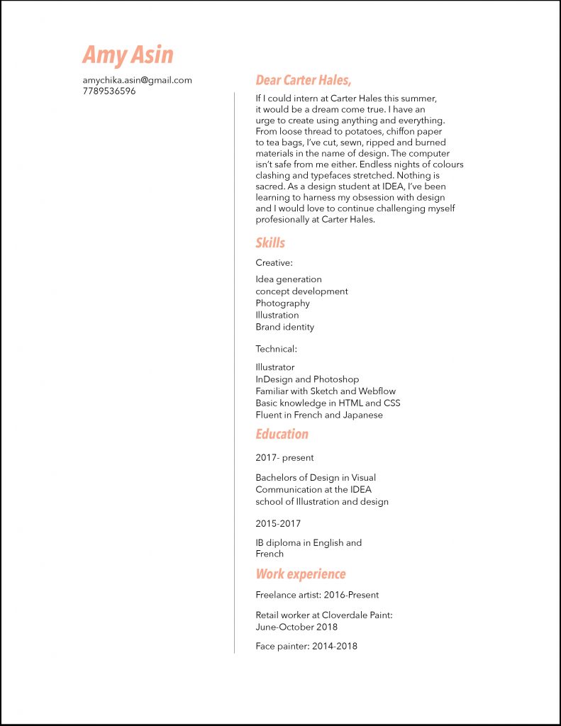
For this assignment, I created a resume for an internship at Carter Hales Design Lab. While researching about the brand, I was struck by their experimental yet professional approach. Since I primarily identified with their more playful and experimental side, I emphasised that in my personal statement.

On the other hand, my layout design is more clean and simple in nature. Since I am still relatively new to typography, I wanted to make sure the resume was functional and readable. While this was done adequately, some of the personality I showed in my writing was lost in the simple design.

If I were to grade this assignment, I would give myself a 6.5/10. I am happy with the writing I think it works with both my personality and Carter Hales’ brand. On the other hand, while the resume is legible, an element of craziness needs to be added to the design in order for it to come together.

IDES 244 Design Manifesto

In recent years, people have begun to show more and more interest in sustainability. While there has been much emphasis on environmental sustainability; economic, social and cultural aspects have always been deeply intertwined.

For this manifesto, my target market consists of young designers who want to be sustainable but have a hard time applying those practices. Since our lives and careers are so connected to consumerism, it can be difficult to implement sustainability. As a result, they may often feel powerless to create change.

The intention behind this manifesto was to remind us that we do have the power to incorporate sustainable practices, through creative thinking. I conveyed this by demonstrating a way to reuse the manifesto and extend its life. By encouraging the receiver of this manifesto to fold paper cranes, I would be sharing a piece of my culture while also allowing the paper to be repurposed.

The poster was designed in a very simple manner with an anti-design approach. This was done to appeal to younger trend-seeking audiences.

If I were to give myself a mark, ut would be 7/10. While I believe the concept and overall thinking are clearly demonstrated, the typography and polish of the design could be improved.