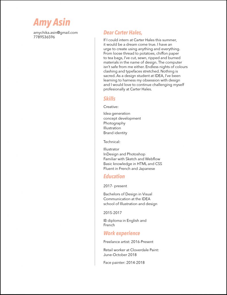
IDES 244 Assignment 2

For this assignment, I created a resume for an internship at Carter Hales Design Lab. While researching about the brand, I was struck by their experimental yet professional approach. Since I primarily identified with their more playful and experimental side, I emphasised that in my personal statement.

On the other hand, my layout design is more clean and simple in nature. Since I am still relatively new to typography, I wanted to make sure the resume was functional and readable. While this was done adequately, some of the personality I showed in my writing was lost in the simple design.

If I were to grade this assignment, I would give myself a 6.5/10. I am happy with the writing I think it works with both my personality and Carter Hales’ brand. On the other hand, while the resume is legible, an element of craziness needs to be added to the design in order for it to come together.

IDES 244 Design Manifesto

In recent years, people have begun to show more and more interest in sustainability. While there has been much emphasis on environmental sustainability; economic, social and cultural aspects have always been deeply intertwined.

For this manifesto, my target market consists of young designers who want to be sustainable but have a hard time applying those practices. Since our lives and careers are so connected to consumerism, it can be difficult to implement sustainability. As a result, they may often feel powerless to create change.

The intention behind this manifesto was to remind us that we do have the power to incorporate sustainable practices, through creative thinking. I conveyed this by demonstrating a way to reuse the manifesto and extend its life. By encouraging the receiver of this manifesto to fold paper cranes, I would be sharing a piece of my culture while also allowing the paper to be repurposed.

The poster was designed in a very simple manner with an anti-design approach. This was done to appeal to younger trend-seeking audiences.

If I were to give myself a mark, ut would be 7/10. While I believe the concept and overall thinking are clearly demonstrated, the typography and polish of the design could be improved.