For my mentorship project, I had the amazing opportunity to work with IDEA alumni, Alex Bakker, from Rethink. The process of this project was very organic but I still feel as though my original vision was executed. Throughout this project, I learned a lot from Alex, learned about my own process and created a great project!
Phase 1
In phase one, I decided to reach out early due to my indecisiveness. In mid-February, I went to meet Alex at the Rethink office, to start our discussion and to see any potential holes in my portfolio. We agreed that I needed a branding project with good typography that had depth and variety in its visual language. Personally, I also wanted to create a project where I could effectively execute my vision.
In the following weeks, I returned to Rethink, presented a long list of ideas and did some big decision making. Of the ideas I presented, four stood out the most:
- A Dagashi (Retro cheap Japanese candy) store.
- A bidet company trying to break into the North American market.
- A bee hotel and honey brand, focusing on sustainability.
- A gender-inclusive suit brand that has a more feminine approach.
We chose the suit brand, created a name, and a brand story the following week. I named it Jeann after Joan of Arc (Jeanne d’Arc). In its brand story, Jeann was created by Kimiko Sato, the daughter of a famous Japanese tailor. She inherited the company from her father and with full creative freedom, Jeann was born. Her inspiration from Joan of Arc came from her own struggles as a woman in a male-dominated industry. She also desired to provide discrimination-free services and space for marginalized people.
The following week, I ended up creating two briefs, due to my indecision. The first was Jeann and the second was a new idea, Serene. Serene was a medicinal marijuana brand for women with menopause, an idea I developed but rejected in Dominic’s class. I ended up choosing Jeann, due to its more interesting brand story.
For this phase, I would give myself a grade of 7/10. I struggled with clarity and decision making, as per usual. However, I later found my footing thanks to Alex’s guidance.
Phase 2
In this phase, I explored different logos, concepts and did some mood boarding. This phase was a struggle, mainly due to my issues with clarity and loss of direction. Alex was also unavailable for 2 weeks during this phase, which was both scary but also helpful in some ways.
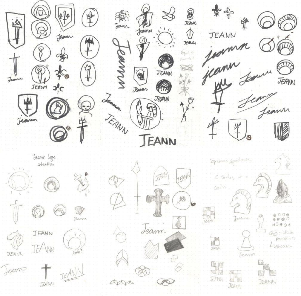
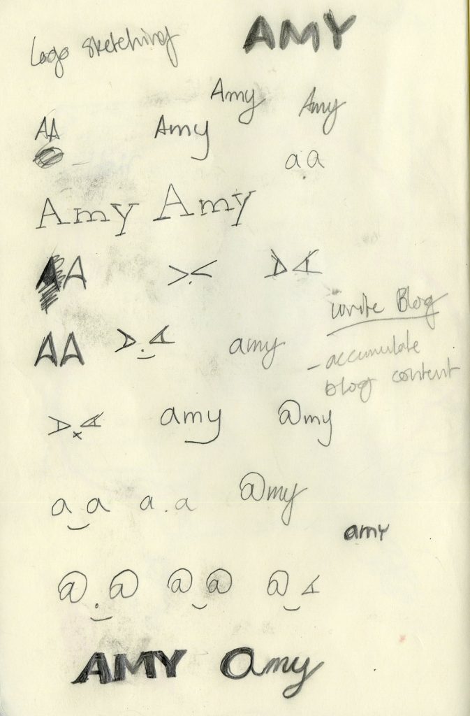
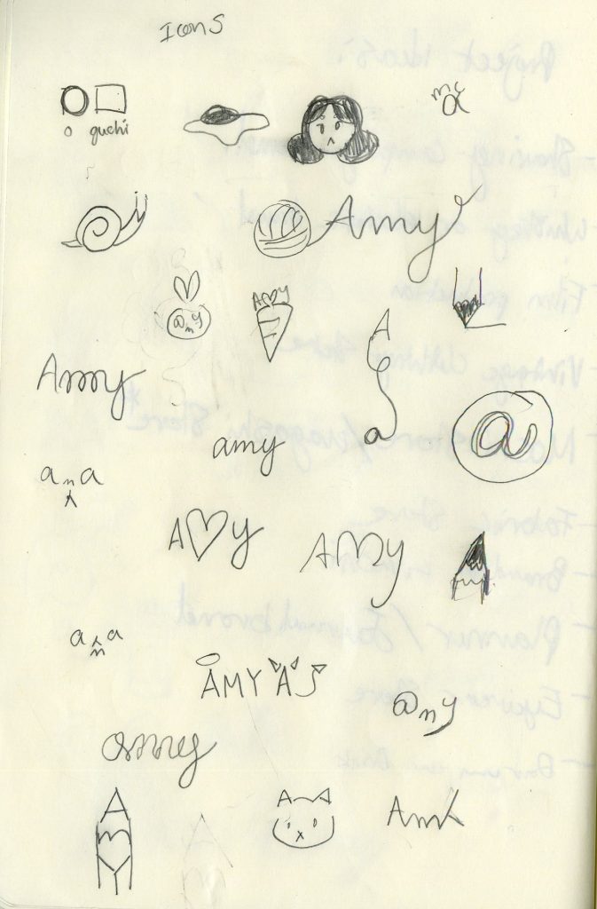
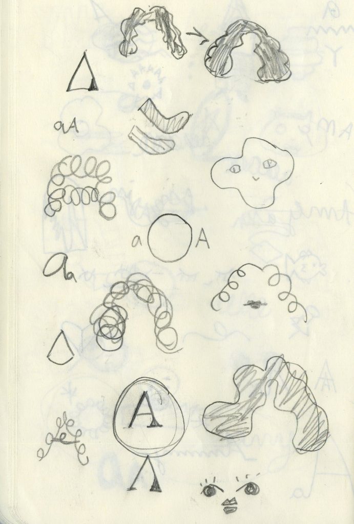
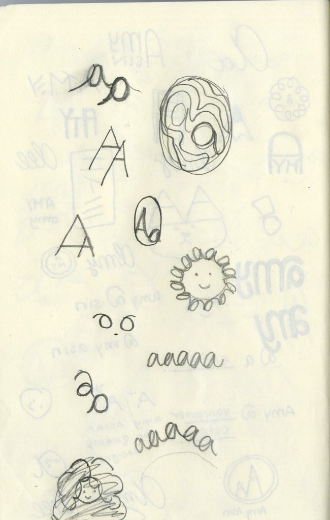
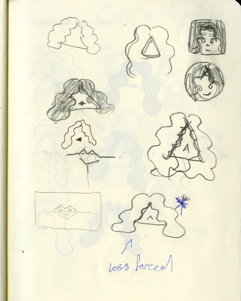
This first round of sketches was done by myself. I mostly explored different elements related to Joan of Arc and medieval motifs. For example, I drew inspiration from medieval crests, saintly portraits, weaponry and armour. I also went on a limb and came up with a chess concept due to its loose relation to war strategy but it was soon dismissed as a whole brand concept. This reminded me that brands need breadth and clarity, and cannot stand on a cool one-off concept alone.
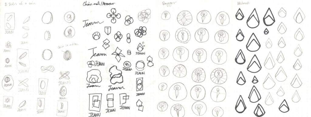
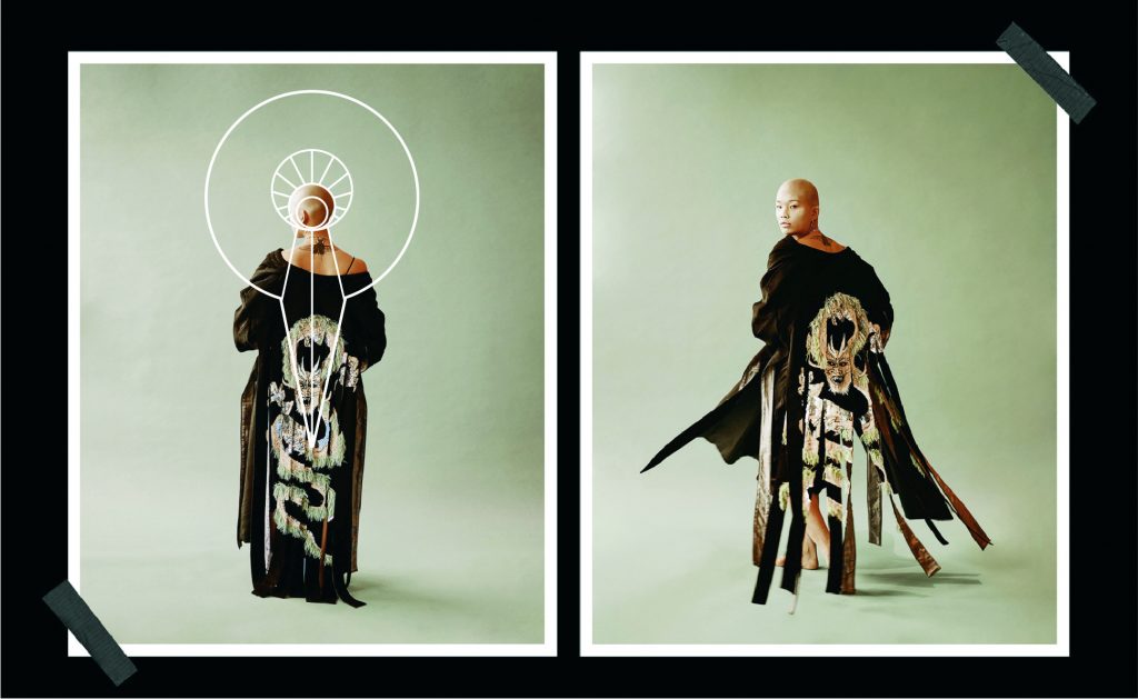
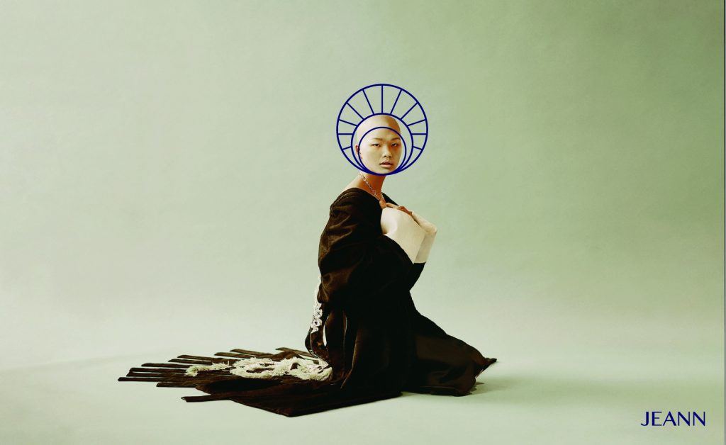
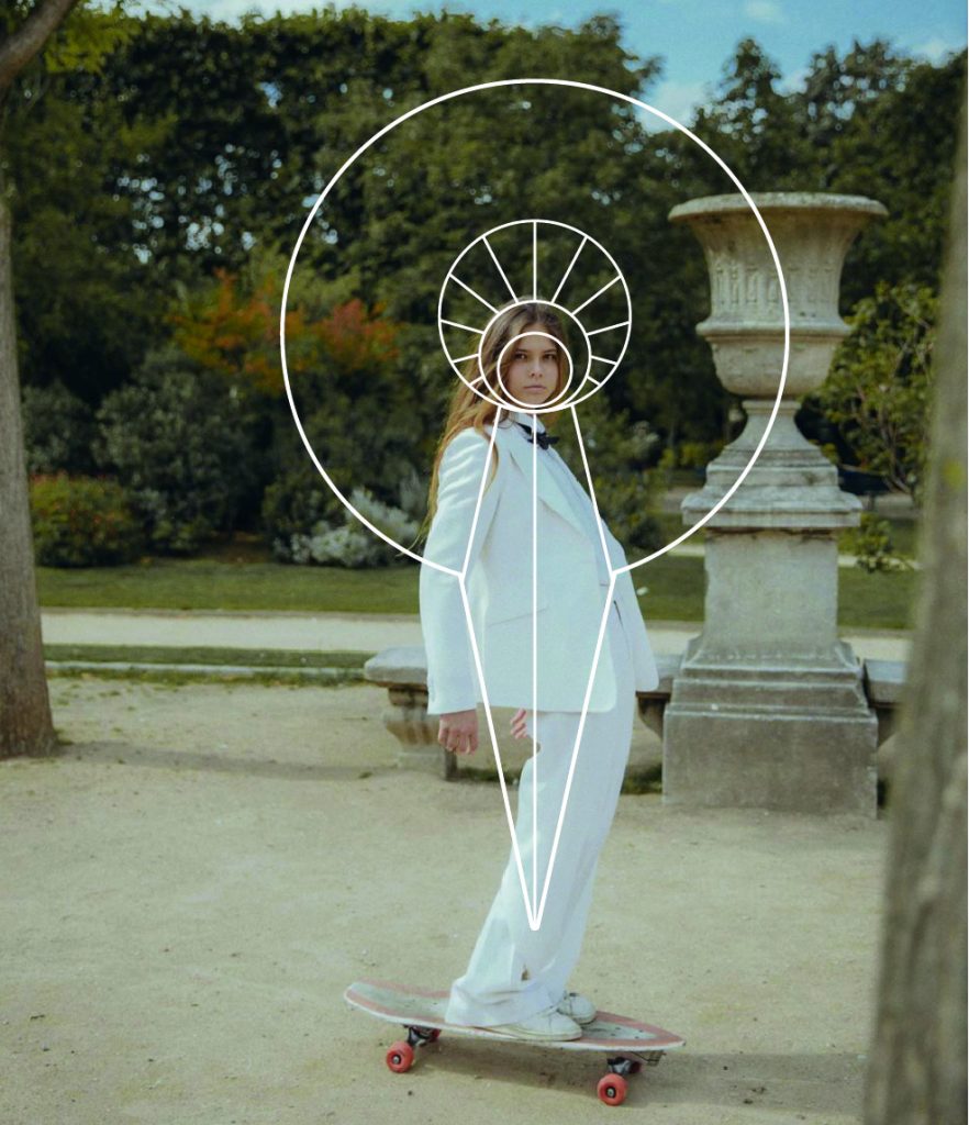
In the second round, I started off by meeting with Alex over zoom and chose a few directions and did further exploration with each. The concepts were: 2 sides of the same coin, chain mail, a saint/dagger, and a helmet. We ended up choosing 2 icons. The saint halo concept from the first round as the main icon and the dagger as a secondary icon. We also decided that the pommel of the dagger could actually be a scaled-down version of the halo icon.
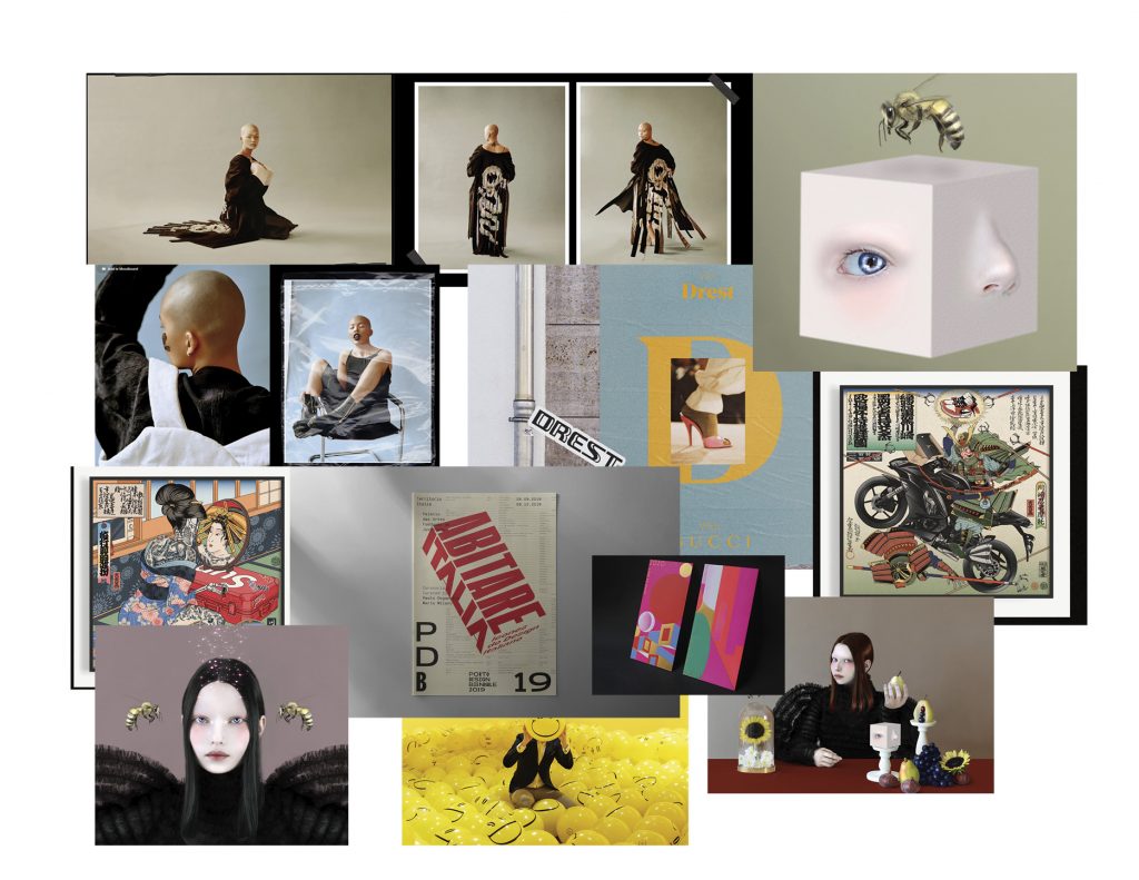
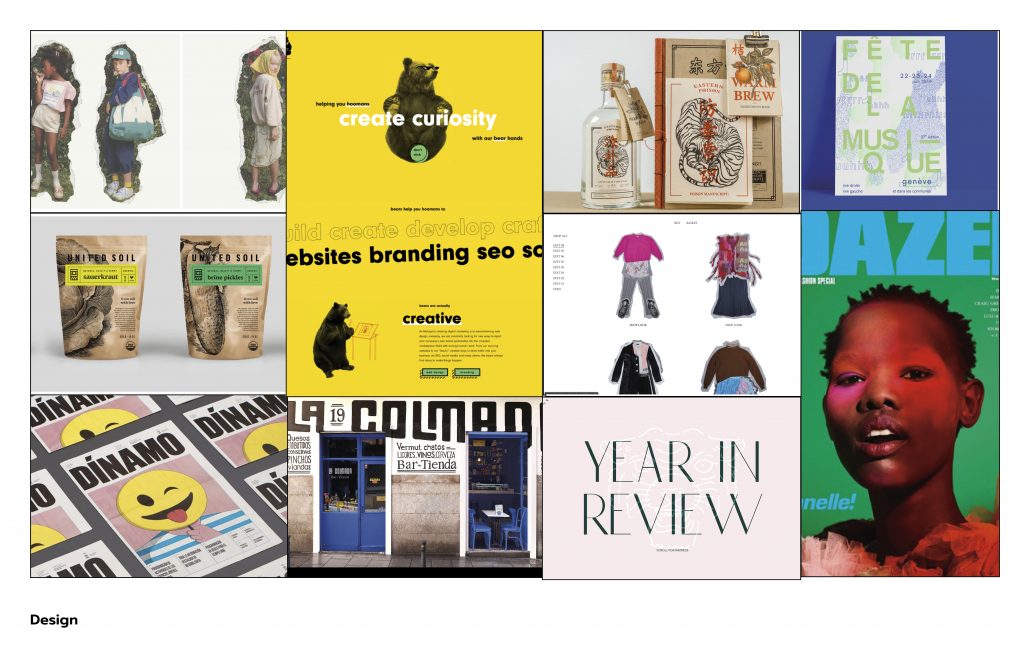
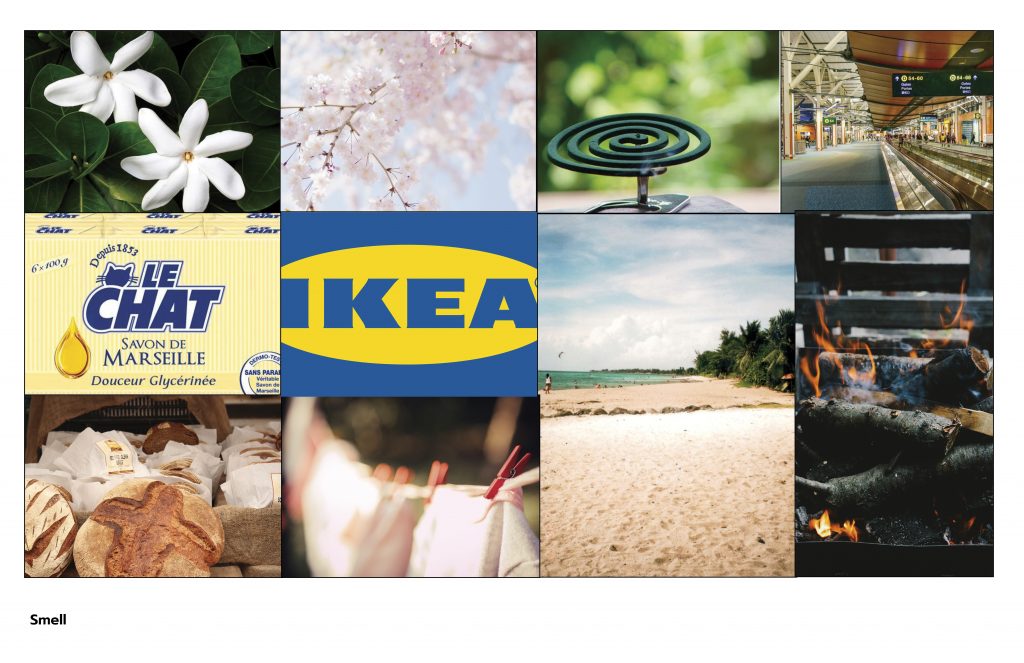
For the initial mood boards, I focused on the feeling I wanted the brand to convey. I mostly followed my intuition, thinking about what the founder of the brand would be drawn to if she existed. I presented my mood boards, feeling really unsure of my choices. However, Alex asked many questions regarding my choices and it helped me a lot with solidifying my thoughts. For example, I realised I was being drawn to the contrast between traditional and experimental design, tasteful weirdness and Japanese design. These were all very valuable and I could have easily dismissed my intuition if it weren’t for Alex’s feedback.
For this phase, I would give myself a 6/10. I didn’t do nearly as many sketches as I wished that I did. I could have pushed myself a bit further and felt as though there were many stones left unturned. I also struggled with the mood boards because of that lack of clarity. However, I did end up with a logo and concept that felt very true to the brand values and its story. I also learned how to ask myself the right questions thanks to Alex’s guidance.
Phase 3
Phase 3 involved refining the logo and starting ideation for applications. Now that I had a more clear direction, I had a lot of fun with exploring every single variation for logos.
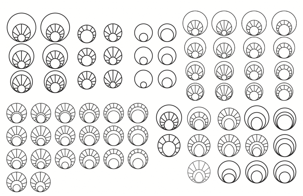
For the first part, I explored many different variations of shape, placement of the rays and sizes of each circle. We decided to go with the circular one with the rays on the outermost circle. It was true to Joan of Arc’s saint portraits and was also ambiguous enough to be genderless.
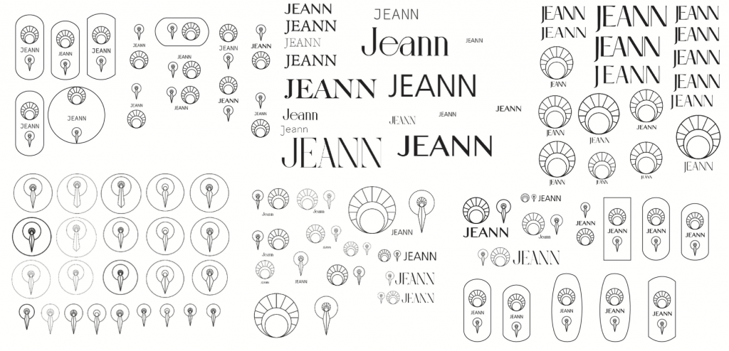
For the second part of this phase, I explored the dagger icon, the wordmark and possible logo lockups. At this point, I had a clearer direction for the primary and secondary logos. However, I struggled with the wordmark and the lockups. I got lost and created a kind of crest style logo (top left and bottom right). While there was nothing wrong with the fact that I explored the possibility, Alex pointed out that it was redundant as a logo system to smush them all together.
I also created some contextual examples of how some applications could look like. This exploration was mostly based on my intuition and getting my ideas out on the page.
For this phase, I would give myself an 8/10. While I did get lost every now and then, I progressed a lot in terms of clarity and Alex’s feedback always kept me on track. I am also proud of how much exploration I did in this phase.
Phase 4
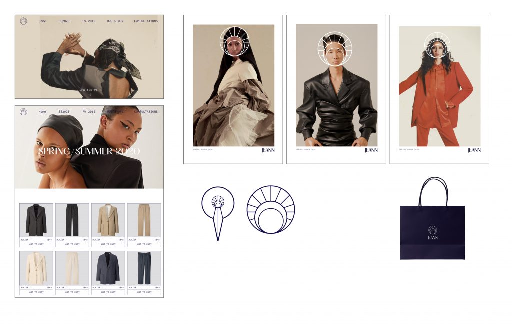
This phase was really about executing and solidifying my vision. It began with laying out the specific main deliverables. The applications were: A series of posters, a business card, a landing page, a shopping bag and one or two more special items.
The beginning was a bit rough. I mostly created what I thought each item should look like rather than what I wanted each item to look and feel like. Alex and I quickly figured it because I had decided to lay everything out in a single page, too make sure it felt cohesive. Seeing everything also allowed me to point out weaknesses within the brand application family.
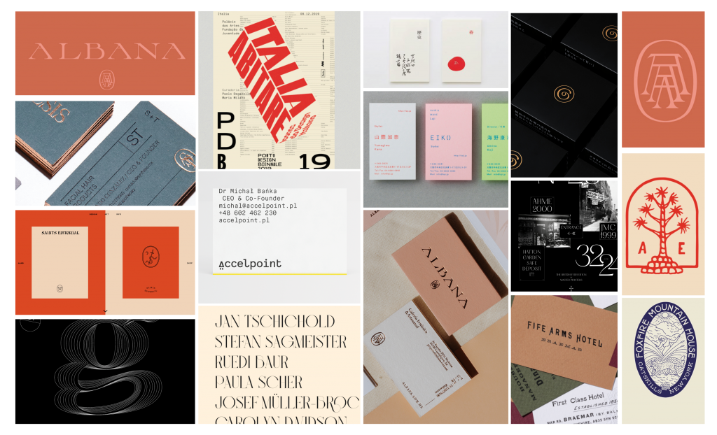
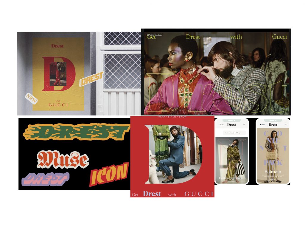
Throughout this process, I also compiled more and more examples of designs that inspired me, to help guide me.
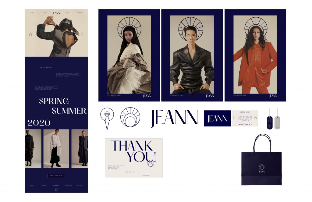
After expelling all the clichés, I pushed myself to work towards my vision for the brand, while regularly consulting Alex. By the end of this phase, I had created a solid visual language and all we had to do was to continue refining.
For this phase, I would give myself a 9/10. I worked really hard and applied the feedback from my discussions with Alex and Judy as well. everything was coming together nicely.
Phase 5
Phase five involved refining everything before presenting, as well as laying down the structure of my presentation.
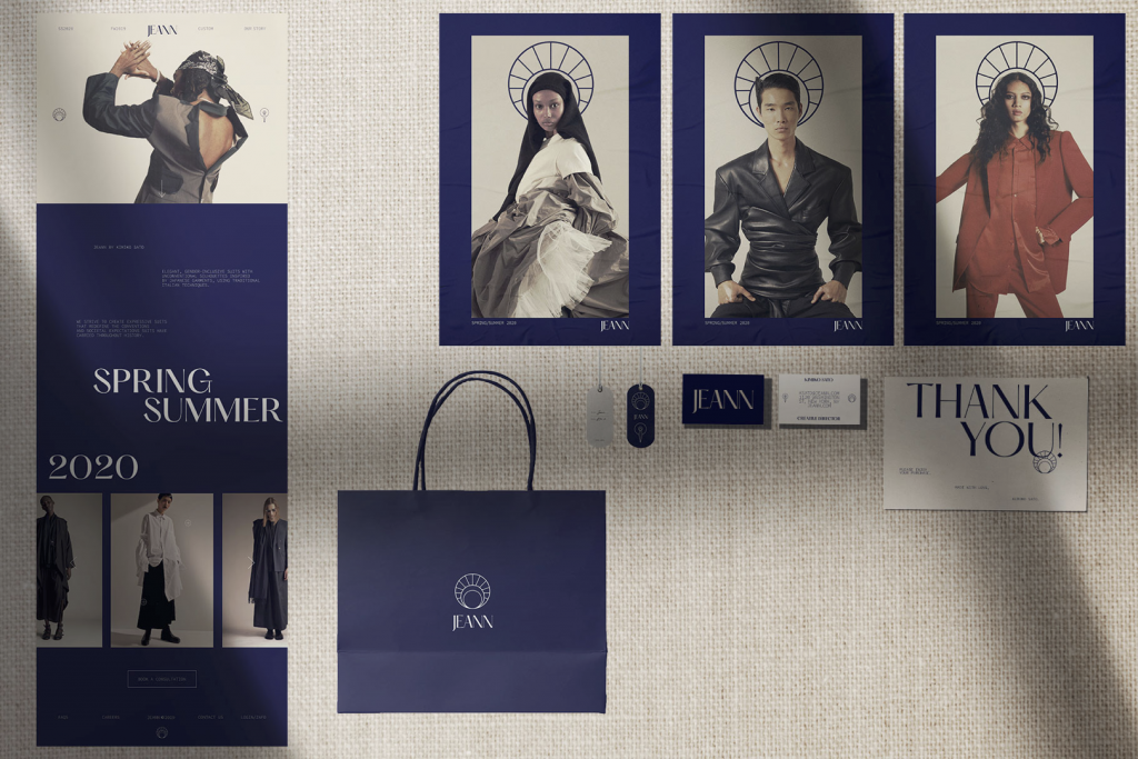
We went over the fine details of each piece and I learned a lot about sticking to the rules established in my brand. I also learned a lot about how to best present the ideas and the story I had spent so much time on, to an audience that has never seen them. The most important thing was to set up the context and linking all my choices back to my brand story and the brief was.
For this phase, I would give myself an 8/10.
